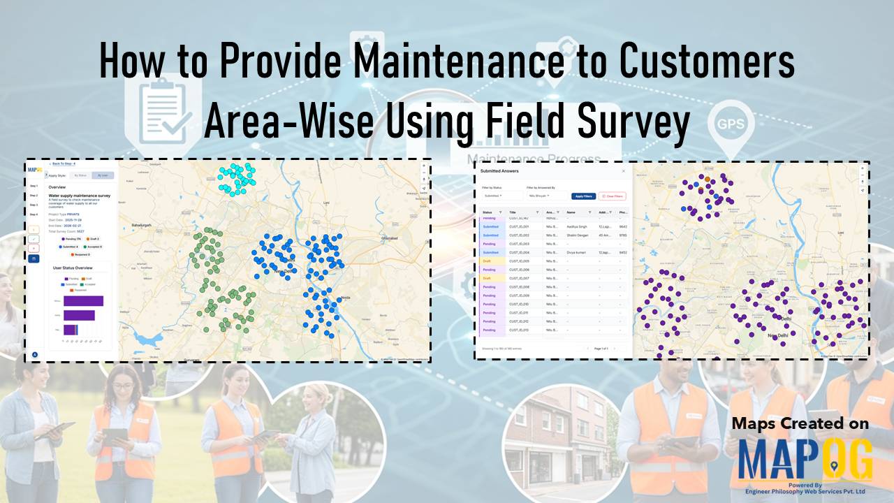
How to Combine All Customer Data from the Field Into One Clean Map
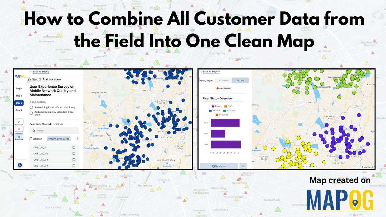
To combine all the customer data from the field is a common challenge for organizations. Teams collect location details, service feedback, and on-site observations through a mix of mobile apps, paper forms, and spreadsheets, but this mix of formats often leaves the data scattered and hard to interpret. A unified map solves this problem by … Read more