Data Visualisation in Map

How to Add Annotated Text on Interactive Maps

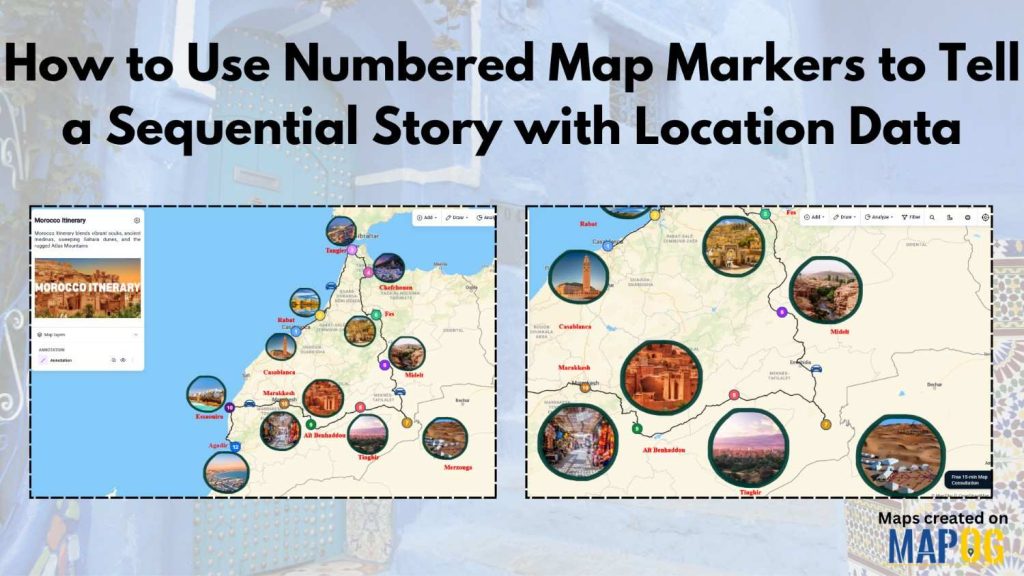
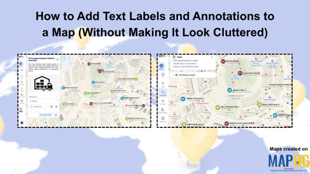
How to Add Annotated Text on Interactive Maps

Traditional maps often only display locations without explaining why those places are important. Important details are usually separated into reports, documents, or datasets, making geographic information harder to understand and less engaging for users. Annotated text on interactive maps solve this problem by adding labels, notes, and pop-ups directly onto the map. This makes information … Read more

How to Draw Interactive 3D Property Boundaries on Maps

How to Draw Interactive 3D Property Boundaries on Maps

In industries like real estate, construction, infrastructure planning, campuses, and tourism, clearly defining areas on a map is essential for better visualization and decision-making. Interactive 3D property boundaries help transform flat maps into more engaging and easy-to-understand visual experiences. With MAPOG, you can create interactive 3D boundaries, customize their height and styling, organize locations, and … Read more

How Field Teams Can Capture and Submit On-Site Data with Offline Sync Using Mobile Devices

How Field Teams Can Capture and Submit On-Site Data with Offline Sync Using Mobile Devices

Field data collection rarely goes as planned—especially in areas with poor connectivity. Teams often rely on paper notes, scattered photos, or delayed updates, which leads to errors and messy datasets. This is where MAPOG makes a difference. With an offline-first approach, field teams can capture on-site data with offline sync, fill surveys, attach photos, and … Read more

How to Review and Approve Location-Based Field Data Submitted by Field Teams

How to Review and Approve Location-Based Field Data Submitted by Field Teams

Location based field data is essential across industries, but reviewing and approving it is often a major challenge. Teams deal with inconsistent formats, scattered data, and slow validation processes, making it hard to ensure accuracy and take timely decisions. MAPOG solves this by centralizing location based field data on an interactive map and enabling structured … Read more

Adding 3D Objects

Adding 3D Objects to Maps for Better Visualization

Modern industries often struggle to present buildings, infrastructure, and location data in a way that feels realistic and easy to understand. Flat maps may display information, yet they usually fail to provide depth, scale, and spatial context. Because of this, architects, urban planners, tourism teams, and real estate businesses are now shifting toward Adding 3D … Read more

How to Visualize Population Data Using Interactive GIS Maps

How to Visualize Population Data Using Interactive GIS Maps

In population studies and urban planning projects, demographic data often stays limited to spreadsheets or reports, making it difficult to understand regional patterns and trends. Consequently, users struggle to identify population density, growth areas, or demographic distribution visually. MAPOG Visualize Population Data using interactive GIS maps. Key Concept: Why Use Interactive GIS Maps for Population … Read more

Map showing a property listing with nearby amenities like schools, hospitals, and transport locations

Make Your Property Listings Stand Out with Nearby Points on the Map

In real estate, property listings are often shared through images, spreadsheets, or basic portals. However, these methods only show partial information. While buyers can see the property, they rarely understand the surroundings. As a result, they spend extra time searching for nearby schools, buildings , and connectivity. With MAPOG , you can turn simple property … Read more

Interactive map showing business data locations, performance insights, and team collaboration

Create Shareable Maps to Present Business Data to Teams and Clients

Managing business data across multiple store locations or sales territories often becomes challenging when teams rely on spreadsheets instead to Create Shareable Maps, emails, and scattered reports. As a result, it becomes difficult to track performance, identify trends, and communicate insights clearly to teams or clients. Moreover, static data lacks geographic context, making it harder … Read more

Create 3D Boundaries

How to Create 3D Boundaries on Maps for Better Visualization

Interactive maps often look flat and difficult to interpret, especially when multiple business zones, campuses, tourist spots, or infrastructure projects are involved. As a result, many teams struggle to explain spatial boundaries clearly. However, when you Create 3D Boundaries on maps, locations become easier to understand, visually engaging, and far more interactive. MAPOG help solve … Read more

Analyze Bridge and River Crossings

Analyze Bridge and River Crossings Using the Intersection Tool

In infrastructure planning and environmental analysis, one persistent challenge is understanding where bridges intersect rivers and how these crossings impact safety, maintenance, and flood risk. Quite often, this data remains scattered, and therefore, decision-makers face slower and less accurate outcomes. However, when you analyze bridge river crossings using modern GIS tools, you can identify patterns … Read more