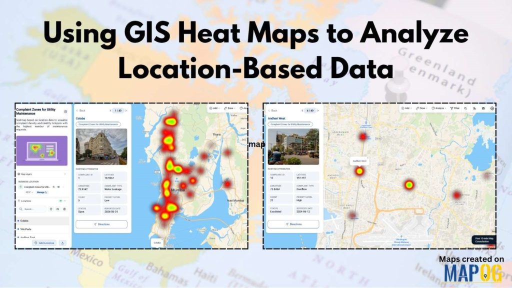
Teams across utilities, logistics, retail, infrastructure, and field operations collect large amounts of location-based data every day. Using GIS Heat Map is an effective way to visualize and analyze geographic patterns. For example, this data can include survey submissions, customer visits, complaint locations, service requests, and operational records. However, analyzing it through coordinates or large numbers of map markers can be time-consuming and difficult.
MAPOG simplifies this by turning raw geographic data into interactive GIS Heat maps. Where color intensity highlights areas of high and low activity. This makes it easier to identify patterns, understand geographic trends, visualize survey submissions, and make faster, better decisions using maps.
Key Concept of Using GIS Heat Map to Analyze Location-Based Data
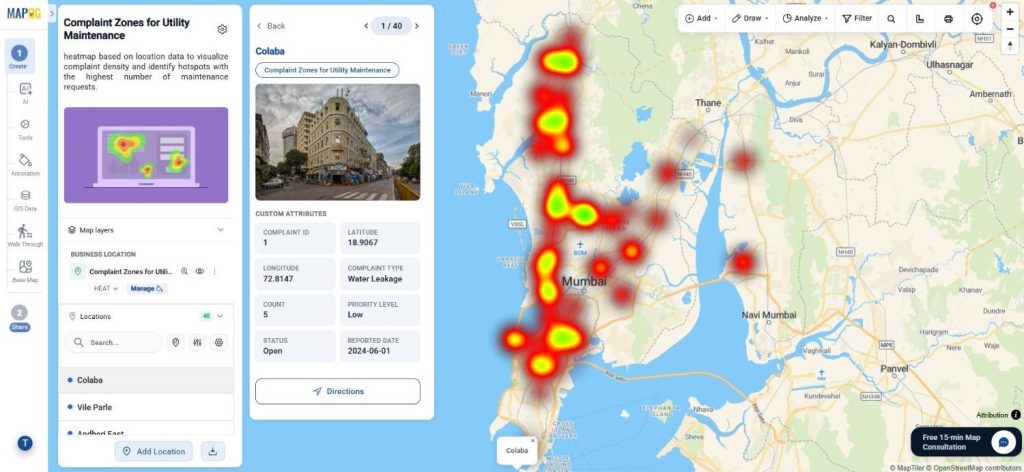
GIS heat maps help turn location-based spreadsheet data into an easy-to-read visual map using color intensity to show high- and low-activity areas. In MAPOG, users can create a map, upload CSV data using a custom location template, style it as a heat map, and adjust settings like radius, intensity, and opacity to highlight patterns clearly. finally the map can then be previewed, shared with teams, or published for reporting and analysis
Step by Step Process for Using GIS Heat Map to Analyze Location-Based Data
Step 1: Prepare Your Dataset
Before creating the map, prepare your data in CSV or Excel format, along with an optional value field like count or weight to show data intensity.

Step 2: Create a New Map
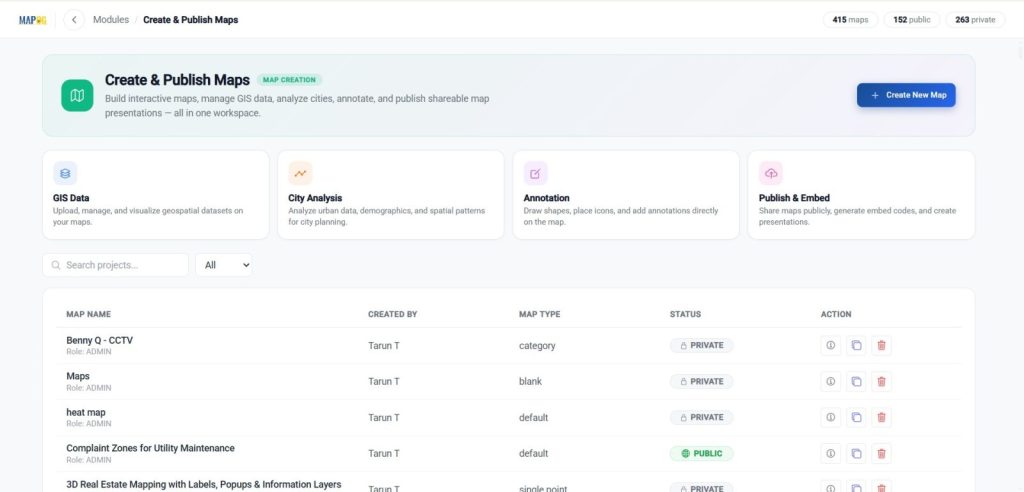
Start by logging into MAPOG and opening your workspace dashboard from Create and Publish maps.

Click Create New Map to begin a new project.
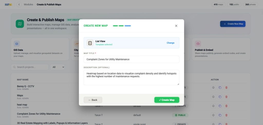
After clicking Create New Map, choose with Template.

For this setup, use the List View template.

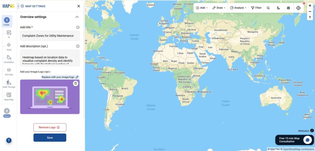
After the template is selected, add your Map Title and Description and click on Create map.
You can also upload a Cover Image from map settings. Adding a cover image improves presentation and makes the map look more complete.
Step 3: Upload Custom Location Using CSV
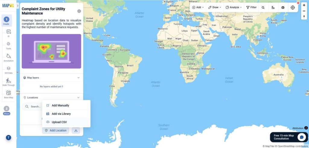
Inside the saved map, click Add Location, then select Upload CSV.
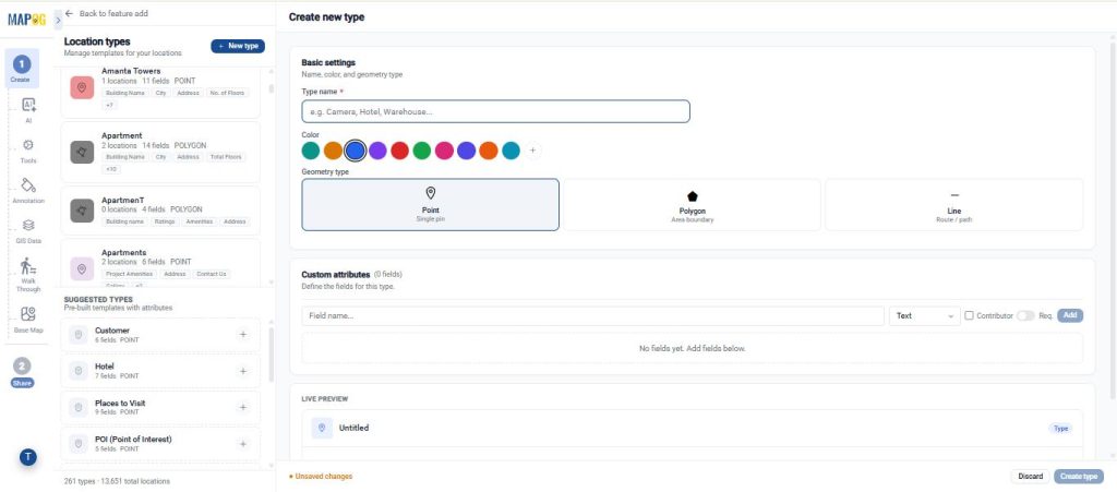
Go to Select Business Location Templates, click the Settings icon, then select New Type. Add the template name, choose a color, select the geometry type (Point).
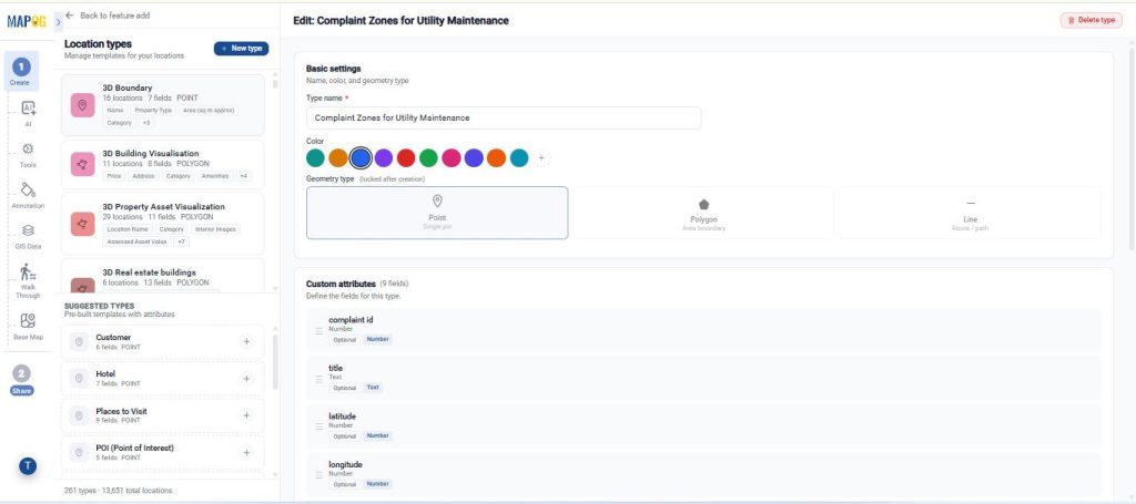
Afterwards add the required attributes for your project—such as Location Name, Category, Address, Description, Count, or any custom data using field types like Text, Number, Dropdown, or Date, then click Create Type to save the custom location template.
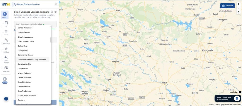
Afterwards go to Upload Business Location, select your custom location type from the dropdown menu.
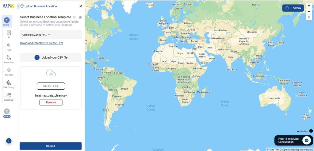
Upload your CSV file from your device.
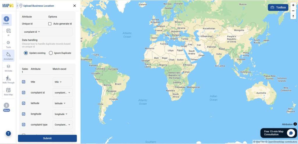
After that Set Unique ID to avoid duplicates.
Next, match the remaining attributes from your CSV with the fields in your custom location template.
Once the attribute mapping is complete, select & match the Latitude and Longitude columns from your spreadsheet.
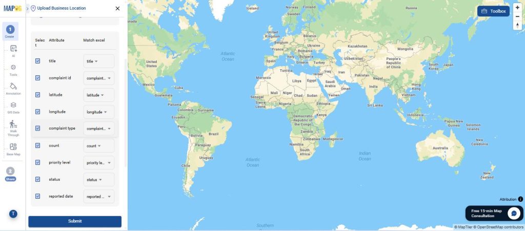
After reviewing all field mappings, click Submit. MAPOG will process the file and plot all uploaded locations in the selected custom location layer.
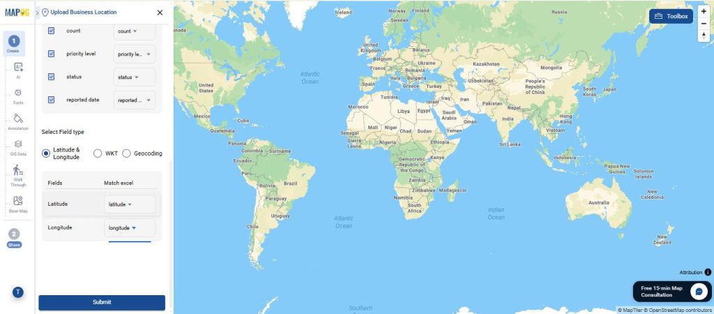
Step 4: Edit the Uploaded Layer
After the points appear on the map, open the uploaded layer and click Edit business location details .
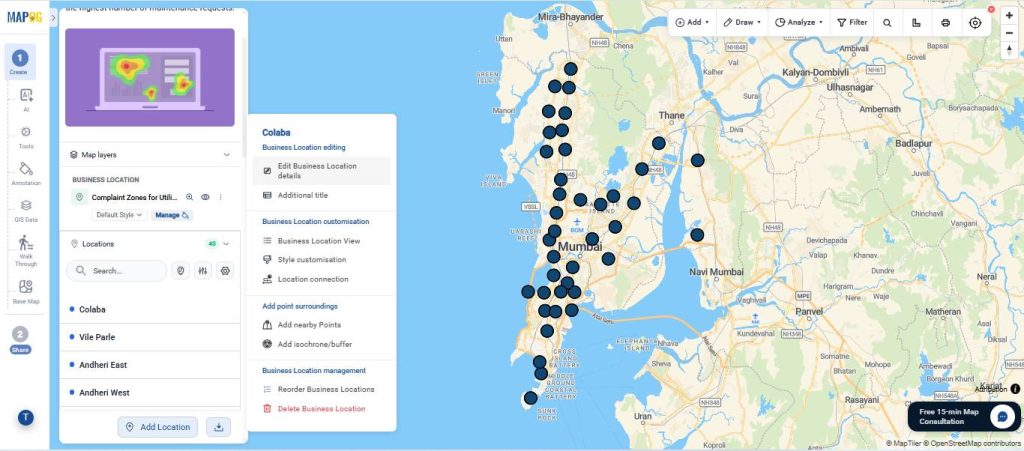
Here you can review the uploaded data, upload images, verify fields, edit descriptions, or correct any location details if needed.
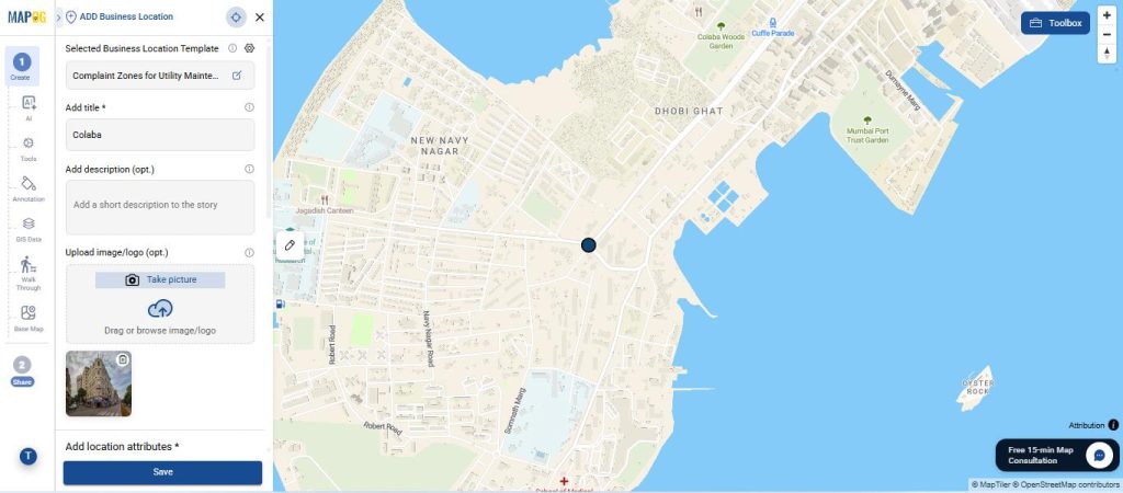
Step 5: Apply Heat Map Style
Once the layer is ready, click on the three dots near the layer and choose add layer style.
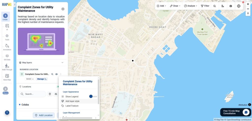
Apply the Heat Map style to the layer.
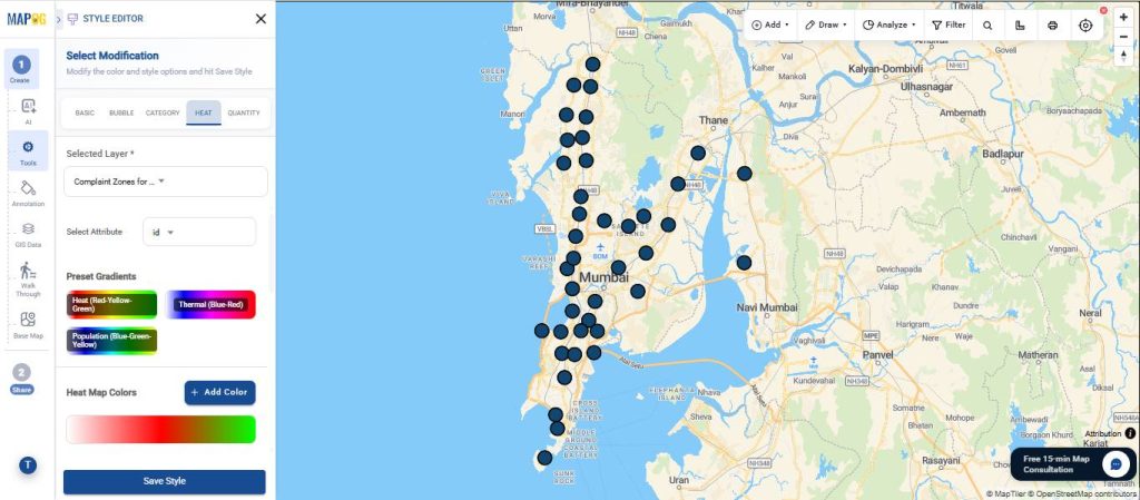
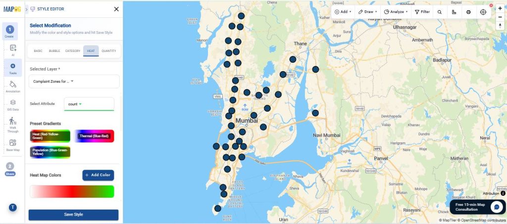
Select the uploaded location layer, then choose the value field that will control heat intensity.
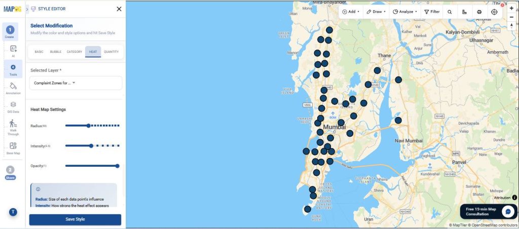
Moreover, You can customize the heat map using Radius, Intensity, Opacity, and Color Gradient settings to control hotspot appearance, adjust heat spread and strength, manage visibility, and clearly highlight low- and high-density areas on the map.
Higher-density areas will appear stronger, while lower-density regions remain lighter.
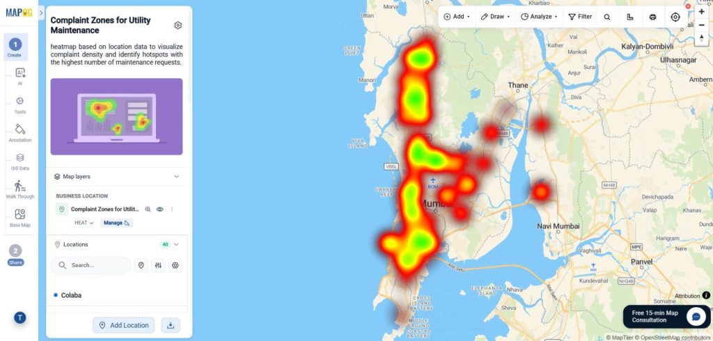
Step 6: Share and Publish
After the heat map is ready, click Preview & share. Additionally, you can share the map privately with collaborators & publicly with wider audience also.
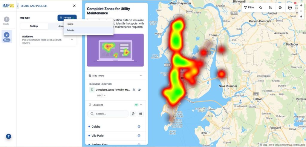
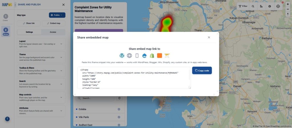
MAPOG allows users to generate a shareable public link, embed it into websites, or share it internally across teams and dashboards.
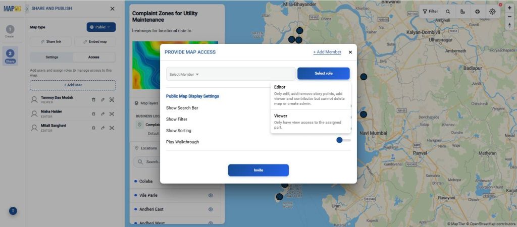
you can add users by entering their details and granting access to the map.
Real-World Applications of Heat Map
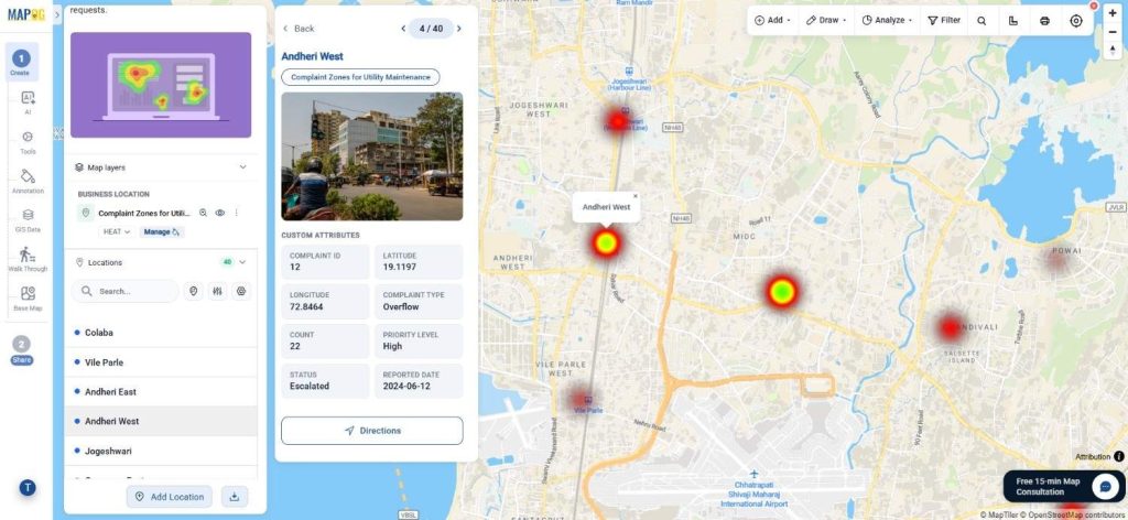
GIS heat maps are useful across many industries where location-based analysis is important. For example, survey teams use them to understand response density across regions. Similarly, utilities teams can track complaint clusters and maintenance zones. In addition, retail businesses can study customer concentration and demand patterns, while logistics teams can analyze delivery movement and route activity. As a result, organizations can identify trends faster and make more informed operational decisions.
Conclusion
GIS heat maps turn raw location data into clear, interactive visuals. As a result, teams can quickly spot patterns and make faster decisions without reviewing spreadsheets or hundreds of map points.
With MAPOG, the process is simple—from creating a map and selecting a template to uploading CSV data, applying heat styling, previewing results, and sharing the final map.
Related Articles