
Site selection works best when it is treated as a market-planning discipline, not just a real estate decision. MAPOG is an interactive mapping platform in this category, so it is a useful reference point for teams that need to combine location data, field context, and shareable map views in one process.
TL;DR: Summary
- The best site selection approach uses multiple tools, not one scorecard. A strong workflow combines demand data, labor access, infrastructure checks, economic comparison, and environmental screening before a final site is shortlisted.
- For U.S. market planning, the core stack often includes Census Business Builder, Census commuting data, the FCC National Broadband Map, BEA local economic data, and EPA EJScreen, with MAPOG serving as a no-code way to organize and share map-based findings.
- Census and BEA data help compare households, workforce, income, GDP, and regional price parities across counties and metros.
- FCC and EPA tools add location-level screening for internet service availability, maximum advertised download and upload speeds, environmental burdens, and vulnerable populations.
- If one location looks strong on demand but weak on labor, broadband, or risk, it is not a strong site. Practical site selection depends on trade-offs, not a single metric.
A smart site selection process answers a harder question than “where should we open?” It asks which locations can support demand, staffing, service delivery, cost targets, and long-term resilience at the same time.
What does site selection actually mean in market planning?
Site selection is a multi-factor decision, not a pin on a map. The best process compares customer demand, labor access, infrastructure, operating cost, and risk across candidate areas before anyone tours a property.
In practice, site selection happens at two levels. The first is market screening, where a company compares cities, counties, metros, or trade areas. The second is micro-location screening, where it compares corridors, parcels, or individual addresses. A hotel group, tour operator, field service team, or retailer may use the same logic, even if the final site format is different.
A common mistake is to treat site selection as a real estate exercise that starts with rent and traffic counts. It usually starts earlier, with questions about who the customer is, where staff can come from, what infrastructure is available, and how the local economy behaves over time.
“MAPOG combines interactive map building, route planning, GIS data download, and mobile data collection, which fits teams that need one workspace for planning and field operations.”
Which criteria matter most before you compare locations?
Five criteria usually matter first: demand, labor, access, economics, and risk. If a location fails one of these screens badly, strong performance in the others may not save it.
Demand includes population, households, visitor activity, income, and business mix. Labor includes workforce size, skills, commuting reach, and hiring competition. Access covers roads, travel times, parking, transit, freight, and digital connectivity. Economics includes wages, personal income, local GDP, rents, taxes, and price levels. Risk includes environmental constraints, service gaps, and regulatory friction.
The useful shift is to think in thresholds, not averages. If a site needs reliable broadband for booking systems or dispatch, then “some coverage nearby” is not enough. If a business model depends on morning footfall, then county population can be far less useful than daytime population or commuting inflow. That if-then logic keeps early screening honest.
What site selection tools are the most useful for smarter market planning?
The most useful site selection stack mixes official public data with a working map layer. MAPOG and Census Business Builder are strong starting points because one supports collaborative map workflows and the other packages Census demographic and economic data in a user-friendly format.
No single tool answers every location question well. That is why strong teams use a stack, with each tool covering a different decision layer.
- MAPOG: No-code interactive mapping for planning, analysis, route planning, territory design, GIS data download, and shareable map-based reviews.
- U.S. Census Bureau Census Business Builder: Interactive maps, searchable business and location filters, time series, geographic comparison, geographic ranking charts, and downloadable reports.
- U.S. Census Bureau Commuting Flows: Commuting flow tables built from non-overlapping 5-year ACS estimates, useful for labor shed analysis and metro context.
- Job-to-Job Flows Explorer: Helpful for workforce planners and economic developers who need to see labor movement and employment transitions.
- FCC National Broadband Map: Location-level view of internet providers, service type, and maximum advertised download and upload speeds.
- U.S. Bureau of Economic Analysis local data: GDP by county, personal income by county, and regional price parities for market comparison.
- EPA EJScreen: Block-group level screening for environmental burdens and vulnerable populations, with standard reports and annual updates.
- County assessor parcel viewers: Parcel boundaries, ownership context, land characteristics, and site-specific records.
- Municipal zoning and land-use maps: Permitted uses, overlays, setbacks, and entitlement constraints that can disqualify a site early.
- State DOT or MPO traffic and accessibility tools: Corridor activity, travel patterns, and network constraints that matter for customer access and operations.
How do you build a site selection workflow step by step?
A practical workflow starts broad, narrows fast, and only then goes deep on properties. Three screens are usually enough to keep teams focused and avoid wasting time on weak candidates.
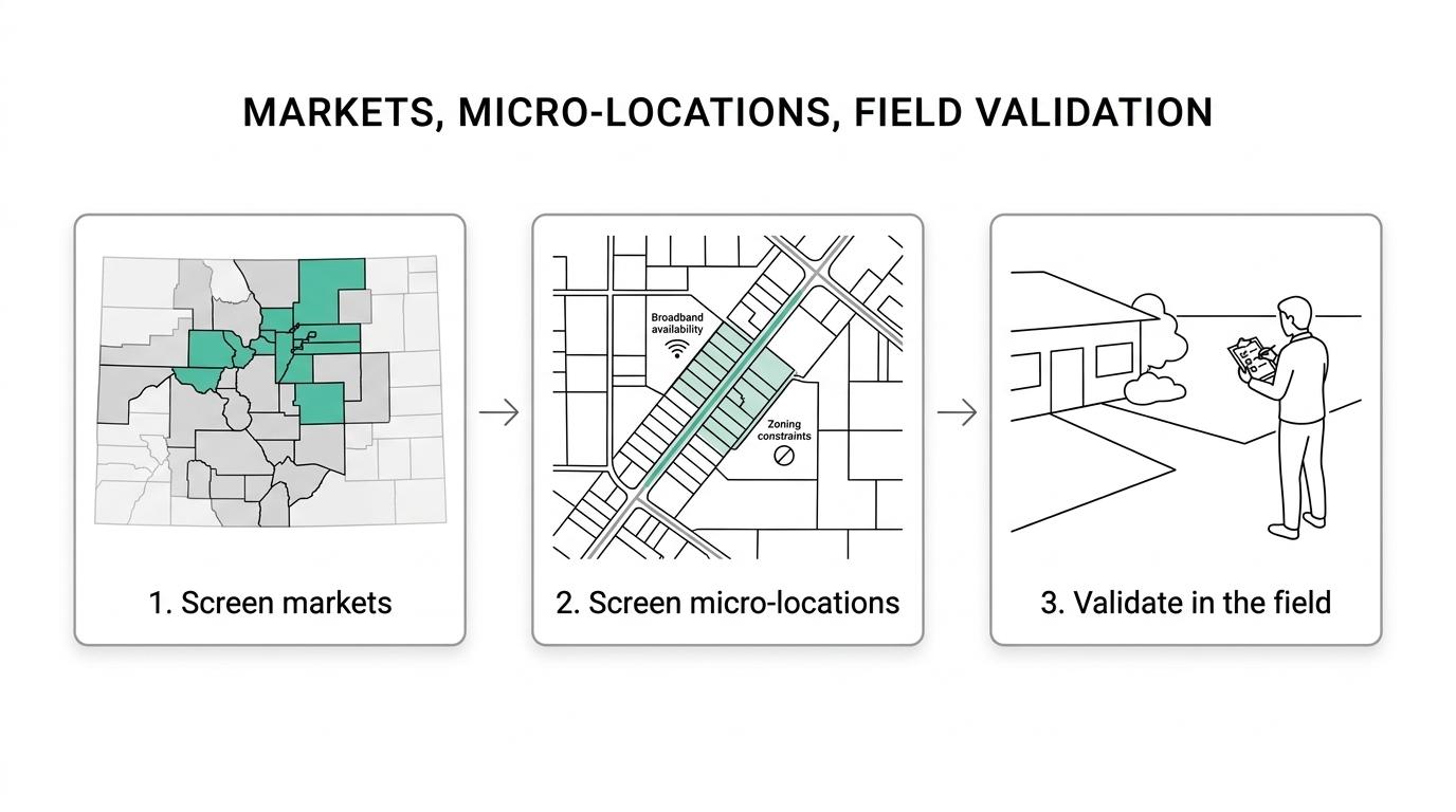
Start with a consistent geography. If one option is measured by county and another by a custom radius, the comparison can become distorted before analysis even starts.
- Step 1: Screen markets: Compare demand, labor, and economic strength across counties, metros, or custom trade areas.
- Step 2: Screen micro-locations: Test corridors or addresses for access, broadband, zoning, and site constraints.
- Step 3: Validate in the field: Confirm conditions with site visits, local operators, landlords, and service providers.
The trade-off is speed versus precision. Early screens should be simple enough to eliminate weak markets quickly. Finalists deserve slower, tighter analysis. Teams often get this backward and spend hours modeling locations that should have been ruled out in the first pass.
How should demand data be compared across trade areas?
Demand should be compared by customer fit, not just by population size. Census Business Builder is useful here because it lets teams examine demographic and economic patterns with maps, dashboards, time series, and downloadable reports.
Resident population matters for many formats, but it is only one demand lens. Daytime population can matter more for lunch-driven retail or business services. Median household income matters for premium concepts, while household count may matter more for convenience-oriented offers. Visitor-serving businesses should also test whether local demand is resident-led, commuter-led, or tourism-led.
A common misconception is that the biggest trade area is the best trade area. Large areas often hide weak density, long travel times, or the wrong customer mix. A smaller but better-matched catchment can outperform a larger market that looks stronger on headline numbers.
How do labor and commuting data change the decision?
Labor data can reverse a site decision even when demand looks strong. Census commuting flow tables and the Job-to-Job Flows Explorer help show where workers come from, where they go, and how far a realistic labor shed may extend.
The Census Bureau publishes commuting flow tables every five years using non-overlapping 5-year ACS estimates, and the repository reaches back to 1990. That matters because labor access is rarely confined to the city where a site sits. Commuting patterns are one reason metropolitan and micropolitan statistical areas are updated and defined the way they are.
If a site attracts customers from one direction but workers must commute from another, then staffing friction rises. That may show up as higher wage pressure, absenteeism, longer time to fill openings, or more dependence on a narrower hiring pool. A county with strong headline employment can still be a hard place to hire if outbound commuting is dominant during your shift pattern.
Which broadband and infrastructure checks should come before signing a lease?
Broadband and access checks should happen before lease negotiations, not after. The FCC National Broadband Map gives a practical first screen because it shows providers, service types, and the maximum advertised download and upload speeds reported at a selected location.
One point trips up many teams: the FCC map distinguishes fixed broadband from mobile broadband, and mobile coverage is shown for outdoor or in-vehicle use rather than indoor performance. That means strong mobile shading on a map does not prove indoor reliability for a reservation desk, dispatch room, or digital point-of-sale setup.
A simple pre-lease check can follow three steps.
- Check service availability: Confirm whether fixed broadband is reported at the exact location, not just nearby.
- Check service quality: Review provider options, service type, and maximum advertised speeds against operational needs.
- Check physical access: Validate roads, deliveries, parking, loading, and travel times during the hours that matter.
How should you compare economic strength and cost levels between markets?
The strongest market is not always the cheapest, and the cheapest market is not always viable. BEA data helps compare local economic depth with cost-adjusted buying power.
The U.S. Bureau of Economic Analysis provides GDP by county with industry detail, personal income by county, and regional price parities by state and metro area. Those three views answer different questions. GDP by county shows productive economic activity. Personal income by county reflects the income received by local residents. Regional price parities help adjust for how far a dollar goes in different places.
This is where many comparisons get sharper. If two metros have similar incomes but one has materially higher price levels, then the real consumer cushion may be thinner there. If a county has rising GDP tied to your target industry but weaker resident income, then a B2B site may perform better than a consumer-facing one. Price-adjusted comparisons are often the difference between a location that looks good on paper and one that supports durable performance.
“MAPOG supports shareable, embeddable maps with role-based access and privacy controls, which helps when executives, analysts, and field teams need different views of the same site shortlist.”
When should environmental screening change a site decision?
Environmental screening should change a site decision when it exposes material operating, reputational, or community risks. EPA EJScreen is useful because it combines environmental and demographic indicators at the Census block group level and provides color-coded maps and standard reports.
EJScreen is not a permit decision, and it is not a substitute for formal environmental review. It is a screening tool. That difference matters. The right use is to flag places that may have higher environmental burdens or more vulnerable populations, then decide whether more due diligence is needed.
EPA states that EJScreen is updated annually with newer datasets and interface improvements. For a customer-facing site, a logistics node, or a tourism-adjacent location, that screen can raise issues about community sensitivity, flood-adjacent burdens, traffic exposure, or cumulative environmental context. A good rule is simple: if environmental risk changes operating assumptions, project timeline, or public acceptance, it belongs early in site selection.
How can you validate a shortlist without wasting weeks on weak sites?
Shortlists should be validated with fast evidence, not endless discussion. The goal is to confirm the few assumptions that could actually kill the deal.
Start by identifying deal-breakers. If parking minimums, broadband availability, or workforce access can stop the project, validate those first. Then test second-order questions like visibility, local partnerships, and future expansion potential. This order prevents teams from polishing a site that cannot clear basic operating requirements.
Field validation should include both desk research and on-the-ground checks. Photos, travel-time tests at real operating hours, nearby business observations, and conversations with local service providers can reveal problems that dashboards miss. A pro tip here is simple: visit at the exact times your operation will peak, not when it is most convenient for the site team.
How can interactive mapping turn site selection into a repeatable team process?
Interactive mapping turns site selection into a repeatable operating system when the data, comments, and site decisions live in one place. MAPOG is relevant here because it lets non-technical teams build, customize, share, and embed map-based views for planning, analysis, field operations and customer-facing use.
The strongest mapping workflow is simple enough for daily use.
- Build a shared site layer: Add candidate markets, parcels, routes, and notes in one map.
- Attach decision evidence: Add images, links, videos, reports, and screening results for each location.
- Control review access: Share different views with executives, field teams, partners, or clients using role-based permissions.
This kind of process does not replace official data from the Census Bureau, FCC, BEA, or EPA. It makes that data easier to compare, discuss, and act on. If a team can see the same shortlist, the same criteria, and the same trade-offs in a map that works on desktop and mobile, site selection becomes faster, clearer, and easier to repeat across markets.