Category Style

Plan multi day travel routes

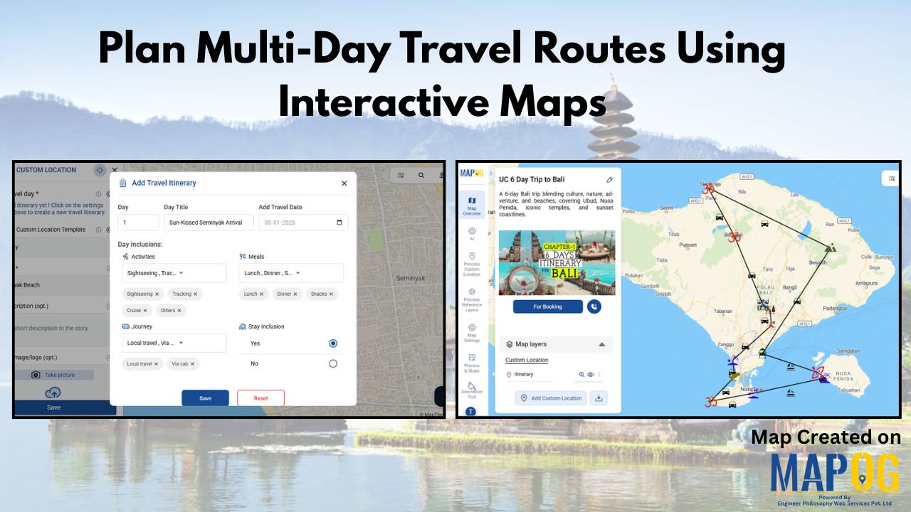
Plan Multi-Day Travel Routes Using Interactive Maps

Having to plan multi-day travel routes can quickly become overwhelming when destinations, routes, and travel times aren’t clearly visualized. Traditional itineraries often fail to show how places connect across days, as a result, leading to inefficient routes, rushed schedules, and missed experiences. For travel agencies, and destination management companies, this lack of clarity complicates planning … Read more
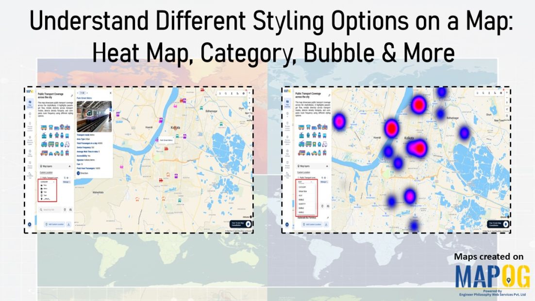
Shows comparison of different map styling options: including heatmap, category, bubble and quantity

Understand Different Styling Options on a Map: Heat Map, Category, Bubble & More

At first glance, raw data on a map often looks like scattered points with little meaning. Although the information is there, the story remains hidden. As a result, patterns are difficult to spot, categories blur together, and intensity feels impossible to judge. That’s why it matters to understand different styling options on a map . … Read more

Use “Group By” to Categorize

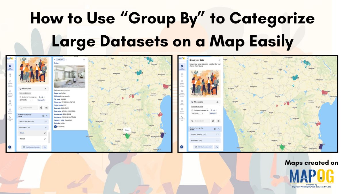
How to Use “Group By” to Categorize Large Datasets on a Map Easily

Working with large datasets on a map can feel overwhelming when everything appears scattered and unorganized. By using group by to categorize your data by attributes such as state, city, project type, or customer category, you can neatly categorize and organize even the biggest datasets. This simple approach helps your maps become clearer, more manageable, … Read more

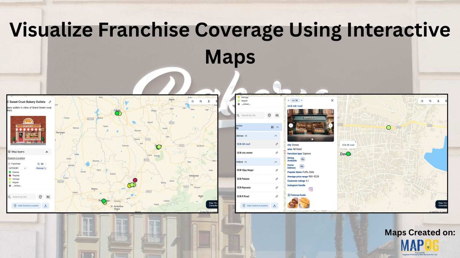
visualize the franchise covergae for a bakery outlet

Visualize Franchise Coverage Using Interactive Maps

Running a franchise business is no longer just about opening outlets in multiple cities. Instead, it is about understanding where your outlets are located, how they perform, and which areas remain untapped. This is where interactive maps play a crucial role. Visualize  franchise coverage on a map, businesses can instantly see location patterns, service reach, … Read more

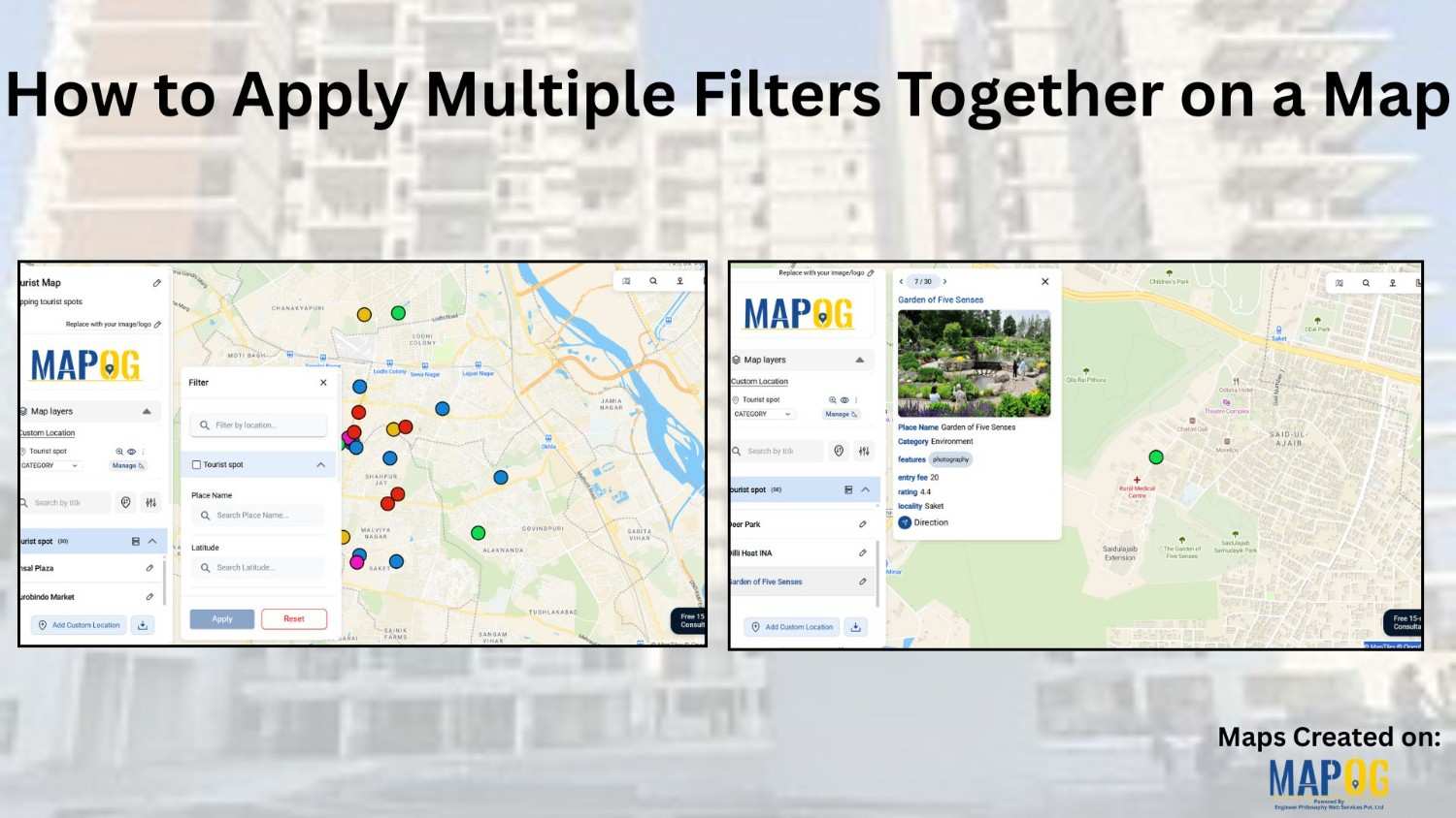
how to apply multiple filters

How to Apply Multiple Filters Together on a Map

When you work with location-heavy data, simply placing points on a map is not enough. You need a way to apply multiple filters on map , compare categories, and instantly highlight visuals that matter. That is why applying multiple filters together on a map becomes so powerful. It helps you narrow down results, spot patterns … Read more

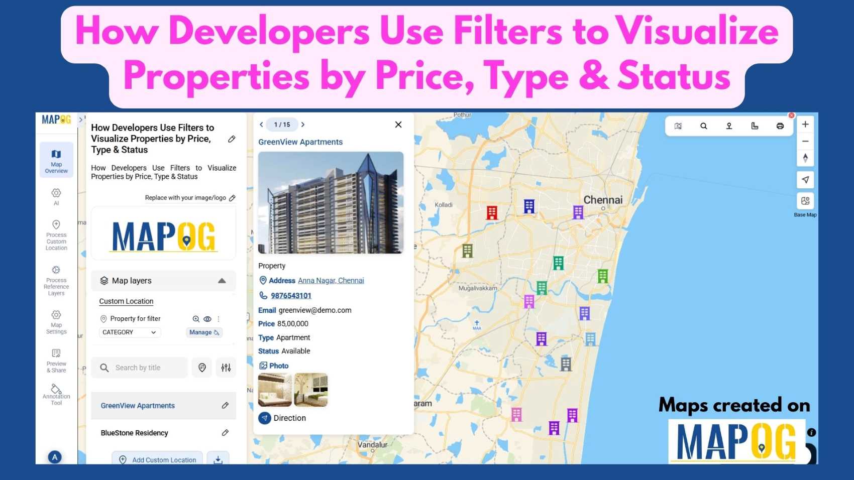
Filter Properties for Insights

How Developers Use Filters to Visualize Properties by Price, Type & Status

In today’s real estate tech landscape, clarity and precision in data visualization are essential for smarter property decisions. Simply listing properties isn’t enough-you need a way to slice, sort, and understand them instantly. That’s where Interactive filters come in. By Filter Properties for Insights based on price range, property type, and availability status, maps become … Read more

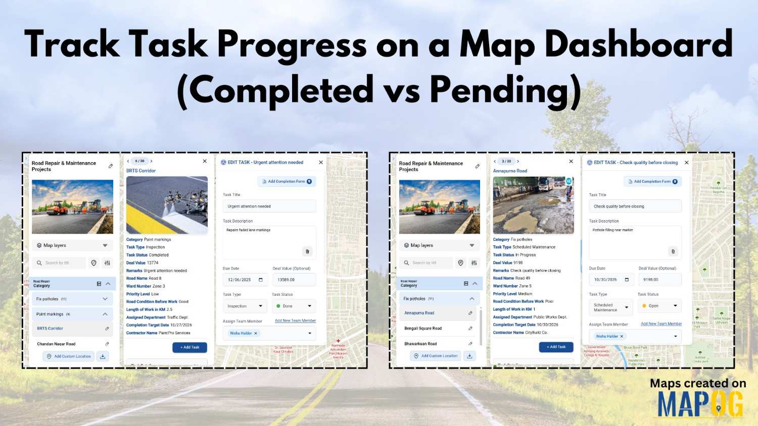
Track Task Progress

Track Task Progress on a Map Dashboard (Completed vs Pending)

Track Task Progress visually instead of relying on scattered spreadsheets or delayed updates. Today, many infrastructure and field teams prefer map dashboards because teams can see completed vs pending tasks instantly. Moreover, when teams link task data to real locations, planning becomes faster and accountability improves. In this article, you’ll discover how to Track Task … Read more

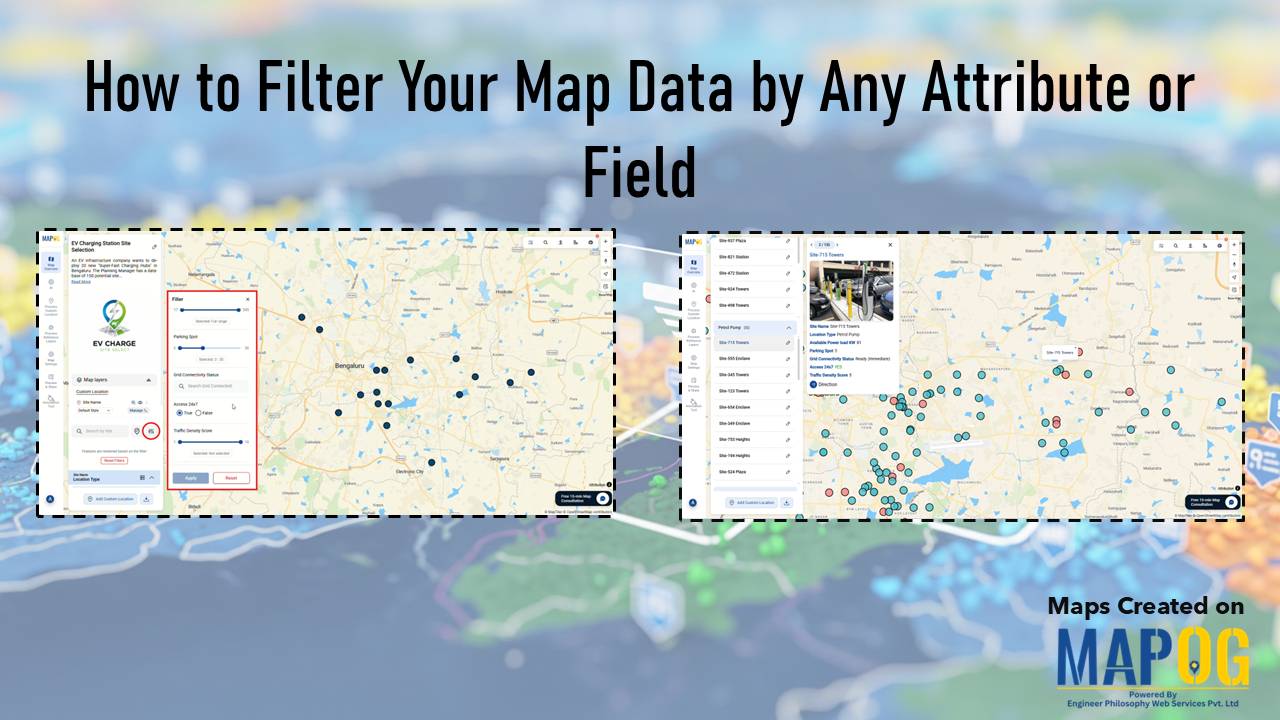
MAPOG interface showing tools to Filter Your Map Data by attributes for smarter location and site selection.

How to Filter Your Map Data by Any Attribute or Field

Modern planning teams operate in environments where speed, accuracy, and clarity directly influence outcomes. Consequently, the ability to filter your map data by any attribute becomes a core strategic skill. In high-growth sectors like EV infrastructure, teams often evaluate hundreds of potential locations before selecting only a few high-impact sites. While this process traditionally demands … Read more

Reuse

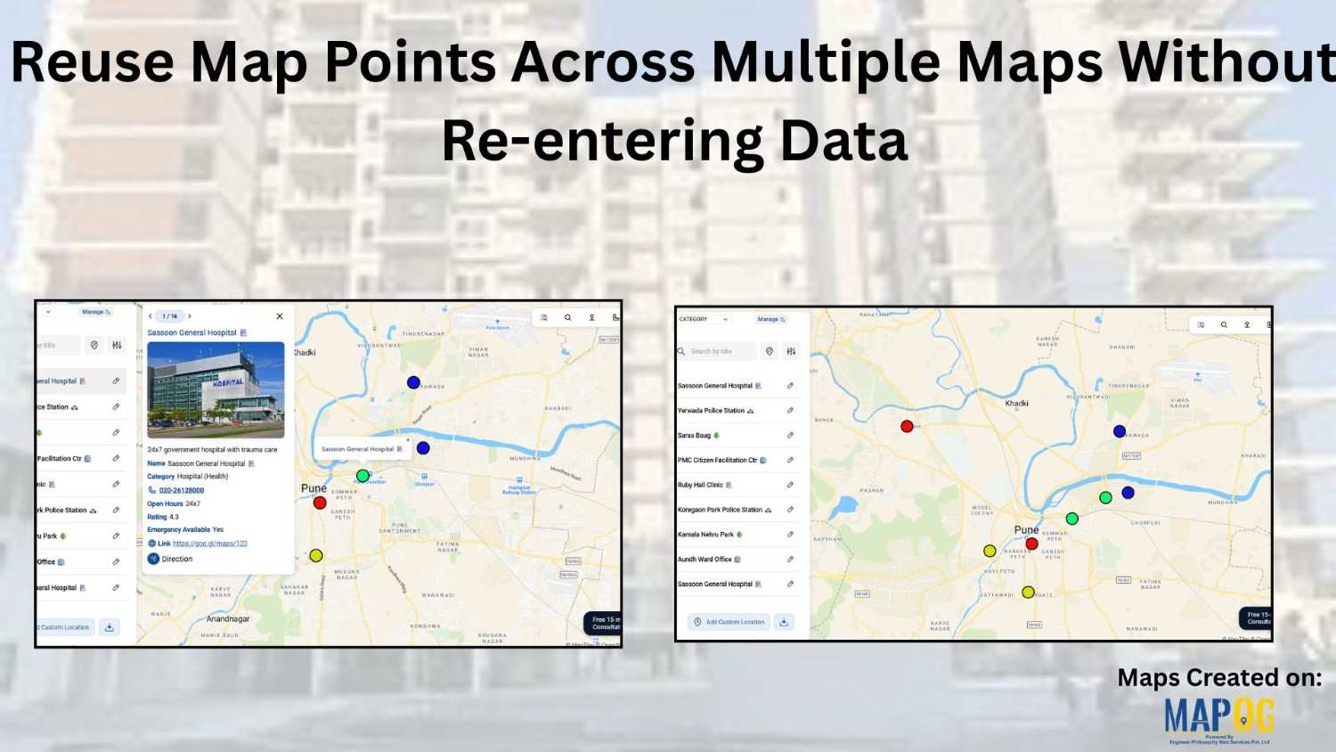
Reuse Map Points Across Multiple Maps Without Re-entering Data

Building maps repeatedly with the same locations can quickly feel slow and unnecessary. Moreover, whether you’re creating story map  visuals for planning, reporting, or even fieldwork, entering the same points again and again eventually wastes a huge amount of time. Therefore, a smarter and far more efficient approach is to reuse saved map points instead … Read more

sales area

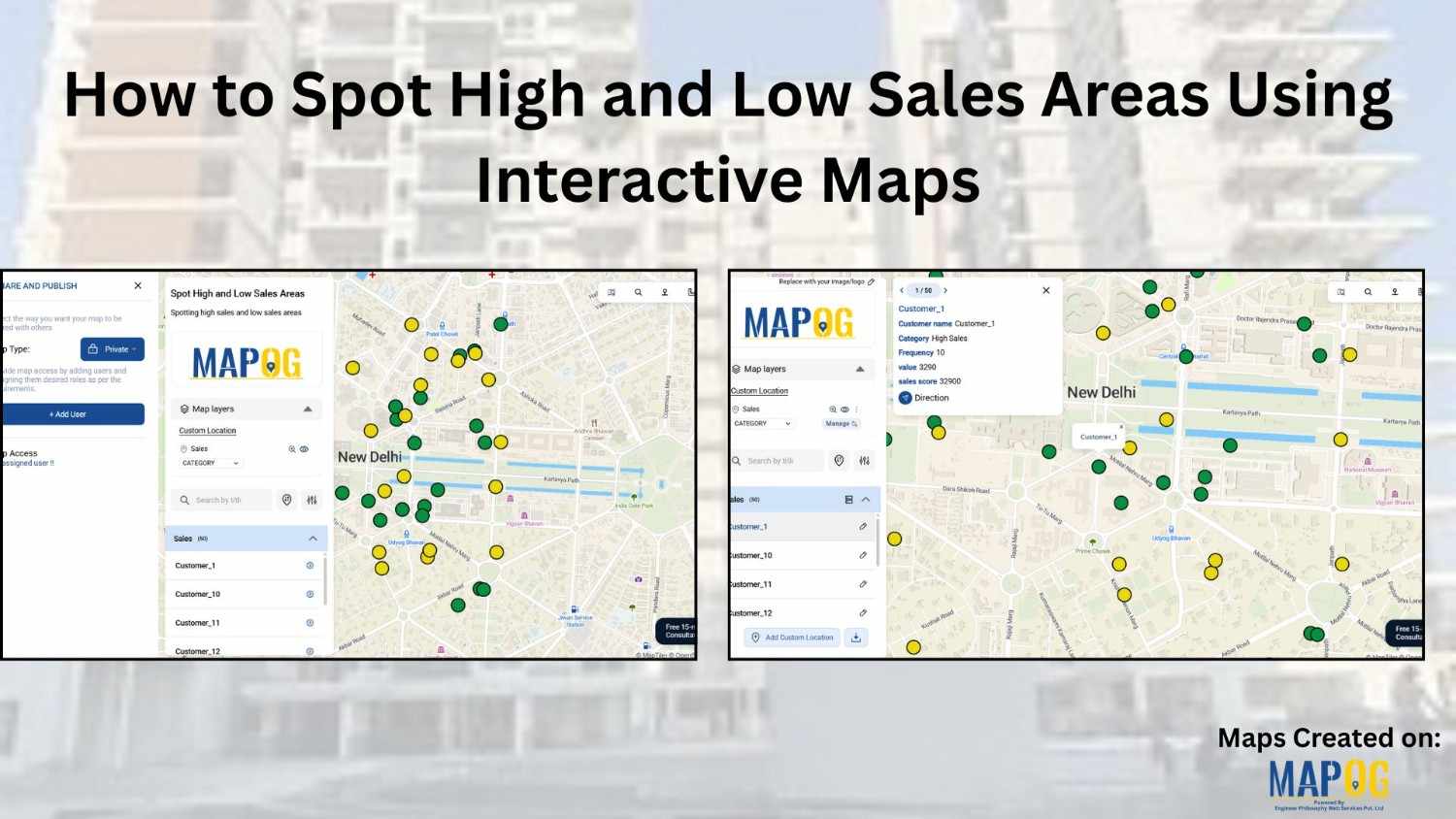
How to Spot High and Low Sales Areas Using Interactive Maps

When businesses work with sales data spread across multiple locations, spreadsheets alone often fail to reveal meaningful insights. Simply listing numbers does not clearly show where performance is strong or weak. That is why MAPOG  plays a crucial role in sales  visuals . By visualizing sales data geographically, you can instantly high and low sales … Read more