Category Style

how to apply multiple filters

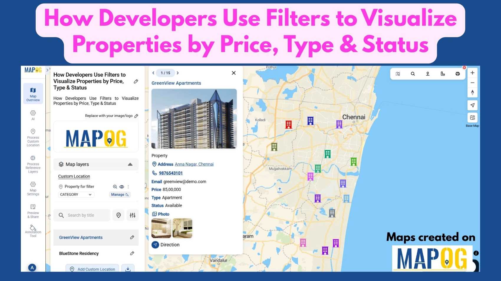
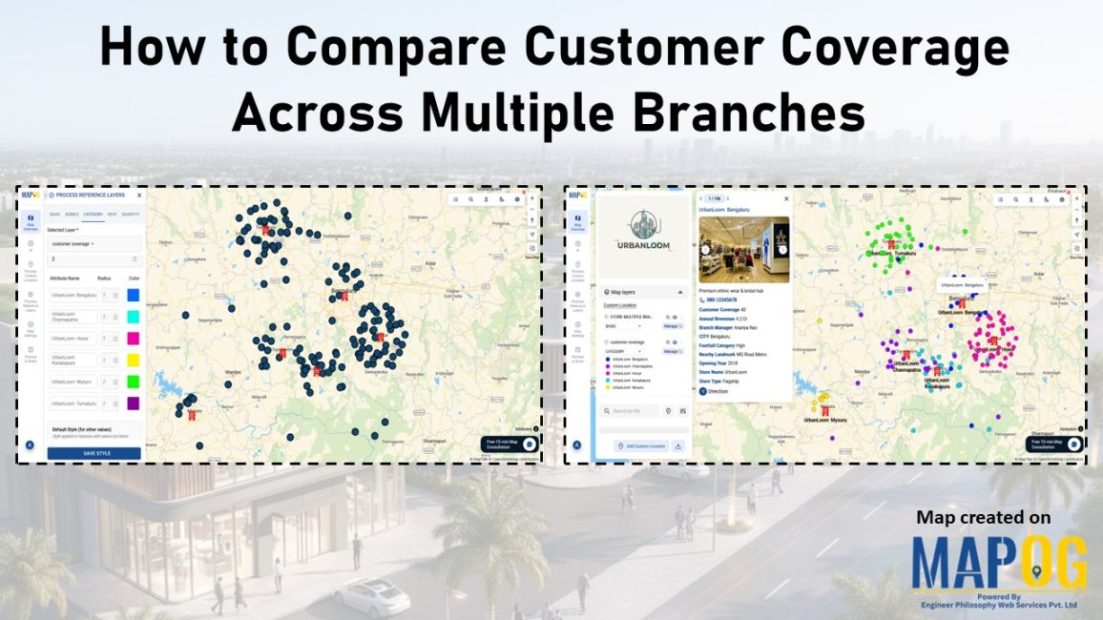
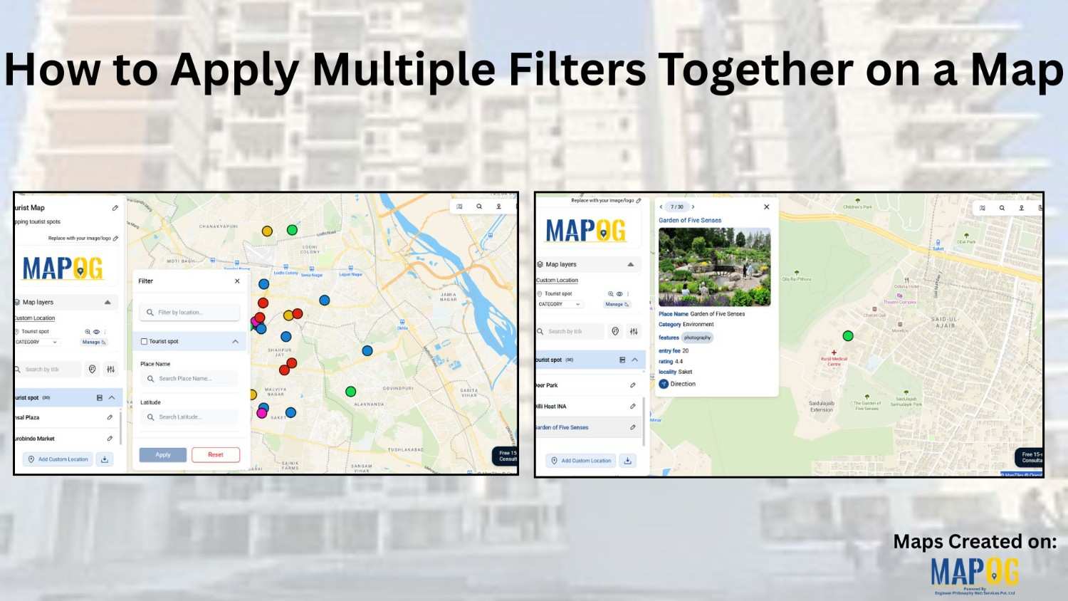
How to Apply Multiple Filters Together on a Map

When you work with location-heavy data, simply placing points on a map is not enough. You need a way to apply multiple filters on map , compare categories, and instantly highlight visuals that matter. That is why applying multiple filters together on a map becomes so powerful. It helps you narrow down results, spot patterns … Read more

Filter Properties for Insights

How Developers Use Filters to Visualize Properties by Price, Type & Status

In today’s real estate tech landscape, clarity and precision in data visualization are essential for smarter property decisions. Simply listing properties isn’t enough-you need a way to slice, sort, and understand them instantly. That’s where Interactive filters come in. By Filter Properties for Insights based on price range, property type, and availability status, maps become … Read more

Track Task Progress

Track Task Progress on a Map Dashboard (Completed vs Pending)

Track Task Progress visually instead of relying on scattered spreadsheets or delayed updates. Today, many infrastructure and field teams prefer map dashboards because teams can see completed vs pending tasks instantly. Moreover, when teams link task data to real locations, planning becomes faster and accountability improves. In this article, you’ll discover how to Track Task … Read more

MAPOG interface showing tools to Filter Your Map Data by attributes for smarter location and site selection.

How to Filter Your Map Data by Any Attribute or Field

Modern planning teams operate in environments where speed, accuracy, and clarity directly influence outcomes. Consequently, the ability to filter your map data by any attribute becomes a core strategic skill. In high-growth sectors like EV infrastructure, teams often evaluate hundreds of potential locations before selecting only a few high-impact sites. While this process traditionally demands … Read more

Reuse

Reuse Map Points Across Multiple Maps Without Re-entering Data

Building maps repeatedly with the same locations can quickly feel slow and unnecessary. Moreover, whether you’re creating story map  visuals for planning, reporting, or even fieldwork, entering the same points again and again eventually wastes a huge amount of time. Therefore, a smarter and far more efficient approach is to reuse saved map points instead … Read more

sales area

How to Spot High and Low Sales Areas Using Interactive Maps

When businesses work with sales data spread across multiple locations, spreadsheets alone often fail to reveal meaningful insights. Simply listing numbers does not clearly show where performance is strong or weak. That is why MAPOG  plays a crucial role in sales  visuals . By visualizing sales data geographically, you can instantly high and low sales … Read more

Filter Map Points

Filter Map Points by Attribute Values (From Excel/CSV)

When working with large datasets on a map, it can be difficult to focus on only the information you need. By filtering map points using attribute values stored in an Excel or CSV file, you can quickly highlight specific categories, ranges, or conditions—such as cities above a certain population, demographics, or locations with active status. … Read more

tracking customer

How to track customer visits without calling the team again and again

Many organizations struggle to keep track of customer visits without calling in real time zones  , which often leads to repeated phone calls, confused updates, and inefficient coordination. As a result, teams end up relying on scattered verbal reports, causing delays, and inconsistent follow-ups. Consequently, managers find it difficult to monitor field activity, assign tasks, … Read more

cover image

Color-Code Your Customers by Purchase Behavior on a Map

In today’s data-driven retail world, every customer leaves behind a digital footprint — where they live, how often they buy, and how much they spend. Yet, even with this information it can be difficult to decipher the bigger picture or understand where your most valuable customers actually come from. That’s why visualizing customer data matters. … Read more

Image showing customer coverage map across multiple branches using colored pins and branch-level data.

How to Compare Customer Coverage Across Multiple Branches

When managing multiple branches, one persistent challenge is the lack of clarity around how customer coverage compares from one location to another. As a result, teams often struggle to make informed decisions. Without a structured way to compare customer coverage across multiple branches, they may rely on assumptions rather than spatial evidence. MAPOG helps solve … Read more