Dashboards summarize numbers, but visual maps reveal where and why things happen. Business Needs a Visual Map for example, a coffee chain can use MAPOG to see café locations, spot top performers, and analyze competitor proximity in one interactive platform. Moreover, visual maps also help real estate, logistics, healthcare, and many other industries turn complex data into clear, actionable insights. By adding spatial context, businesses can therefore make smarter decisions, improve efficiency, and ultimately uncover opportunities.
Key Concept: Why Your Business Needs a Visual Map
In addition, a visual map transforms business intelligence from static data into actionable strategic insight. By mapping your locations, or suppliers, you can:
- Spot Patterns Quickly: First, identify which areas have high-performing outlets and, at the same time, which zones require marketing attention.
- Compare Regions Effectively: Next, analyze how store performance correlates with foot traffic, demographics, or nearby competitors to gain deeper insights.
- Plan Smart Expansion: Then, determine which neighborhoods have untapped potential or where clusters may be too dense.
- Enhance Collaboration: Finally, share insights across teams so marketing, operations, and logistics can all work from a unified visual perspective.
Step-by-Step: Creating Your Business Intelligence Map
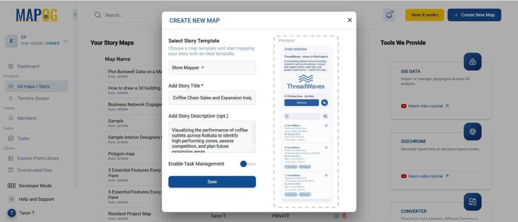
1. Start Your Map
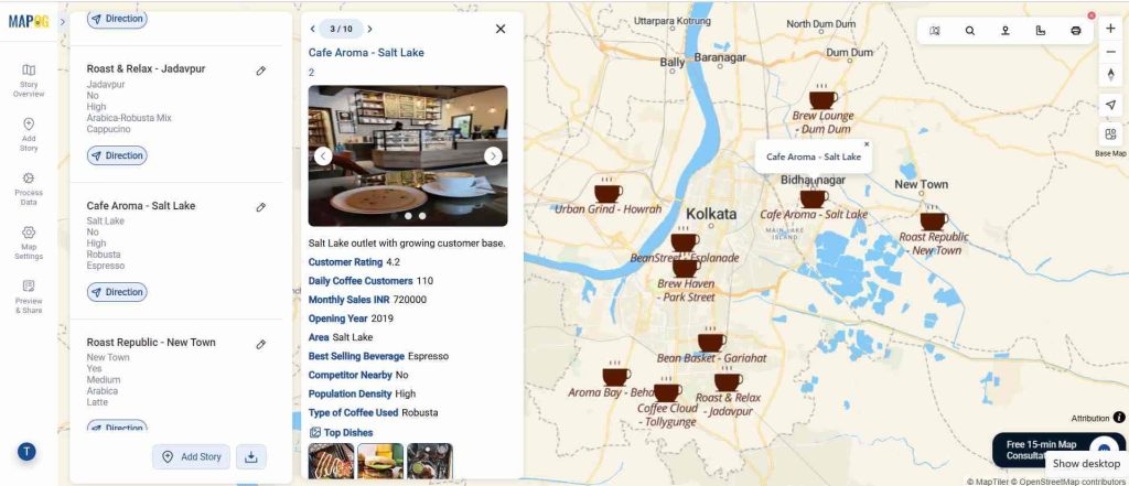
Open MAPOG and create a new map. Choose “Store Mapper” as the story template. Give it a title like “Coffee Chain Map” and add a short description such as: “An interactive business map to visualize café performance, competition, and ideal expansion zones.”
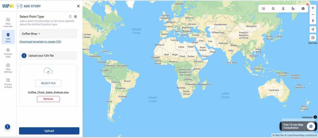
2. Add Story Points
Go to Add Story → Add by Uploading CSV and upload your café data file containing locations, sales figures, and performance ratings. Each point should include details like outlet name, sales score, and nearby competitors.
For example:
- Café A – High performance, near university zone
- Café B – Low performance, competitor within 300m
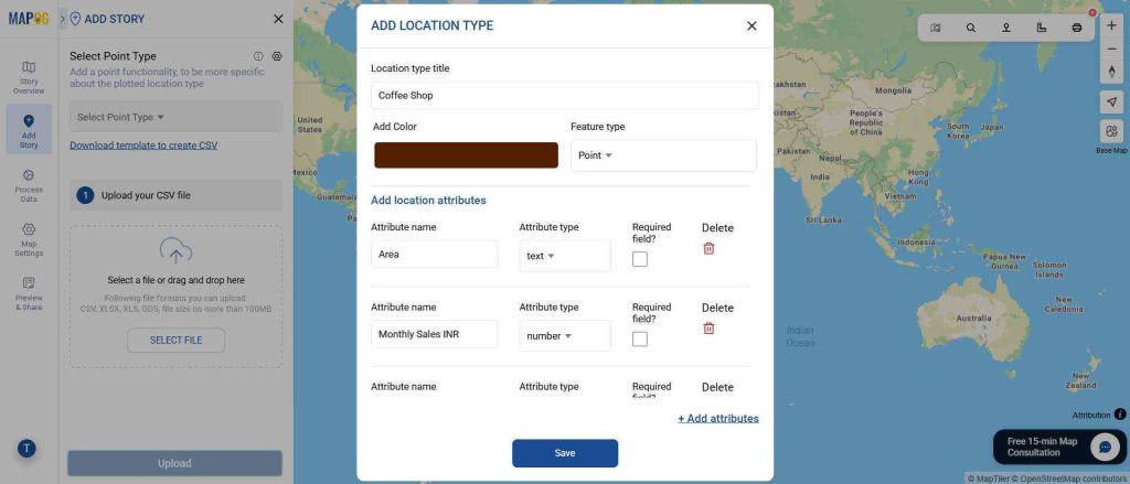
3. Define and Enhance Attributes
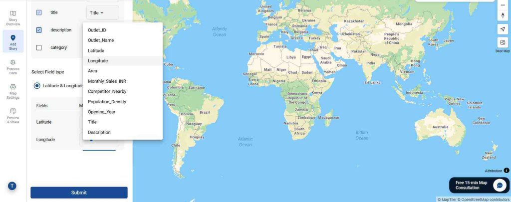
To assign attributes, click “Select Point Type” and add a new location type (e.g., Flagship, Regular, Kiosk). Choose the point type, assign a color, and add attributes like Outlet Type, Performance Level, and Competitor Distance, defining each as text, number, or list. This makes each location clearly categorized, visually distinct, and interactive for easy filtering and analysis.
This makes your map far more insightful than a plain table. After uploading your data, make sure to match all the Excel columns—such as ID, title, description, latitude, and longitude—to the corresponding fields in the mapping tool. Once everything is matched correctly, click on submit to populate your interactive map with all the location details, making it ready for analysis and visualization.
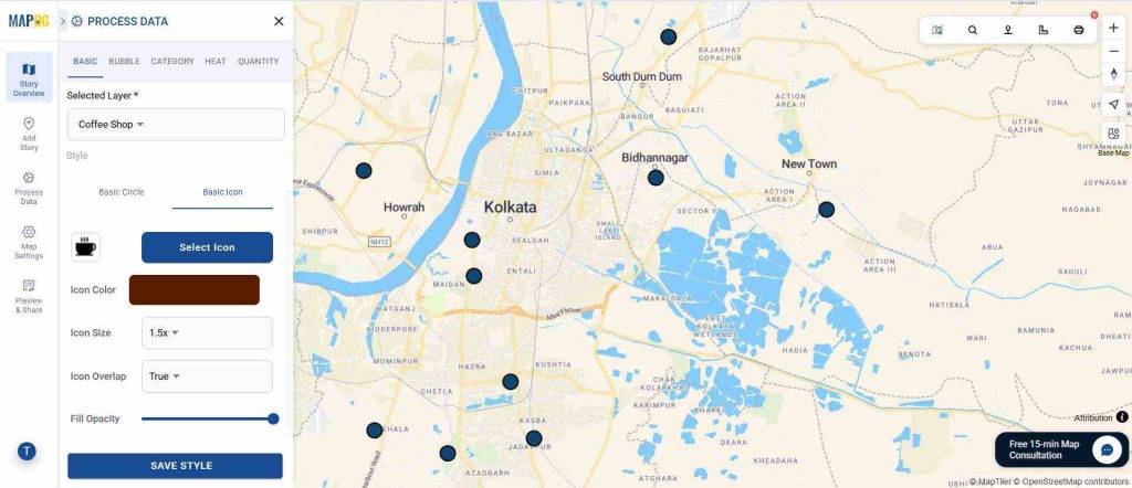
4. Visualize Chains and Performance
To show patterns, go to Add Style Layer → Basic and customize point colors and icons, then add labels and make the map visually appealing and easy to understand.
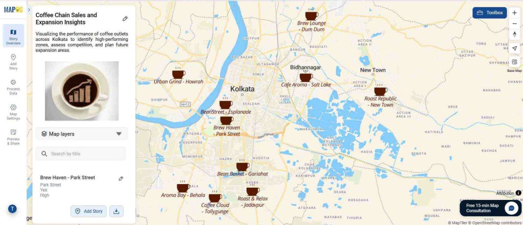
5. Analyze and Interpret Insights : Business Needs a Visual Map
Once your data is visualized, analyze patterns like top-performing cafés near business districts, low-performing ones near competitors, or underserved zones. Go to Style Layer > Style Customization to choose visualization types (bubbles, heat maps, etc.) and adjust intensity if needed. Click save, then add labels via Style Layer > Add Label to display key information for easier interpretation.
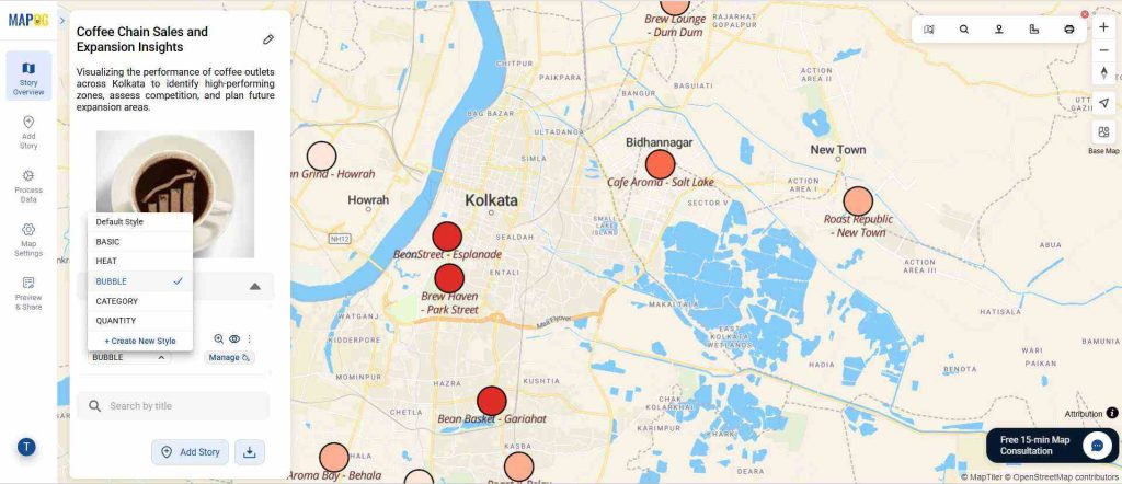
This turns the map into a true decision-making tool rather than a passive report.
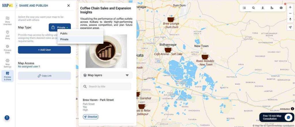
6. Preview and Share
Click Preview & share to review your story. Then, share it publicly or privately with your management team. You can even embed it on your company dashboard or internal portal for team-wide visibility.
Broader Benefits for Businesses
- Data-Driven Decisions: Combine sales and location data for actionable insights.
- Operational Efficiency: Streamline expansion planning and logistics.
- Better Communication: Present results visually to investors and stakeholders.
- Competitive Edge: Identify high-value zones before your competitors do.
Conclusion: Business Needs a Visual Map
A visual map goes beyond dashboards — it’s where strategy meets geography. For the coffee chain, mapping café performance and competition reveals why numbers differ and where to grow next. Whether you manage retail outlets, supply chains, or service networks, an interactive map built with MAPOG transforms data into direction.