Noise pollution is an increasingly critical yet often overlooked environmental challenge. In urban areas, it stems primarily from traffic, construction, railways, and industrial activities. Fortunately, with the rise of Geographic Information Systems (GIS) especially tools like heat maps and buffer zones for Mapping Noise Pollution Levels. We can now visualize these invisible pollutants. As a result, this project becomes highly suitable for students, educators, city planners, and researchers alike. By integrating data and spatial analysis, GIS enables users to identify noise hotspots and assess their impact on public health. This empowers decision-makers to implement targeted mitigation strategies and promote more livable urban environments.
Key Concept: Why Mapping Noise Pollution Levels Matters
To begin with, understanding how noise pollution spreads across a city is essential. Not only does it allow us to assess its health implications such as stress, hearing issues, and sleep disruption but it also helps shape smarter urban development. Furthermore, GIS makes it possible to overlay noise data with population or infrastructure, revealing where interventions are most needed. With this layered insight, urban planners can prioritize noise reduction in sensitive areas like schools and hospitals. Ultimately, this fosters healthier, more resilient communities through data-driven environmental management.
Educational Importance and Uses of Mapping Noise Pollution Levels
Mapping urban noise pollution supports a variety of learning goals. Specifically:
- Environmental Awareness: Firstly, it helps students recognize sound as a pollutant.
- Spatial Reasoning: Secondly, it cultivates an understanding of how geography and infrastructure influence sound.
- Real-World Analysis: Thirdly, it links environmental data with real-life decision-making.
- Technical Skill Development: Moreover, learners gain hands-on experience with GIS platforms.
- Policy Insight: Lastly, the tool can support advocacy and community engagement.
Methodology: Creating a Noise Pollution Levels Map Using MAPOG
This step-by-step guide walks you through the creation of compiling the Mapping Noise Pollution Levels using heat maps and buffer tools in MAPOG. Accordingly, you will learn how to interpret, visualize, and share noise data effectively.
1. Data Collection
- First and foremost, collect or simulate noise data using reliable sources such as environmental agencies, mobile decibel apps, or open-access datasets.
- In addition, ensure your dataset contains essential attributes including location name, latitude and longitude, decibel level, type of noise, and, if possible, the time and date of recording.
- Ultimately, having well-structured and comprehensive data is vital, as it forms the backbone for generating accurate and actionable GIS visualizations.
2. Preparing Data for MAPOG
- Once your data has been collected, the next step is to organize it into a well-structured spreadsheet. Specifically, ensure that it includes clearly labeled columns for location name, latitude, longitude, noise level (dB), and source type.
- After organizing your data, it is important to save the file in CSV format, as this ensures compatibility with MAPOG’s import functionality.
- Ultimately, maintaining a clean and properly formatted CSV file is crucial, as it lays the foundation for accurate visualization, effective spatial analysis, and meaningful insights.
3. Adding Points and Attributes in MAPOG
- To begin with, log into your MAPOG account and click on “Create New Map.
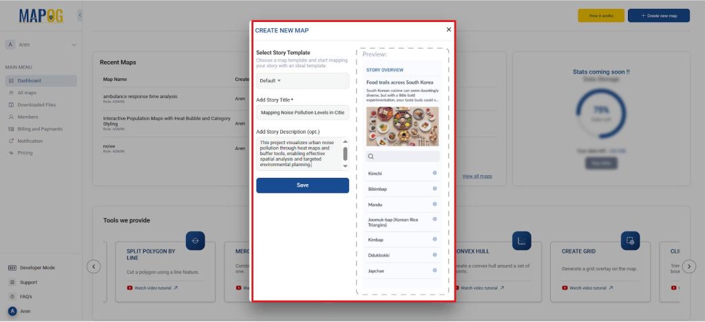
- Next, provide a meaningful name and description for your map so others can easily understand its purpose. After that, select the “Default” map template to proceed.
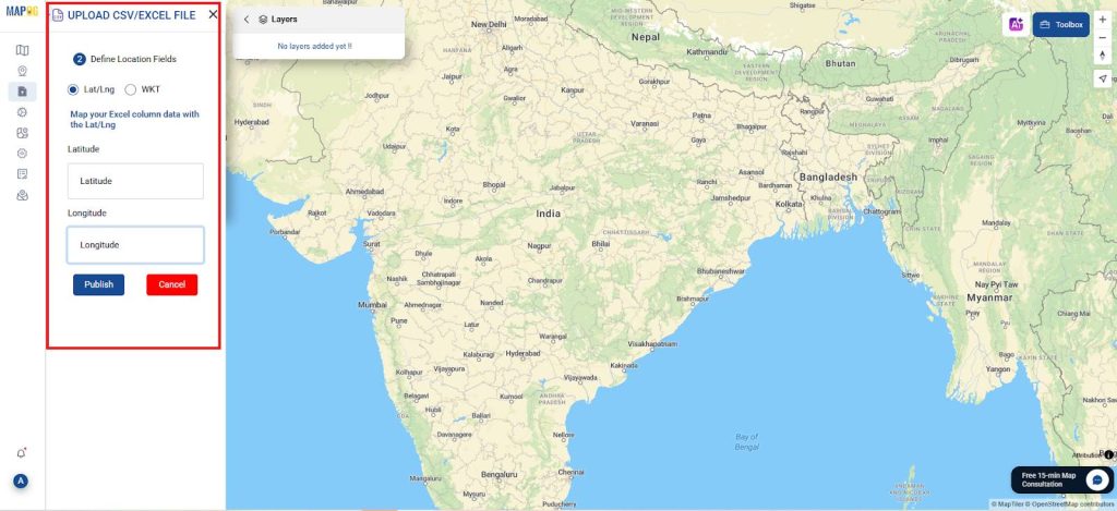
- Then, click on “Upload CSV/Excel” and add upload data and ensure you correctly assign the latitude and longitude columns to match your data. Once done, upload your spreadsheet file—this step integrates your noise data into the mapping platform.
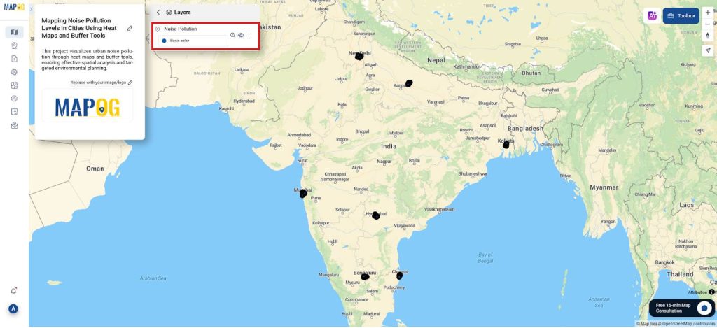
- Following the upload, navigate to “Show Data Table,” which displays the imported information. From there, select “Edit Attribute Table” to begin customizing your dataset.
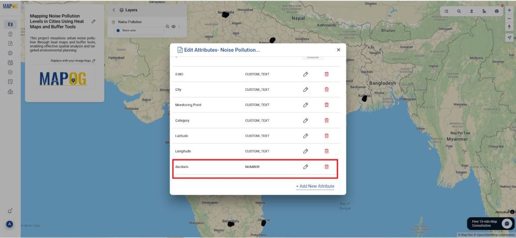
- At this stage, create a new column titled “Values in dB” within the attribute table. Afterward, manually input the decibel values (noise levels) for each location listed in your dataset.
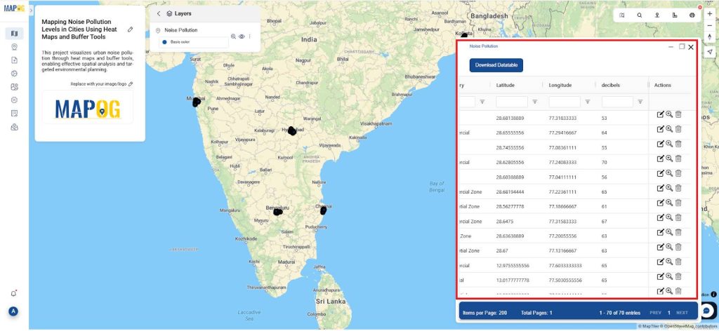
- Finally, review the attribute table thoroughly to ensure all entries are accurate and complete. This verification step is crucial before moving on to visualization or analysis.
What is a Buffer Tool?
A buffer tool in GIS creates zones around a specific point, line, or area at a defined distance (e.g., 250m, 500m, 1km). These zones help analyze the spatial impact or influence of a feature, such as how far noise pollution spreads from a highway. It’s commonly used for proximity analysis in urban planning and environmental studies.
4. Applying Buffer Tools for Impact Zones
- In addition to using heat maps, you can further enhance your analysis by utilizing Buffer Tools to assess the spread of noise pollution at varying distances, specifically 250m, 500m, and 1km around high-noise locations.
- To do this, begin by selecting “Process Data,” then choose the Buffer Tool. Next, provide your Excel sheet as the input file and define the buffer ranges as mentioned above.
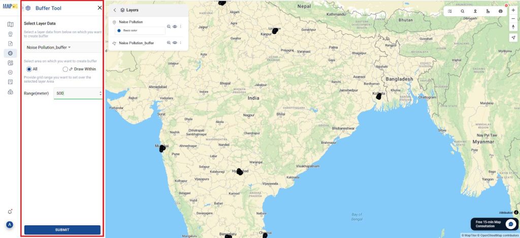
- After setting up the buffers, label them accordingly: “High Impact” for 250m, “Moderate Impact” for 500m, and “Low Impact” for 1km zones.
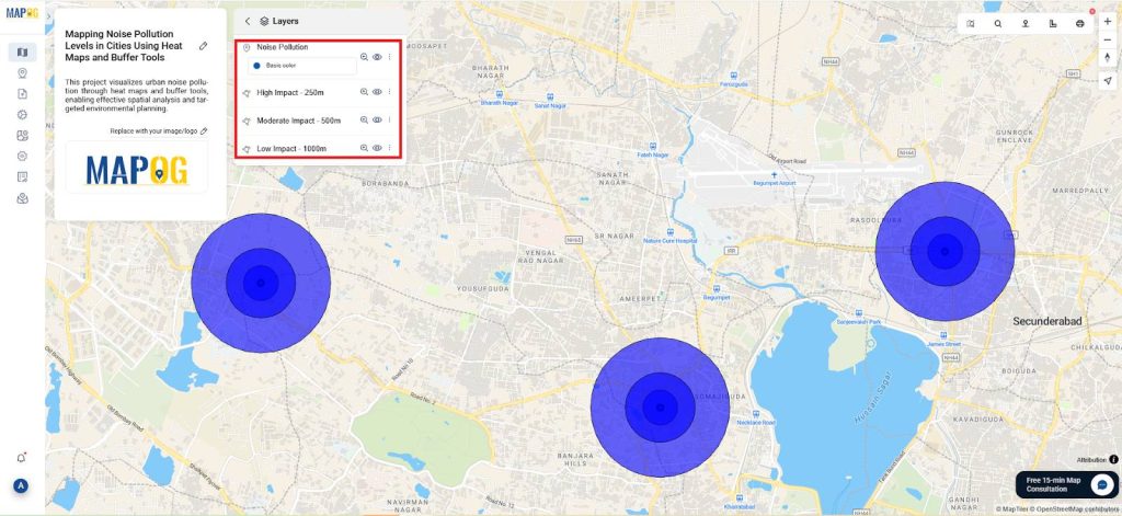
- As a result, this layered analysis allows urban planners to clearly visualize how noise pollution extends into surrounding areas, particularly in sensitive zones such as residential neighborhoods and schools.
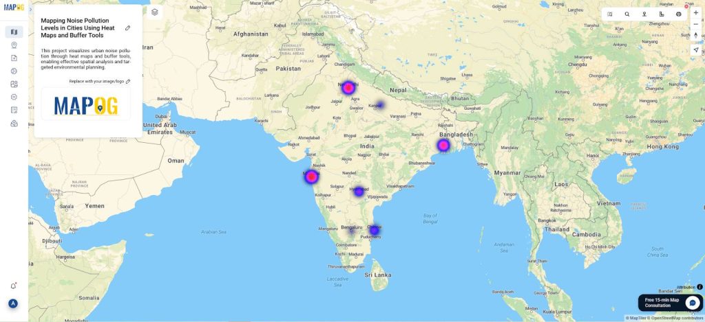
What is a heat map?
A heat map is a data visualization tool that uses color gradients to represent the intensity or concentration of values across a geographic area. In GIS, it highlights hotspots where specific phenomena like noise, crime, or pollution are more prevalent. This makes it easy to identify patterns and areas needing attention.
5. Using Heat Maps for Visualization
- First, activate the Heat Map layer and navigate to the Style Layer settings to select the heat map option. Then, set the “Values in dB” field as the intensity input to visualize noise levels.
- Next, adjust the radius and gradient to accurately represent noise severity using the color scale: Blue (≤50 dB) for low, Pink (51–70 dB) for moderate, and Red (>70 dB) for high intensity.
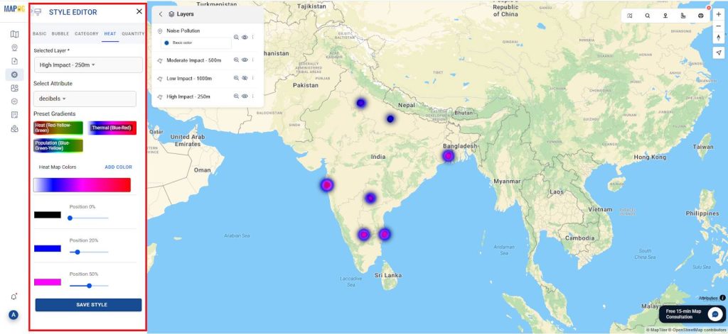
- Consequently, this setup allows users to easily identify noise hot spots and quieter areas within the city.
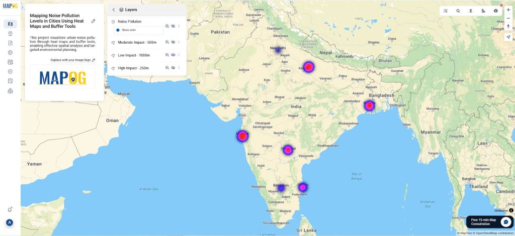
- Finally, replicate this configuration for all three buffer zones—250m, 500m, and 1km—so each impact area is clearly mapped and analyzed for effective planning.
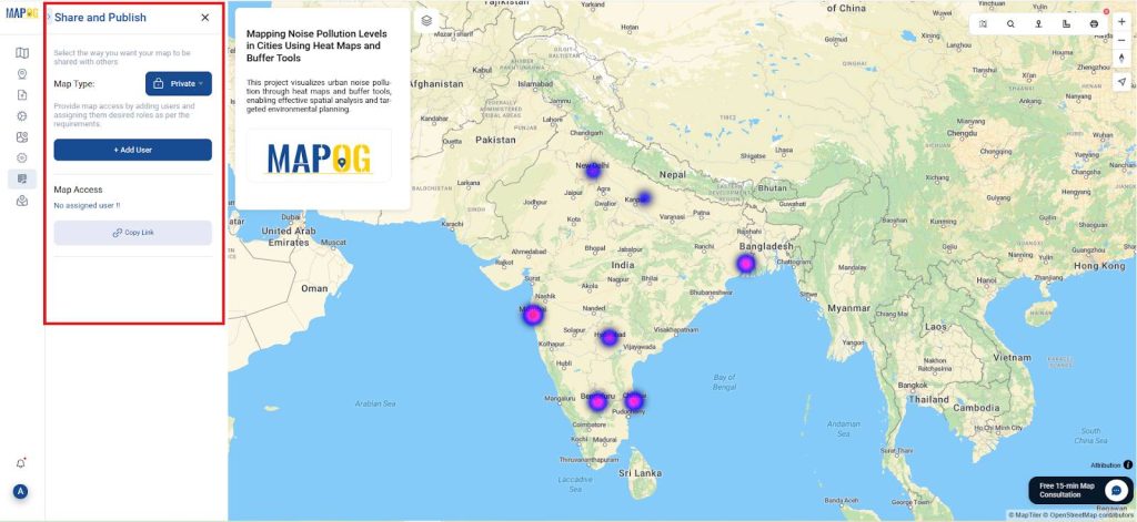
6. Sharing and Educational Use
- Once your map is finalized, navigate to “Publish & Share” to begin the sharing process.
- From there, you can generate a public URL or choose to embed the map into educational lessons, blogs, or urban planning dashboards.
- As a result, this accessibility enables educators, planners, and environmental advocates to effectively raise awareness and promote informed, data-driven decision-making.
Principal Results and Insights
This project results in an interactive noise pollution map that clearly visualizes sound intensity across urban areas. Using heat maps and buffer tools, it helps users identify noise hotspots and assess their spread. The map supports data-driven urban planning, encourages public awareness, and informs noise mitigation efforts. It also builds spatial thinking and GIS skills, promoting environmental responsibility and informed decision-making in both educational and civic contexts.
Industry and Domain
Industry: This project bridges key sectors including Environmental Monitoring, Urban Planning, Smart Cities, and EdTech. It offers practical tools for policy-makers, planners, and educators to assess and manage urban noise using GIS. In classrooms, it supports STEM education through hands-on mapping and data analysis.
Domain: Academically, it spans Environmental Geography, Public Health, and Geospatial Sciences, enabling studies on noise exposure, urban stressors, and spatial patterns. It also contributes to Digital Humanities by visualizing human-environment interaction. The project supports interdisciplinary collaboration and real-world learning, with broad applications from education to urban sustainability.
Conclusion
To sum up, mapping noise pollution using MAPOG turns environmental data into an educational experience. Not only does it raise awareness, but it also teaches practical GIS skills and promotes smart urban design. In doing so, it empowers users to connect science with everyday life. As technology continues to shape education and urban management, projects like this empower learners and communities alike. It opens doors for future innovation in smart city planning and environmental justice.
MAPOG was employed in several studies cited within this context.
- Role of GIS In Irrigation Planning and Water Resource Management
- How GIS and Smart Mapping Reduce Urban Heat Islands
- GIS in Infrastructure Development and Road Network Analysis
- Flood Risk Mapping with Interactive Web Maps: SaaS Approach
- Optimizing Warehouse Location Selection with GIS for Supply Chain Efficiency
So, are you ready to map your city’s soundscape? Start today with MAPOG and become an advocate for quieter, healthier urban environments!