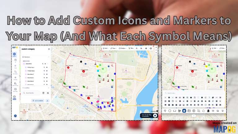
Ever tried navigating a map where every single landmark looks like an identical red pin?
When a high-security police station, a busy hospital, and a local museum all share the exact same marker, your map loses its utility. Forcing users to click every single pinpoint just to find basic context is a massive spatial user-experience failure.
MAPOG completely eliminates this guesswork. It is a powerful, no-code GIS platform that brings visual sub-typing to your maps. Instead of generic pins, it lets you drop custom icons, color-code facilities by function, and sketch boundaries in real time.
Key Concept of Adding Custom Icons and Markers
Traditional web mapping tools lack intuitive visual sub-typing. Visual Sub-Typing is the practice of categorizing map features using unique icons and distinct colors rather than uniform pins. It completely replaces cluttered text labels and complex legends, giving your viewers instant, at-a-glance clarity.
MAPOG provides a robust, no-code environment designed to solve this exact issue.
Step-by-Step Workflow of Adding Custom Icons and Markers
Step 1: Initiating your map canvas
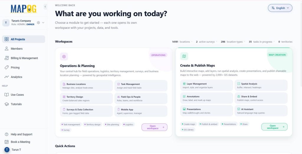
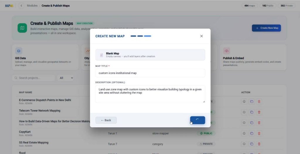
To kick off your project, navigate to the MAPOG dashboard and click on the Create & Publish Maps option,
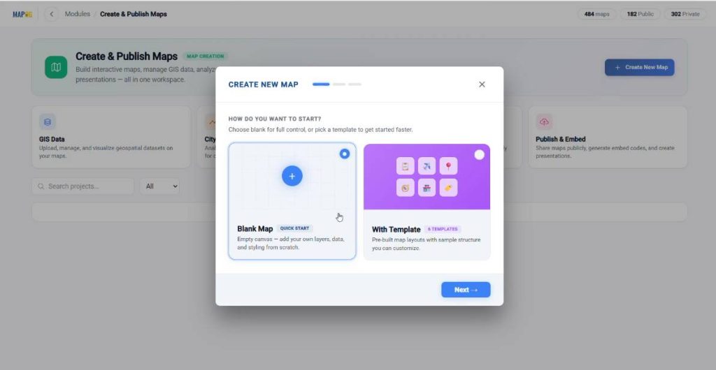
then select the Blank Map template to open a fresh canvas.
Give your project a title and a brief description.
Before adding data, click on the map settings panel on the left side of the screen. Here, you can upload your organization’s official logo to ensure the final output is properly branded.
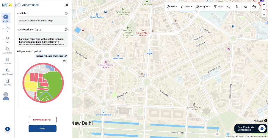
Once saved, use the search bar located at the top of the interface to type in your target region, which will instantly center and zoom your viewport directly over your designated institutional zone.

Step 2: Implementing Visual Sub-typing with Custom Icons
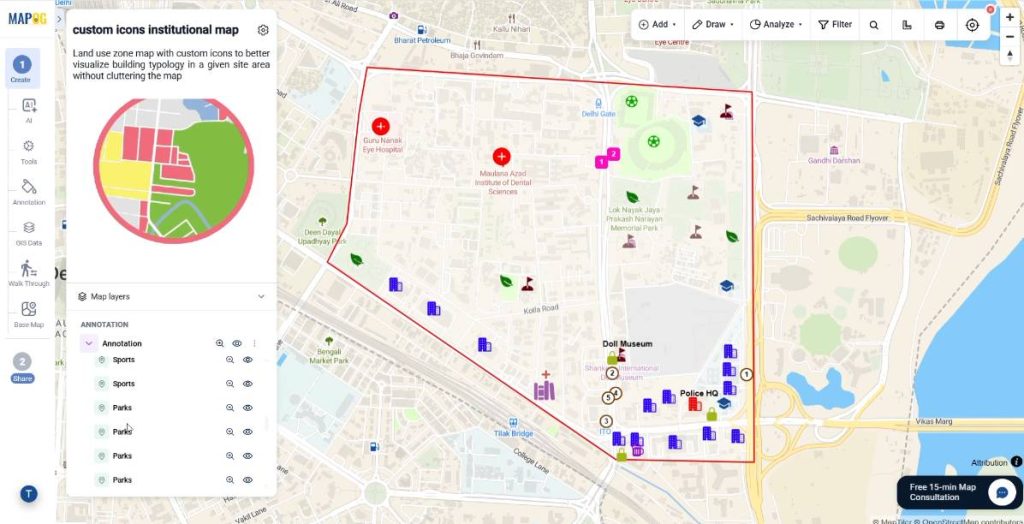
With your map centered, you can begin replacing generic markers with highly specific iconography. Open the Annotation section from the left-hand sidebar.
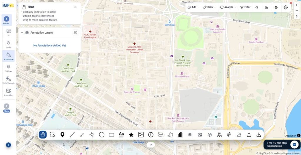
and, click on the Icons tool to launch MAPOG’s built-in symbol library. Scroll through the categorized industries or search for specific symbols,
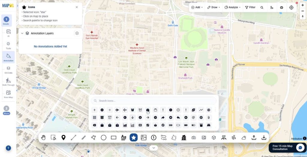
then click directly onto the map canvas to place your marker precisely where the facility exists.
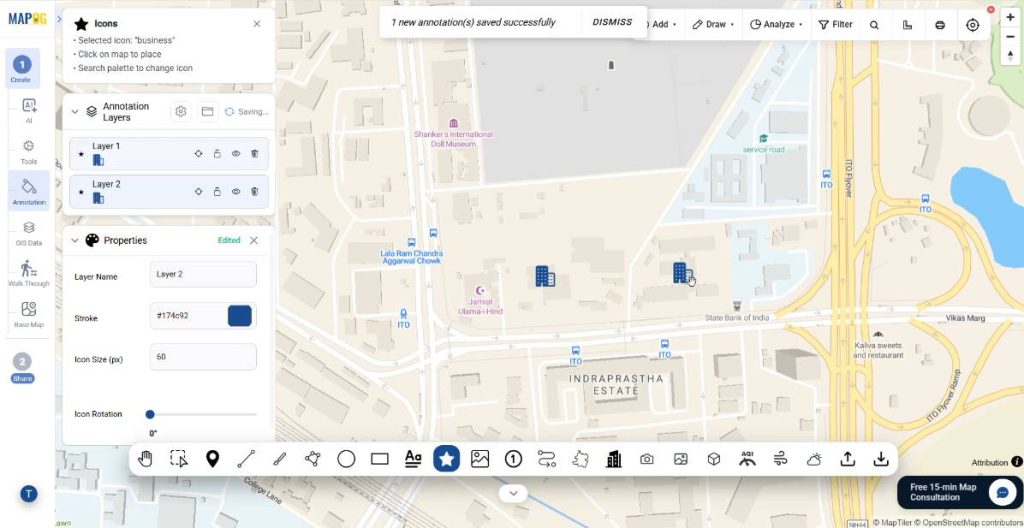
To differentiate these locations further, click on any placed icon to open its Properties panel. Within this menu, you can adjust the icon’s size in pixels, change its rotation, and apply distinct color fills.
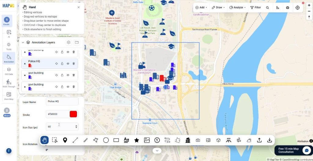
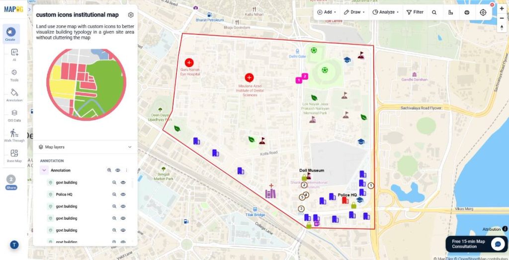
For instance, you can apply a vibrant red fill to emergency infrastructure like police stations, while assigning a clean blue fill to standard administrative government offices.
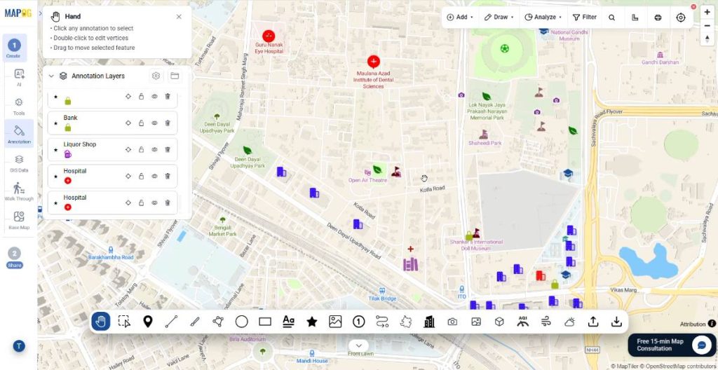
Step 3: Annotating Boundaries and Access Points
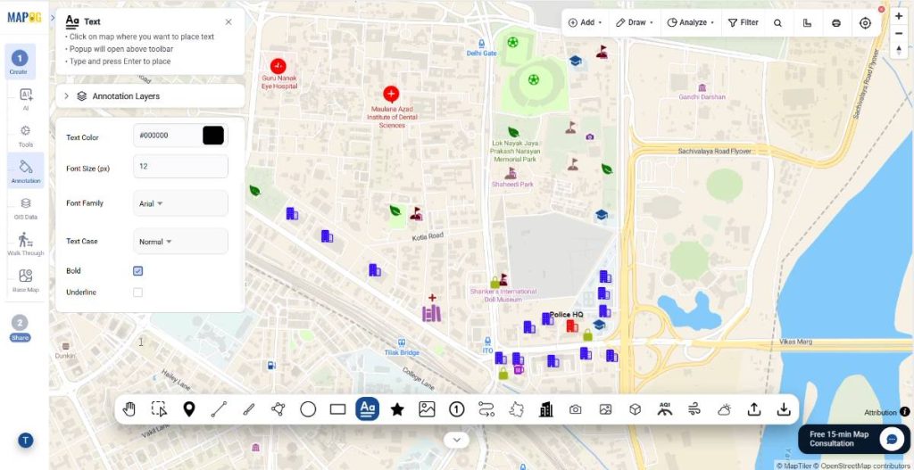
An effective institutional map requires clear textual context and structural boundaries alongside its icons. Select the Text tool from the annotation menu, click near your markers, and type out explicit titles like “Police HQ” or “Doll Museum.”
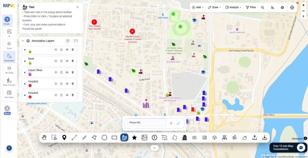
You can easily customize the font size, apply bold styling, and adjust the label offsets so the text sits perfectly aligned next to your icons without overlapping.
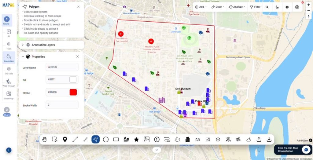
To map physical perimeters, select the Polygon tool to trace boundary limits around specific zones,
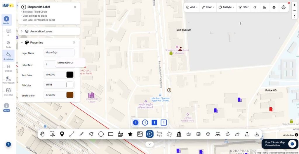
or utilize the Shapes with Label tool to color-code and designate critical checkpoints, such as marking various subway entries as “Metro Gate 1” or “Metro Gate 2.”
Furthermore, always remember to hit the save button within the annotation panel to secure your geometric updates.
Step 4: Publishing and Deploying the Map
Finally, the last stage involves moving your asset from the editing suite to the public domain or your internal team. Click on the Preview & Share option located on the primary sidebar menu.
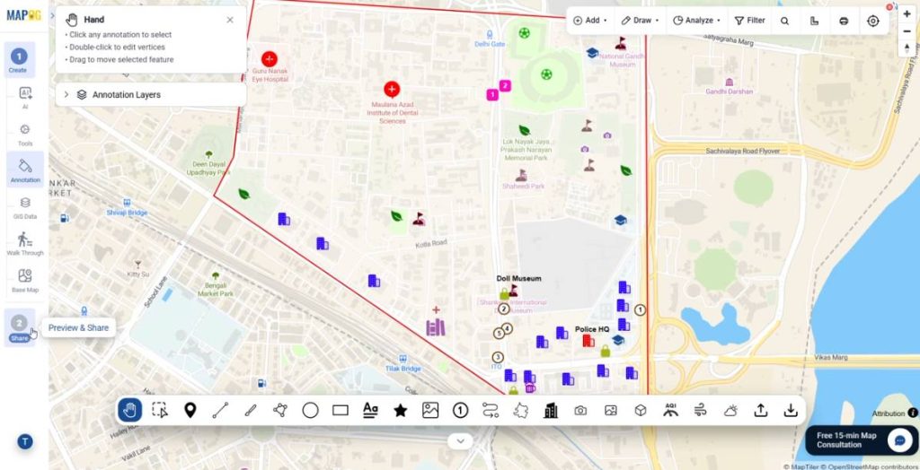
If you are handling sensitive internal infrastructure, keep the map setting Private and invite authorized stakeholders by entering their emails and assigning them specific permissions as either Viewers or Editors.
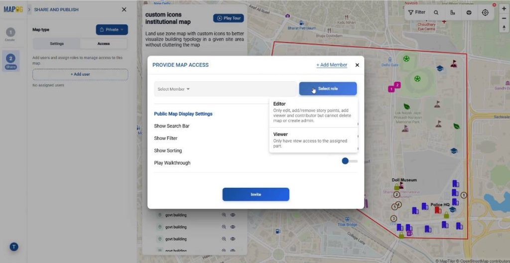
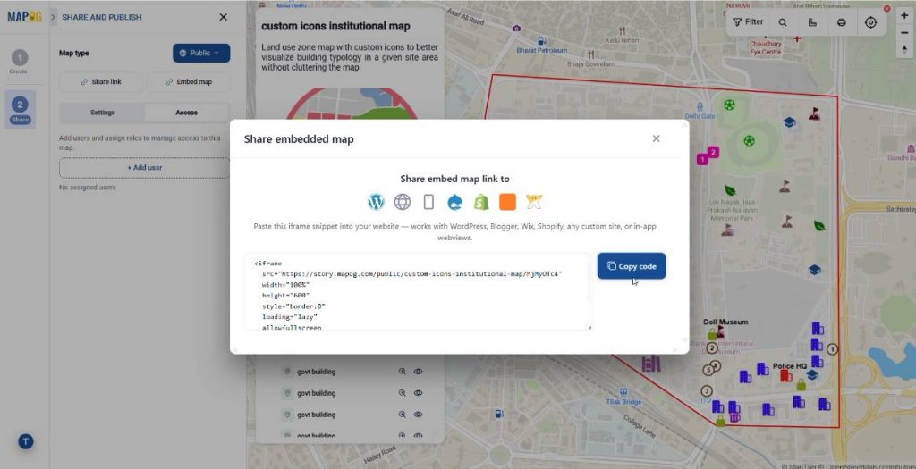
If the map is intended for community use, toggle the privacy status to Public. This action will instantly generate a unique Share Link for distribution, as well as an optimized Embed Map code block that you can copy and paste directly into your organization’s WordPress site or internal portal.
Cross-Sectoral Applications of Adding Custom Icons and Markers
Implementing custom-icon zone maps offers significant advantages across a wide range of industries:
- Urban Planning & Smart Cities: Municipalities can map public utility networks, civic offices, and upcoming zoning developments, allowing citizens to distinguish between construction sites, corporate sectors, and public parks at a glance.
- Campus & Facility Management: Universities, corporate tech parks, and hospital complexes can leverage this workflow to guide students, employees, and visitors to specific halls, parking structures, and emergency exits.
- Emergency Response & Security: Public safety teams can map critical incident zones, routing options, and asset distribution, using color-coded custom icons to denote fire hazards, police outposts, and medical tents during large-scale public events.
Final Thoughts
Static, confusing maps are a relic of the past. By utilizing MAPOG‘s annotation and visual sub-typing tools, you eliminate cognitive overload for your map readers. Transforming an intricate layout of institutional buildings into a clean, color-coded, and interactive digital asset takes only a matter of minutes – no GIS degree required.
Other related articles you might be interested in:
- Adding Points on a Map: Create Your Custom Icons
- Visualize Different Customer Segments in Different Colors on a Map