Interactive maps for tourism planning transforms raw data into dynamic visuals, helping manage tourism efficiently. Additionally, the 5 essential features every interactive map should have are Real-World Updates, Custom Icons & Labels, Heatmaps, Pop-Ups and Collaboration.
Key Concept: interactive maps for tourism planning
Interactive maps highlight attractions, heritage sites, hotels, and amenities while integrating layers like footfall, accessibility, and importance, enabling planners to assess tourism distribution, identify hotspots, and prioritize resource allocation effectively.
What is Interactive Mapping?
Meanwhile, Interactive mapping turns data into dynamic visuals, enabling exploration, smarter planning, and impactful decision-making.
Methodology: interactive maps for tourism planning
Real World Updates:
Dynamic maps use live data from CSV uploads or IoT feeds, ensuring accurate, real-world updates on visitor density on Tourism & Heritage Site Management and preparing interactive maps.
For Example:
- Create a New Map: Open MAPOG and create a map for heritage sites or tourist attractions.
- Add Title and Description: Give your map a meaningful title and short description for easy identification.
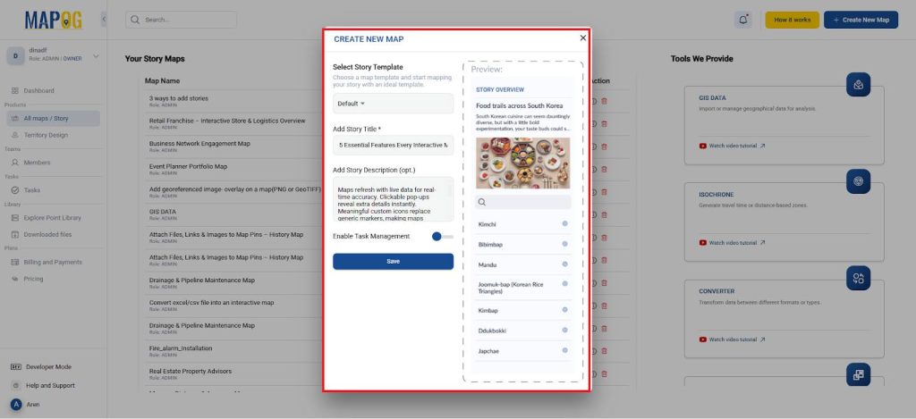
- Visitor Updates: Upload visitor footfall data via Add by uploading Excel/CSV to update the map in the real world as shown below.
- First, create a new Add location type in select point type and give it a title and feature type.
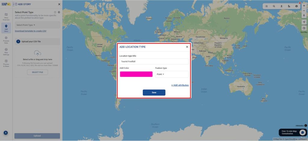
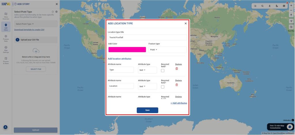
- Using add attributes add all the data as shown and give its type also and save it.
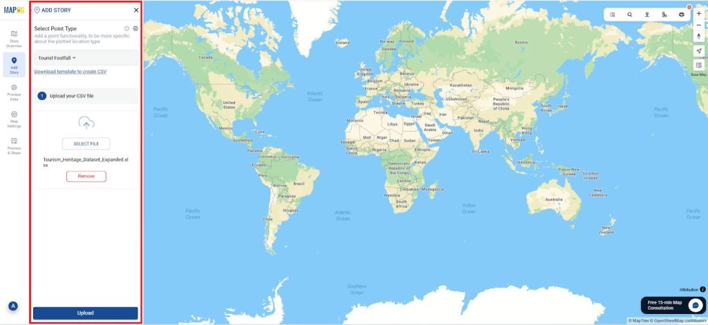
- Now, select the point type you created and upload the CSV file (Footfall data) as shown and select upload.
- Next define location fields and match Attribute Values to Excel Columns and Select Field type as Latitude & Longitude and match with the excel sheet as shown.
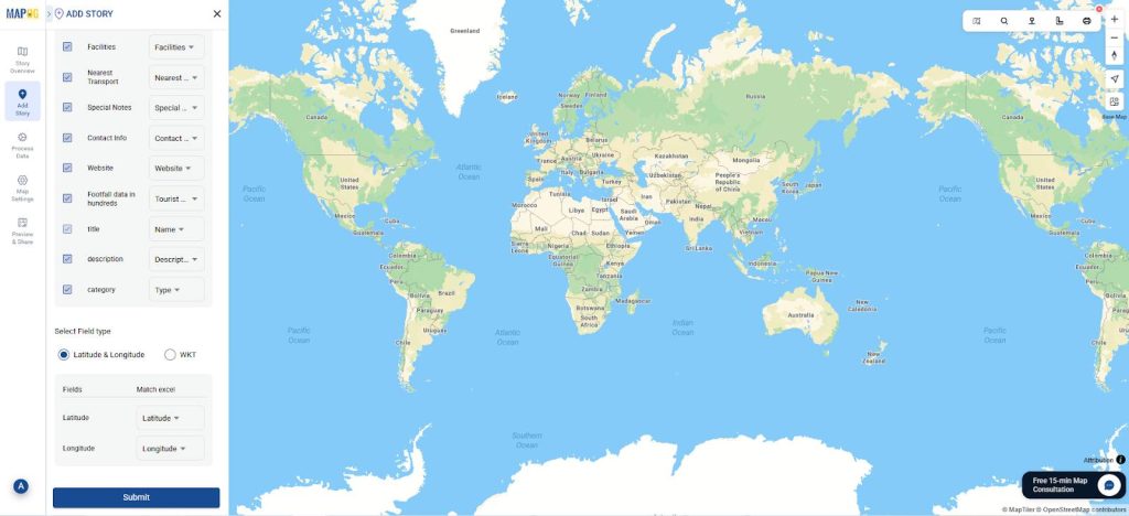
- Finally, submit it and you can view the locations mapped.
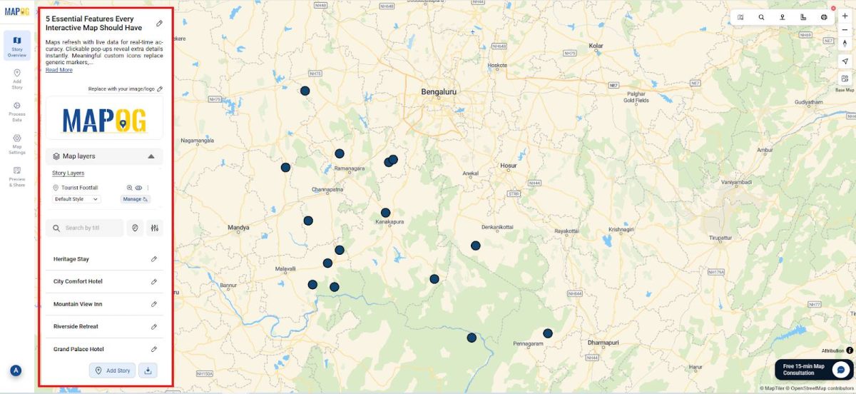
- Helps planners track crowds, organize events, and manage visitor flow efficiently.
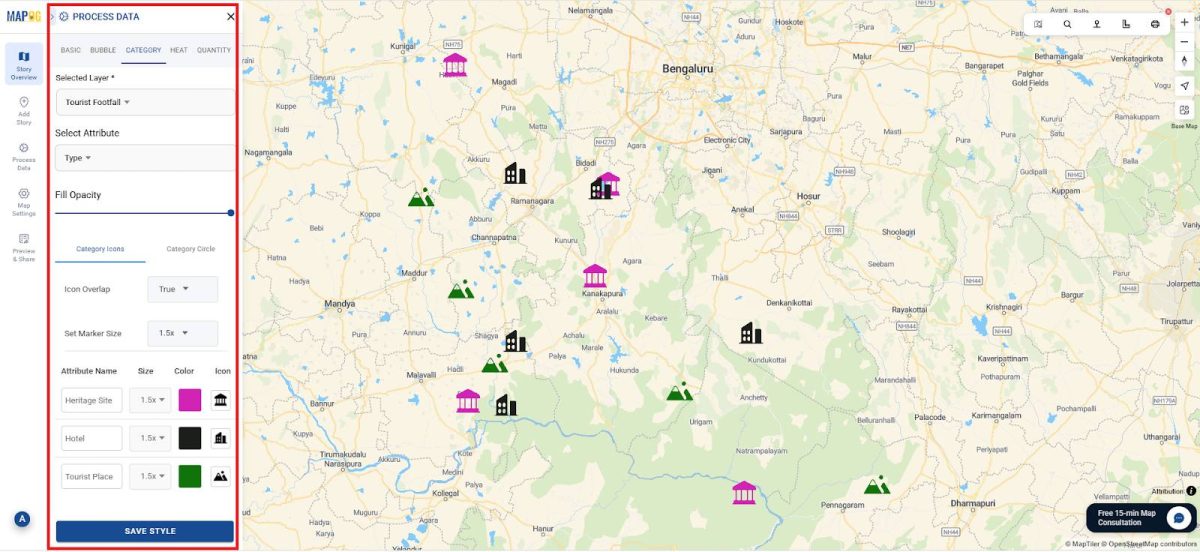
Custom Icons and labels:
Next to replace generic markers with meaningful icons like monuments, hotels, or schools. Custom icons make maps intuitive, visually engaging, and easy to understand at a glance.
For Example:
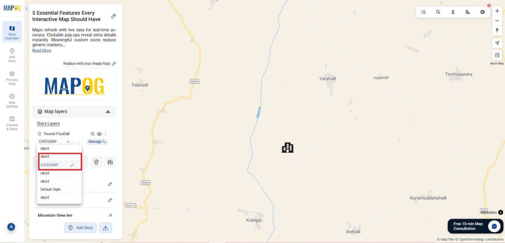
- Style using Category: Go to the Add style layer in Story layers and the attributes as style and then you can customize the icons and color as shown in category icon and save it.
- Use distinct icons: ⛰️ for tourist spots, 🏛️ for heritage sites, 🏠for hotels.
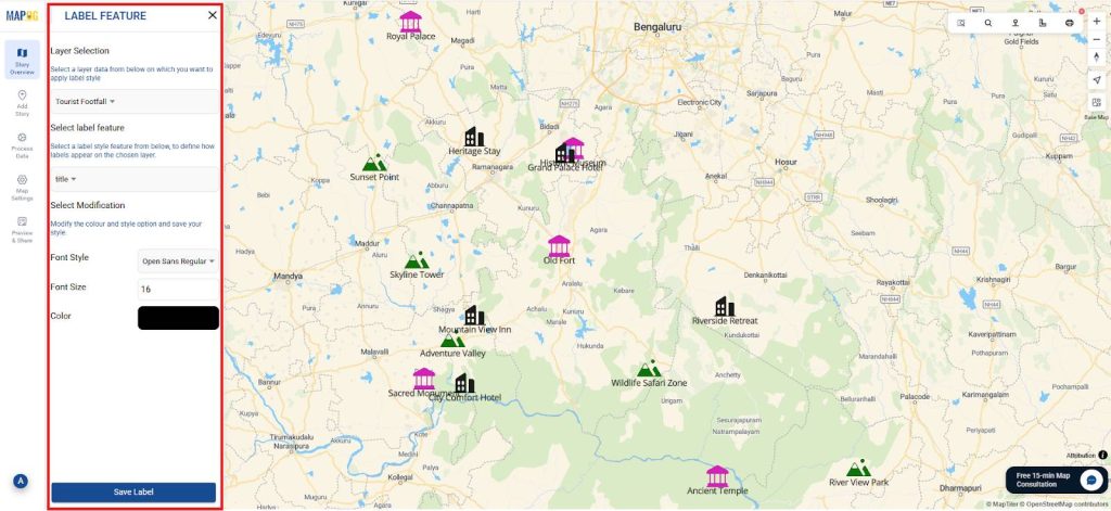
- Label Icons: Using the label feature, you can add the labels and select the feature to be named and customize its size and font also.
Visual distinctions clarify each location’s purpose, making maps intuitive for users.
Heatmaps
Visualize data density through heatmaps, revealing trends like crowded tourist zones, traffic hotspots, or pollution levels. Great for analysis and decision-making.
For Example:
- Heatmaps style highlight crowded attractions, helping planners manage flow and allocate resources.
- In which similarly go to the add style layer and select Heatmap and give the attributes as Footfall data and save it as shown.
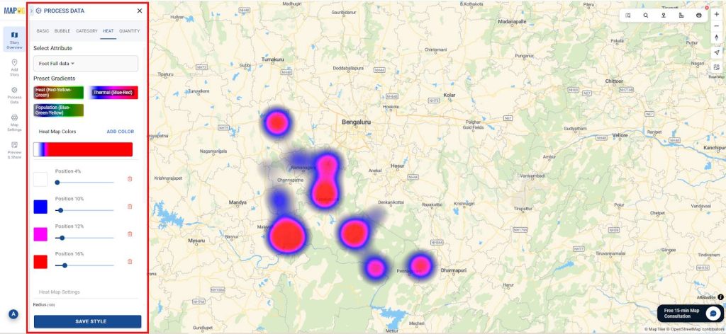
Also, heatmaps show tourist density, aiding planning, congestion control, and resource allocation.
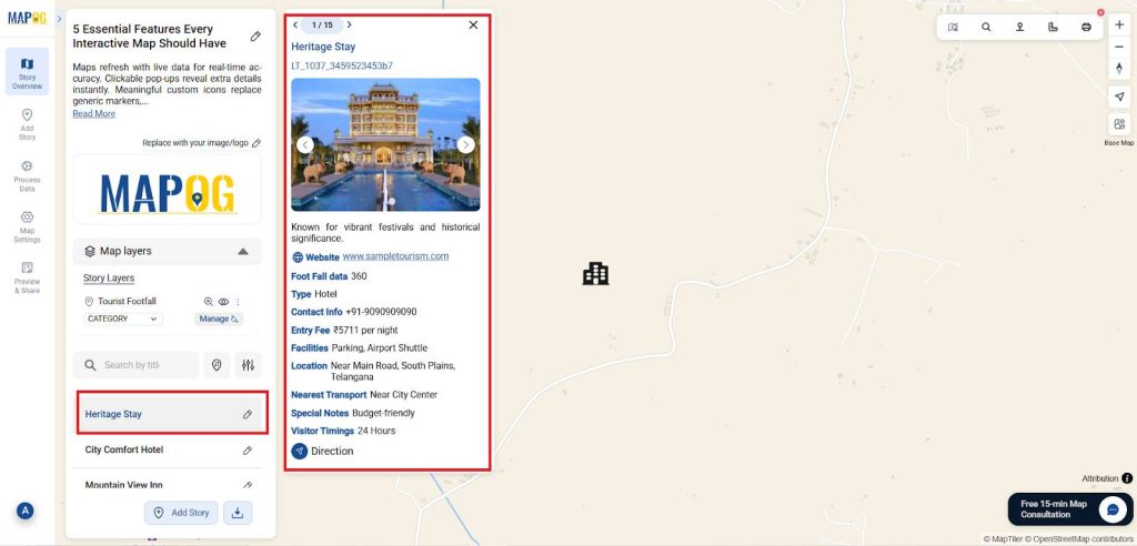
Pop-Ups:
Enable interactive pop-ups to display extra details when clicking a location. This gives users quick insights without cluttering the map.
For Example:
- Pop-ups display visitor timings, ticket prices, and historical notes, showing all details when selected.
- And here you can toggle between the two style layers as shown in the image.
This ensures that users can access all relevant information with a single click.
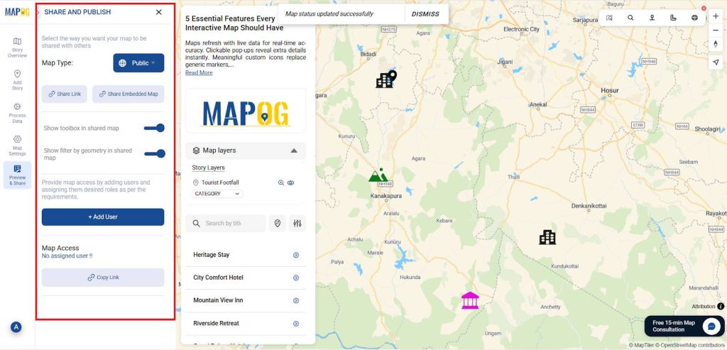
Collaboration:
Allow multiple users to edit and share maps in the real world. Collaboration improves planning, communication, and teamwork across projects, organizations, and communities.
For Example:
- Likewise interactive maps shared with stakeholders promote transparency, ensure consistent data, and encourage community engagement.
- Finally, you can share using the Preview and share option and embedded in links also.
Benefits of interactive maps for tourism planning
- Highlight popular and under-visited sites instantly for better planning.
- Provide real-time data to guide decisions and accountability.
- Engage communities with clear and interactive insights.
Conclusion
Interactive mapping with MAPOG combines icons, pop-ups, updates, heatmaps, and collaboration, enabling planners to monitor sites, enhance visitor experiences, and plan strategically, with applications across tourism, heritage, and other sectors.
Several research works mentioned in this context have utilized MAPOG.