In today’s world, where Interactive maps have become an essential tool for everything from navigation to data analysis, clarity and readability are key. A map becomes effective when it presents its data clearly and meaningfully. One of the most overlooked yet crucial elements of good map design is smart labelling; the art of making map points clear, meaningful, and easy to read.
From Labels to Logic: Why Smart Labelling Matters
Traditional maps often relied on fixed text placement, leading to clutter or overlapping labels when too much information was shown in one area. In contrast, MAPOG uses intelligent labelling techniques to ensure that map points remain readable at any zoom level. Labels automatically adjust, hide, or highlight based on context, helping users focus on what matters most.
How Smart Labelling Works
Smart labelling involves balancing clarity and context. Instead of displaying all labels at once, advanced mapping tools manage visibility dynamically. For example, a city map might only show major landmarks when zoomed out, but display street names and facilities as you zoom in.
On MAPOG, users can fine-tune label visibility by adjusting layer styles, changing font sizes, and controlling when labels appear. You can even group related points under one label to prevent overlapping. This makes your map cleaner, more readable, and visually appealing across devices, like mapping the major refineries in a country. Using labels these features can be represented and described with ease.
Create Clear Labels in MAPOG
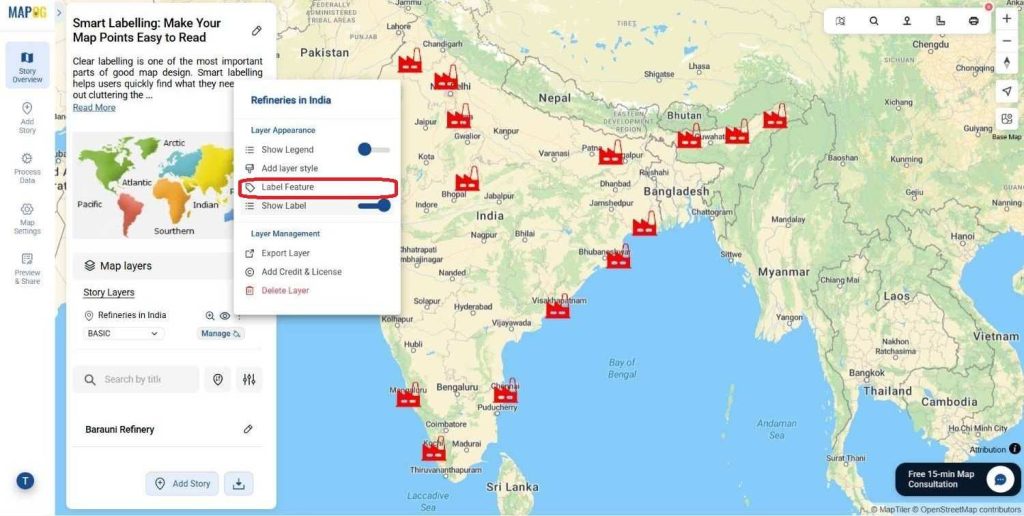
After styling, move on to the Label Feature Tool. Go to the story layer and click on the three dots there, in the layer appearance section you’ll find the “Label Feature” option. This is where smart labelling really comes into play.
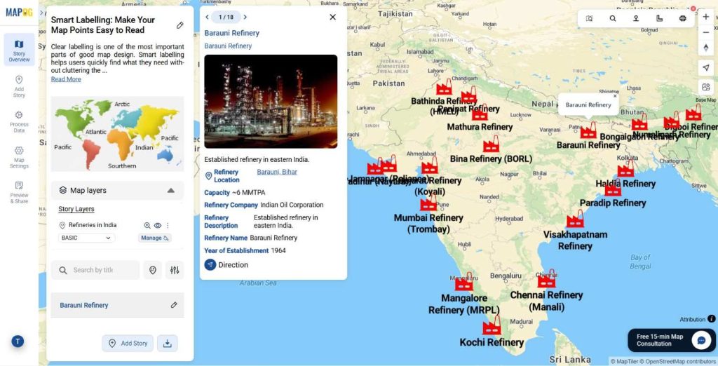
Use this tool to add labels to your points so viewers can quickly identify what each location represents. You can label them by names, production capacity, or any key attribute that matters most to your project.
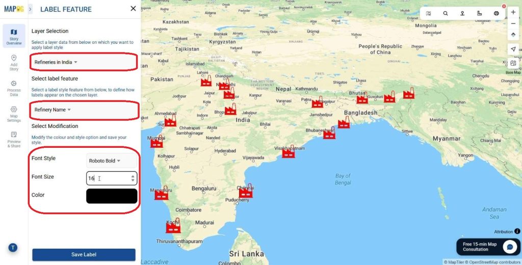
Next, select the Layer to be Labelled from your map’s list of layers, such as Refinery Locations. Then, choose the specific Label Feature you want to display, like Refinery Name .
Now it’s time to style your labels.
Pick font categories, sizes, and colors that keep your map easy to read without overcrowding it. A clear sans-serif font usually works best. Use medium font sizes that stay visible even when zoomed out, and colors that contrast well against your map background.
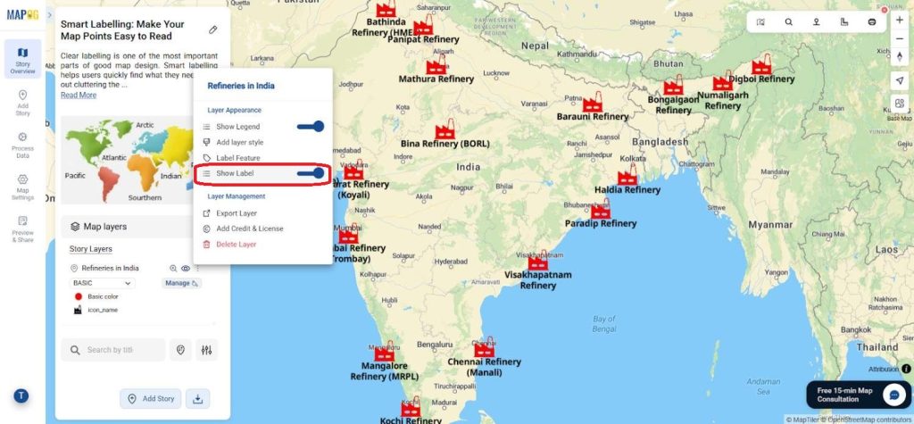
If the map demands the labels can be turned on and off according to the user or mapmaker for adjustment or editing.
Smart Labelling in Action
Good labelling is more than design, it’s data communication. Urban planners use smart labels to highlight zones, developers use them to mark project sites, and tourism boards rely on them to guide visitors to attractions. By improving readability, smart labelling enhances the map’s purpose and usability across industries.
The Future of Smart Mapping
As GIS and AI technologies advance, labelling systems are becoming even more intuitive. Future maps may automatically prioritize labels based on user behavior or environmental conditions, ensuring context-aware visibility in real time. MAPOG is already moving in that direction—helping users create maps that not only look good but also think smart.
Conclusion
Smart labelling turns a good map into a great one. It keeps your visuals clean, your data accessible, and your message clear. Whether you’re building a city plan, visualizing logistics, or mapping events, tools like MAPOG make it simple to label points meaningfully and keep your map easy to read.
Do you want to see the step-by-step process to create such beautiful live interactive property map?
More from MAPOG:
- Protecting Wetlands: Guide to Create GIS Map for Nature
- Fast Emergency Response: Using GIS and Isochrone Maps for 10-Minute Ambulance Arrival
- Make Routes for Military Aerial Planning- Through Bearing angle and Distance calculation – Online Route Compass
- GIS Analysis in Urban Planning: Reshaping Transportation Future Insights of state/city