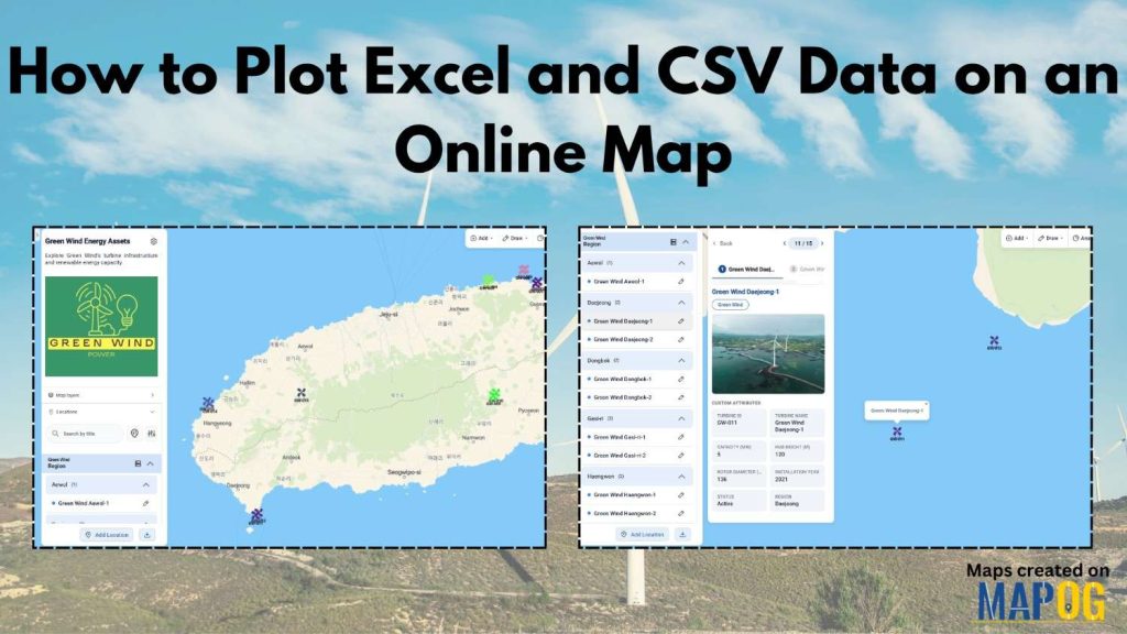
Managing location data in spreadsheets is still a challenge for many industries. Whether you’re tracking wind turbines, retail stores, assets, or project sites, rows of data inside Excel files often fail to provide clear geographic insights. As a result, we can miss important patterns and decision-making becomes slower. Fortunately, Plot Excel and CSV Data workflows have become much easier with modern mapping platforms. With MAPOG‘s Upload CSV feature, we can transform large datasets into interactive online maps within minutes. In this guide, you’ll learn how to Plot Excel and CSV Data using a wind turbine dataset and create a professional map that we can share publicly or privately.
Key Concept: Why Plot Excel CSV Data on a Map?
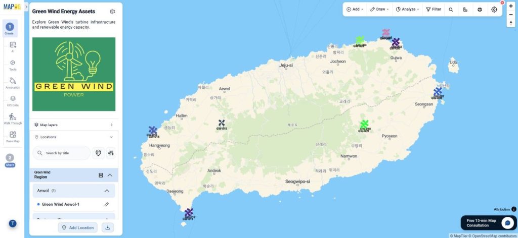
When you Plot Excel and CSV Data, geographic information becomes easier to understand. Instead of reviewing hundreds of spreadsheet rows, users can instantly visualize locations on a map. Furthermore, the map can display attributes such as turbine capacity, hub height, and rotor diameter directly alongside each location.
For example, a renewable energy company may maintain a spreadsheet containing wind turbine locations. Once you map the data, you can manage regional distribution, maintenance planning, and performance tracking more efficiently.
Step-By-Step Guide to Plot Excel and CSV Data
Step 1: Create a Wind Turbine Map Project
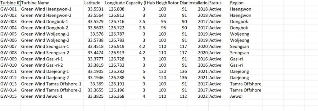
First, prepare a CSV dataset containing wind turbine coordinates and attributes such as Name, Capacity, Hub Height, Rotor Diameter, Region, Latitude, and Longitude.
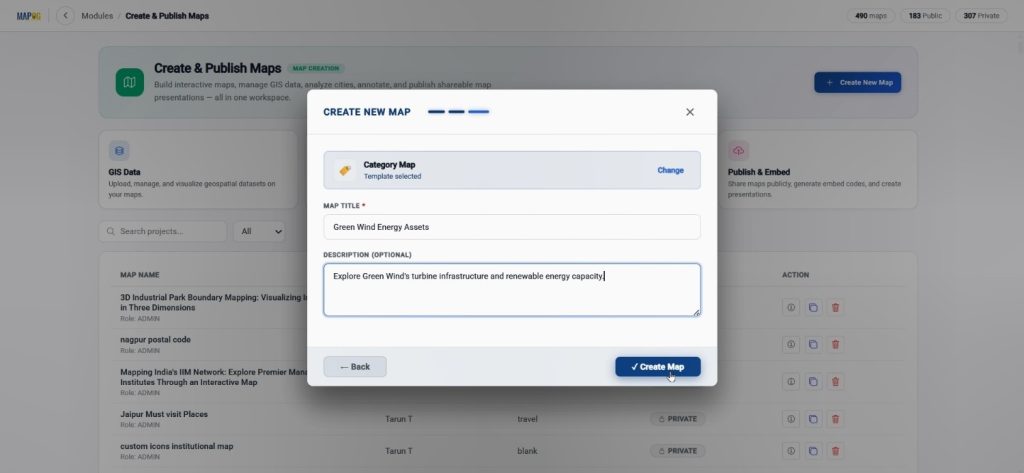
Next, visit MAPOG. Then click Create & Publish workspace, select Create New Map, select the with template option.

Choose the Map template as category,

Enter a title and description. When done click create map.
After creating the map, open Map Settings, upload your company logo using the Upload Logo option, and save the changes.
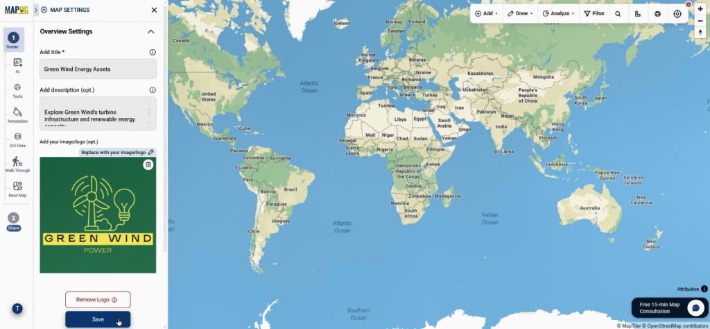
Step 2: Upload CSV and Plot Excel CSV Data
Afterward, open Add Location and select Upload CSV.
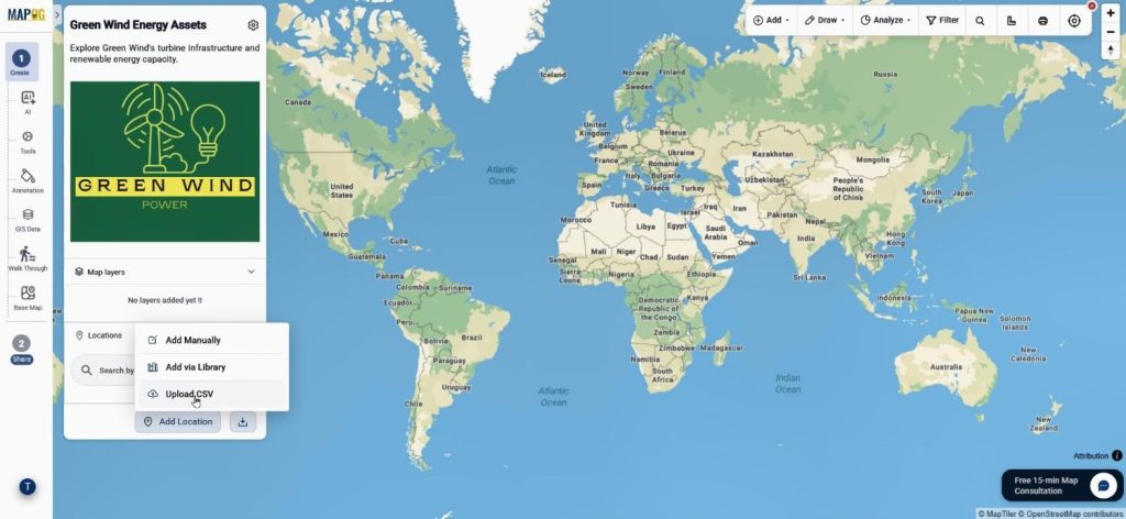
Before uploading, create a reusable location template through Business Location Settings. Click New Type, choose a color, select the point geometry type.
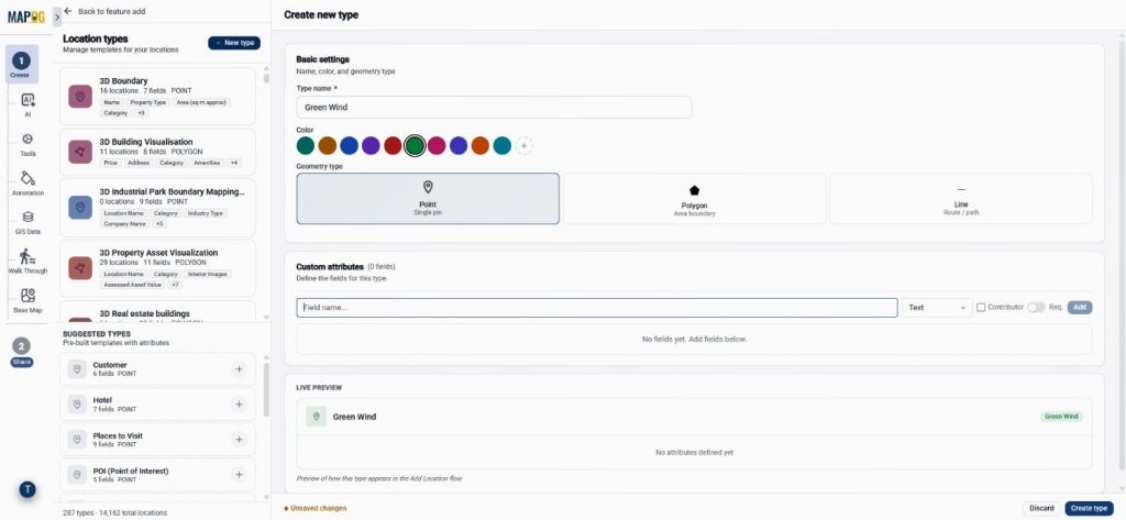
Additionally, add attributes including Name, Capacity, Hub Height, and Rotor Diameter. You can configure text, select, and number formats, and enable contributor access so team members can update the data. Click create type to save the template.
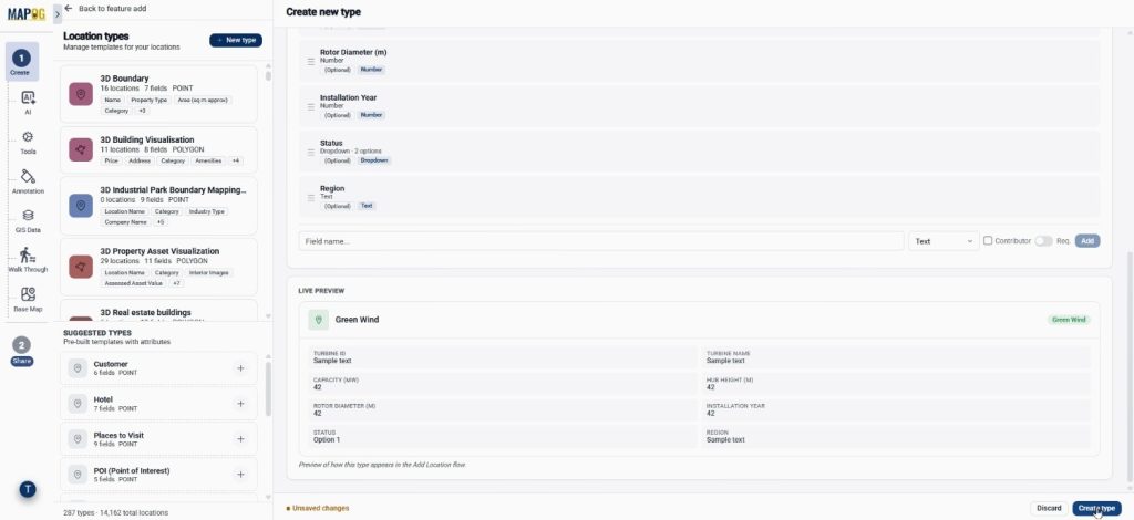
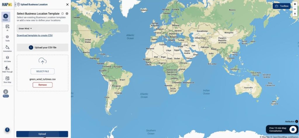
After saving the template, select the template you created and upload the CSV file.
assign a unique ID to prevent duplicates,
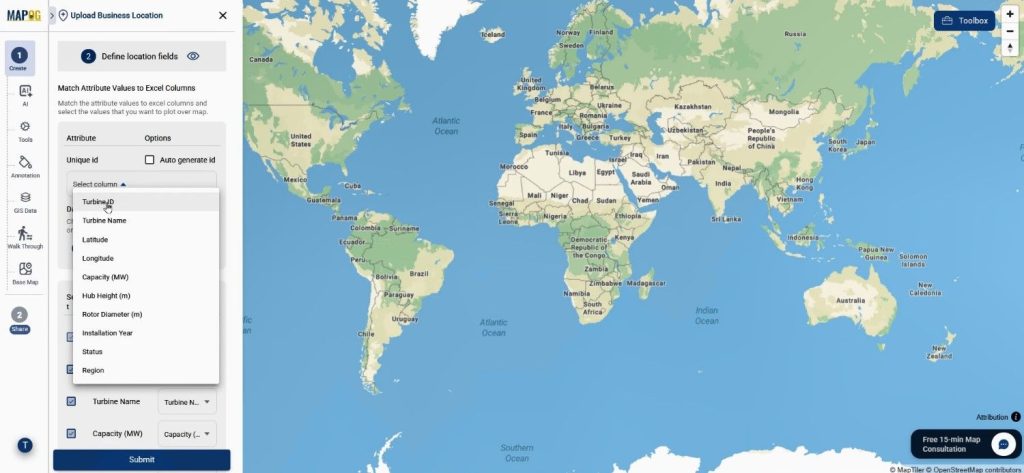
match the columns, and set the latitude and longitude fields. Finally, submit the data, and the system will automatically plot all wind turbine locations.
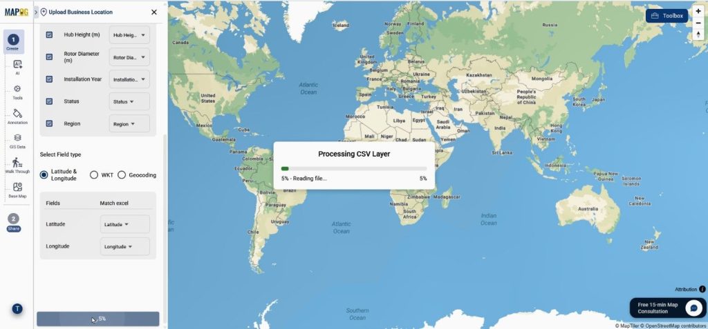
Step 3: Enhance Plot Excel CSV Data Visualization
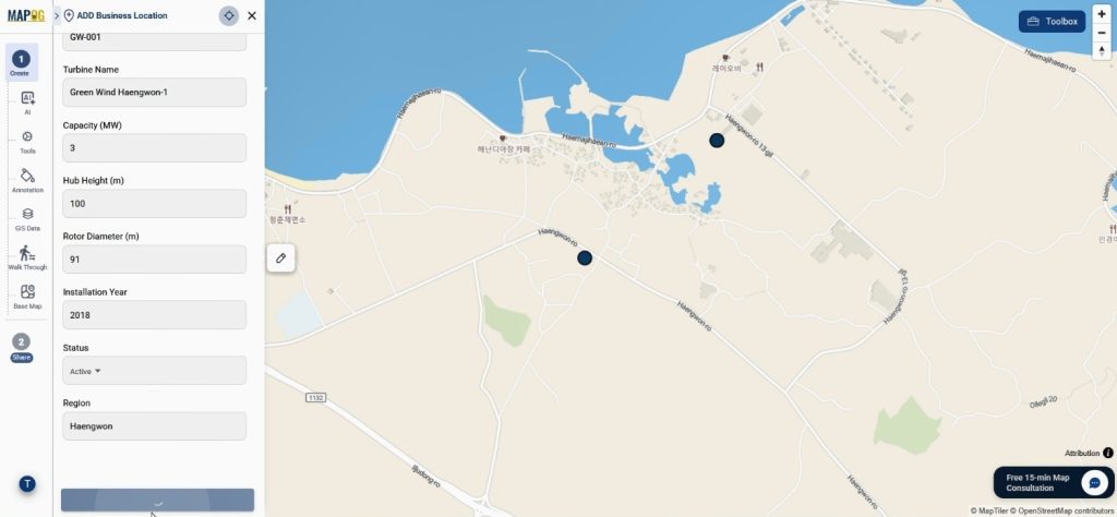
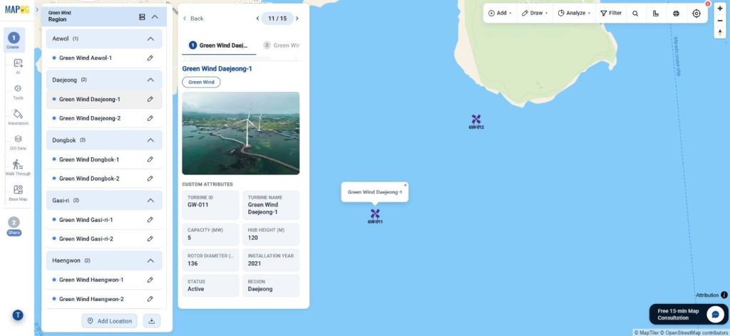
After adding the locations, open any turbine point and edit its details through Edit Business Location Details. You can attach descriptions, photos, and additional information to enrich the map.
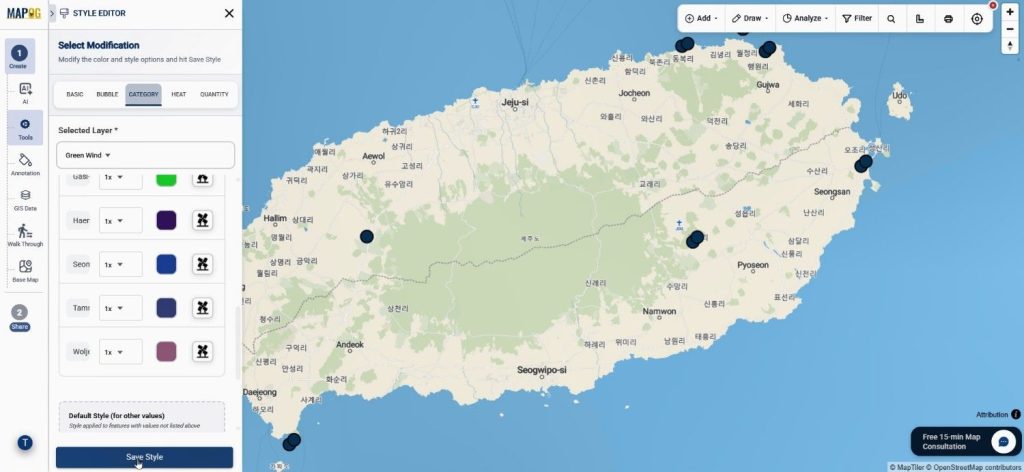
Meanwhile, the Add Layer Style feature can be used to apply category-based colors and icons according to attributes such as region.
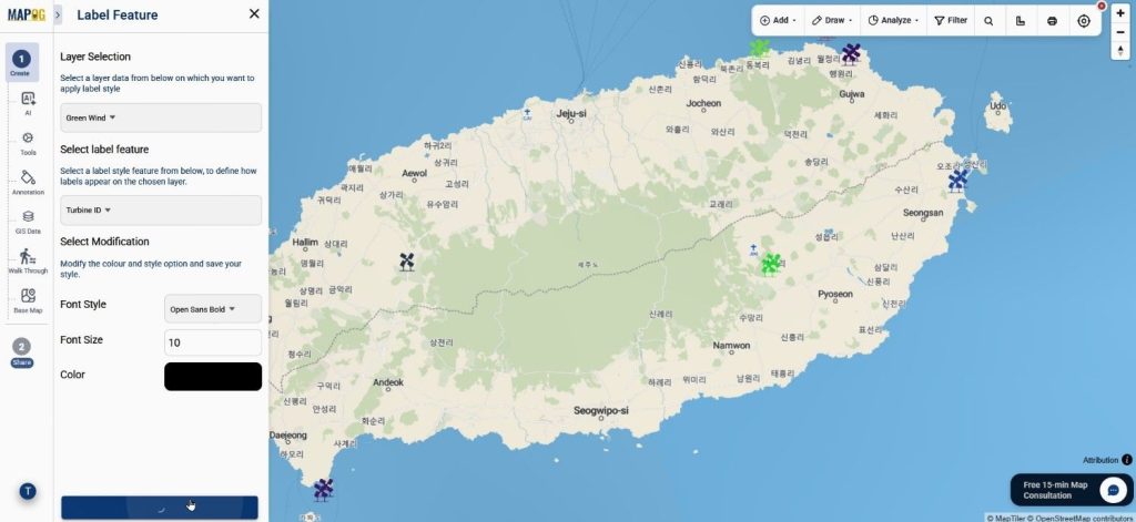
Furthermore, labels can be customized by adjusting font size, style, and color. As a result, the map becomes easier to interpret and more visually appealing.
Step 4: Organize and Share Plot Excel CSV Data Maps
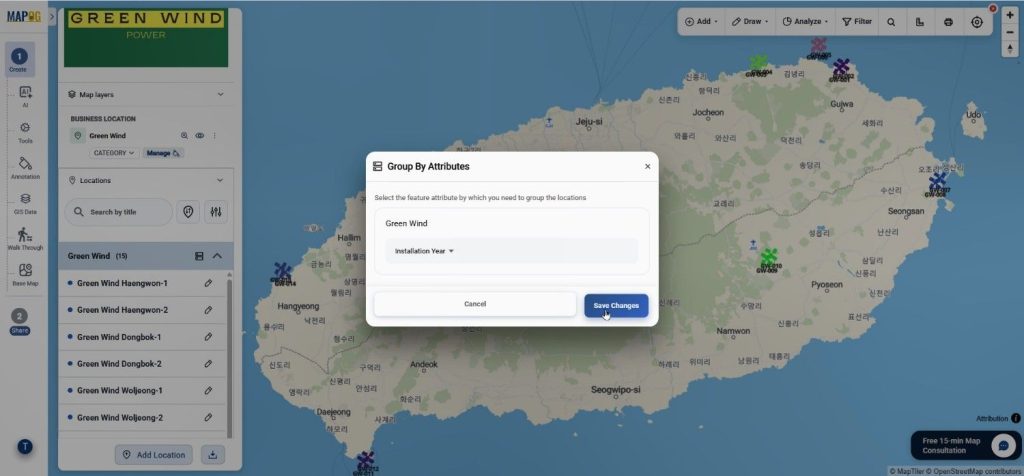
Next, use the Group By feature to organize locations based on attributes such as region or turbine type.
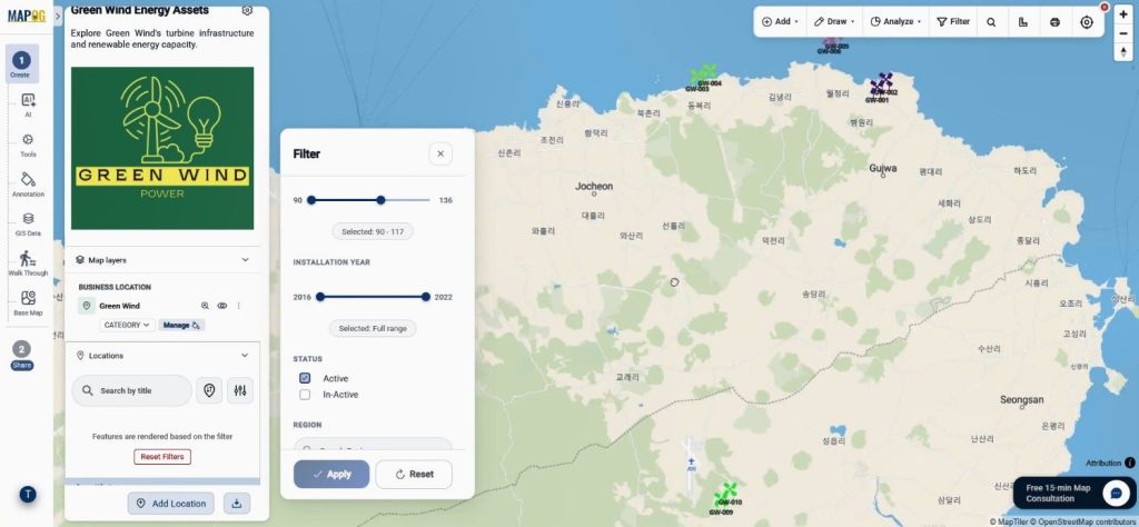
Similarly, filters can be applied to display only selected categories.
After reviewing the map, click Preview & Share. The project can then be published publicly, embedded on websites.
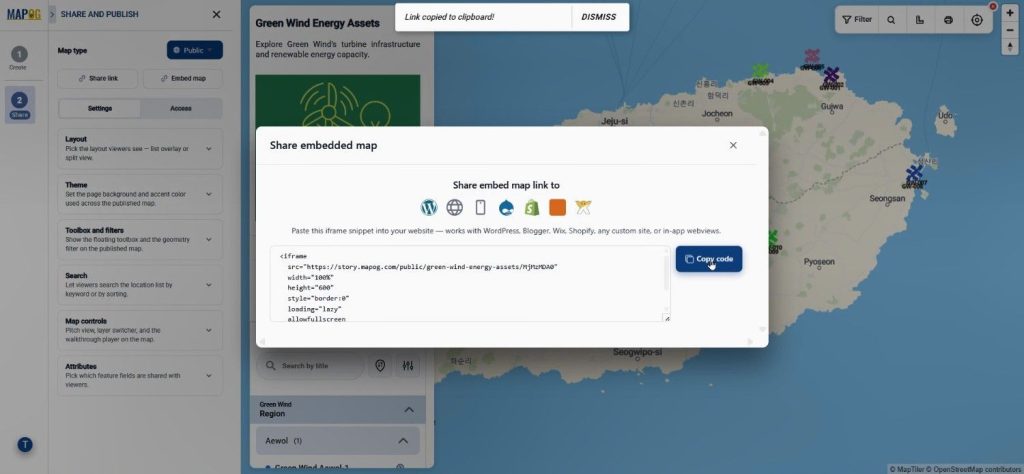
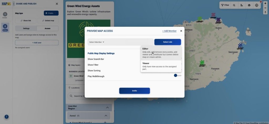
Share privately for collaboration using Add User. Consequently, teams can work with the same location data from anywhere.
Industries and Benefits of Plot Excel CSV Data
The ability to Plot Excel CSV Data is valuable across many industries. Renewable energy companies can monitor wind farms more effectively, while logistics teams can track assets and delivery locations. Likewise, city planners can visualize infrastructure projects and utilities.
Key benefits include:
- Faster data visualization
- Better geographic insights
- Easier collaboration
- Improved reporting
- Interactive online sharing
- Reduced manual mapping effort
Conclusion
As datasets continue to grow, spreadsheet-only workflows become less effective. Therefore, organizations are increasingly choosing mapping solutions to visualize and manage location information.
If you regularly work with spreadsheets containing coordinates, MAPOG‘s Upload CSV feature provides a simple way to Plot CSV Data, organize attributes, customize map styles, and share results with others. Ultimately, turning spreadsheet data into interactive maps can improve understanding, collaboration, and decision-making.