Finding healthcare gaps isn’t just about counting hospitals. Rather, it’s about understanding access, travel range, and unserved rural zones. Therefore, with the help of MAPOG, planners and health departments can visualize these relationships using buffer analysis. Additionally when used in combination with choropleth-style overlays, village point layers, or service area mapping tools, MAPOG makes it easier to strengthen rural healthcare infrastructure. Buffer analysis for hospitals not only helps identify underserved areas, but also supports long-term planning of medical infrastructure in rural regions.
Key Concept: Buffer Analysis
A buffer in GIS draws a radius around a feature—usually a circle around a point—to measure proximity. In the context of healthcare, buffers help visualize which villages lie within reach of hospitals and which don’t. Moreover, this technique supports service area analysis, highlights underserved zones, and complements spatial tools like heat bubbles or location scoring for equitable planning.
Steps to Locate Hospitals Using Buffer Analysis
Step 1: Open Your Mapping Platform
To begin with, head to MAPOG and click “Create New Map.”
Fill in your Title, Description, and optionally upload a Cover Image.
Click Save to begin.

Step 2: Upload Required Layers
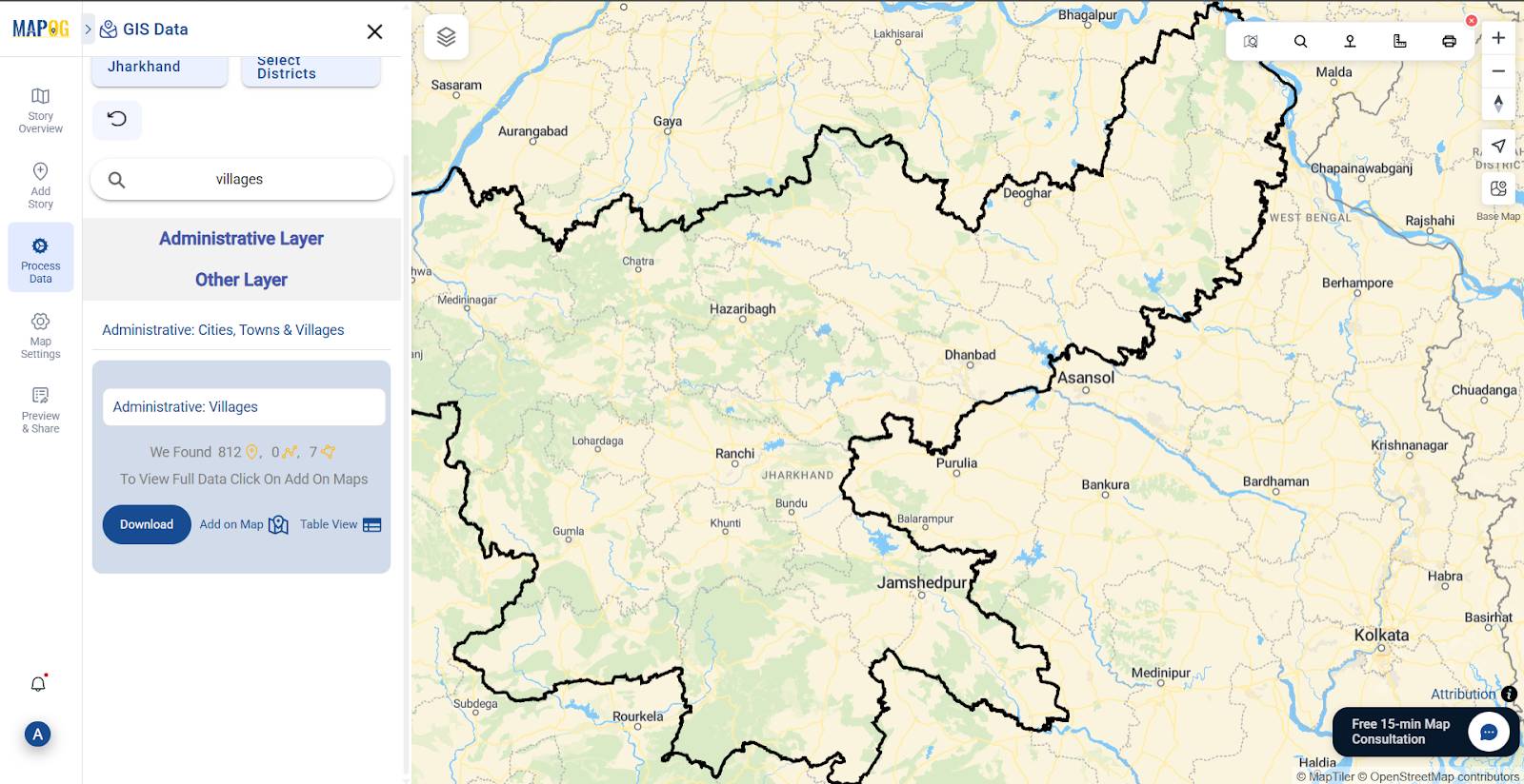
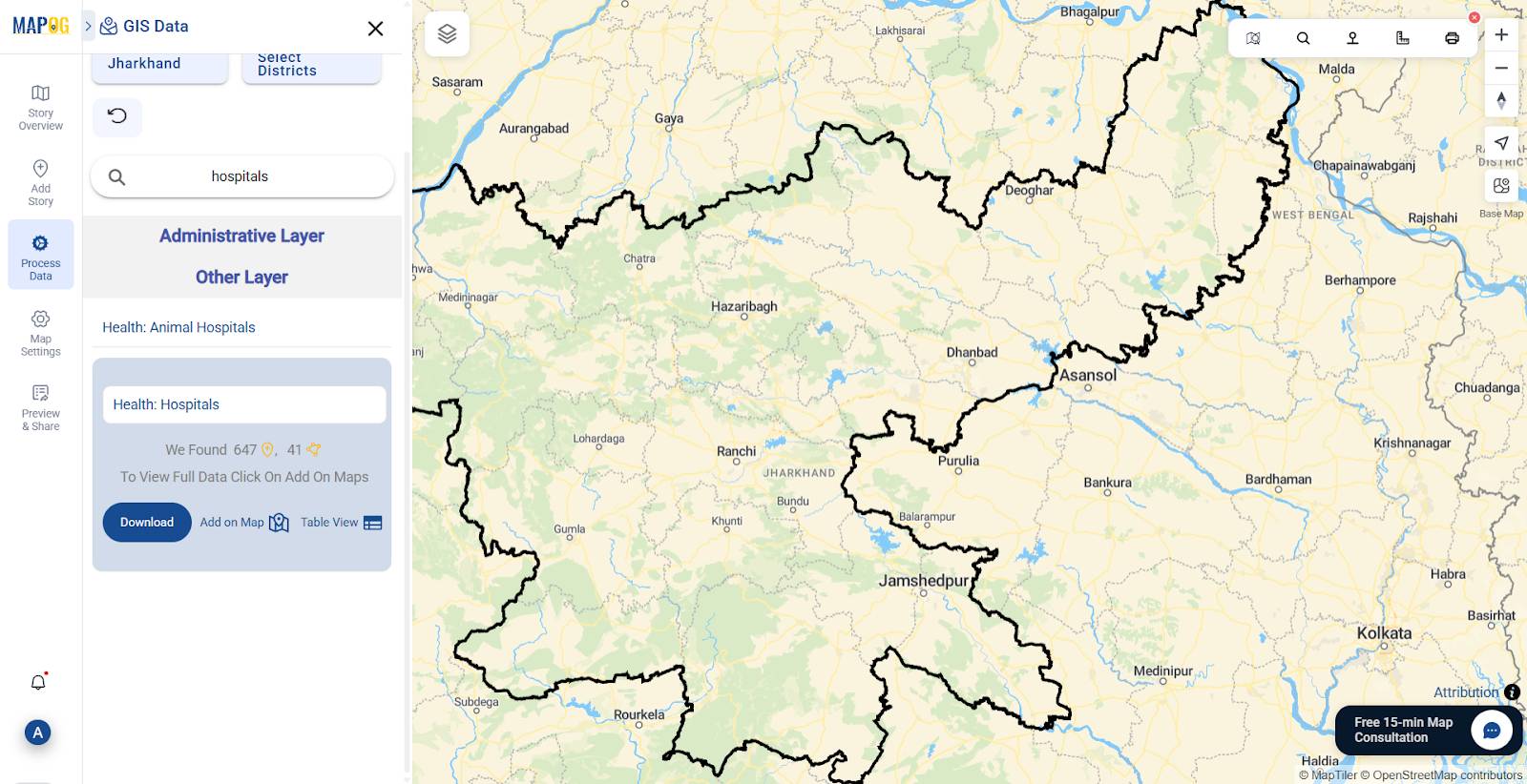
Go to “Process Data” → choose the GIS Data tab under Add/Upload Data.
Next, search for and select layers like:
- Administrative: Villages (Points)
- Health: Hospitals (Points)
These layers are essential to analyze access patterns. Furthermore, they will be used in the buffer tool.
Step 3: Run the Buffer Tool
Click “Process Data” on the left → choose “Buffer Tool.”
Set the main layer to Hospitals (Points).
In Buffer Distance, type a value in metres (e.g., 5 km) to represent accessible or quick transport distance for villagers.
Click Submit.
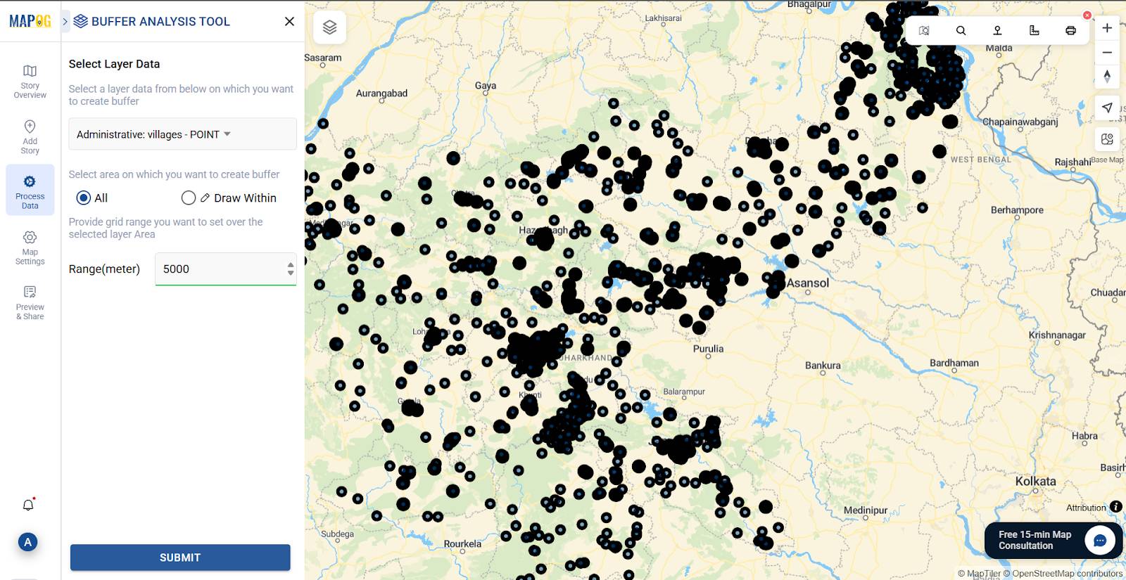
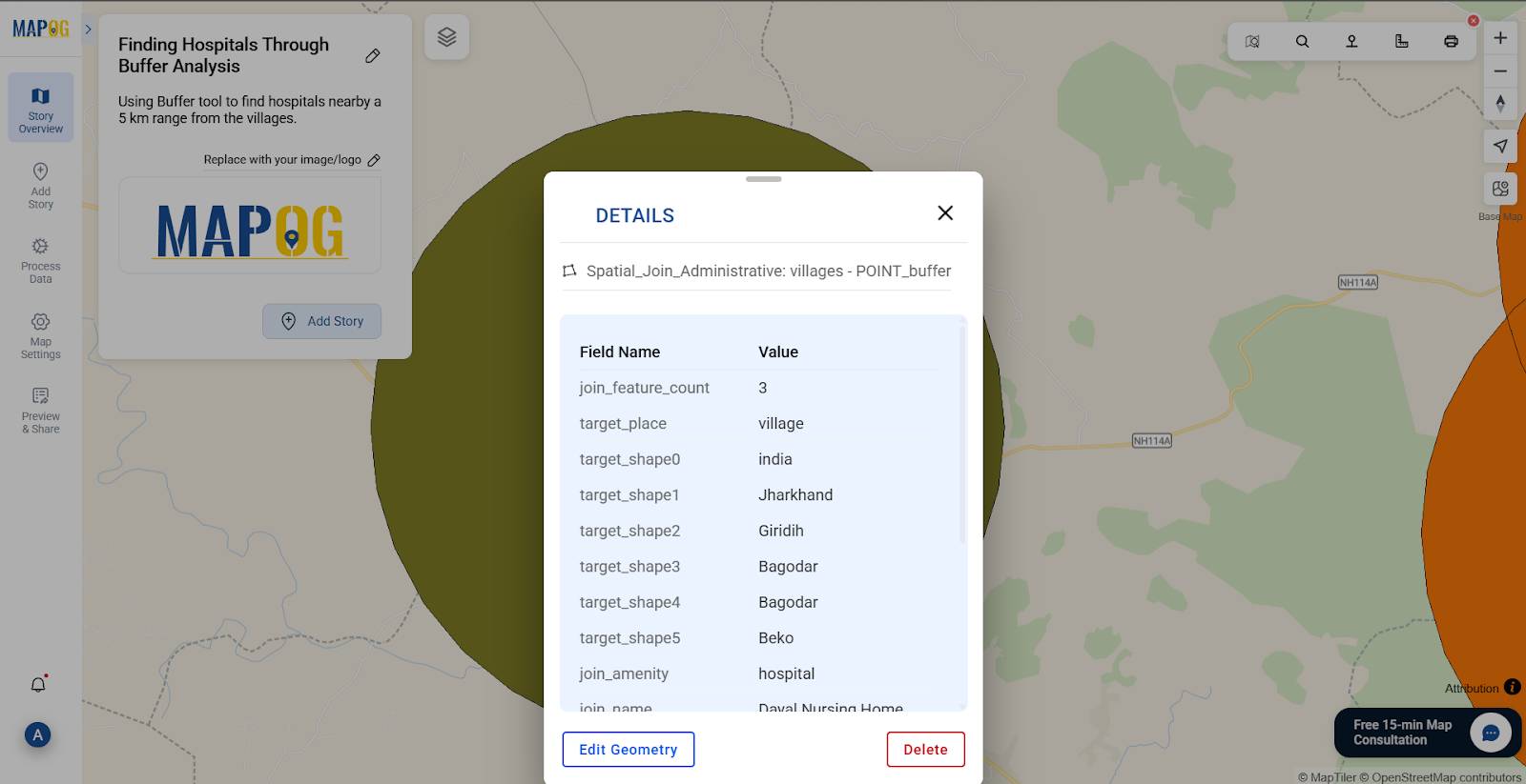
As a result, you’ll see buffer zones appear around each hospital.
Step 4: Use Spatial Join to Link Hospitals with Villages
Click “Process Data” on the left → choose “Spatial Join.”
Set the main layer to 5 km Buffer Layer.
Set the joining layer to “Hospitals” Layer.
In Joining Option, select “Within.”
Choose “Save in New Layer” to preserve the result.
Select “One to many” if multiple hospitals may fall within a single buffer zone.
Click Submit.
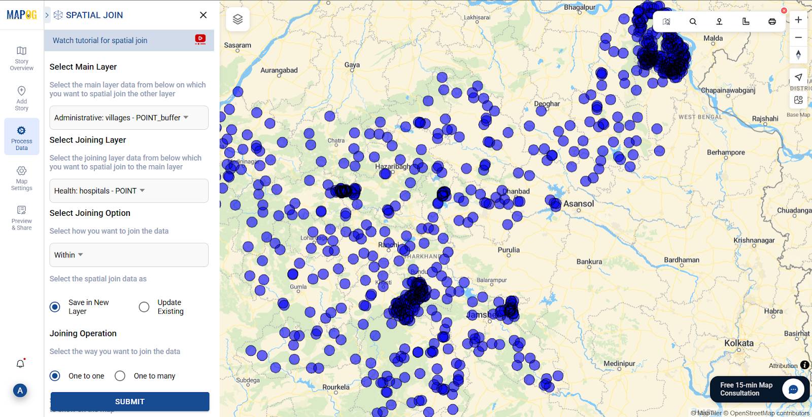
Consequently, MAPOG will generate a new layer showing which hospitals fall within the 5 km radius of each village.
Step 5: Style the Buffer and Hospital Layer
Click “Style Layer” on the final layer→ choose a fill color and opacity that allows the buffer to stand out over village points.
Use quantity style to show the intensity of any village holding more or less hospitals. Select the spatial_join as layer and join_feature_count as attribute and custom your color scheme and quantity every class holds.
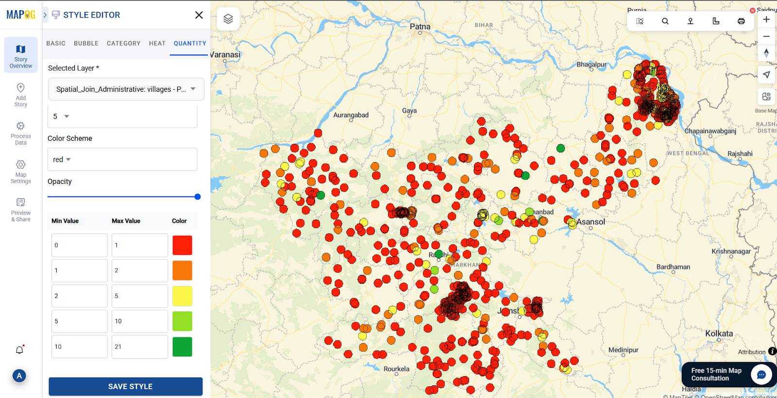
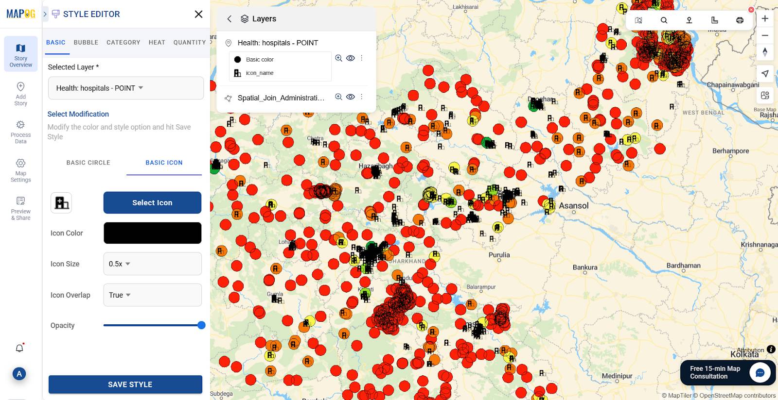
You can also Style the Hospital layer in a similar way by changing its icon under the “basic icon” option.
As a result, each distinct village buffer will contain the data of its hospital(s).
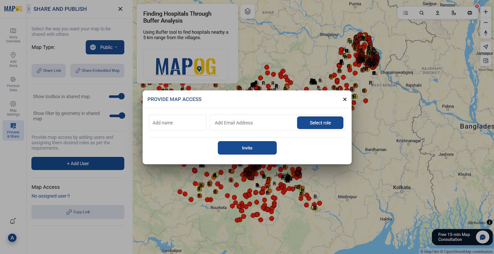
Step 6: Save and Share
Once your map is complete, click “Preview and Share.”
Click Save, and choose whether to keep it private or public.
Invite collaborators or stakeholders if needed.
Industry Applications
Buffer maps offer practical insights for rural healthcare and beyond:
- Healthcare Gap Detection: Spot villages outside coverage zones.
- Ambulance Planning: Create buffer corridors for emergency response.
- Infrastructure Placement: Decide where to set up new clinics or mobile units.
- Policy Reporting: Visually present access gaps in planning documents.
Buffer analysis, especially when combined with choropleth maps and spatial filters, empowers data-backed public service planning.
GIS DATA USED
Conclusion
A buffer map may seem basic, but it speaks volumes. For example, in rural India, it can mean the difference between healthcare access and isolation. With this in mind MAPOG empowers everyone—from local authorities to researchers—can use simple spatial tools to support better policy. To sum up, start with a buffer—it might lead to a healthier, more connected future.
Explore more with these MAPOG articles: