To visualize field office coverage, organizations increasingly rely on maps because they present operational data clearly and quickly. Instead of managing scattered spreadsheets, you can see how field offices and communities connect spatially. Moreover, when coverage areas are visualized together, planning gaps become obvious. Using MAPOG, which support Excel uploads, GIS Data, and custom location templates, the process becomes efficient and structured. This guide explains how you can visualize field office coverage and community reach on a single interactive map.
Key Concept: Why Visualize Field Office Coverage
When teams visualize field office coverage, they gain clarity on operational reach and community access. For instance, you might manage multiple field offices, yet some communities could remain underserved. By mapping offices alongside covered communities, patterns emerge naturally. As a result, decision-making improves, coordination becomes smoother, and field planning stays data-driven. MAPOG supports this workflow by linking GIS Data with attribute-rich location layers.
Step-by-Step Process to Visualize Field Office Coverage
Step 1: Prepare Field Office and Community Data
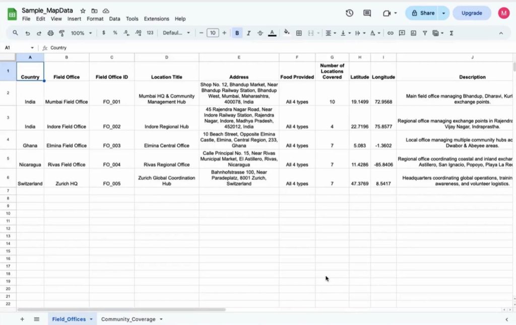
Next, prepare two Excel or CSV files. One dataset includes field office details such as office name, ID, address, and coordinates. The second dataset includes community locations linked to each field office. Although sample data can be used initially, real datasets fit seamlessly later.
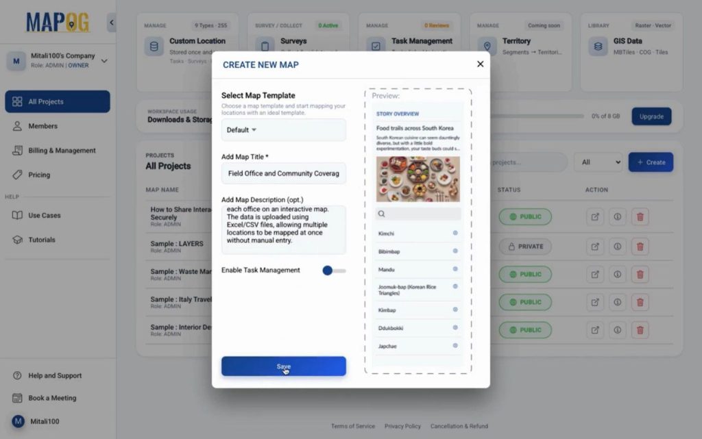
Step 2: Create a Mapping Project
First, open MAPOG and click “create” to create a new project with a clear title and description. This step keeps your visualize field office coverage goal well defined.
Step 3: Create Custom Location Templates
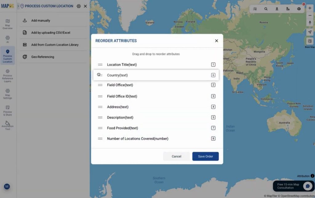
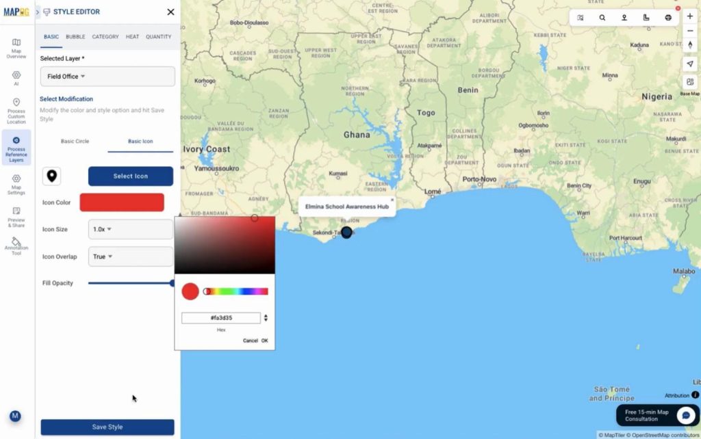
Then, navigate to Process Custom Location settings icon and create a new template for field offices. Choose a color, set the geometry as point, and add attributes matching your Excel columns. This template ensures data consistency while you visualize field office coverage.
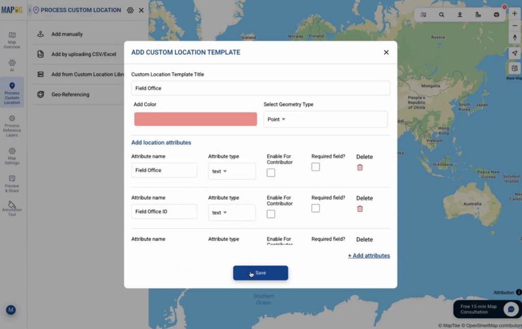
you can drag & drop to re-order the attributes as you want.
Step 4: Upload and Plot Field Office Locations
Afterward, choose Add by uploading CSV/Excel from process custom location & upload the field office CSV using the created template from drop down.
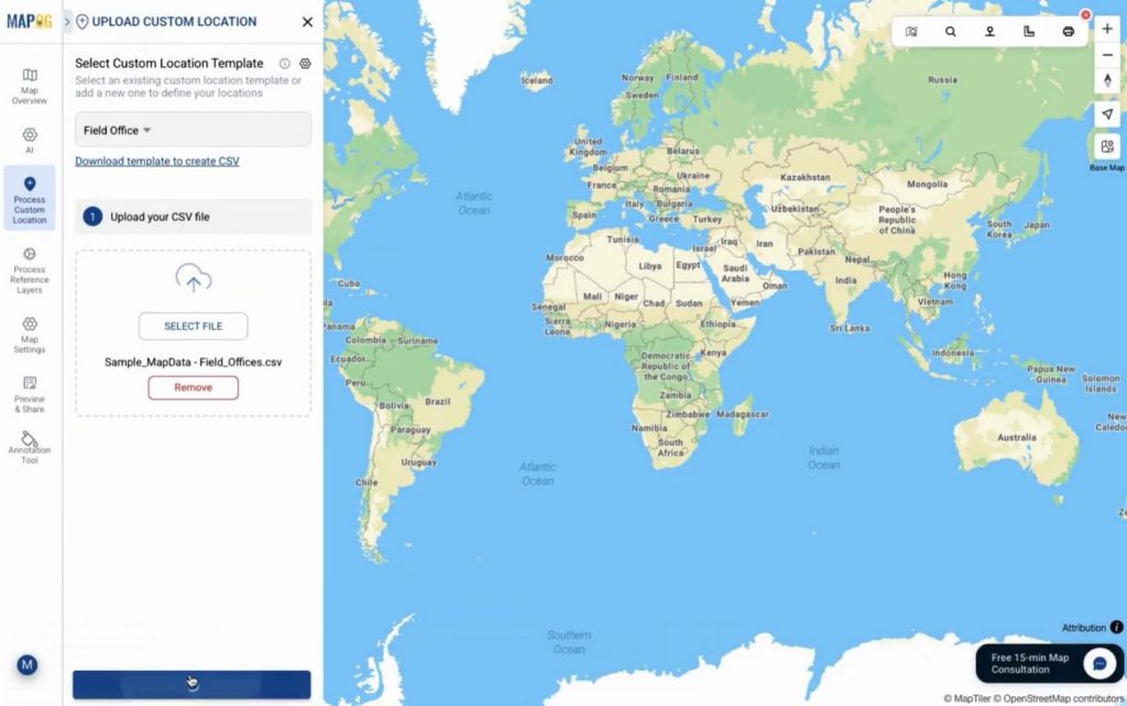
Assign a unique ID for future updates and map the attributes correctly.
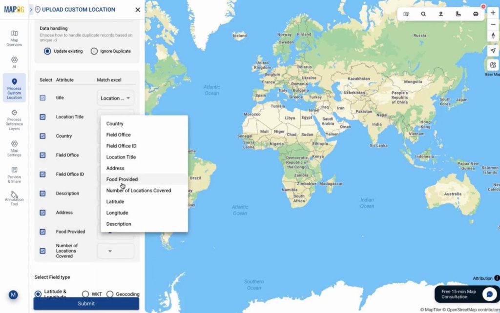
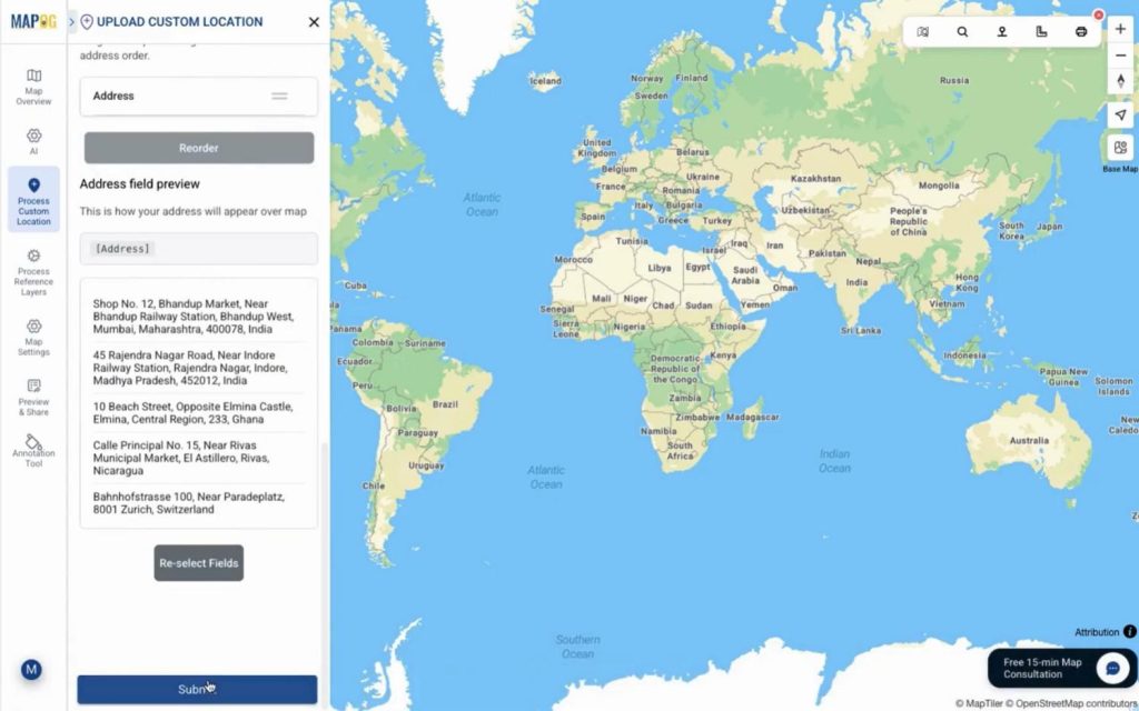
You can plot locations using latitude-longitude, WKT geometry, or address-based geocoding. For geocoding just put country name & the address filed. After submitting locations appear instantly with full details.
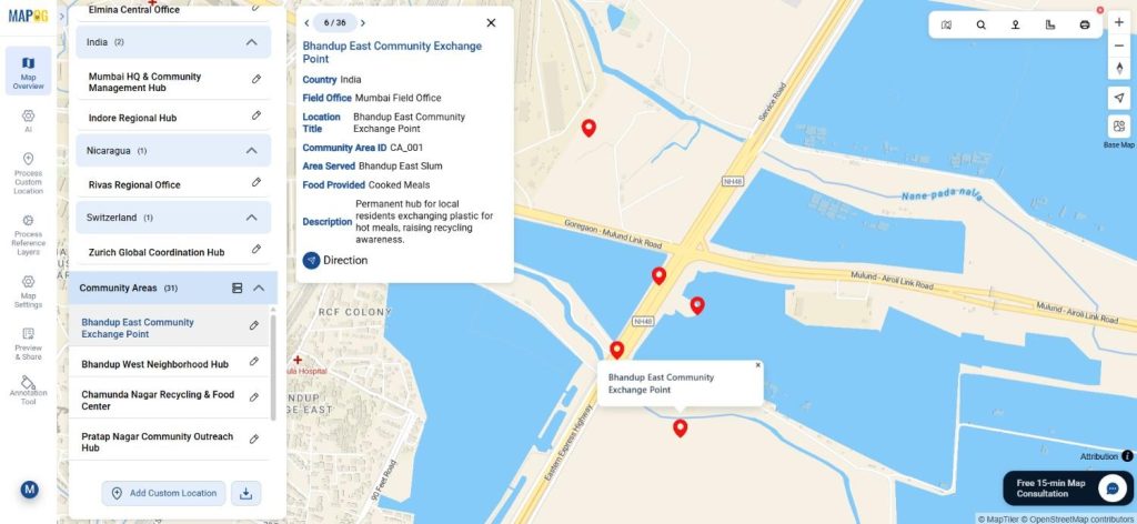
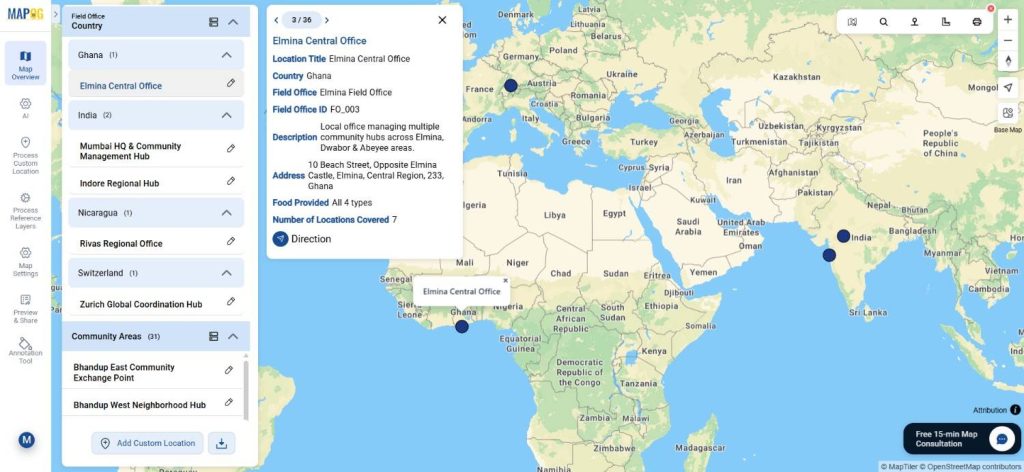
Step 5: Add Community Coverage and Organize Layers
Similarly, upload the community dataset and plot all covered locations. Go to add layer style and select basic style and choose different icon to differentiate the field office & community area layer well.
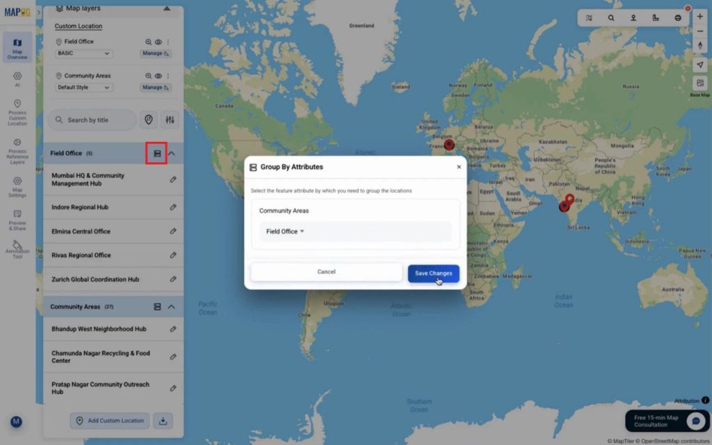
You can use “group by attributes” to categories layers by field office or any other attributes.
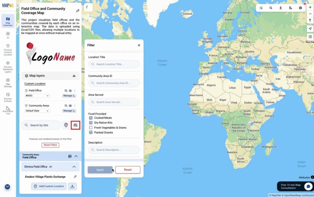
Apply filters to filter out specific location as per requirement.
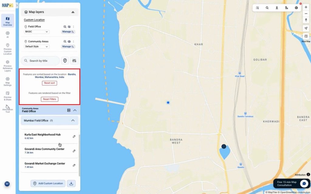
If needed, we can sort locations based on a live location or by searching for a place. Consequently, coverage relationships become easy to interpret.
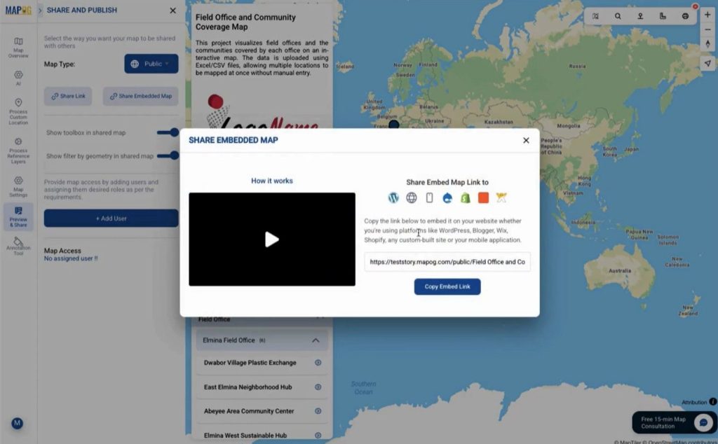
Step 6: Share and Publish the Map
Finally, use the preview & share option to control access. You can share maps privately with editors or viewers or
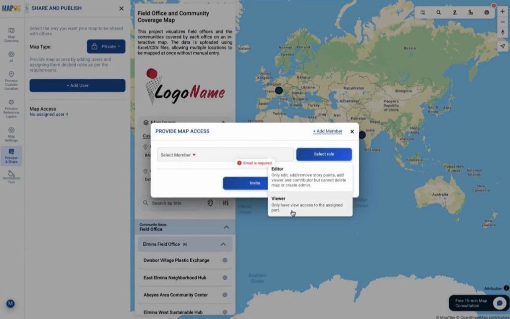
publish them publicly using a link or embedded map. This makes collaboration seamless.
Industry Use Cases and Benefits
Organizations visualize field office coverage to manage NGOs, healthcare outreach, education programs, and sales territories. For example, NGOs can track which communities fall under each field office, while planners can filter areas by services provided. MAPOG simplifies this by combining Excel uploads, GIS Data, and flexible visualization tools.
Conclusion
In summary, to visualize field office coverage, mapping both offices and communities together offers unmatched clarity. With MAPOG, data uploads stay simple, layers remain organized, and insights appear visually. Explore how interactive maps can strengthen your operational planning and coverage analysis.