Often, when faced with a large set of data, it is very difficult to visualize it together. We need the help of data visualization tool in digital maps. Suppose you are a businessperson, who owns several retail chain stores across the city and need to see the performance of your stores in an effective manner. You can use MAPOG as a tool to visualize this data individually and altogether. Hence, with the help of differently styled icons you can interpret, visualize and customize your story in the way of maps.
Key Concept: Importance of using icons as a tool
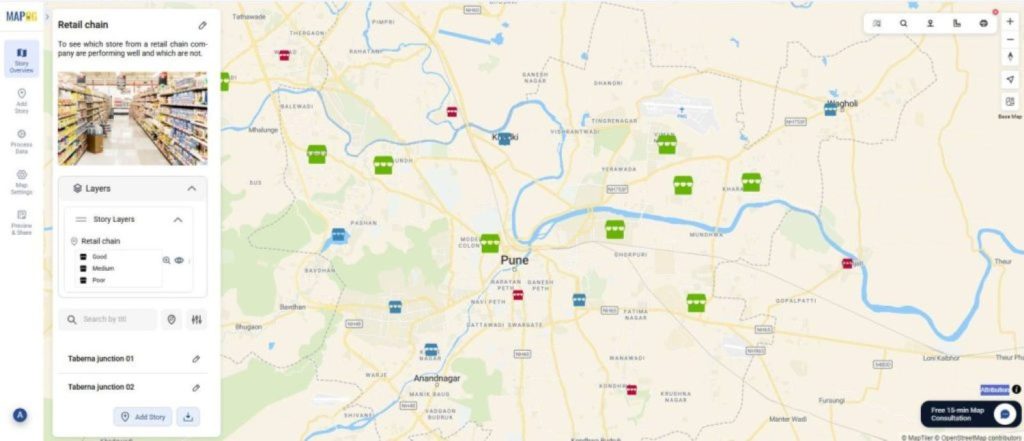
With the help of icons as a tool, MAPOG helps in visualizing the data in an effective manner. The icons will give us important information such as, the location in the city and the status of the attribute which will differentiate our data. Thus, your data can be easily imagined. For example, you are a businessperson who owns a retail chain of stores. A few of your stores are not performing well. You are looking for a way to see which of your stores is performing good and which one is not. You can use these feature of styling your icons based on the sales performance on your digital map and easily check the progress at any given time.
Process to styling the icons and changing the size
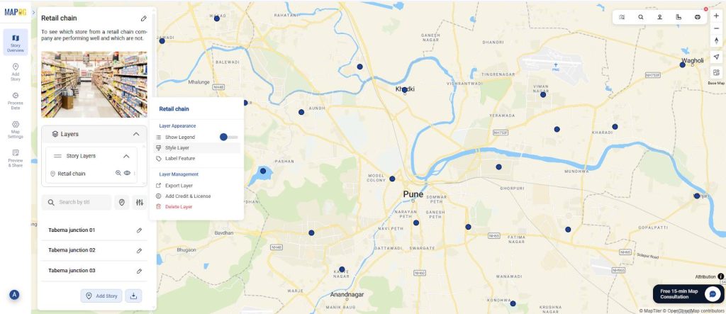
After creating a new map on MAPOG, you can style the icons based on the performance of each individual store. For this feature, go to the layer settings and select ‘Style layer’.
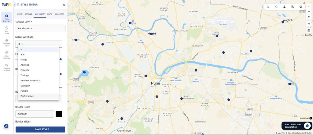
Now, in the style editor choose style by ‘category’ and add the distinguishing attribute under the name ‘performance’.
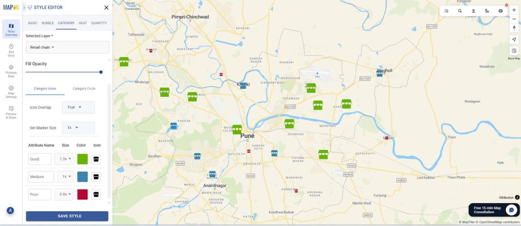
Afterward, assign different colours, icons and sizes to the stores based on their performance. Provide the color “Green” for good performance, “Blue” for medium & “Red” for poor performance. Furthermore, you can change the size for each icon based on performance. Now you have icons of different colour and size based on the performance of each individual store. Lastly, select ‘save style’.
Industry benefits
By using MAPOG, you can move your data from spreadsheets to interactive maps. The change in map icons and sizes act as a data visualization tool in a digital map. The icons having different colours and sizes would benefit the business by allowing for easy tracking of each store’s progress and profits, thus facilitating problem-solving. Stores that are underperforming can be identified and targeted, and this data can be used to strategically improve business operations. Furthermore, this information can be helpful for consumers, enabling them to locate stores and access details such as parking availability and special services.
Conclusion
Whether you need to optimize your data in order to solve problems or check large pieces of information in one place, mapping provides the best solution. If you want to change map icons and sizes, with the help of MAPOG, you can customize your data in the form of icons of different shape, size and colour and visualize them effectively.