Mapping crime hotspots is a critical approach in understanding and preventing urban crime. By visualizing clusters of criminal activity, law enforcement and urban planners can make informed, data-driven decisions. One modern way to do this effectively is through interactive mapping platforms that offer grid-based analysis and visual heat bubble styles—such as MAPOG’s intuitive tools. This article walks you through the entire process of mapping crime hotspots using grids and heat bubble tools, sharing how spatial insights can be beautifully and functionally visualized.
Understanding the Key Concept: Mapping Crime Hotspots
At its core, mapping crime hotspots involves plotting crime data geographically to identify zones with higher-than-average criminal activity. This isn’t just about placing dots on a map—it’s about recognizing dangerous patterns, understanding urban dynamics, and using visualization techniques like heatmaps and bubble layers to communicate complex trends clearly.
Using MAPOG, you can go beyond basic pins and dive into layered spatial analytics, utilizing features such as the grid tool and style layer to represent intensity and location of crime incidents more effectively.
Step-by-Step Guide: Creating Crime Maps Using MAPOG
1. Create a New Crime Mapping Project
- Visit MAPOG and start by creating a new map.
- Enter a project name and brief description that reflects your objective.
- Save your map to begin working with the data interface.

2. Upload Your Crime Data
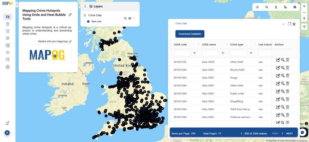
- Use the Upload CSV/Excel File feature from “Add upload data” to import crime data. Make sure your dataset includes location-based information like latitude and longitude, type of crime, and time/date.
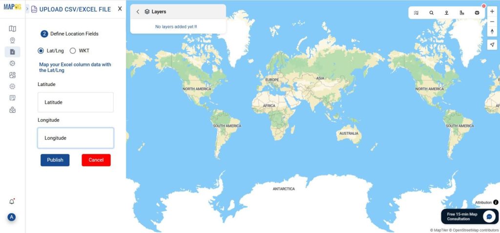
- Once uploaded, your data points will appear on the map. You can also view the data table.
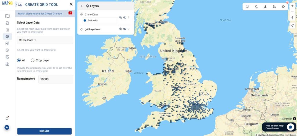
3. Use the Grid Tool to Identify
- Navigate to Process Data and select the Grid Tool.
- In the tool select the crime data layer and set the grid range as 10KM, the tool will automatically generate uniform grids around your crime points. These grids help to group spatial data and make hotspot zones visually identifiable.
4. Apply Heatmap and Bubble Styles
- Go to Style Layer to enhance the visual representation. Choose Heatmap to show intensity (darker colors = more crimes)
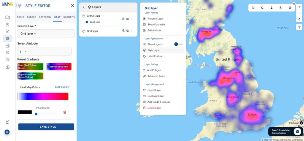
- and Bubble to depict crime frequency with varying bubble sizes and colors.
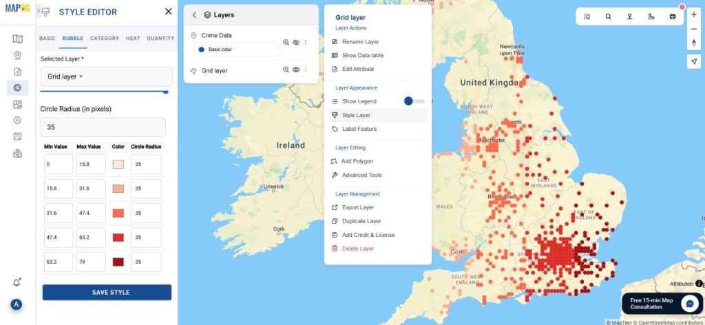
- Adjust styling preferences (color gradients, transparency, size) to make your map more informative and aesthetically clear.
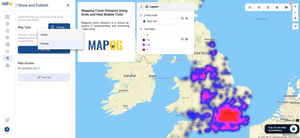
5. Preview and Share Your Interactive Crime Map
- Click on the Preview and Share option to view your final interactive map.
- You can generate a public share link or embed code, making it easy to include in reports or community safety dashboards.
Industry Relevance and Benefits for mapping crime hotspots
Mapping crime hotspots has become an essential practice in modern-day policing and urban governance. For example:
- Urban Planners: Can redesign public spaces to discourage crime in identified zones.
- Police Departments: Use hotspot data for predictive patrol routing.
- Public Safety Groups: Share visual data to increase awareness and community reporting.
Using tools like MAPOG’s grid tool and style layer allows professionals to make decisions based on evidence, not just instinct.
Conclusion
With the growing need for data transparency and public safety, mapping crime hotspots using interactive maps is no longer a luxury—it’s a necessity. Through MAPOG, users can upload crime datasets, apply intuitive grid structures, and visualize threats using heat and bubble styles. These methods empower cities and citizens alike to better understand and act upon spatial crime patterns.
Here are some other blogs you might be interested in