In a globally connected world, students, researchers, and academic planners are increasingly turning to smart solutions for understanding how leading institutions are distributed across regions. Whether you’re exploring top engineering schools, renowned MBA programs, or historic fine arts colleges, mapping education institute places offers a dynamic and visual way to grasp academic reach and reputation. Using platforms like MAPOG, this process becomes not only insightful but also interactive—helping users dive into school map area coverage to better understand spatial patterns in education.
Key Concept Behind the Mapped Guide to Top Universities
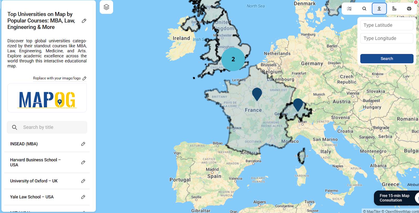
The main goal of this project is to use an interactive map online to visually organize world-renowned universities by their top academic disciplines—such as MBA, Law, Engineering, Medicine, and Arts. Instead of presenting a standard list, this approach transforms educational data into a categorized spatial map, highlighting regional academic strengths and global education hubs. By merging geographic context with academic focus, it makes the global higher education landscape more accessible and easier to understand.
Step-by-Step Guide: Mapped Guide to Top Universities
• First, Add Title & Description
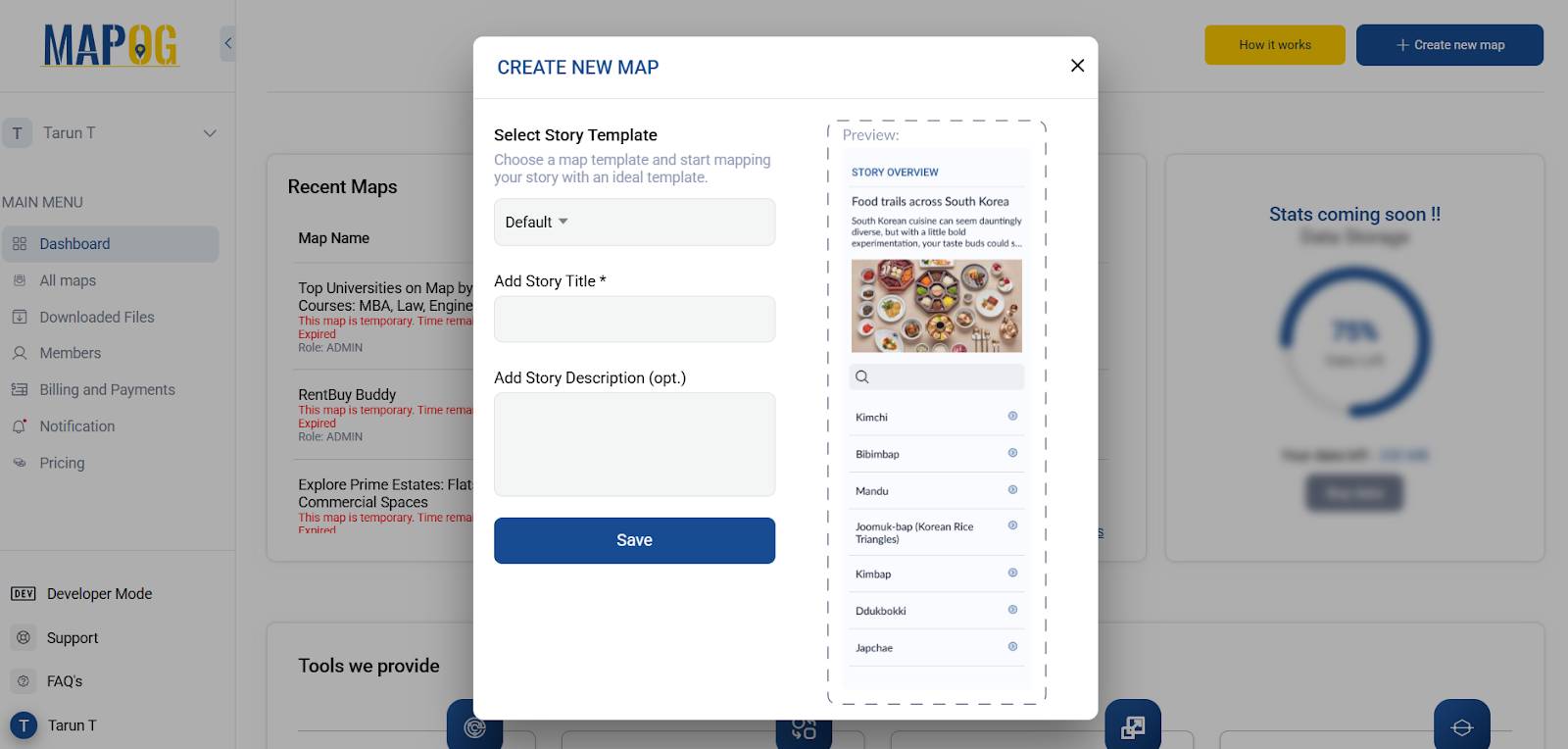
Begin by selecting ‘Create New Map’ in MAPOG. Add a concise and catchy title such as “Top Universities by Course” along with a brief description explaining the map’s focus on educational categories.
• Search for Top Universities Using the TOOL Box
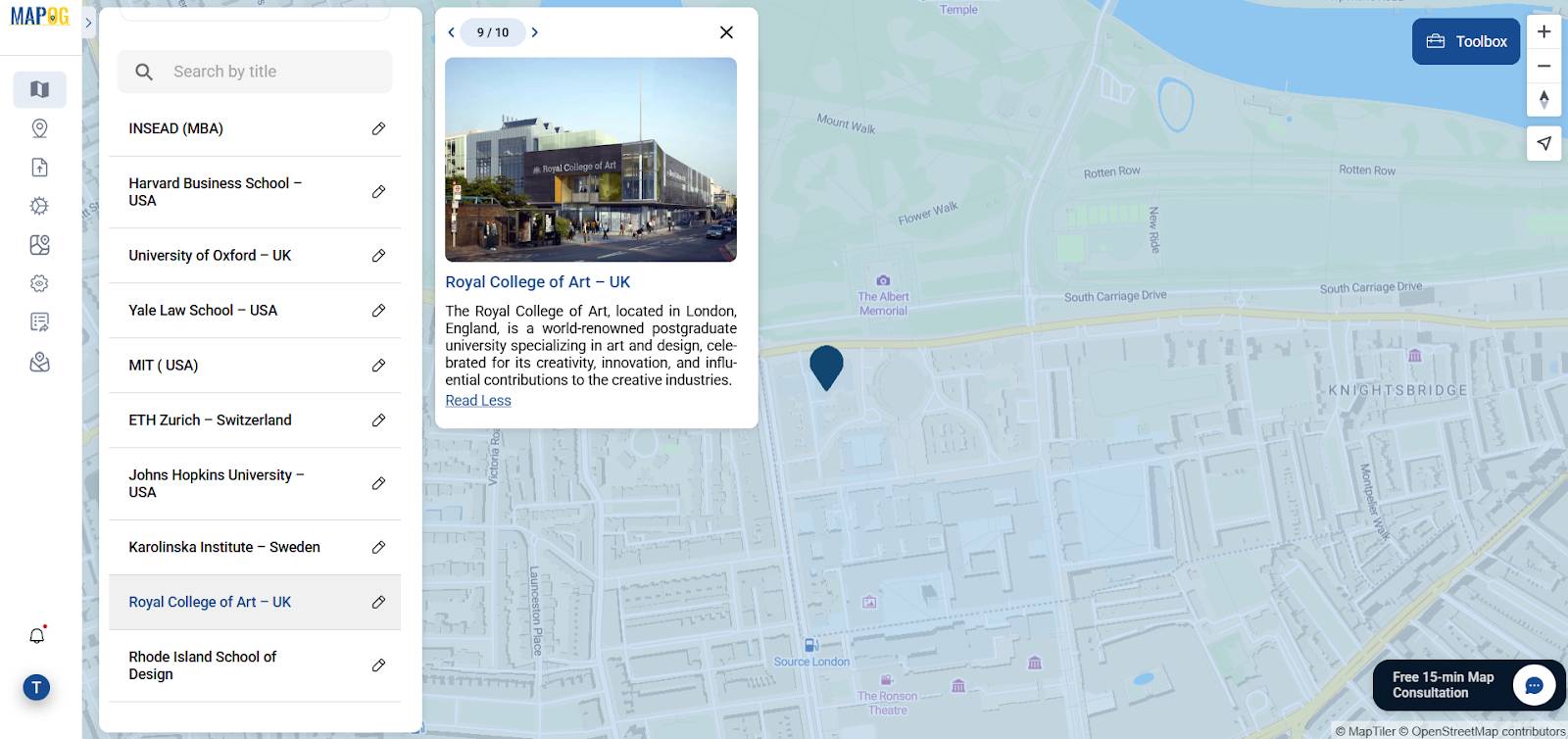
To begin, using global university rankings as a reference, you can then utilize the TOOL search box in MAPOG to look up universities known for their strength in specific courses like MBA, Law, or Medicine.
• Search by Address or Lat-Long
For more precise placement, you can input the university’s full address or alternatively use latitude and longitude coordinates. This ensures that each institution is accurately geo-tagged.
• Add Country Boundaries Using GIS Data
To enhance clarity, first highlight each university’s host country by uploading or selecting a country boundary polygon using the GIS Data feature. Then, use the Style Layer tool to customize colors and borders—making your category map visually segmented and easier to navigate.

• Use the ADD Point Section
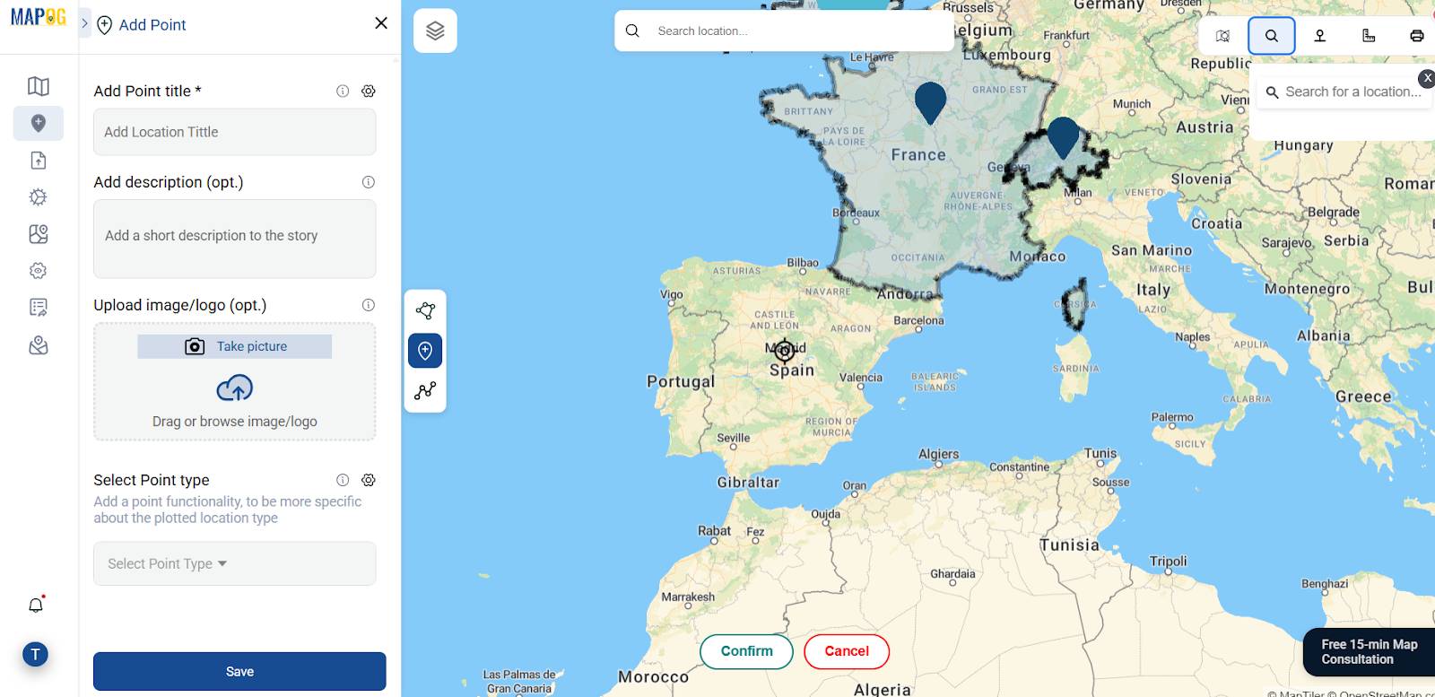
Next, under the Add Point section in Add Story, insert details for each university—such as its name, description, and even a representative image or logo. This not only adds personality to each data point but also makes the map more engaging for viewers.
• Share & Preview
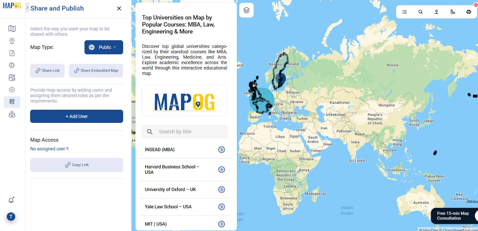
Finally, finalize your map using the Share & Preview feature. With this, MAPOG offers options to directly share your project via link or easily embed it in websites, blogs, or educational portals.
Why GIS Matters in the Mapped Guide to Top Universities
Geographic Information Systems (GIS) significantly elevate the way we consume and interpret educational data. While a list of top universities is informative, a map showing their exact global distribution by specialization is truly transformative. GIS allows users to see patterns: for example, engineering powerhouses in Europe, law-centric institutions in the U.S., or top art schools concentrated in cultural capitals. Using a platform like MAPOG, we don’t just access data—we bring it to life with spatial intelligence.
Who Is Benefiting
This map serves a wide spectrum of users:
- Students and parents when exploring global education opportunities, start by focusing on your specific field of interest.
- Educational consultants looking for visual tools to support client decision-making.
- Researchers use spatial analysis to uncover trends in academic excellence.
- Policy planners and education analysts study the global distribution of specialized education programs.
Consequently, each user benefits from the map’s clarity, interactivity, and accessible format—powered by intuitive GIS tools.
Data used
Conclusion
By mapping top global universities based on their course strengths, we not only go beyond rankings but also enter the realm of visual understanding. Moreover, with GIS tools like MAPOG, we make this educational data more interactive, more insightful, and ultimately more impactful.. In a world where data is everywhere, the ability to map and interpret it spatially gives both learners and leaders a crucial edge.