Sustainable development cannot be achieved without community-driven initiatives that focus on water, energy, and environmental needs. Moreover, Mapping Community Water, energy, and environmental projects offers a practical way to visualise data, highlight impact, and ensure transparency. In fact, by creating interactive maps, decision-makers, NGOs, and local communities can track project status, monitor beneficiaries, and share progress publicly. At the same time, MAPOG simplifies this process, enabling users to transform complex datasets into clear, visual stories.
Key Concept of Mapping Community Water, Energy and Environmental Projects
Furthermore, the idea behind Mapping Community Water, energy, and environmental projects is simple yet powerful. For instance, when projects such as clean water supply, renewable energy hubs, sanitation drives, or reforestation programs are plotted on a single interactive map, the information becomes accessible and actionable. In addition, through MAPOG’s Add Story and Category features, communities can not only document what exists but also analyze gaps, ensure accountability, and even inspire others to adopt similar initiatives.
Step-by-Step Process to Mapping Community Water, Energy and Environmental Projects
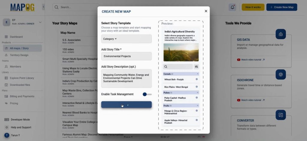
1. Creating the Map
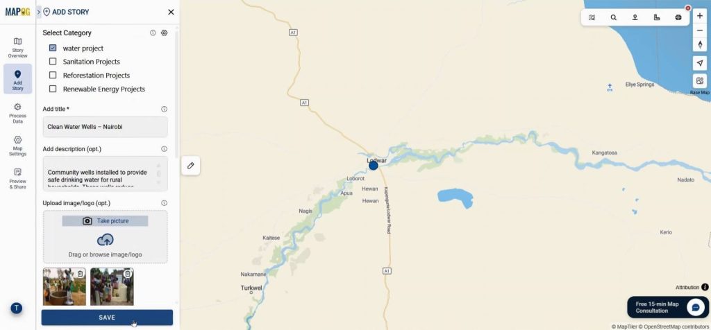
On MAPOG, the process starts by selecting Create new map. Choosing a story template, adding a title and description, and saving it lays the foundation. You can also attach images that bring local context alive. This first step in Mapping Community Water projects ensures a structured starting point.
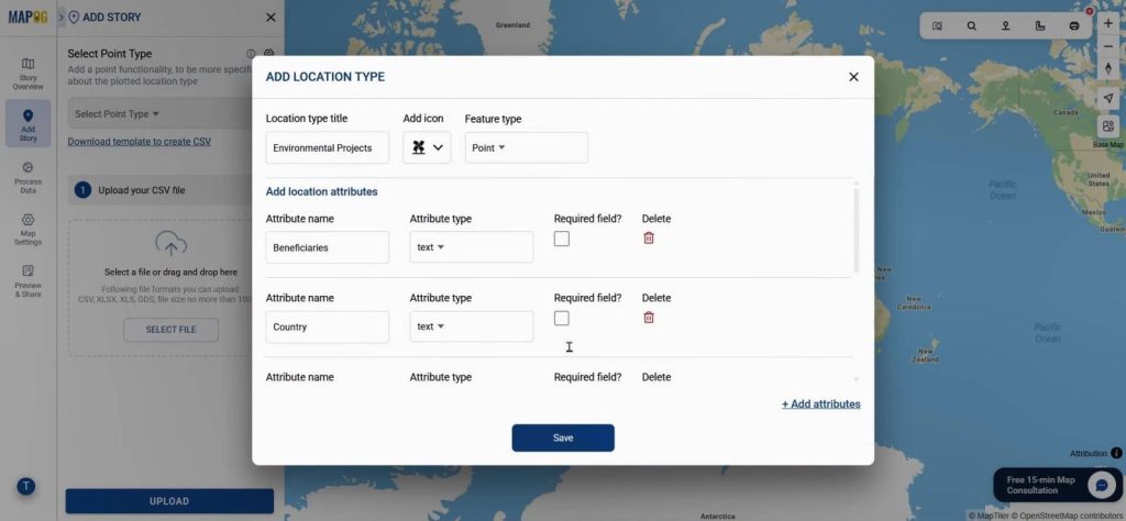
2. Adding Stories Through Data
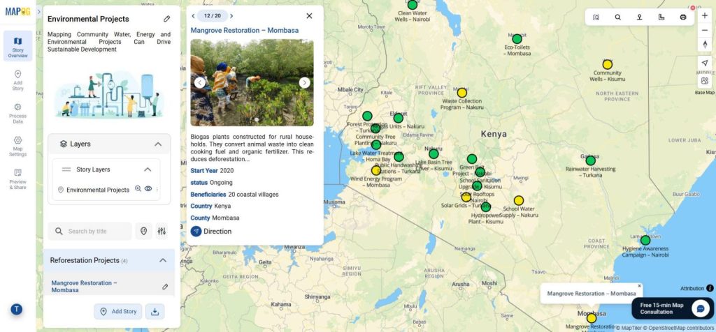
Next comes the Add story option where you can upload CSV or Excel data through Add by uploading CSV/Excel. Set an attribute type such as Environmental Projects through Select Point Type option and adding fields like beneficiaries, country, county, and project status, data takes shape.
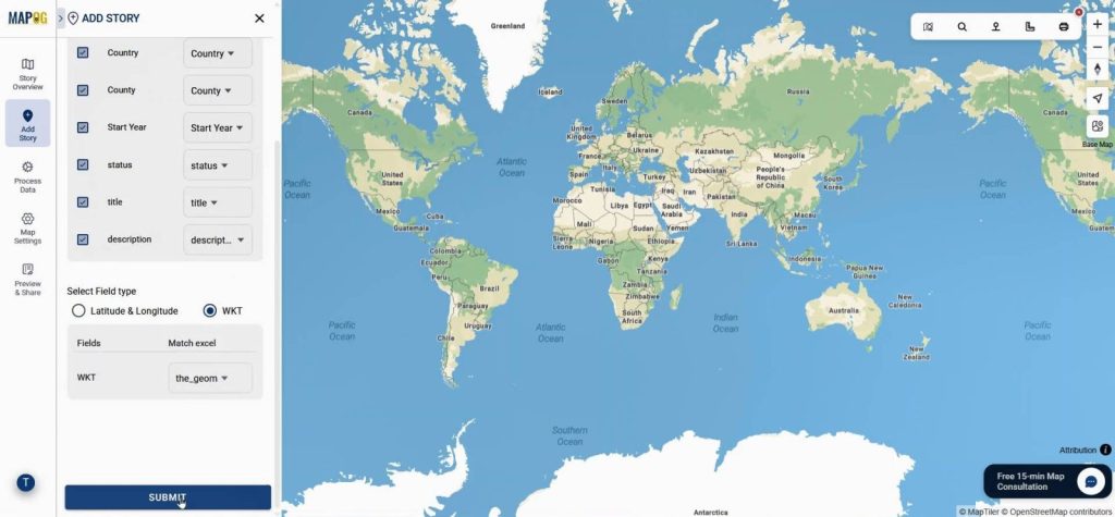
Uploading your CSV, linking attributes with match excel, and applying the WKT geometry ensures your points are automatically plotted. Moreover, In this way, Mapping Community Water and related initiatives transforms static data into dynamic insights.
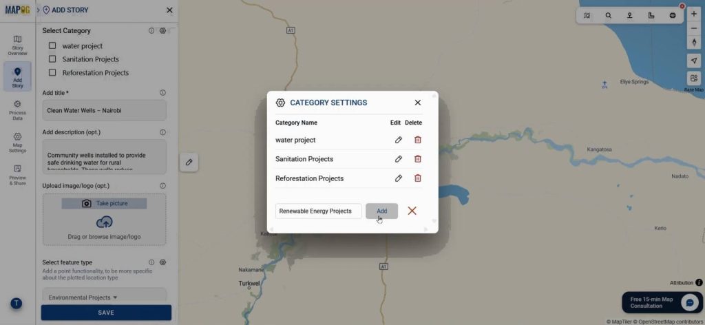
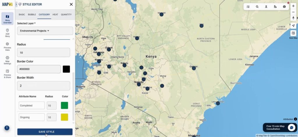
3. Categorizing Projects for Clarity
Go to edit point details, then select category settings type, there you can create categories such as Water Projects, Sanitation Projects, Reforestation Projects, and Renewable Energy Projects. Assigning each point to its correct category not only improves organization but also reveals patterns across communities. This structured categorization makes Mapping Community Water efforts more accessible for stakeholders.
Lastly add images and other finishing touches & save the point.
4. Styling and Labeling the Map
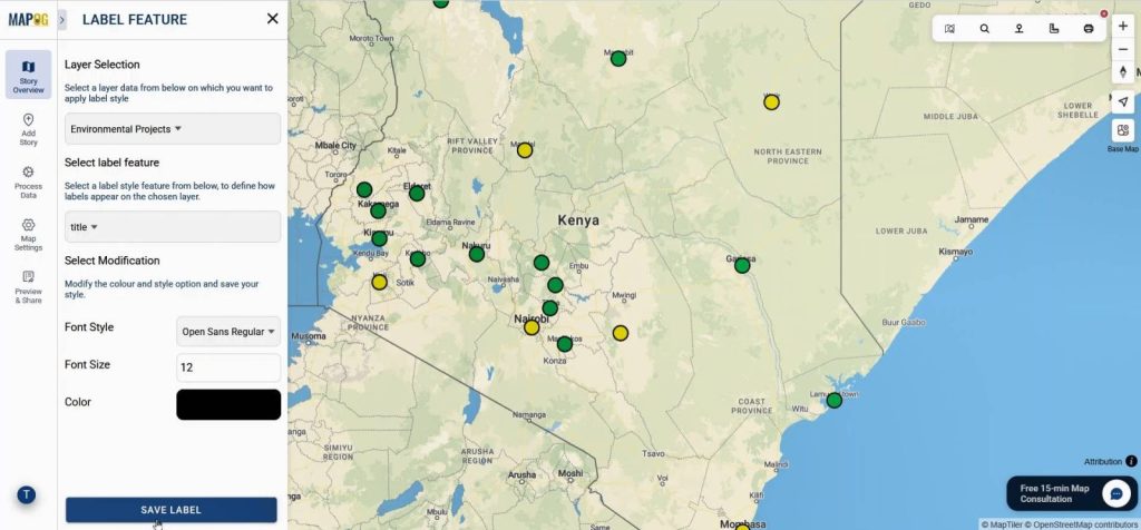
Maps are most effective when they are visually engaging. Go to Style layer of this specific layer & choose Category style, select the “status” attribute and set green for completed projects & yellow for ongoing projects, then save the style.
Turning on the Label Feature makes project names visible, guiding viewers as they navigate the map. These enhancements make Mapping Community Water and environmental programs more intuitive and user-friendly.
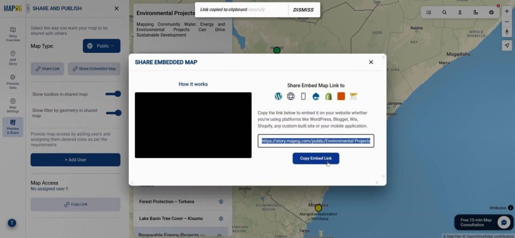
5. Sharing for Collaboration
The final step is Preview and Share. By setting the map to public, communities, organizations, and policymakers can access it with just a link. This accessibility encourages collaboration and accountability.
Industry Use & Benefits
The value of mapping goes beyond community-level projects. Nonprofits, government agencies, and private organizations all benefit. For instance, an NGO can highlight how many households a sanitation project reaches, while energy companies can display renewable installations across regions. With Mapping Community Water and related categories, the bigger picture emerges—who benefits, what areas are underserved, and where future efforts should focus.
Conclusion
Sustainability cannot thrive without clarity, and clarity comes from visualization. By using MAPOG’s Add story and category features, Mapping Community Water and environmental projects becomes a practical way to combine data, people, and purpose. Interactive maps not only improve understanding but also inspire communities to take part in building a sustainable future.