Visualizing population density map by districts helps uncover patterns in urban growth, resource distribution, and planning needs. Whether you’re working on development plans, healthcare access, or disaster preparedness, mapping this data by district brings clarity that raw tables cannot. Thanks to MAPOG, users can create, style, and share interactive maps easily—no advanced GIS degree needed.
Understanding the Key Concept: Population Density Map by Districts
Before diving in, let’s define it clearly. A population density map by districts shows how many people live per unit area in each administrative division. This helps identify urban hot zones, under served areas, or regions requiring urgent policy attention. For example:
- Urban Planning: Overlay population with transportation routes.
- Healthcare: Identify regions needing new clinics.
- Education: Spot school shortages based on population clusters.
These insights become intuitive once displayed visually on a map.
“Visualizing COVID-19 Mortality Patterns: Heatmap Analysis“ dives into a gripping visual exploration of how the pandemic affected different regions over time. This article uses powerful heatmaps to uncover hidden mortality trends and regional disparities that numbers alone can’t explain.
Step-by-Step: How to Build a Population Density Map by Districts
Here’s how you can create one using MAPOG:
1. Upload Your District-Level Data
After successfully creating a project on MAPOG, come to the map interface and in the left panel click on “Add Upload Data” and use the “Upload Vector File“ option.
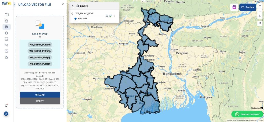
Make sure your file includes population data and district boundaries (formats like SHP, KML, or GeoJSON work well). This is the foundation of your population density map by districts.
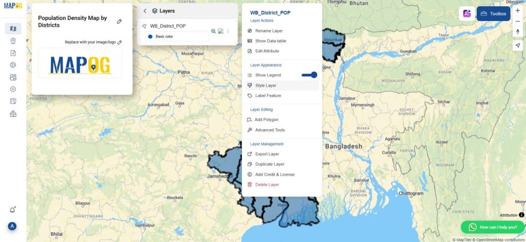
2. Open the Style Editor
After uploading, click on the action button to get “Style Editor”. Choose the quantity-based style to visualize population differences across districts.
Now:
- Set attribute to your population column.
- Define the number of classes (e.g., 5 groups for low to high density).
- Adjust opacity and color to make the differences visually clear.
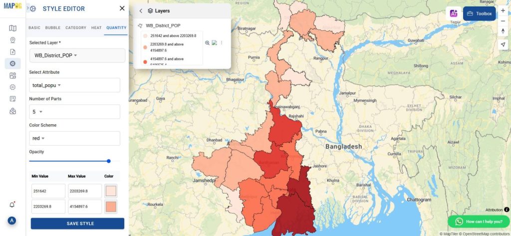
Using this, districts will be shaded based on how densely populated they are—darker shades can indicate high-density zones.
3. Save and Share Your Work
Once styled, go to the “Share & Publish” tab. You can either copy the link to share or embed it into your website.
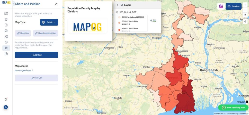
This way, anyone—colleagues, planners, or the public—can interact with your population density map by districts.
Industry Use & Benefits of District-Level Population Mapping
Why is a population density map by districts so powerful? Because it transforms raw data into actionable insights. Some real-world use cases include:
- Government Agencies: Prioritizing infrastructure in overpopulated areas.
- Nonprofits: Targeting aid in disaster zones by population clusters.
- Researchers: Correlating population with environment, income, or access.
MAPOG’s visual editor and file upload features reduce the GIS entry barrier, making such projects accessible even to those without a technical background.
Curious about how to visualize where people live and how crowded an area really is? “Creating Population Density Maps: A Guide to GIS Mapping“ breaks it down in simple steps using powerful GIS tools. Whether you’re a student, planner, or data lover, this quick read will show you how to turn raw population data into impactful visual stories
Conclusion: Create, Customize & Share Your Population Insights
Creating a population density map by districts isn’t just about pretty visuals—it’s about clarity, planning, and action. MAPOG, with features like the style editor and vector file upload, simplify this process and make your insights shareable and impactful.
Here are some other blogs you might be interested in