To create interactive maps that make presentations stand out often runs into a familiar problem: spatial data gets flattened by static visuals. Bullet points can’t show movement. Charts miss relationships. And maps, when passive, lose their power to engage.
This disconnect is especially clear when presenting franchise networks, logistics zones, or planning overlays. Without interactivity, audiences struggle to connect the dots. MAPOG shows how much more intuitive and dynamic spatial storytelling can be.
Key Concept: Why Create Interactive Maps for Presentations
In contrast to static visuals, interactive maps stand out because they invite exploration, not just display information. Instead of showing fixed locations, they guide audiences through layers of meaning, gradually revealing patterns, comparisons, and context. With features like toggle-able views, clickable attributes, and clean visual logic, MAPOG make it easy to build maps that feel intuitive and engaging.
Step-by-Step Guide to Create Interactive Maps for Presentations that Stand Out
Let’s take a retail franchise example to see this in action.
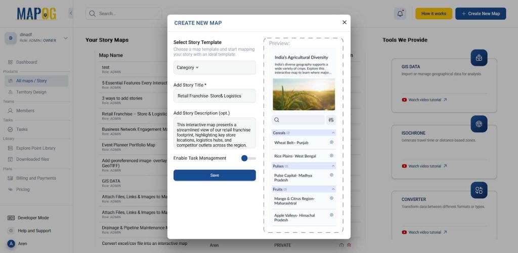
1. Create a New Map
To begin, head to MAPOG and click on Create New Map. Choose template as category. Then, add a title and short description to define your map’s purpose.
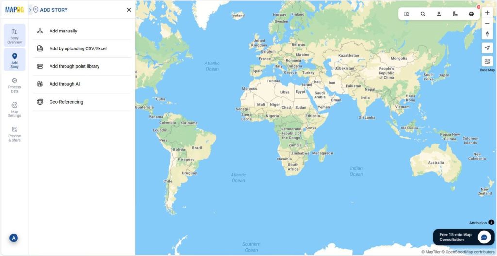
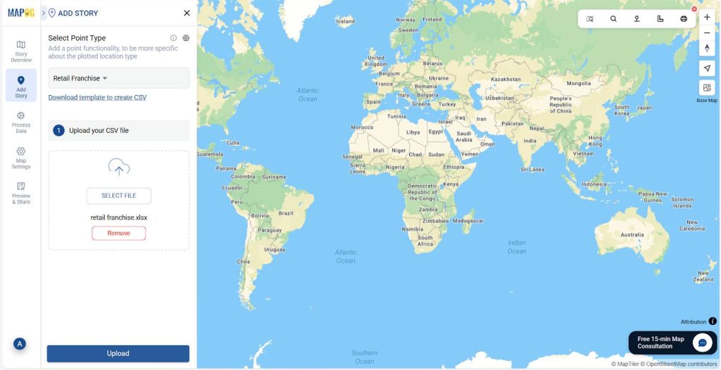
2.Upload Your Data to Begin Mapping
Next, go to the Add Story section and select Add by Uploading CSV/Excel File to start building your interactive map.
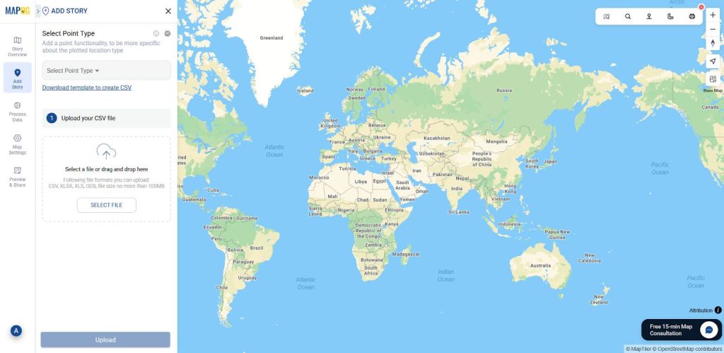
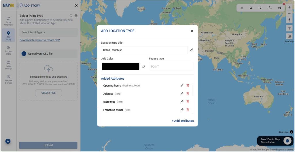
3. Define Location Type and Add Attributes
Further, click the Select Point Type Settings icon to create new attributes for the interactive map.
Afterward, click Add More Location Type to create a new one. Add a title, and choose feature type: Point, Line, or Polygon, based on how your data should appear. Finally, assign formats to each attribute: use address for addresses, number for contacts, and Business Hours for timings.
4. Upload Your Excel File
After setup, return to the upload section and select your Point Type. Then, browse your Excel/CSV file that contains coordinates information, and click Upload. This will display your data as clickable points on the map.
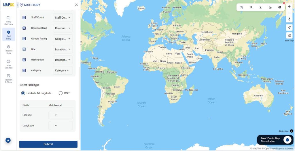
5. Define Location Fields
Now, select your unique ID & match attributes to your Excel columns.
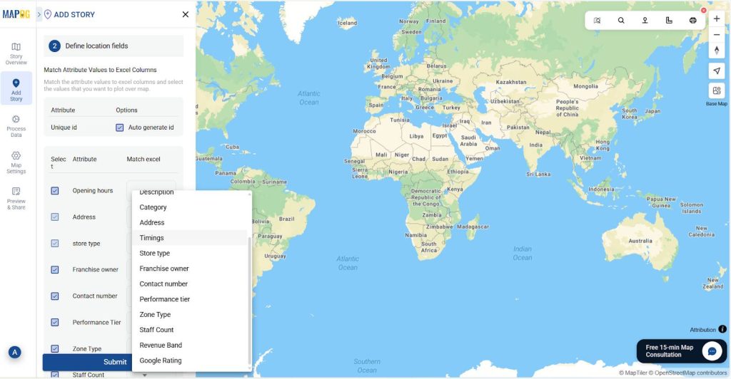
For placement, choose either coordinates or WKT,align them, and click Submit.
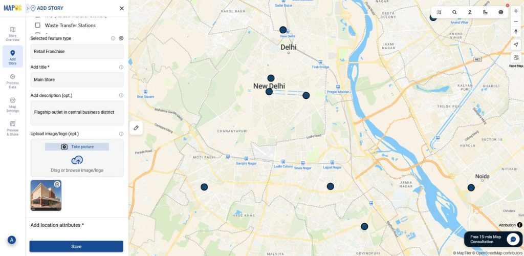
6. Add Categories to Organize Your Map
Additionally, to make your map more interactive, add categories. Click the Pencil Icon on a point, select Edit Point details.
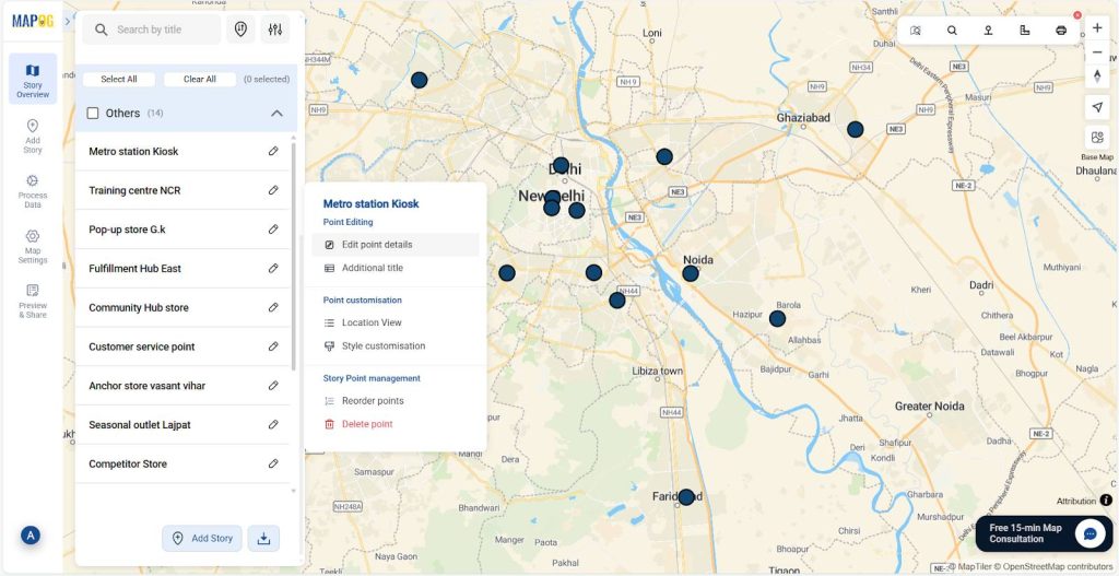
Then, create categories like Retail Franchise or Corporate by clicking the Select Category Settings icon and using the Add More Categories section.
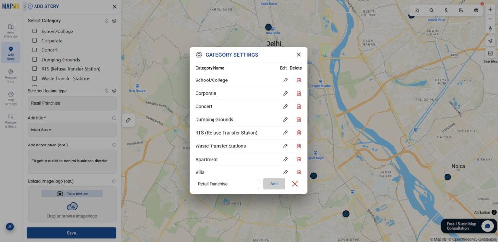
Also, enrich individual points by uploading relevant images, for added context and clarity.
7. Style Layers
You can also customize your map visuals, for that go to Add Layer Style in the layer panel and choose icons and colors based on categories so each layer can stand out.
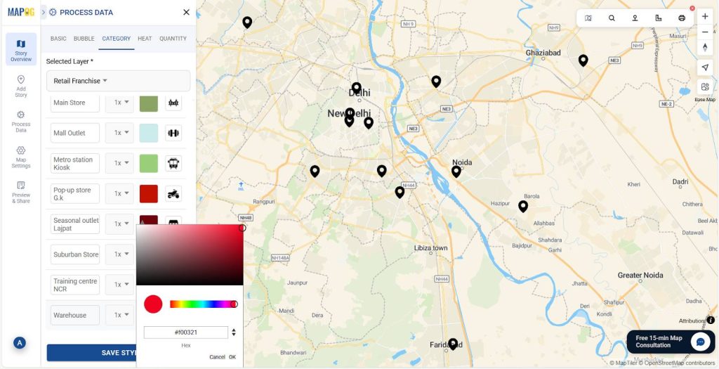
That’s it your map is now ready: layered, clickable, and presentation-friendly.
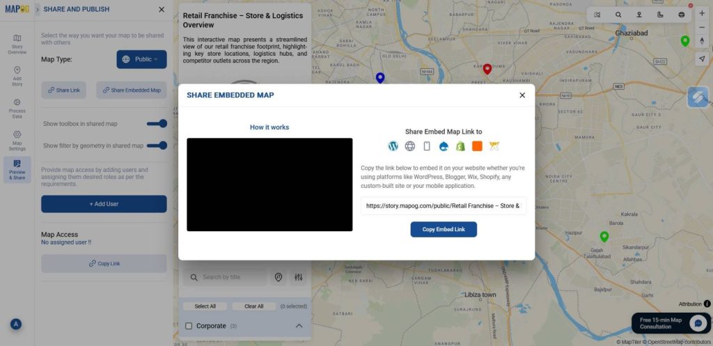
8.Preview and share
Lastly, head to the “Preview and Share” section. Set the visibility to Public, then copy the share link or embed code to make your map easily accessible to teams, clients, or stakeholders.
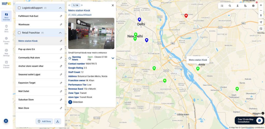
Industrial use and benefits
Interactive maps don’t just organize data; instead, they transform how it’s experienced. Through layering attributes, styling categories, and enabling exploration, platforms like MAPOG turn complex details into clear, visual stories. whether it’s retail teams comparing outlet performance, logistics planners mapping routes, municipal staff showcasing infrastructure, or marketers targeting zones, interactive maps make presentations more intuitive, engaging, and memorable.

Conclusion
At the end of the day, a good presentation isn’t just about showing data; instead, it’s about helping people see what matters. That’s why interactive maps built in MAPOG are so effective. They help turn scattered details into layered stories, making it easier for audiences to follow, compare, and connect. Whether you’re presenting franchise data or planning overlays, using interactive maps for presentations ensures your audience sees not just the data, but the story behind it.
Here are some other blogs you might be interested in:
- Mapping Borewell Locations Near Rivers and Lakes with GIS-Based Tools
- How to Map and Share Retail Store Locations for Your Franchise?
- How to Organise Your Property Hunt: Pin Live Locations, Add Photos, and Manage All Details on One Interactive Map
- How to Create Map, Share, and Embed Your Retail Business Locations