When managing multiple branches, one persistent challenge is the lack of clarity around how customer coverage compares from one location to another. As a result, teams often struggle to make informed decisions. Without a structured way to compare customer coverage across multiple branches, they may rely on assumptions rather than spatial evidence. MAPOG helps solve this by enabling centralized mapping workflows that visualize branch reach, highlight coverage gaps, and bring spatial clarity to data that would otherwise remain fragmented.
Key Concept: Why to Compare Customer Coverage
Although branch-level data may seem complete, without spatial comparison, key coverage gaps often remain hidden. By contrast, when you compare customer coverage across multiple branches, patterns like blind spots, overlaps, and uneven reach begin to emerge. As a result, teams can prioritize outreach, balance workloads, and coordinate more effectively.
Step-by-step guide to compare customer coverage
1. Open Your Map
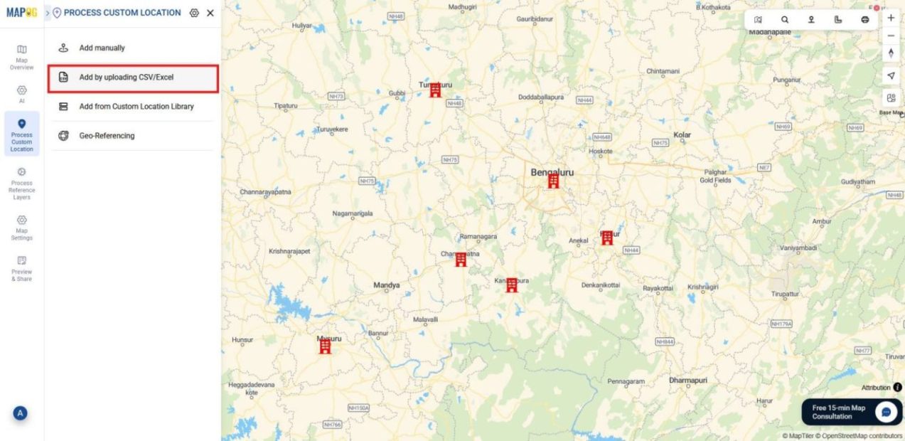
Start by logging into MAPOG and opening the pre-existing Branch Location Map. Then, go to the process custom location section and select Add by Uploading CSV/Excel to begin uploading your customer data.
2️. Create a Customer Location Type
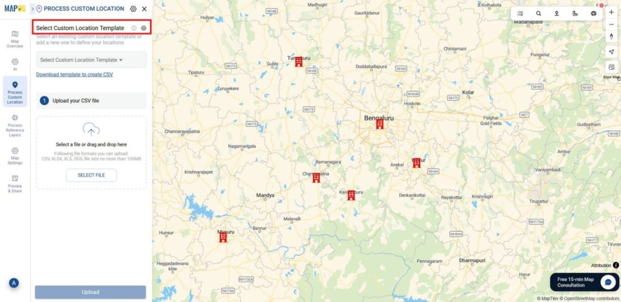
Next, click the Select custom location template Settings icon to define your customer data attributes.
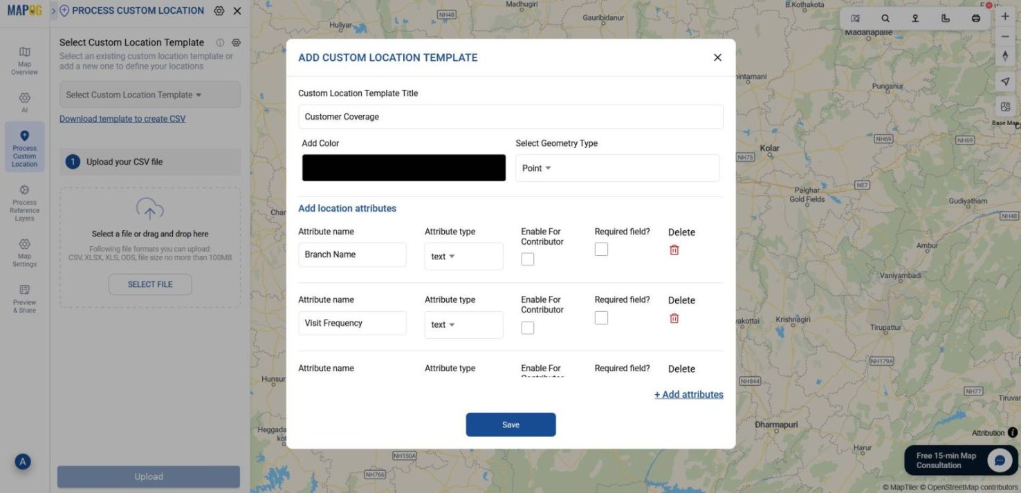
Choose Add More Location Type, name it something like “Customer Coverage”, and define attributes such as Branch Name, Visit Frequency, and Purchase Amount—making sure each is assigned to its correct attribute type. Once done, click Save.
3️. Upload Your Customer File
Now, select the location type you just created from the drop-down. Browse and upload your customer data (CSV/Excel) file containing coordinates and attribute details.

4️. Match Attributes and Submit
After uploading, choose a unique ID, match each attribute to the corresponding column in your file.
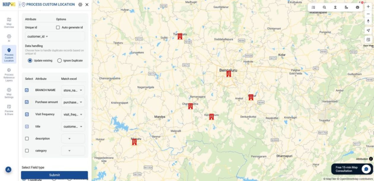
For placement select either Coordinates or WKT. Then, click Submit to plot your customer points on the map.
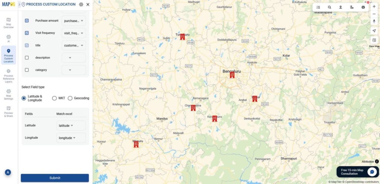
5. Style by Branch
Once your customer points are plotted, go to Map Layers, open the Customer List Layer Panel, and click Add Style Layer.
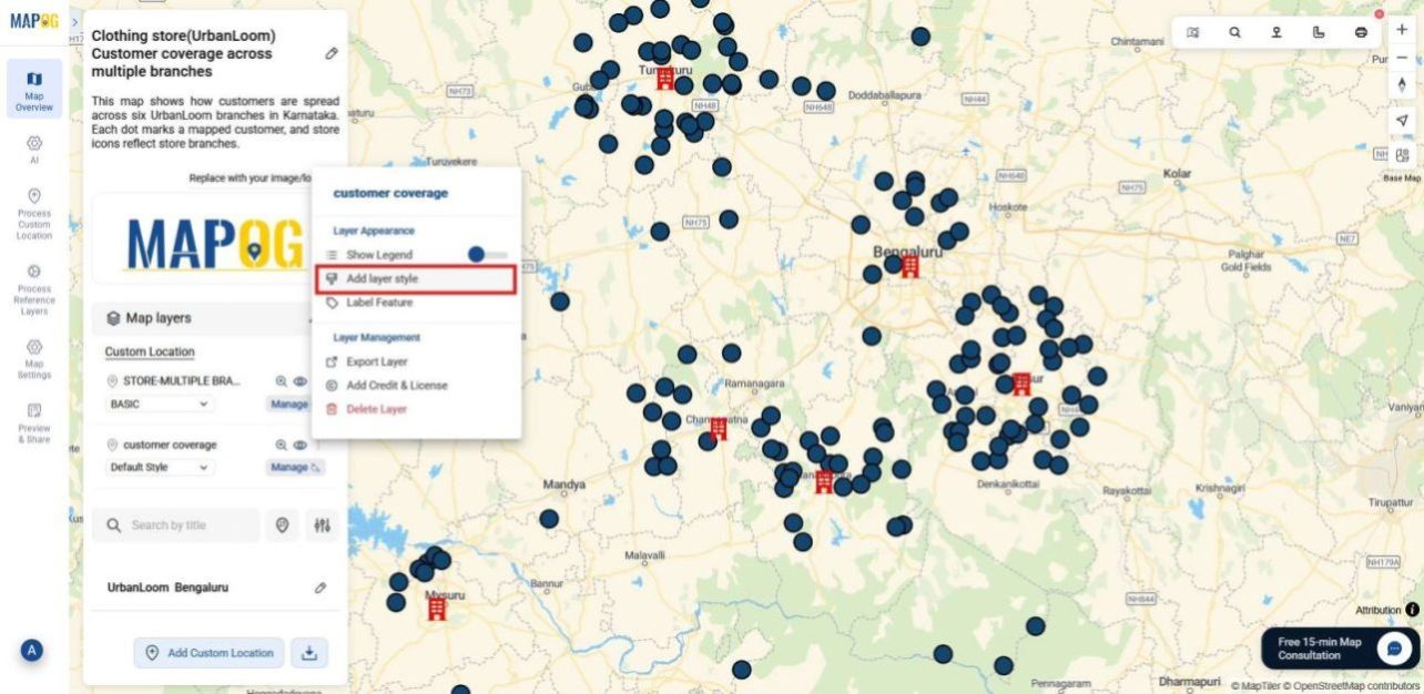
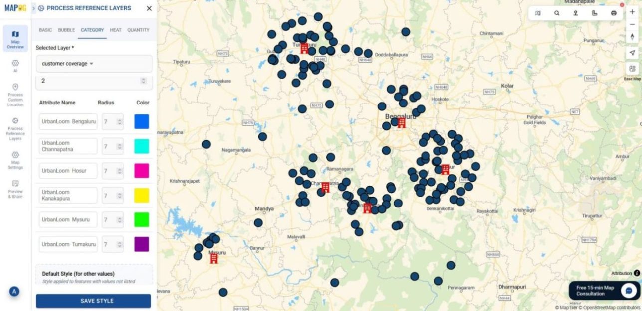
In the Category section, select Branch Name as the attribute to categorize points according to that.

After that, color-code customer points by branch and adjust point size for visual clarity and then click save style.
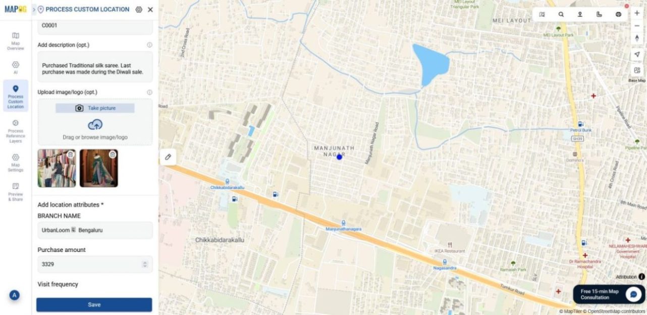
Then, after styling, click on each customer point ID and hit the Pencil icon to open Edit Point Details.
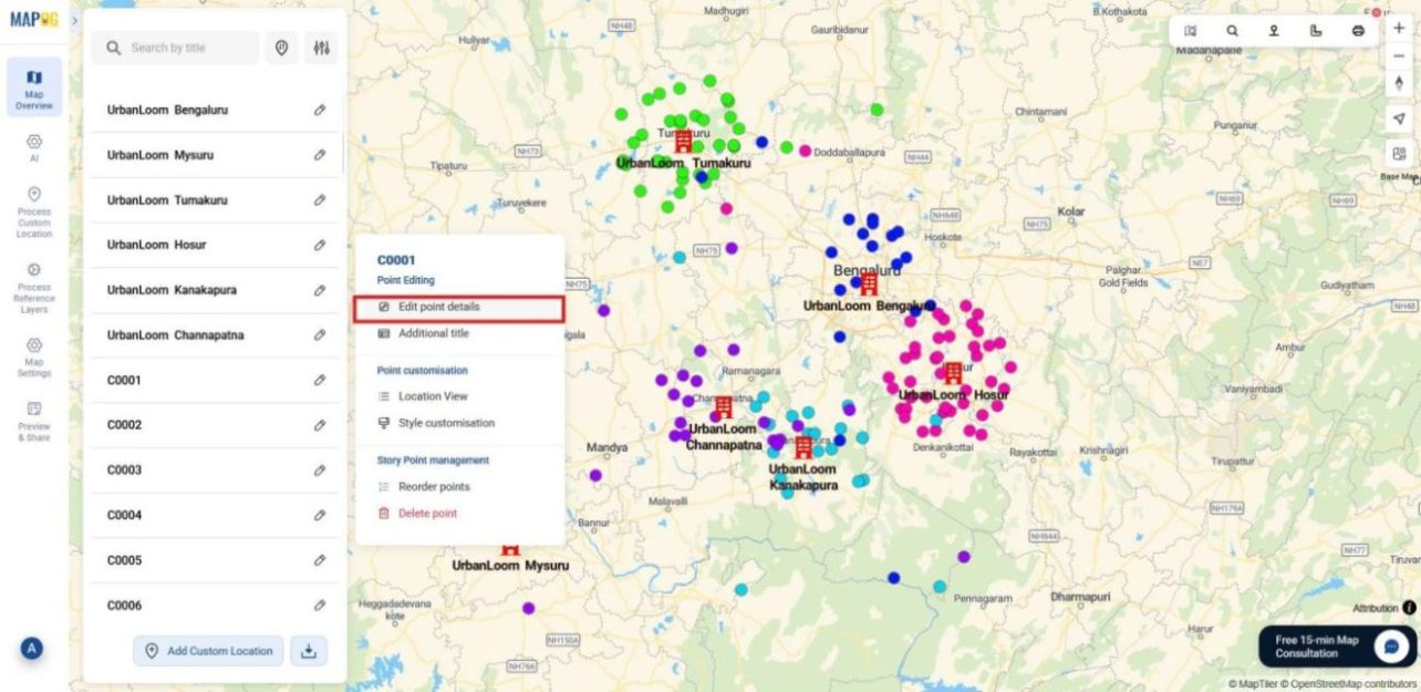
Here, you can update attributes and add relevant images to enrich each point. Once done, click Save to apply your changes.
6. Show Legend
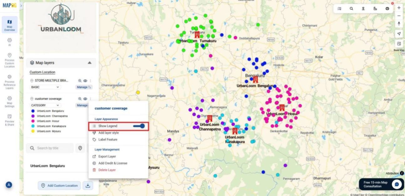
To wrap up, go to the Customer Layer Panel and select Show Legend. This adds a visible key to your map, showing which colors correspond to which branches, making it easier to interpret customer distribution at a glance.
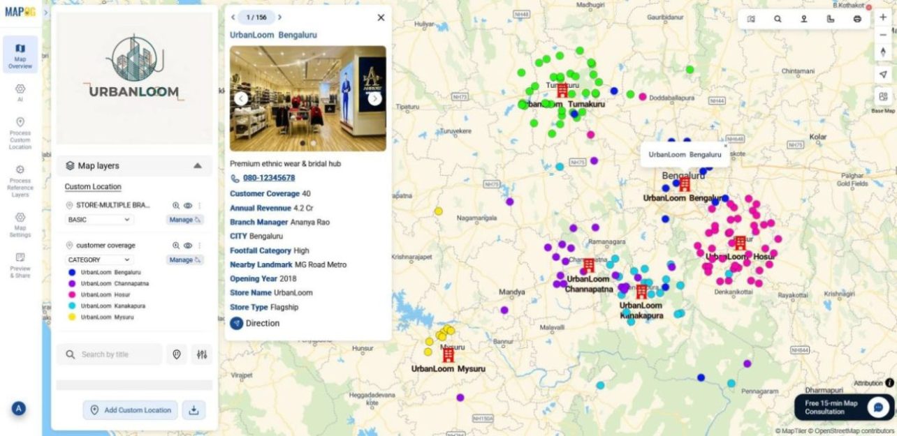
Your customer coverage map is now ready, visually showing which branches are clustered with customers and which need more attention.
Industrial use and benefits
Across sectors, comparing customer coverage across branches unlocks new clarity. For instance, in retail, it highlights which outlets are overserved and which lack footfall. Meanwhile, field service teams can identify overloaded hubs and rebalance technician zones. Similarly, NGOs can compare outreach density across field offices and redirect resources to under-served areas. Even banks and telecoms benefit by visualizing customer spread across branches, making it easier to optimize staffing, marketing, and expansion strategies.
Conclusion
Ultimately, comparing customer coverage across branches helps teams shift from scattered data to clear, map-based insight. Teams visualize customer clusters, spot under performing branches, and assess resource distribution to make grounded, effective decisions. Through centralized workflows and intuitive styling, MAPOG makes this process efficient, turning raw location data into clear, actionable insight.
Here are some other blogs you might be interested in: