In today’s competitive market, businesses thrive when they analyze customer distribution effectively. Therefore, understanding where your customers come from, how frequently they purchase, and how their spending patterns vary across regions becomes crucial. Moreover, this insight helps you make smarter sales and marketing decisions. Fortunately, interactive mapping with MAPOG simplifies this process even further, allowing you to visualize and compare customer data in a meaningful and engaging way. As a result, by integrating your customer dataset and using map layers, you can uncover hidden trends, improve targeting, and plan strategic growth effortlessly.
Key Concept: Analyze Customer Distribution
Furthermore, when you analyze customer distribution, you gain actionable insights about your audience’s geography and purchasing behavior. Consequently, with this knowledge, businesses can redirect promotions, allocate inventory efficiently, and decide where to open new branches with greater confidence. Additionally, MAPOG makes this smoother through its Add by uploading CSV/Excel and Add style layer features, which together streamline the process of turning static data into dynamic map visuals.
Step-by-Step Process to Analyze Customer Distribution
Step 1: Uploading Customer Data to Begin Mapping
To begin the journey to analyze customer distribution, go to MAPOG and open your pre-existing store location map.
Step 2: Upload and Process Custom Data
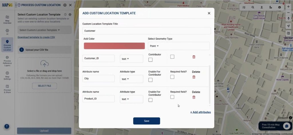
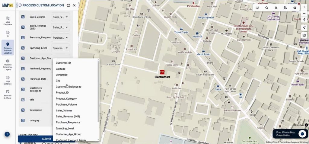
To begin, navigate to the Process Custom Location option, and then click “Add by uploading CSV/Excel”. Next, under Select Custom Location Template, add a new attribute type named Customer and set its feature as Point. After that, define essential attributes such as purchase volume, sales volume, purchase frequency, and spending level. These parameters, in turn, help you differentiate and categorize customer data visually on the map, thereby adding more depth to your analysis.
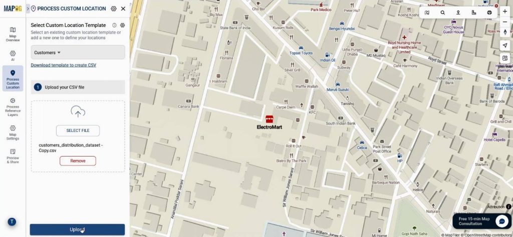
Select your recently created custom template, upload your CSV file that includes fields such as latitude, longitude, purchase volume, and spending level. This allows the system to precisely place every customer on your interactive map.
Step 3: Match Coordinates and Submit
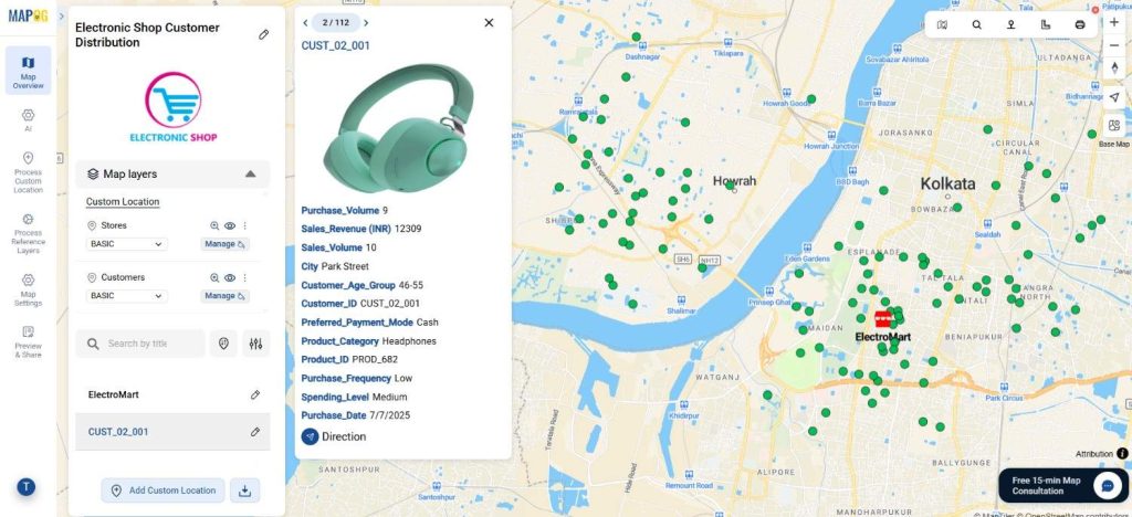
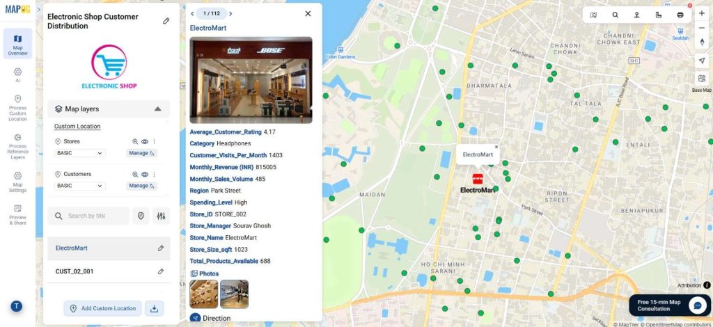
Set the Customer ID is as a unique identifier. Match your Excel columns with the relevant attributes and select latitude and longitude fields as coordinates. Once submitted, your customer locations will automatically plot on the map, revealing spatial patterns that would be hard to see in a spreadsheet.
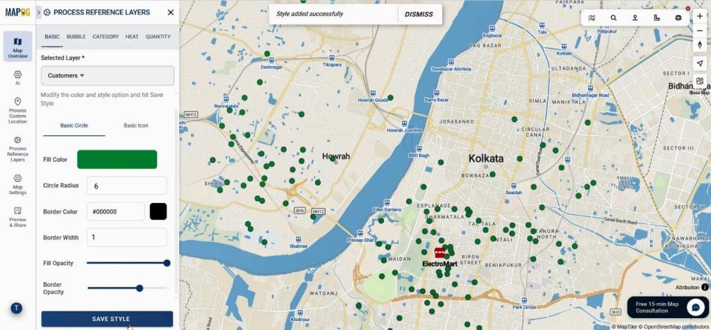
Step 4: Customize the Visual Layers
Now comes the exciting part—styling your map. Go to the Add Style Layer option, select Basic Style, and assign colors to your customer points. This color coding enhances readability and helps you analyze customer distribution visually. Save your settings once satisfied with the style.
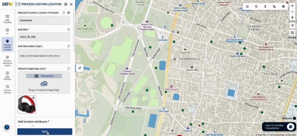
Step 5: Add Details and Final Touches
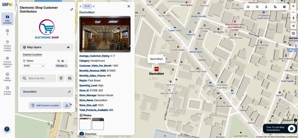
In the Customer Edit Point Details section, you can enrich each point by uploading relevant images—like store photos, product visuals, or customer snapshots. This not only personalizes your map but also creates a richer narrative layer to your analysis. After saving your edits, you’ll have a complete visualization that’s both functional and visually appealing.
Industry Use & Benefits
The ability to analyze customer distribution benefits a wide range of industries—from retail and logistics to real estate and marketing. Retailers can pinpoint high-demand zones, logistics firms can optimize delivery routes, and marketers can tailor regional campaigns. MAPOG’s Add by uploading CSV/Excel and Add style layer capabilities make it a preferred platform for transforming raw data into actionable geographic insights.
Conclusion
In conclusion, when you analyze customer distribution through interactive map layers, you move beyond basic analytics to spatial intelligence. By using MAPOG’s user-friendly tools, businesses can visualize customer behavior, identify growth opportunities, and enhance decision-making in real time. If you haven’t yet explored it, visit MAPOG today and start transforming your customer data into meaningful visual stories.