In life-threatening emergencies, every second counts. Consequently, ambulances must reach patients quickly. However, in many cities, emergency response times are slowed down by poor planning, traffic congestion, or lack of infrastructure. This is precisely where Geographic Information Systems (GIS) step in. Platforms like MAPOG are transforming how cities visualize Ambulance Accessibility & Response all without writing a single line of code.
In this article, we’ll walk through a step-by-step guide to building an interactive, ambulance accessibility map using MAPOG. Whether you’re a city planner, public health official, or researcher.
Key GIS Concepts for Ambulance Accessibility & Emergency Response Planning
Ambulance accessibility mapping plays a vital role in emergency response planning by showing how quickly medical assistance can reach various parts of a city or region. To make this possible, Geographic Information System (GIS) tools such as Isochrones, Buffer zones, and Clip analysis help visualize ambulance coverage and highlight areas that may be underserved. Through this approach, planners and public health officials can make data-driven decisions when determining where to place new ambulance stations or how to optimize existing routes.
In addition, MAPOG simplifies this process by allowing users to overlay multiple spatial data layers including hospital locations, road networks, and city boundaries without needing to write any code. As a result, users can quickly generate travel-time zones that reveal both well-served and vulnerable areas within urban or rural settings. Even without detailed population data, the visual analysis of coverage gaps provides actionable insights, making it easier to address infrastructure deficiencies and improve emergency response times citywide.
Ambulance Accessibility Mapping: A Step-by-Step Guide to Emergency Response Planning with GIS
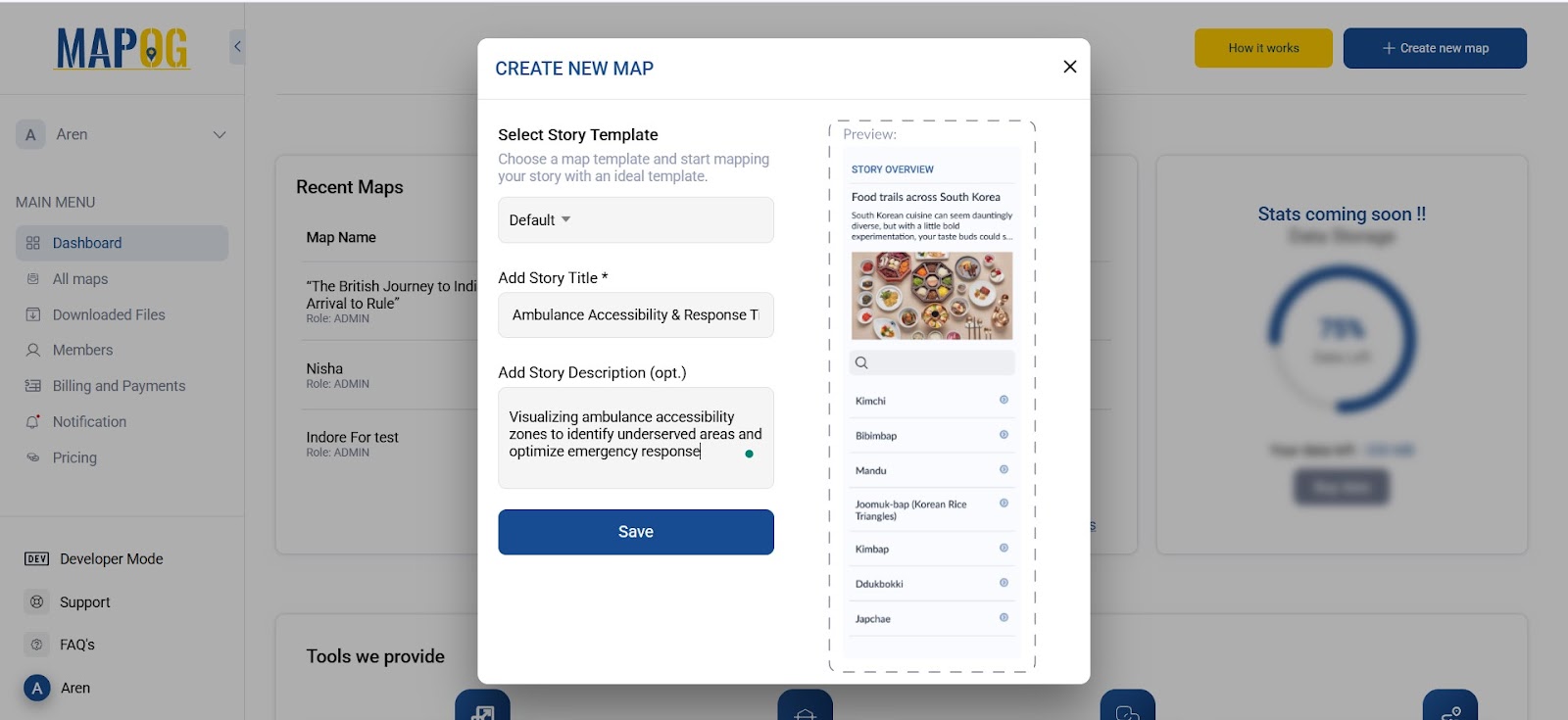
Step 1: Creating a New Ambulance Accessibility Map Project on MAPOG
To begin, Go to MAPOG. Then, click “Create New Map” to start your project. give your project a title such as Ambulance Accessibility Analysis, and write a short description like: “This map displays ambulance response time zones across key urban areas.” Click Save to begin mapping.
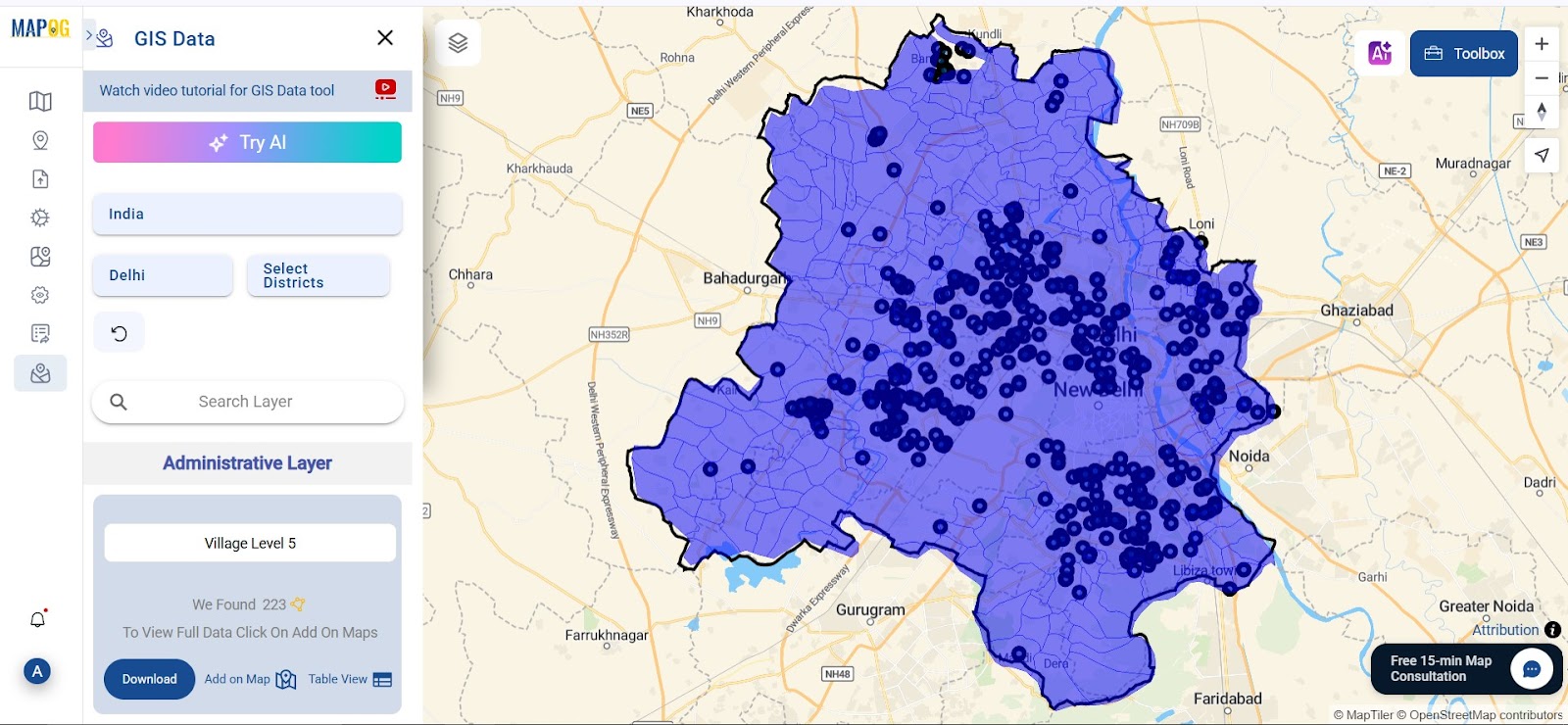
Step 2: Adding Hospital and Ambulance Station Data Layers for Emergency Response Mapping
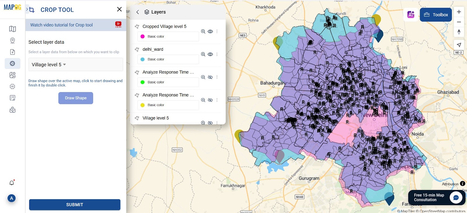
Next, go to the “GIS Data“, and choose your region (starting from the state and then drilling down to the district or sub-district). After that, select the Hospital Layer, which will load all known medical facilities onto the map as points. This will, therefore, serve as the base for your ambulance accessibility mapping.
Step 3: Use Isochrones to Map Ambulance Response Time Zones
Choosing Isochrones Parameters
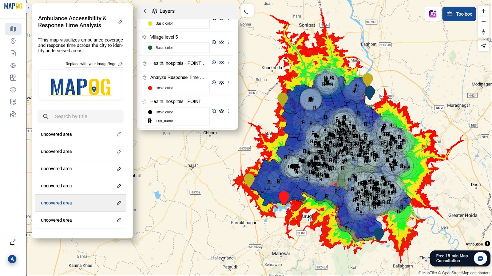
To calculate how far an ambulance can reach within a specific time, after completing your base layers, first navigate to “process” then go to “Isochrones.” then Choose the hospital layer as the input. Set the travel mode to “Driving.” Input time intervals of 15, 20, and 25 minutes. Click Run, and MAPOG will generate three concentric zones .
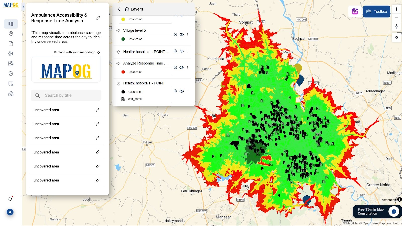
Now go to the Style layer tab and color the zones clearly—green for 15 min, yellow for 20 min, and red for 25+ min. This helps in immediately identifying areas with strong or weak coverage.
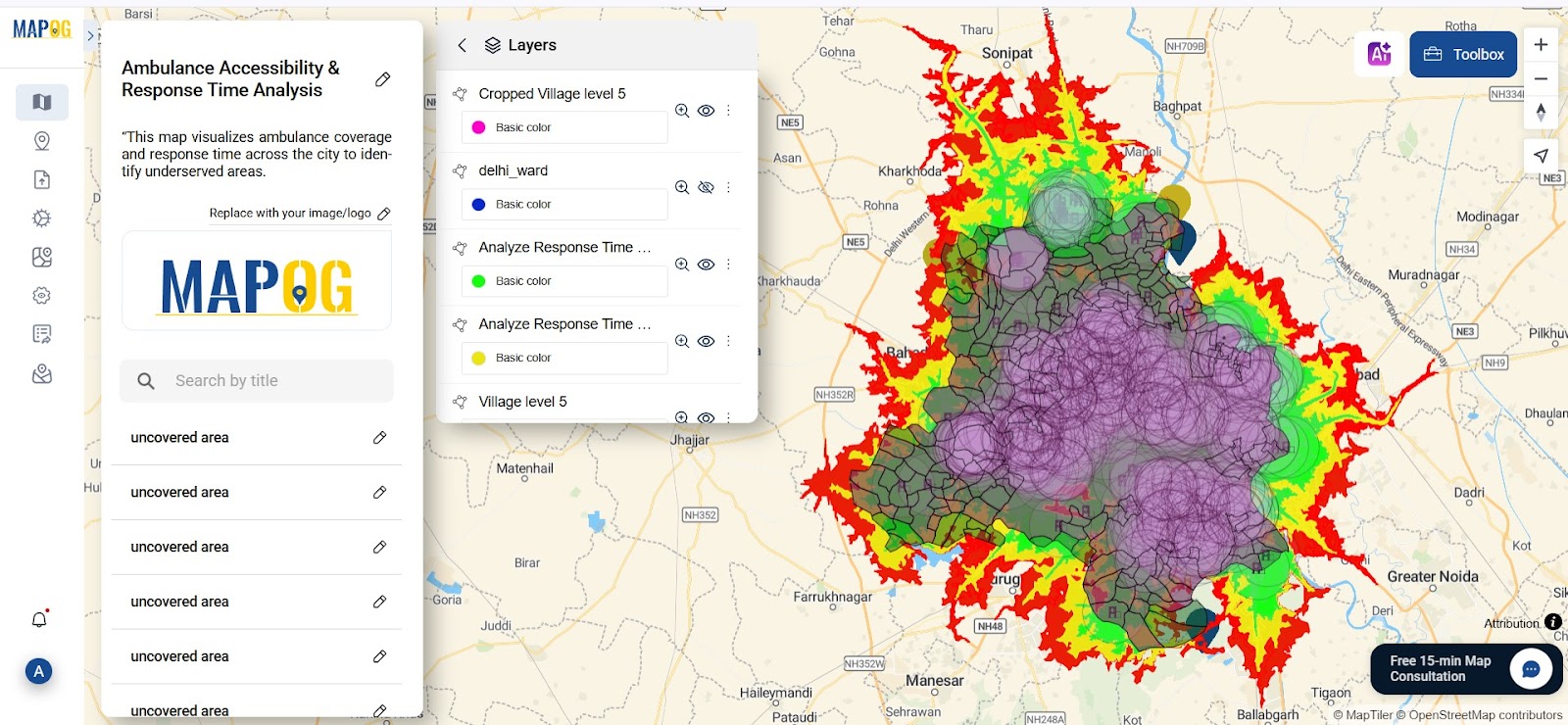
Step 4: Applying Buffer and Clip Tools to Detect Emergency Coverage Gaps
To visualize geographically underserved areas: Click on “process” and then choose “Buffer Tool. ” then select the hospital layer and set the radius to 3000 (3 km). Run the tool to create static buffer zones.
Next, return to the GIS Data section. , and After selecting your city boundary layer, next proceed to the “Clip Tool”. Use the city boundary as the input and your buffer or isochrone layer as the clip layer.
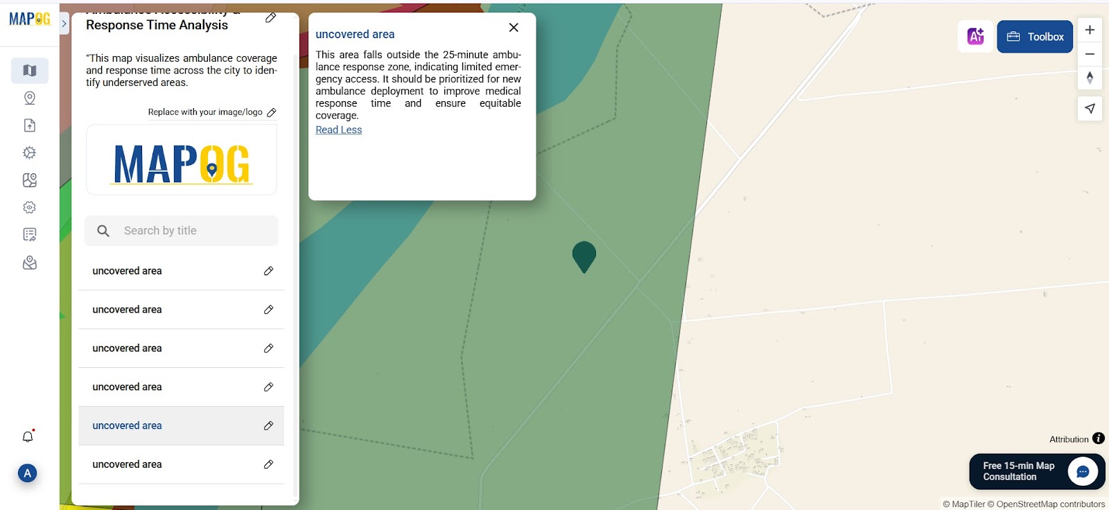
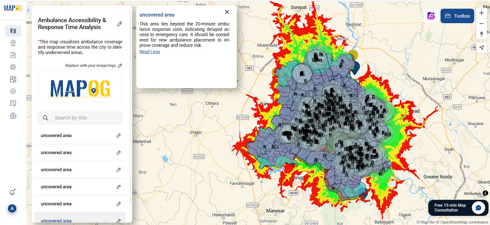
Step 5: Manually Observe Underserved Areas for Better Emergency Planning
At this stage, first visually scan areas beyond the isochrone zones. Then, use the “Add point” option to mark them. Next, choose a manual point marker and label it as either “Uncovered area residential” or “Outside emergency range.” Furthermore, add a population layer for better understanding and interpretation. Finally, review all marked points to ensure accuracy.
In addition, add a population density layer to correlate gaps in coverage with high-risk populations. This step improves accuracy in identifying underserved regions.
Step 6: Suggest New Ambulance Locations Using Map Observation
Finally, observe which parts of the city are furthest from any ambulance point. Mark these with a new point layer titled “Recommended location for new ambulance station.
How MAPOG Simplifies Ambulance Accessibility Mapping Without Coding Skills
- No Coding Required – Designed for both technical and non-technical users
- Built-in GIS Tools – Isochrones, Buffers, Clip, and Styling in one platform
- Flexible Styling – Add notes, colors, and multimedia for clarity
- Export & Share – Create PDF reports or share live maps instantly
- Free Tier Available – Start analyzing without a subscription
GIS Data Used
Conclusion: Enhancing Ambulance Accessibility and Emergency Response Times with GIS
In cities where delays cost lives, Ambulance Accessibility Mapping is not just a life-saving tool; it’s a public safety priority. With MAPOG, emergency service teams, NGOs, and government bodies can create professional, data-backed response maps in just minutes.
Whether it’s identifying coverage gaps or planning new ambulance hubs, these maps empower faster, smarter, and more equitable medical care delivery across urban and rural zones.
Here are some articles you might be interested in :
Role Of GIS in Irrigation Planning Using Water Resource Management