Identifying Areas with Limited Access to Doctors and Medical Facilities
Mapping healthcare deserts in India helps expose one of the biggest barriers to healthcare access: geography. Although access to healthcare is a fundamental right, how soon someone can reach a hospital often depends more on location than need. Healthcare desert mapping—regions where timely access to medical care is out of reach—is one way to reveal hidden gaps in our health infrastructure. Whether you’re planning rural health services, coordinating emergency response, or evaluating healthcare equity, spatial mapping, therefore, clarifies what spreadsheets cannot.
Thanks to tools like MAPOG, it has become possible to visualize healthcare accessibility with travel-time isochrones, superimpose them on population information, and indicate underserved areas without requiring sophisticated GIS knowledge.
Understanding Healthcare Deserts in India
Before diving into the mapping process, it’s important to understand what a healthcare desert actually is. A healthcare desert refers to a geographic area where essential medical services are either completely unavailable or difficult to reach within a reasonable travel time.
In India, mapping healthcare deserts often reveals underserved areas like:
- Rural or tribal belts with low population density and poor road infrastructure
- Hilly or desert regions where terrain limits accessibility
- Urban slums where population pressure exceeds local healthcare capacity
These areas are not just underserved—they are structurally excluded from basic medical access, which can lead to increased disease burden, higher maternal and infant mortality rates, and delayed treatment during emergencies.
Common characteristics of healthcare deserts include:
- Fewer than 1 doctor per 10,000 people
- No Primary Health Centre (PHC) within 5 km
- No hospital reachable within 30–45 minutes of travel
- Long distances to emergency or specialist care
“Mapping Healthcare Deserts in Indian States: A Time-Distance Accessibility Story” offers a powerful spatial narrative on how geography shapes health outcomes. Using layered drive-time isochrones, this analysis visually exposes the gaps in hospital access across India’s diverse terrain. From remote desert districts to overcrowded urban fringes, the map uncovers inequities in healthcare reach that raw facility counts fail to reveal.
Step-by-Step: How the Map Was Created Using MAPOG
Step 1: Access the MAPOG Platform
To begin, head over to MAPOG.
Once on the homepage:
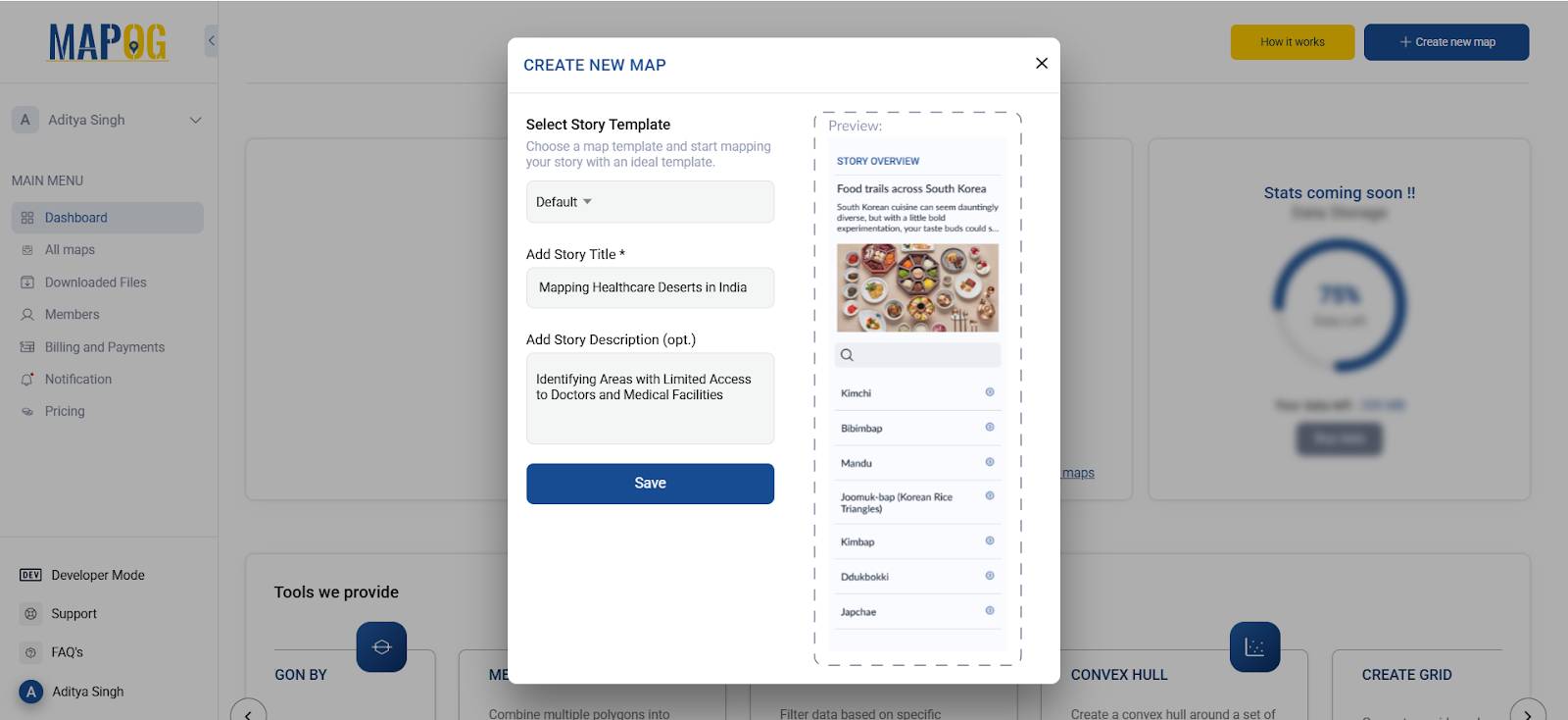
- Click “Create” to start building your map
- Click “Create New Map”
- Add a title and description for your map (e.g., “Mapping Healthcare Deserts in Rajasthan”)
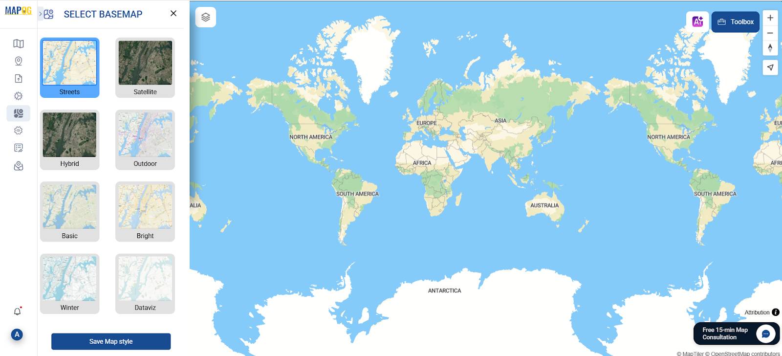
- Choose a suitable base map (e.g., Satellite, Terrain, or Street View)
Step 2: Importing Essential GIS Layers
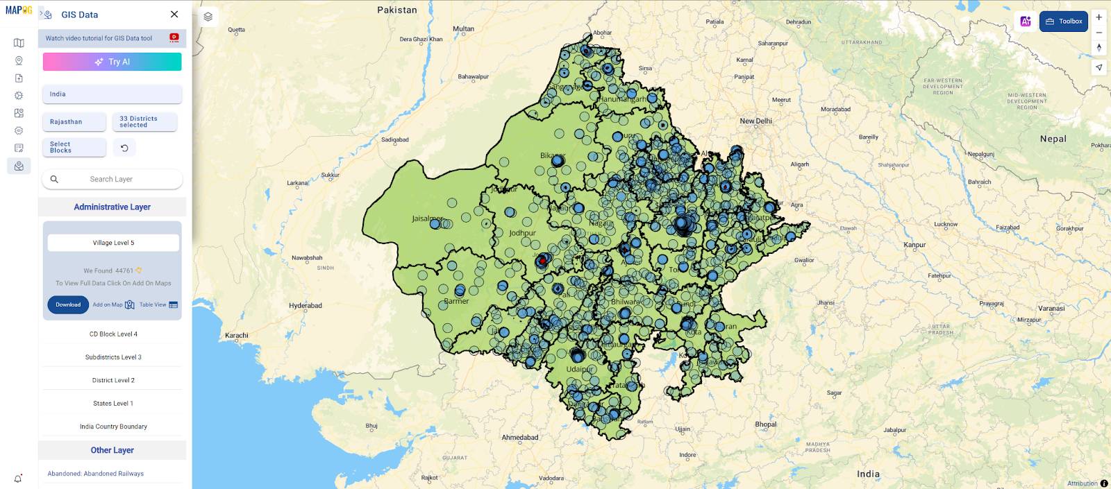
We need a certain dataset when we first access the MAPOG interface. By selecting the GIS Data option, we may obtain a variety of pre-existing GIS data from the platform, which we can then add to a map and begin working.
So, import important datasets first:
- Rajasthan District Boundaries
- Hospital Locations
- Cities, Towns, and Villages for Rajasthan State
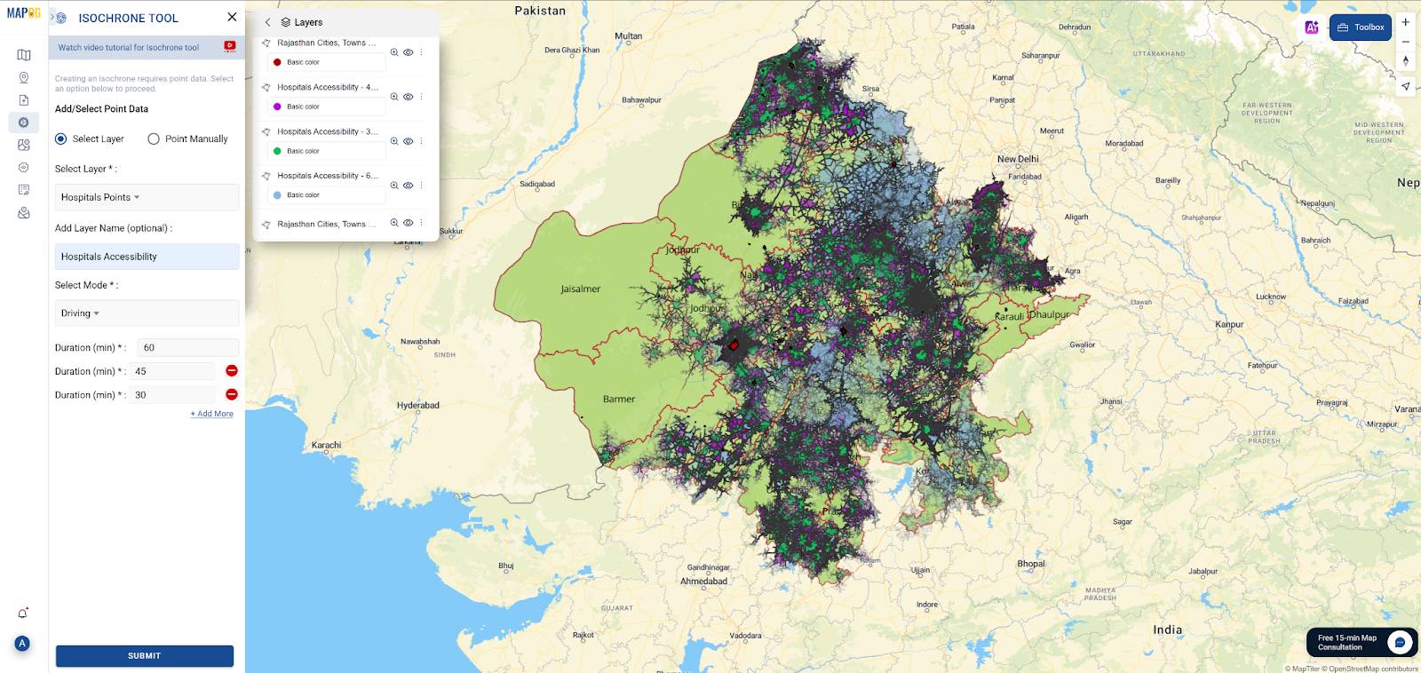
Step 3: Use the Isochrone Tool
- Select the Isochrone Tool from the Process Data tab in MAPOG
- In the tool, first select the “Hospital Locations” layer from the dropdown menu
- Then, enter time intervals: start by adding 60 minutes, then 45 minutes, and finally 30 minutes
- Set travel mode to “Driving” for realistic rural travel speeds
- Click “Generate Isochrones” to create accessibility zones
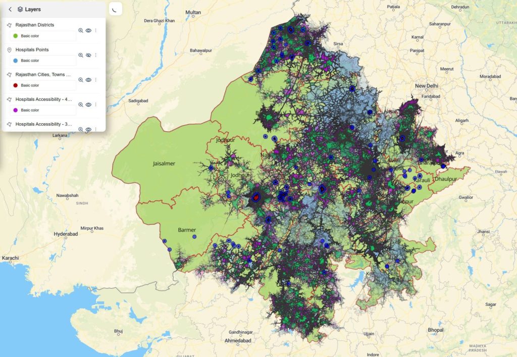
The tool automatically generates polygons showing how far each hospital can be accessed within those time limits
Now that the isochrone polygons have been generated, the next step is to style them for better visual clarity—so that each travel-time zone is easy to interpret on the map.
- Go to the Layer Panel and locate the isochrone layer.
- Click on more options and in that under Layer Appearance select the Style Layer option
- Under the styling options, assign distinct colors to each time buffer:
🟩 Set light green for the 30-minute zone — this represents optimal access to healthcare.
🟪 Use purple for the 45-minute zone — this indicates acceptable reach.
🟦 Apply dark blue for the 60-minute zone — this marks the edge of accessibility.
Any areas outside these zones remain unstyled—these are healthcare deserts, where no hospital is accessible within an hour.
Step 4: Generate Buffer (5 km Radius)
Go to the “Process Data” tab and select the “Buffer Tool”
In the Buffer Tool:
- Choose the village settlement layer as input
- Set the buffer distance to 5 kilometers
- Name the output layer something like “5 km Village Buffers”
Click “Generate Buffer” to create circular buffer zones around each village.
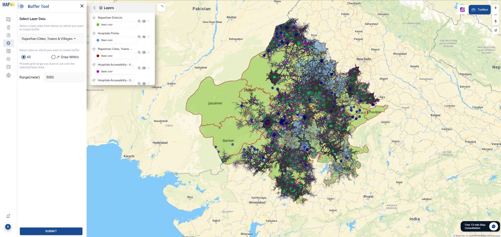
To strengthen the spatial analysis, we created a 5-kilometer buffer around villages and towns that fall outside the 60-minute hospital accessibility zone—also known as the healthcare desert. As a result, these blue circular buffers help visually highlight areas where people live but have no realistic access to critical healthcare within a timely driving distance. Moreover, these buffer zones represent communities at high risk due to their distance from timely medical care. Because of this, a 5 km buffer is a practical measure of walking or short-distance travel range for rural communities in India, particularly where public transport is sparse.
By applying this buffer, we can prioritize villages for:
- Mobile health units
- New PHCs or CHCs
- Emergency service outposts
- Telemedicine hubs or outreach programs
Step 5: Proposing New Healthcare Facility Sites Using GIS
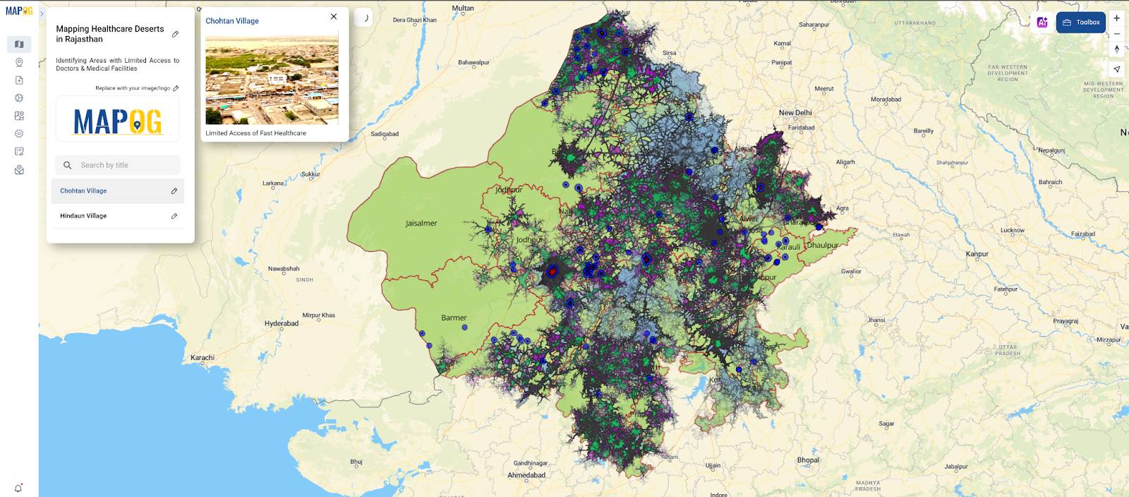
Once the underserved villages and their 5 km buffer zones were visualized, the “Add Point” feature in MAPOG’s Add Story section was used to propose potential sites for new healthcare facilities. These proposed points are manually placed within or near high-priority buffer zones—locations identified through combined spatial analysis of isochrones and settlement layers.
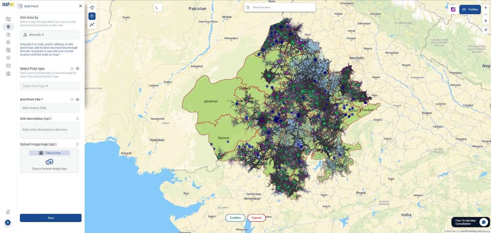
Each point can be labeled with a name, description, and even include a photo or rationale for its selection. This provides clarity and context for decision-makers.
Industry Use & Benefits of Healthcare Desert Mapping
Why is mapping healthcare deserts so impactful? Because it converts scattered facility data and population locations into visually intuitive, actionable insights. By identifying where healthcare access is limited—or nonexistent—this type of analysis can drive better policy, funding, and field-level decisions.
Some real-world applications include:
- Government Agencies: Planning new PHCs, CHCs, and hospitals in underserved regions with clear spatial justification
- Public Health Departments: Improving emergency response times by mapping accessibility gaps
- Nonprofits & NGOs: Deploying mobile health clinics or telemedicine services to areas beyond the 60-minute access zone
- Academic Researchers: Studying the correlation between healthcare access, mortality rates, and rural deprivation
These examples highlight how mapping healthcare deserts in India can directly support data-driven decision-making across sectors.
Conclusion: Map, Analyze & Act on Healthcare Gaps
Mapping healthcare deserts is more than just illustrating access—it’s about identifying disparities, guiding focused interventions, and enabling data-driven healthcare planning. With tools like MAPOG, planners and academics can easily identify underserved communities, measure travel-time gaps, and recommend actionable, location-specific solutions.
Your map transforms from a simple visual aid to a tool for healthcare equitable decision-making by integrating isochrones, settlement data, and buffer analysis.