At first glance, raw data on a map often looks like scattered points with little meaning. Although the information is there, the story remains hidden. As a result, patterns are difficult to spot, categories blur together, and intensity feels impossible to judge. That’s why it matters to understand different styling options on a map . Instead of leaving users stuck with cluttered visuals, MAPOG makes the process simple as it provides smooth transitions between heat maps, category styles, bubble maps, and quantity maps, insights appear clearly, even without technical expertise.
Key Concept: Why to Understand Different Styling Options on a Map Matter
When raw points feel overwhelming, styling brings clarity. For instance, heat maps highlight density, showing clusters. In contrast, category styling separates types, making diversity visible. After that, bubble maps emphasize magnitude, letting larger values stand out. Moreover, quantity styling reveals intensity. Together, these views turn scattered data into insights.
Steps to use and Understand Different Styling Options on a Map
To make the workflow easy to follow, let’s take public transport coverage across the city as an example.
1.Go to Add layer style
Begin by heading to MAPOG and after creating a custom location template and uploading your CSV or Excel file. Once the data is ready, open the Layer Panel and select Add Layer Style. This is where the transformation begins. All styling options, including Heat, Bubble, Category, Quantity, and Basic, are available here to shape your visualization.
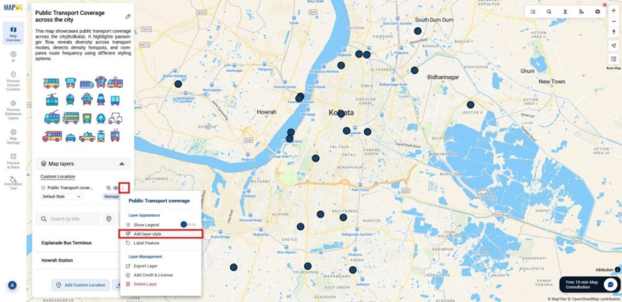
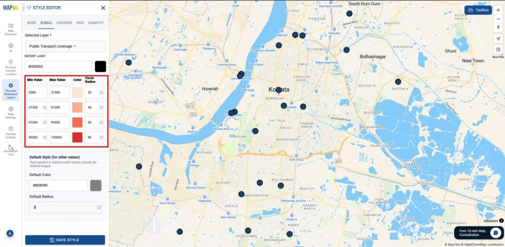
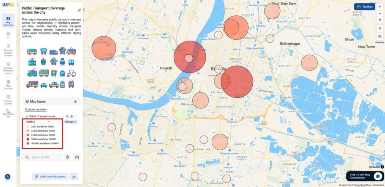
2.Bubble Map styling
The Bubble Map scales stops by total no. of passengers in a day. Bigger bubbles highlight busy hubs, smaller ones show quieter stops.
How to Apply:
Select attribute as total passengers in a day.
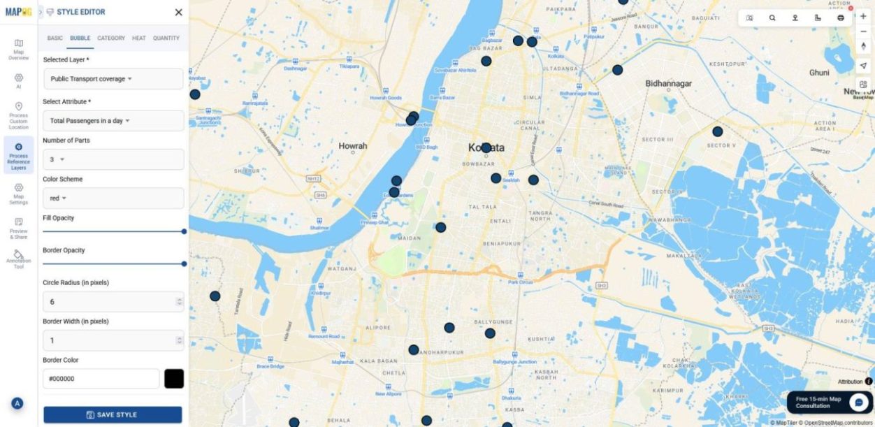
Set number of parts between 3–10, pick a color scheme, and set minimum ranges. Then adjust opacity and radius for variation and save style.
Outcome: Passenger flow becomes instantly visible, showing where demand is highest.
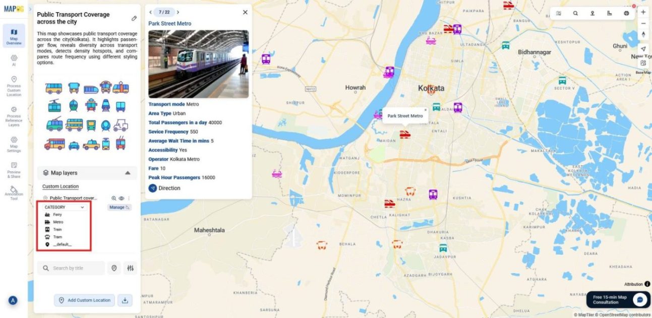
3.Category Map styling
The Category Map colors stops by Transport Mode (bus, metro,train), making the network’s diversity clear.
How to Apply:
Use Transport Mode as the attribute.
Assign distinct colors and icons and refine with size/opacity adjustments.
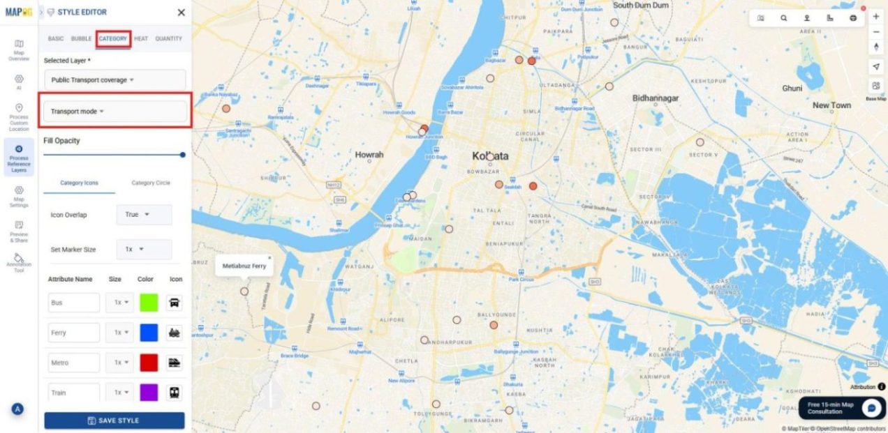
Outcome: Each mode stands out in its own color and icon, making comparisons across services effortless.
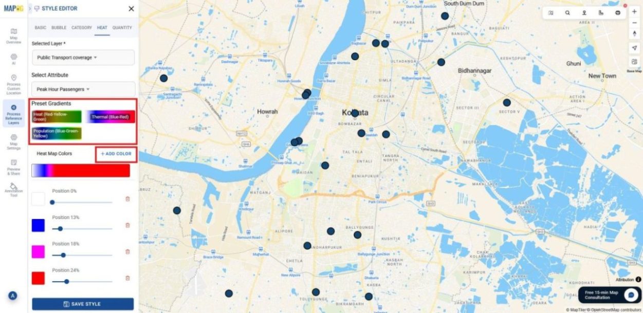
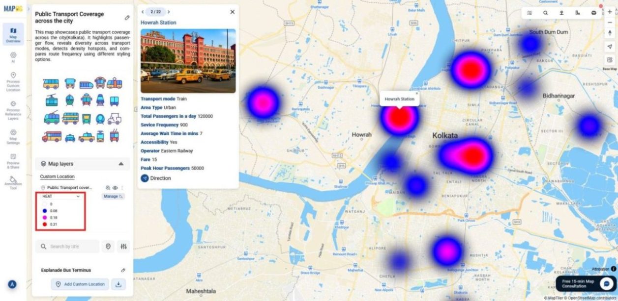
4.Heat Map styling
The Heat Map highlights areas of high and low passenger activity during peak hours, showing where demand is strongest and where service gaps may exist.
How to Apply:
Choose Peak Hour Passengers as the attribute.
Set preset gradients or add custom colors, and adjust the positions of the colors.
Fine‑tune radius, intensity, and opacity, then save the style.
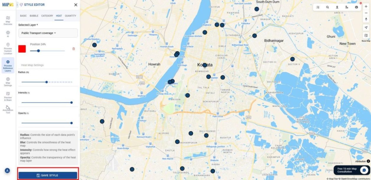
Outcome: Zones with heavy rush‑hour traffic glow brighter, while areas with lighter demand fade, helping you quickly identify congestion hotspots and underserved regions.
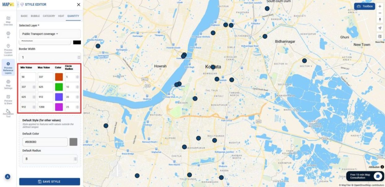
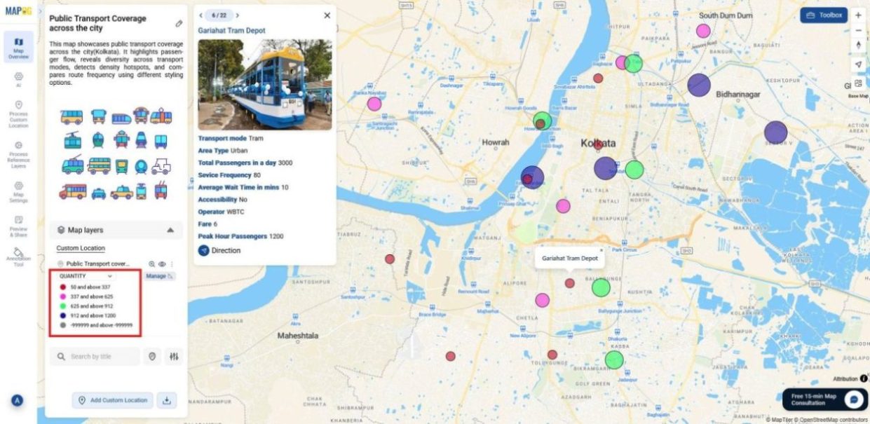
5.Quantity Map styling
The Quantity Map shades transport stops by Service Frequency, showing how often each mode or stop operates.
How to Apply:
Select Service Frequency as the attribute.
Set number of parts between 3–10 in which data will be divided.
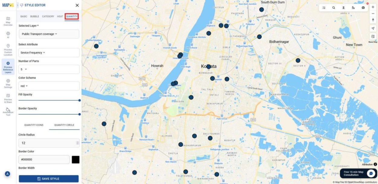
Choose a color scheme, set ranges, adjust opacity, and decide whether to use icons or circles with a suitable radius.
Outcome: Through size and color stops or modes with frequent services stand out clearly, while those with lower frequency are easy to spot, giving a direct picture of operational intensity.
Industrial Use and Benefits
Styling options extend beyond simple maps and flow into industry workflows. In transportation, for example, heat map styling highlights congestion zones. Meanwhile, in retail, category styling reveals customer diversity. When applied to disaster management, quantity styling shows risk intensity. Moreover in urban planning, bubble styling emphasizes busy hubs.
Conclusion
Overall, maps should tell a story, not just scatter points across a screen. By moving from raw data into heat, category, bubble, and quantity styles, patterns start to stand out and decisions become easier. And with MAPOG, all of this happens in a way that feels simple and approachable, no code, no technical expertise, just clear insights.