Working with large datasets on a map can feel overwhelming when everything appears scattered and unorganized. By using group by to categorize your data by attributes such as state, city, project type, or customer category, you can neatly categorize and organize even the biggest datasets. This simple approach helps your maps become clearer, more manageable, and far more useful for uncovering meaningful insights. With MAPOG, you can easily organize your large datasets by grouping them together.
Key Concept of the map
Using “Group By” to categorize data is a powerful way to transform large, overwhelming datasets into clear and meaningful map visualizations. At its core, grouping lets you organize data by shared attributes such as state, city, project type, customer category, or time period so you can quickly make sense of complex information. By reducing thousands of points into manageable categories, your map becomes cleaner, easier to read, and far more efficient. Whether you’re creating a choropleth map, clusters, or category-based styling, “Group By” provides the flexibility to tailor your map to the insights you want to reveal.
Step-by-step method to create map
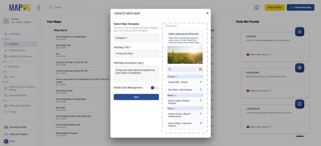
Step 1: Create a new map
Go to MAPOG and create a new map, choose the map template as ‘Category’. Further, you can add a title and description for your map and save it.
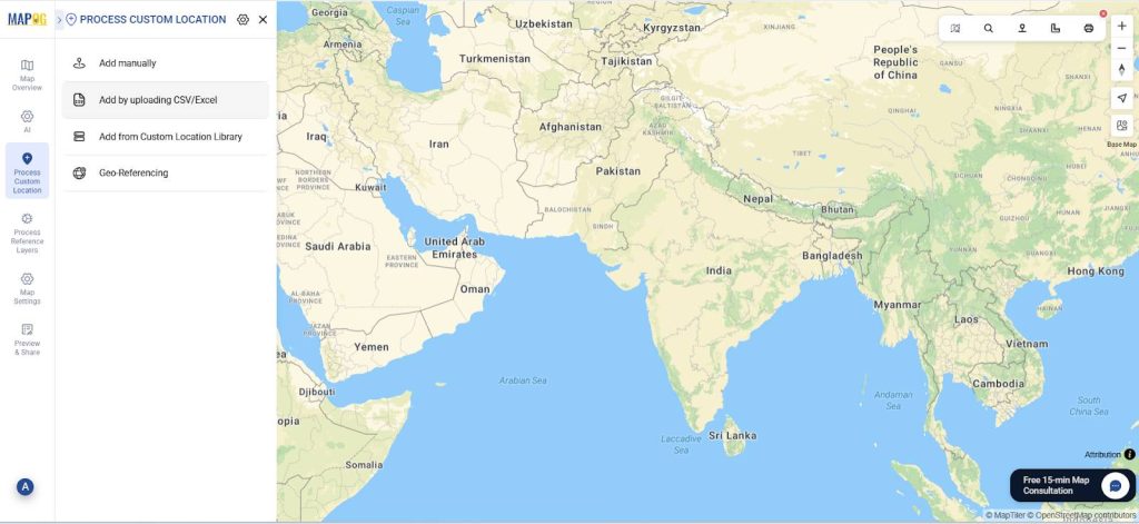
Step 2: Add your excel/CSV file
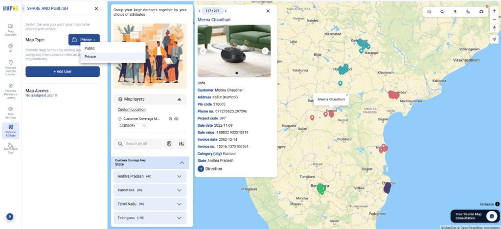
Now, go to process custom location and select add by uploading excel/CSV.
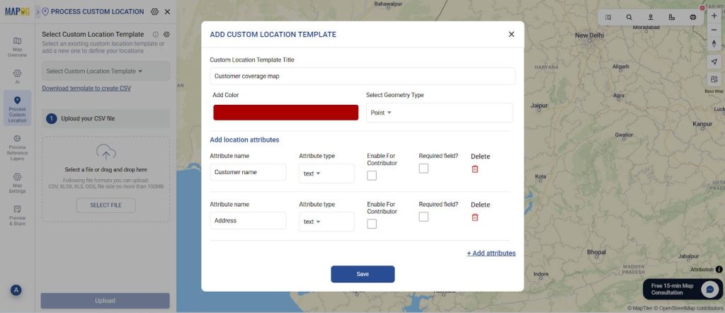
Next, go to ‘Select Custom Location Template’ settings and add your custom location template along with necessary attributes like customer name, address, etc. Select the custom location template that you created. Next, select your excel file with all your data and upload.
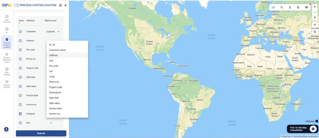
Finally match the attributes to your excel columns and see your data on the map.
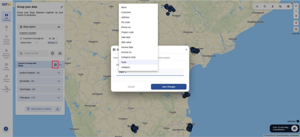
Step 3: Group By Attributes
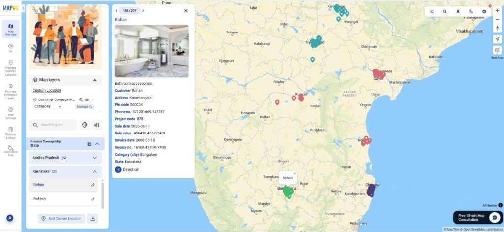
Next, go to Group By Attribute. Here, select the attribute that you wish to use to group your data by. Therefore, you will have your data grouped by whichever attribute you choose. Suppose you want your data by the state or city of residence or their project type code, you can choose these attributes from the drop-down and save changes.
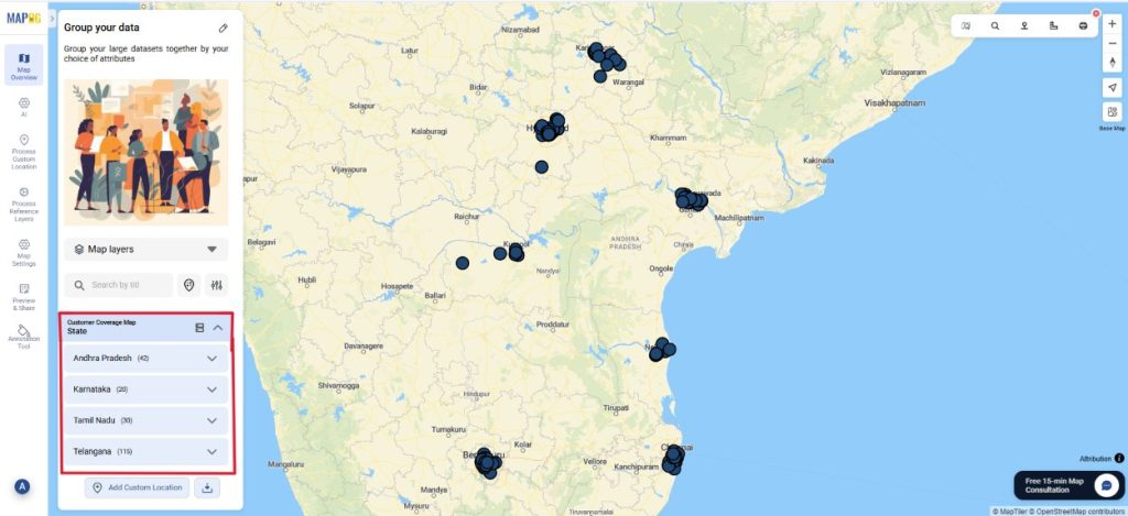
Finally, you can see your data grouped on the basis of that attribute.
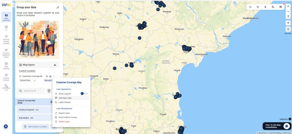
Step 4: Customize points by attributes.
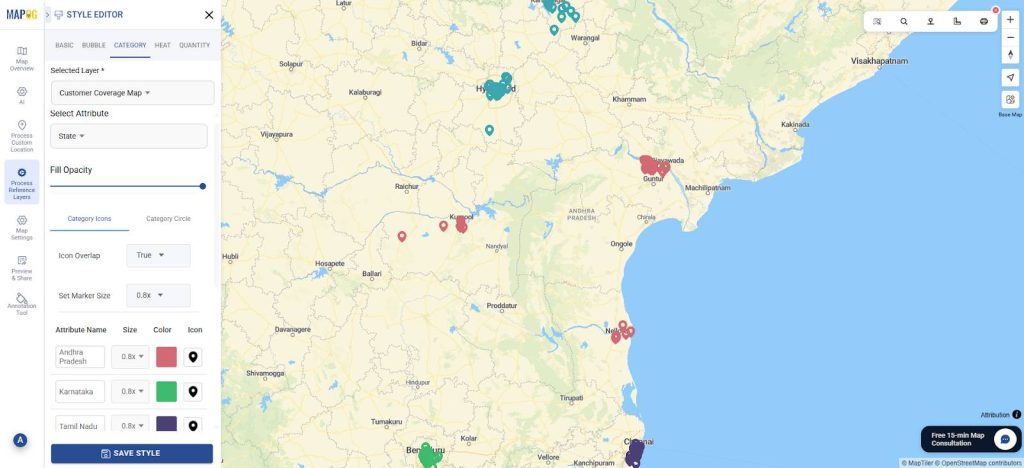
Further, you can select the add layer style and choose style by category. Select the same attribute you did while grouping. Choose your choice of colour and icon size and save the style.
The data will appear differentiated on the basis of colour and size for your attribute.
Step 5: Preview and Share the map
Finally, once your map is complete, click “Preview and Share ”. You can keep it private or share with your team.
Industrial applications
Grouping large datasets on a map offers major advantages across industries by transforming overwhelming point-level information into clear insights. In logistics and supply chain operations, grouping reveals route performance, regional demand, and distribution bottlenecks. Manufacturing and utilities can quickly spot patterns in equipment uptime, energy usage, or service interruptions by aggregating data by plant, grid segment, or asset type. Retailers and telecom providers benefit by grouping stores, customers, or network activity to pinpoint high-performing areas or coverage gaps. Even construction, transportation, and environmental sectors rely on grouping to track project status, identify congestion or risk zones, and monitor sensor data at scale. Finally, by reducing clutter, improving map performance, and highlighting trends, grouping makes it far easier for organizations to interpret complex datasets and make informed decisions across diverse industrial environments.
To Summarize
Therefore, chaos turns into clarity. With MAPOG, you can use the group by option to categorize and organize datasets based on shared attributes whether geographic, operational, or customer related. Organizations across industries can reduce clutter, improve performance, and uncover patterns that drive smarter decision-making. Whether analyzing supply chains, monitoring assets, or understanding customer behavior, effective grouping transforms complex datasets into structured, easy-to-interpret maps that support faster, more confident actions.