Healthcare is vital for every community, and using an interactive healthcare map makes it easier to locate the nearest hospital, clinic, or diagnostic lab. With tools like MAPOG, it’s now possible to visualize the entire healthcare network of a city on a single platform.
An interactive healthcare map makes it easy to categorize facilities, and highlight the strengths and gaps in healthcare distribution. Projects such as Mapping Healthcare Deserts in India already show how spatial mapping can bring attention to underserved areas, while city-level maps help identify and organize existing facilities for daily use.
Key Features
To make your healthcare map informative and actionable, facilities can be organized into four main categories:
- Hospitals – Government, private, and multi-specialty hospitals offering emergency and advanced care.
- Health Centers – Community health centers and family care facilities for primary needs.
- Diagnostic Labs – Pathology labs, radiology centers, and blood test facilities.
- Clinics – Specialized and general clinics such as dental, pediatrics, orthopedics, and small multi-specialty practices.
With category filters, custom attributes, users can quickly separate facility types and explore their distribution. This aligns with the principle of Best GIS Tools for Healthcare Analysis: Enhancing Accessibility & Resource Allocation — making data not only visible but actionable for decision-making.
Steps to Build Your Healthcare Map with MAPOG
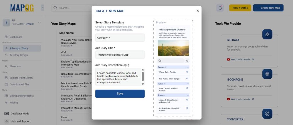
Step1: Start a New Project
- Log in to MAPOG and create a new map.
- Then, Choose Category Map as your format.
- Give a Title and add a description.
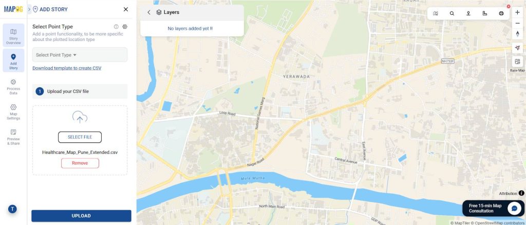
Step 2: Upload Data with CSV
- Go to “Add Story” → “Add by Uploading CSV/Excel”
- Prepare a CSV with details of hospitals, clinics, labs, and health centers.
- Then, include attributes like Name, Address, Category, Services, and Description.
- Import the CSV directly instead of adding points manually—this is perfect when you have many facilities and want to save time.
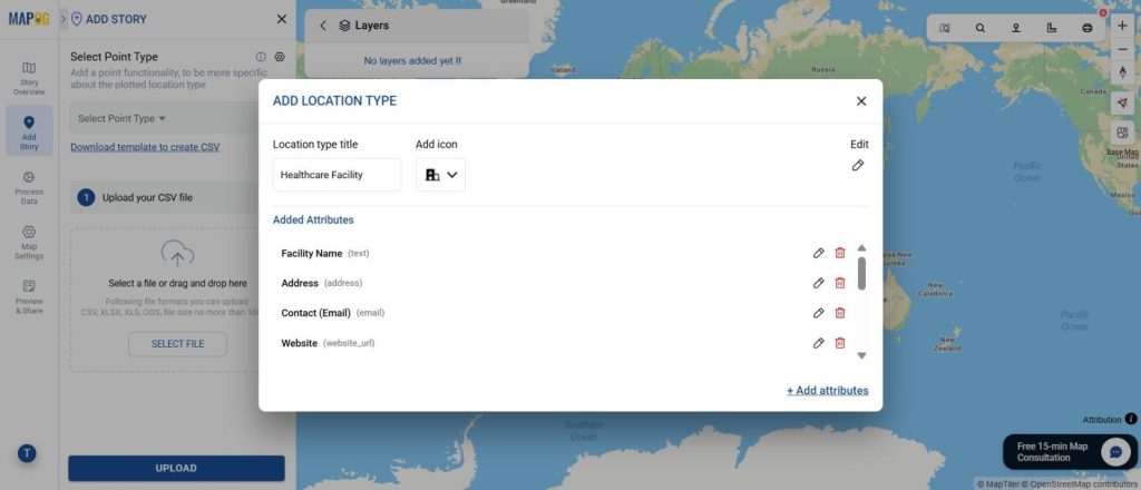
Step 3: Set Up Location Types & Custom Fields
When uploading, in the “Select Point Type” menu, you can access “Location Type Management”.
Furthermore, here you can create different attributes and match them with the columns in your CSV.
To make sure points match properly, add the corresponding point type first.
Add useful custom fields such as:
- Address
- Specialties (Cardiology, Pediatrics, etc.)
- Emergency Services
- Operating Hours
These fields ensure users get meaningful details when clicking a facility.
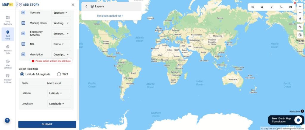
Step 4: Match Attributes with CSV
Once custom fields are set, select all attributes and use the “Match Excel” option to link them with your CSV columns.
Then hit Submit—this lets MAPOG auto-fill most of the information for large datasets, saving huge time and effort.
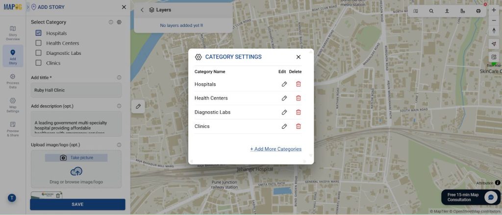
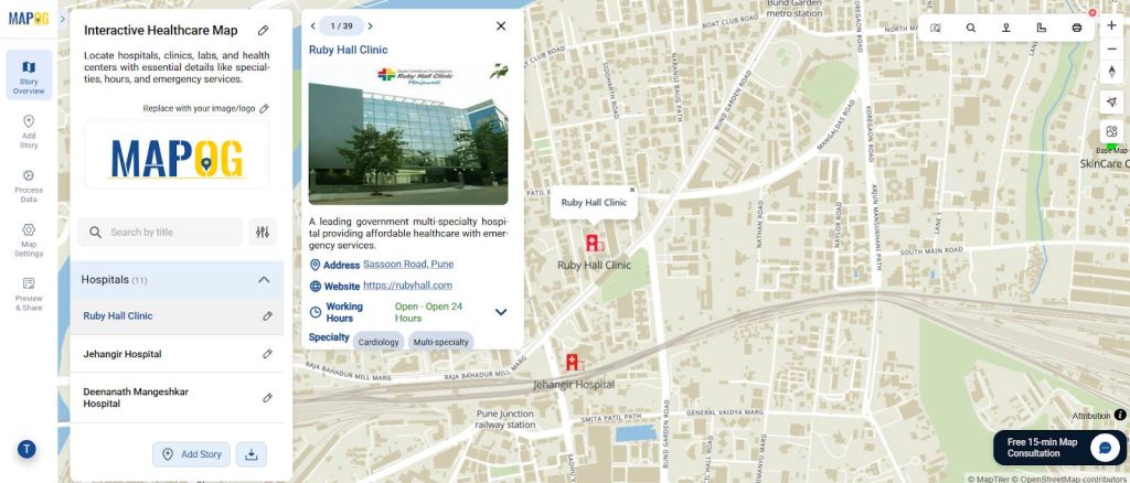
Step 5: Add Images & Define Categories
Go to each mapped point and add an image (e.g., hospital photo, clinic logo).
Then open “Category Settings” and create your facility types:
- Hospitals
- Health Centers
- Diagnostic Labs
- Clinics
Hence, this enables filtering, color-coded layers, and a clean way to organize facilities.
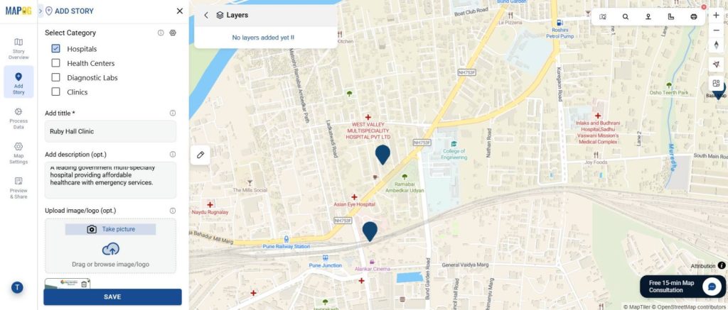
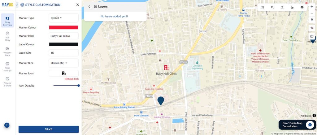
Step 5: Style Your Map
- Assign unique colors for each category using point customization (e.g., red = hospitals, green = clinics).
- Then, add labels for visibility.
- Adjust marker or polygon size for facility importance (e.g., bigger icons for hospitals).
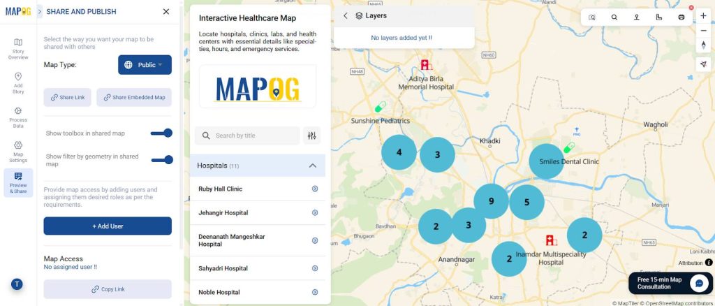
Step 6: Share & Publish
- Go to “Share & Publish”.
- Then, choose visibility (Public or Private).
- Share the link directly, email it, or embed it on a website for easy access.
Industry Applications
Interactive healthcare maps are not just for display — they have a wide range of industry uses. How to Use GIS Grid Tools for Mapping Healthcare Services and Improving Access is a good example of how grid-based analysis can be adapted for accessibility planning.
- Urban Planners: Ensure facilities are evenly distributed across neighborhoods.
- Government & Policy: Resource allocation for underserved regions.
- Hospitals & Healthcare Chains: Showcase network presence and expansion opportunities.
- Finally, Research & Academia: Study spatial patterns of healthcare availability and patient flow.
Conclusion: Smarter Healthcare Mapping
An Interactive Healthcare Map is more than just pins on a screen—it’s a decision-support tool. By categorizing hospitals, clinics, labs, and health centers, stakeholders can quickly assess availability, accessibility, and distribution. Hence, with MAPOG, anyone can build a clear, and shareable healthcare map that makes planning and communication easier.