When you upload your customer list in Excel or CSV format, you’re storing useful details like names, addresses, and service records, but the data stays flat. That’s because spreadsheets don’t show you where customers are clustered, which areas are under served, or how your field teams move across zones. As a result, it’s hard to connect that data to what’s actually happening on the ground. For example, you might overlook rising demand or notice your resources stretched too thin. MAPOG makes this shift intuitive and help you turn static lists into interactive maps that support faster decisions and smarter coordination.
Key Concept: Why Upload Your Customer List to a Map
Instead of rows and columns, a map gives you context. As soon as you visualize your customer list , patterns begin to surface: clusters, blind spots, missed zones. For example, you might notice uneven coverage or overlapping routes. Because the data is spatial, it’s easier to plan, assign, and adjust. This shift doesn’t require code or complex tools, it needs just platforms like MAPOG, which are built for clarity.
Steps to Upload Your Customer List and plot It on map
1. Create a New Map
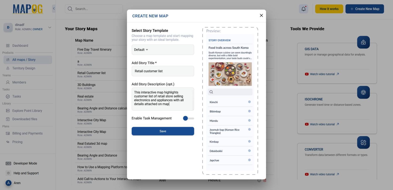
To get started, visit MAPOG and click on “Create New Map.” Then, add a title and short description to define your map’s purpose.
2. Add Your Data to the Map
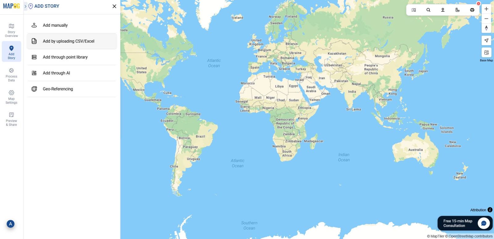
Then, move to the “Add Story” section. Here, select the option “Add by Uploading CSV/Excel” to set the stage for visualizing your customer list.
3. Define Location Type and Add Attributes
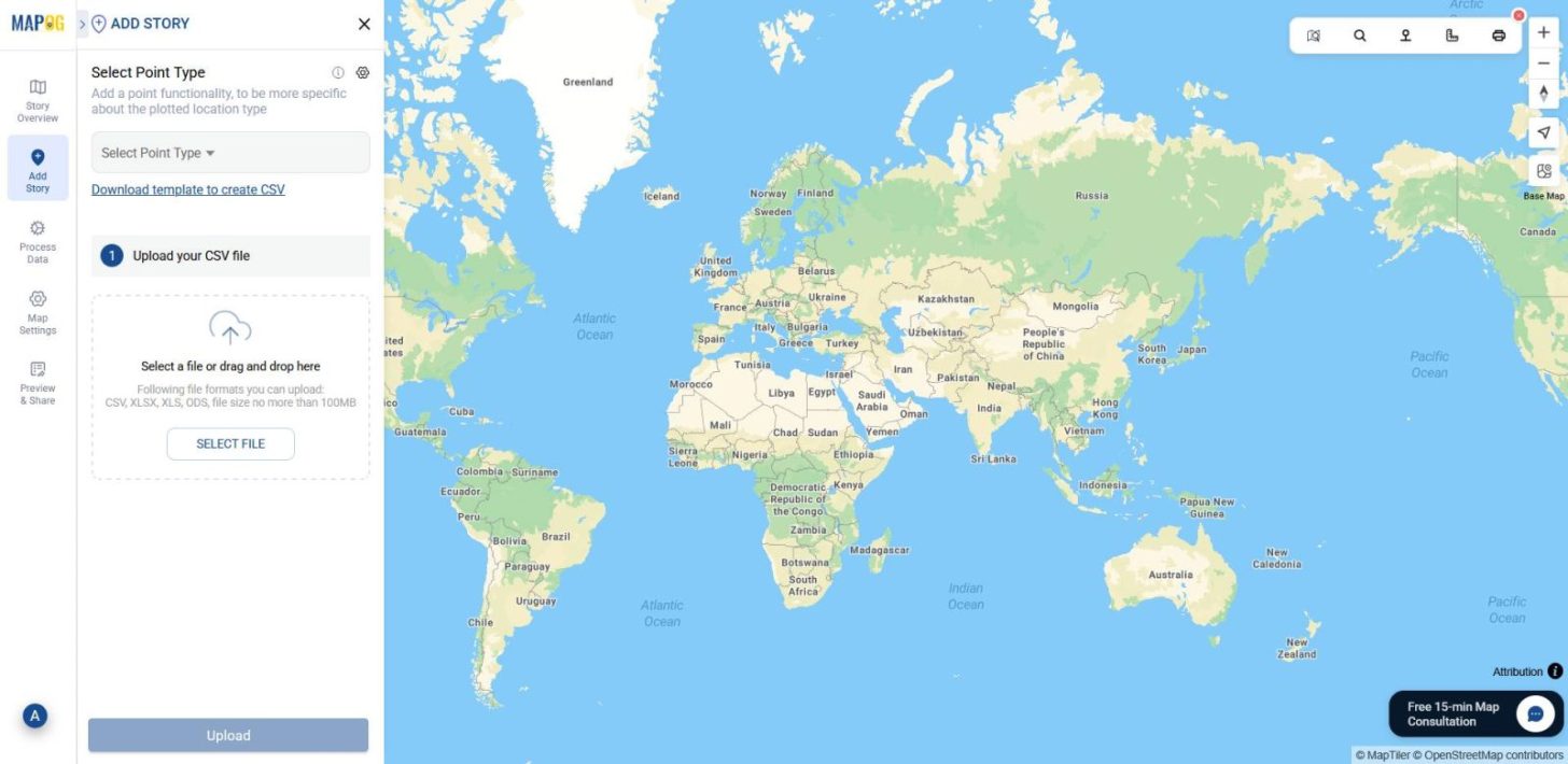
Next, click the Select Point Type Settings icon to create new attributes for the interactive map.
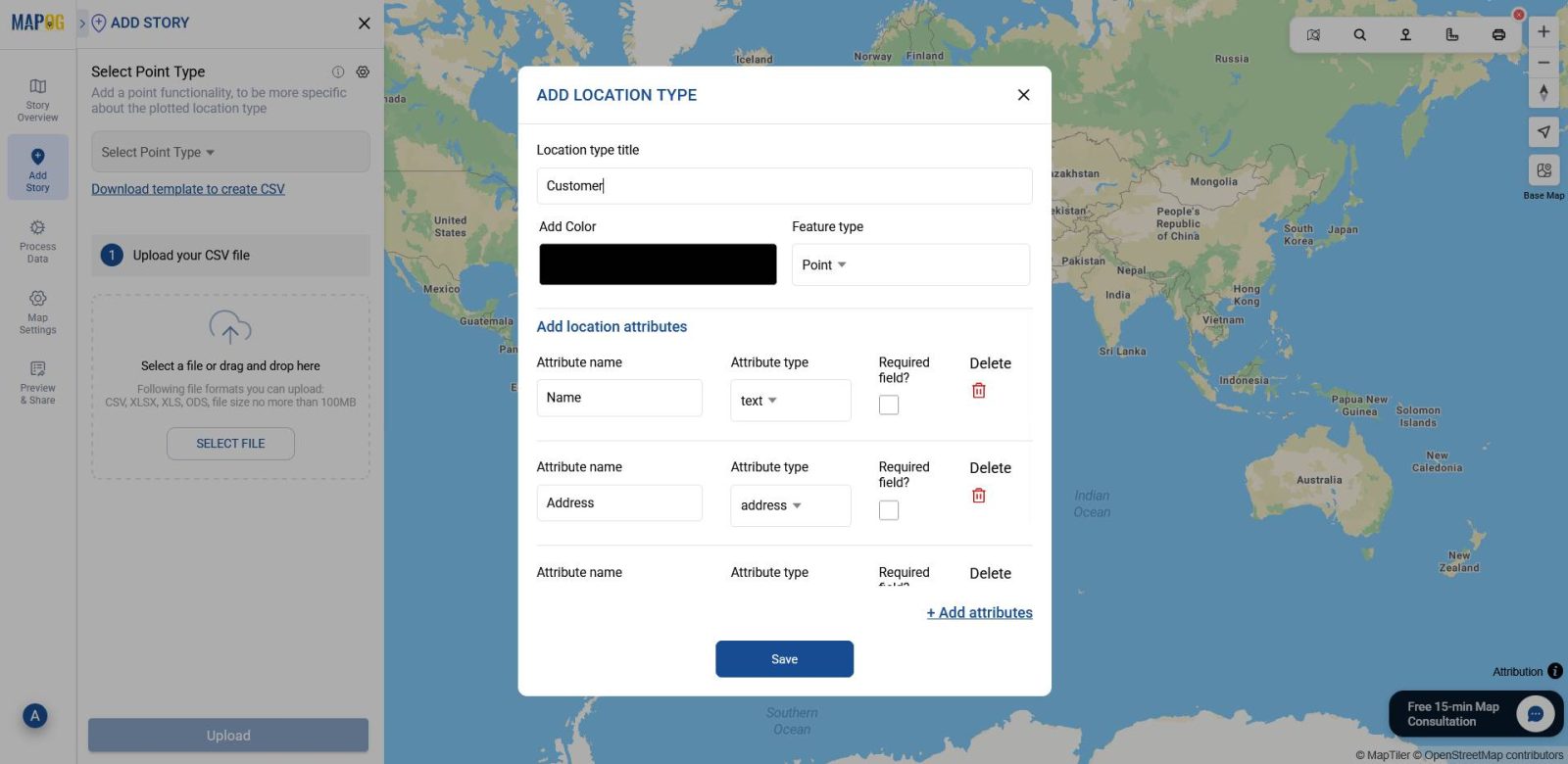
Now, click Add More Location Type to create a new location type. Then, enter a title such as Customer List and set the feature type to Point. After that, add attributes and assign formats for each one, such as Address for addresses, Phone Number for contact details, and Email for email addresses.
Once your point layer is ready, select it from the select point type drop down menu and then browse your Excel or CSV file that contains coordinates data and click upload.
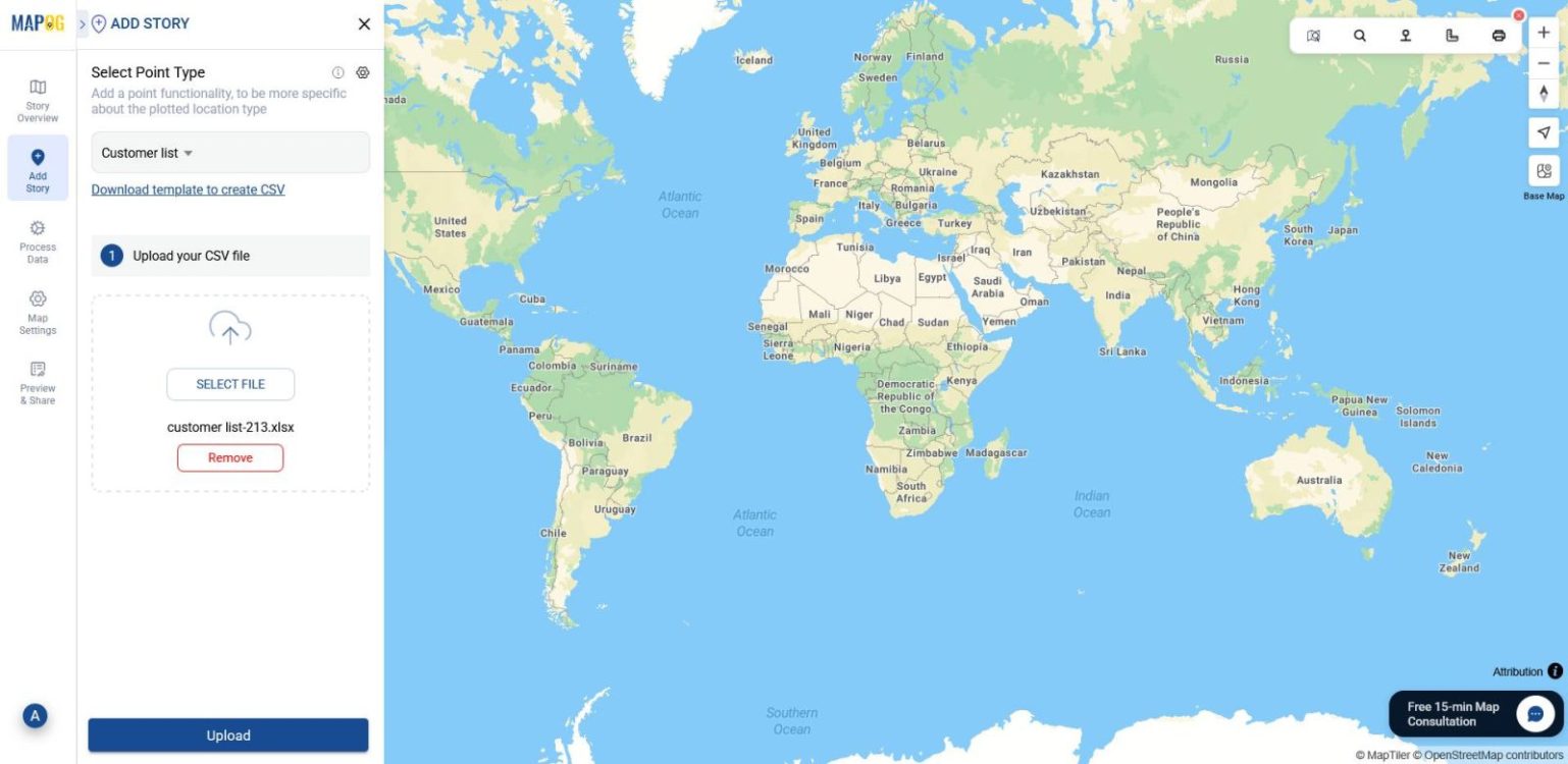
4. Define Location Fields
Now, select your unique ID & match attributes to your Excel columns.
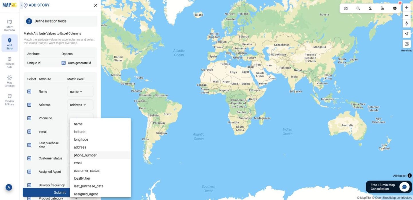
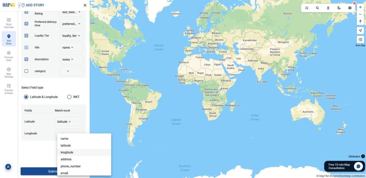
For placement, choose either coordinates or WKT,align them, and click Submit.
5. Edit points and Add Images
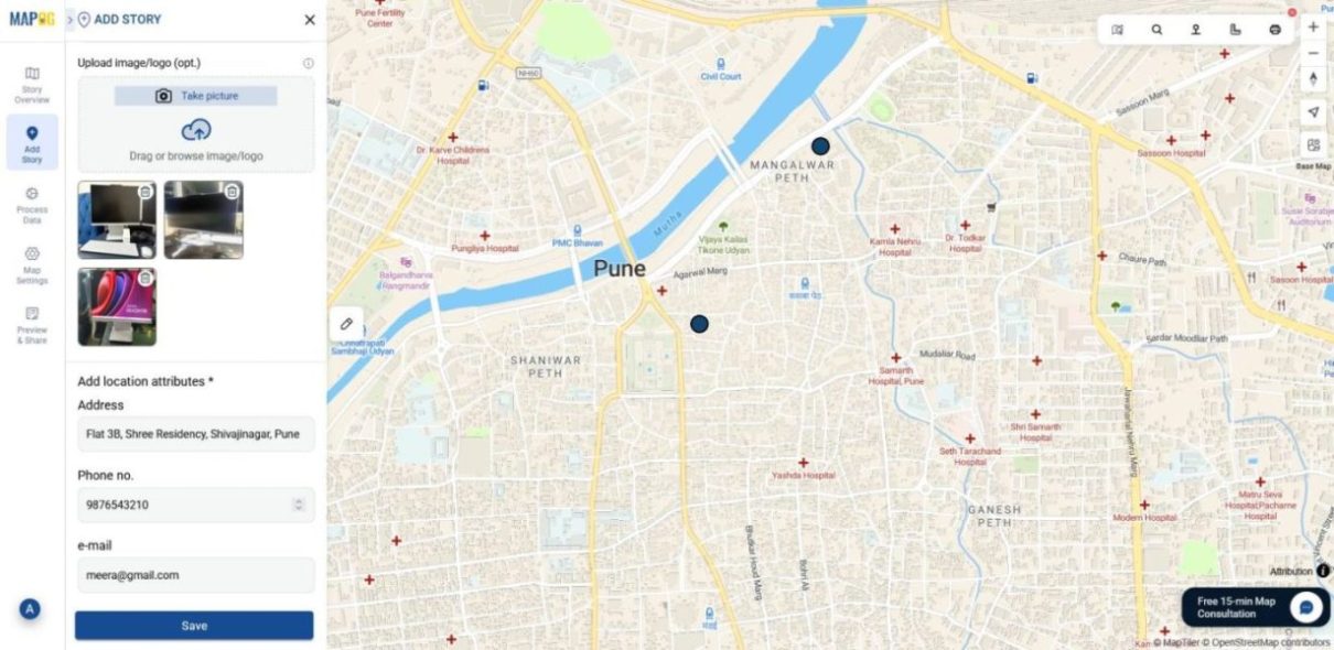
With your points now visible on the map, you can click on each pencil icon of your points and go to edit point details.
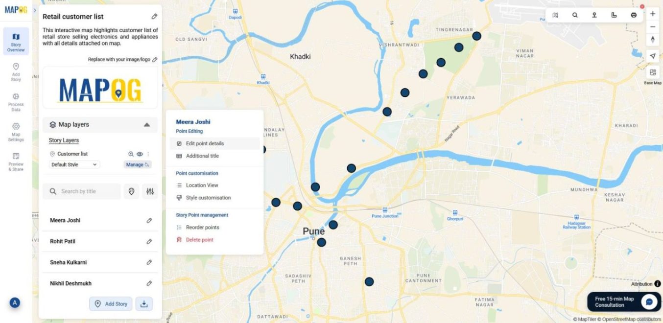
This is where you can edit attributes, or include images to make your map more interactive.
6️. Style Your Map
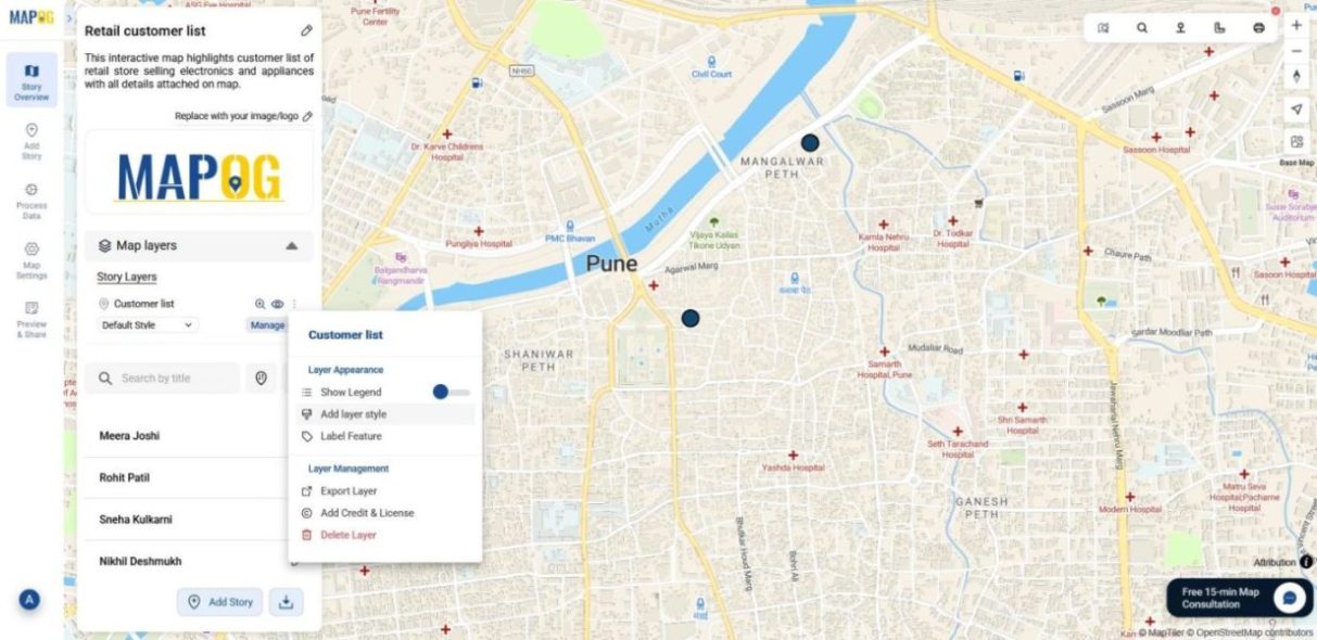
To make your map visually intuitive, head to the Layer Panel.
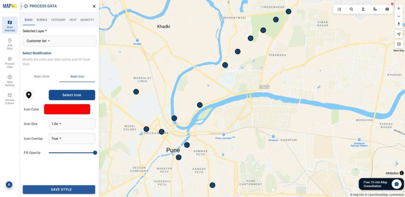
Then, select an icon shape and color to make each location stand out visually.
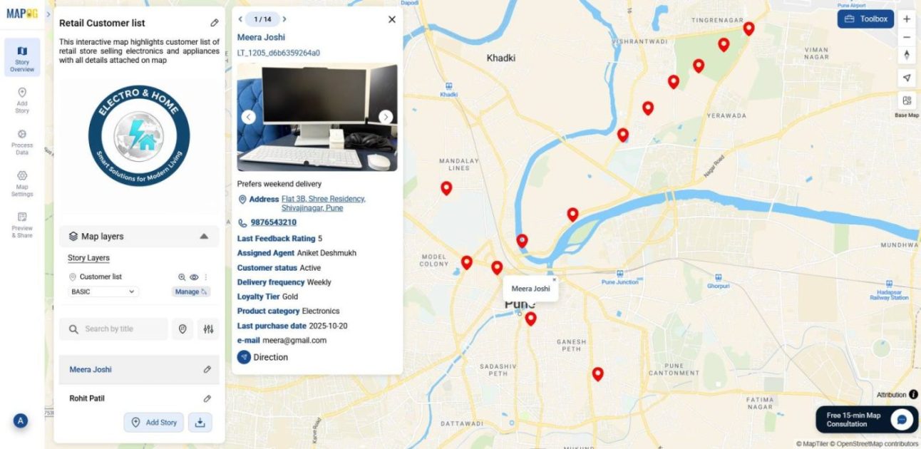
That’s it your customer list is now mapped interactively, with every detail attached and ready to explore through popups.
Industrial use and Benefits
Uploading and mapping customer lists is now simple with MAPOG and the benefits span multiple industries. In retail, it helps visualize outlet coverage, delivery zones, and customer distribution. In contrast, field service teams can track technician routes, service history, and scheduling gaps. Moreover, NGOs use it to map beneficiary locations, identify risk zones, and guide outreach. Also, sales and marketing teams benefit by spotting customer clusters, campaign reach, and referral networks , all in one visual layer.
Conclusion
Overall, mapping your customer list turns static data into actionable insight. Because the process is visual and intuitive, teams can spot patterns, plan smarter, and respond faster. As a result, industries gain clarity across operations. With MAPOG, this transformation becomes easy with no coding, just smarter coordination through interactive maps.