Trying to visualize GeoJSON data can be challenging when moving from raw spatial data to an interactive map. Although GeoJSON is widely used to store geographic features and attributes, it lacks built-in styling and interactivity. This makes raw files difficult to interpret, especially for non-technical audiences. Moreover, converting GeoJSON into a usable map often requires coding, external libraries, and manual configuration, slowing down workflows and limiting accessibility. To simplify this process, MAPOG provides a no-code platform where users can upload GeoJSON files, style layers, enable popups, and share interactive maps. It helps turn static data into dynamic, decision-ready visuals.
Key Concept: Why Visualize GeoJSON Data as Interactive Maps
GeoJSON data holds valuable geographic information; however, its impact depends on how it’s presented. By using interactive maps, users can explore features, reveal attributes, and identify spatial patterns that static visuals often overlook. Consequently, this deeper engagement leads to clearer insights and better decisions.
To support this, MAPOG helps visualize GeoJSON data through styling, popups, and sharing tools.
Step-by-step guide to visualize GeoJSON data on interactive maps
1️. Start by Creating a New Map
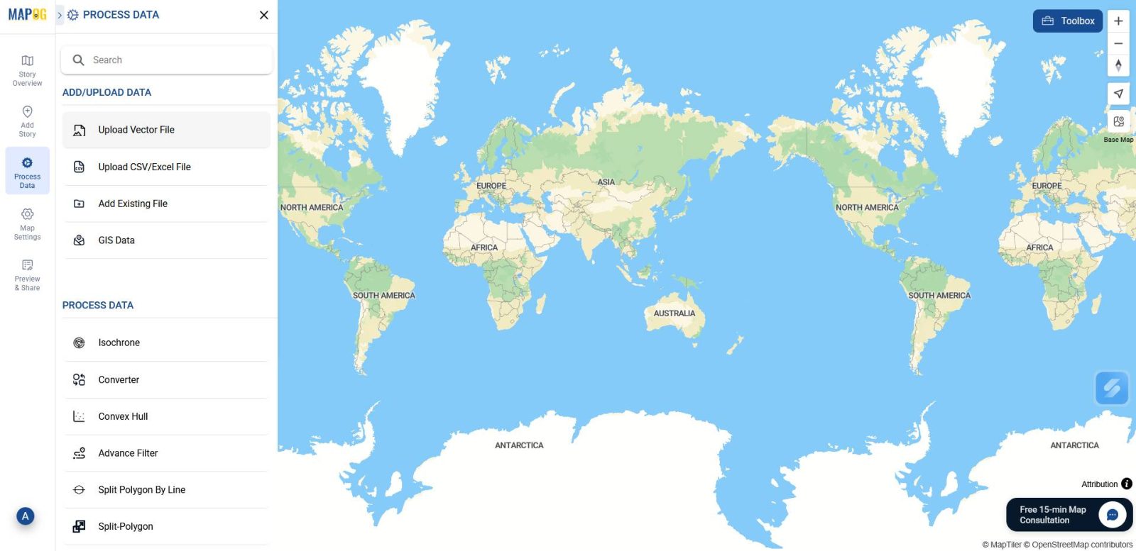
To begin, head to MAPOG and create a new map. Then, navigate to Process Data and select the Upload Vector File option. This step set the stage for importing your GeoJSON data.
2. Upload Your GeoJSON File
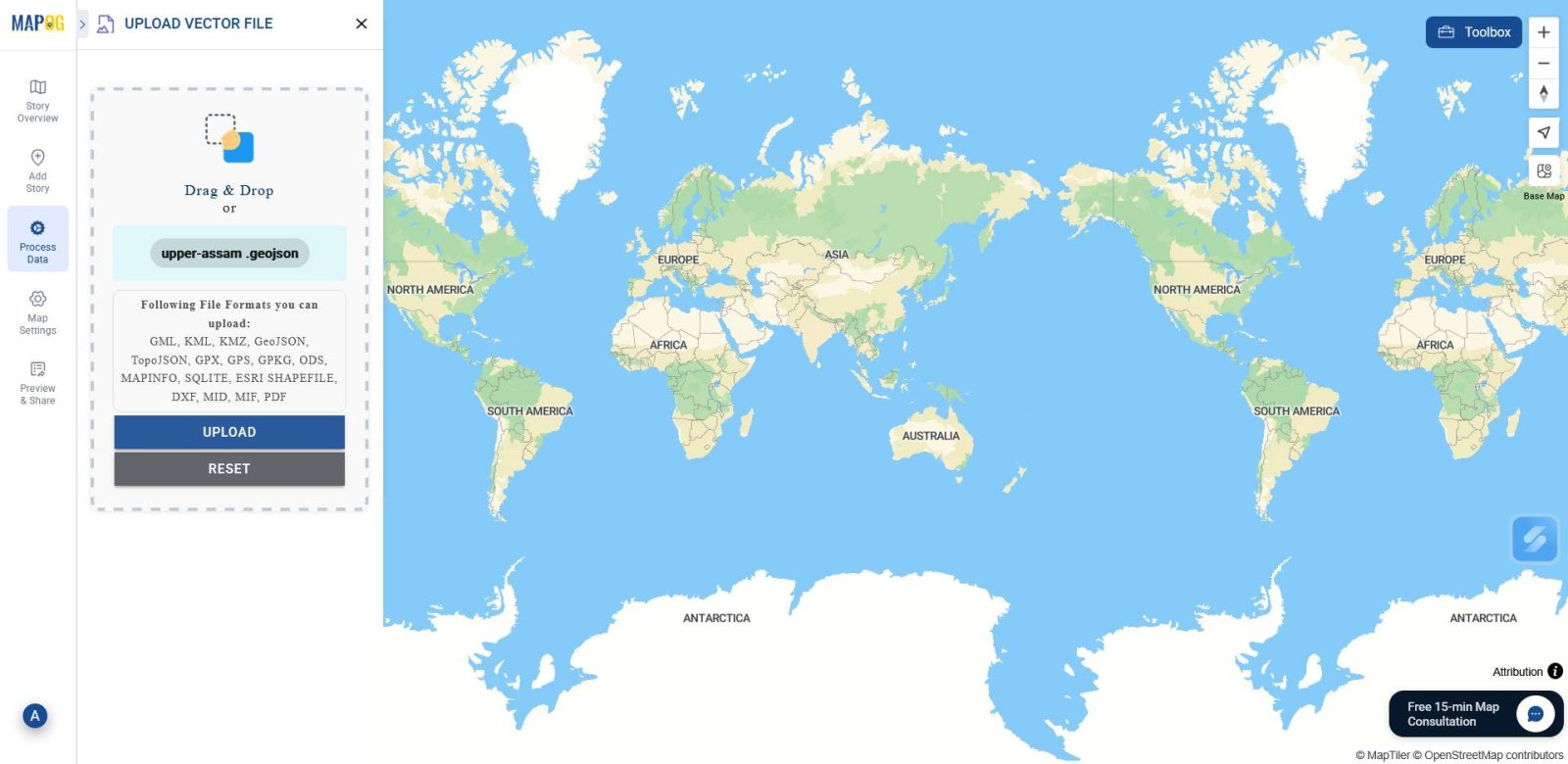
This tool lets you upload different kinds of vector data in 15+ GIS formats. So simply, browse your device and select the GeoJSON file containing your spatial data. After that, click Upload to bring it into the map interface.
3️. Style and Configure Your Layers
Following the upload, go to the Layer Panel.
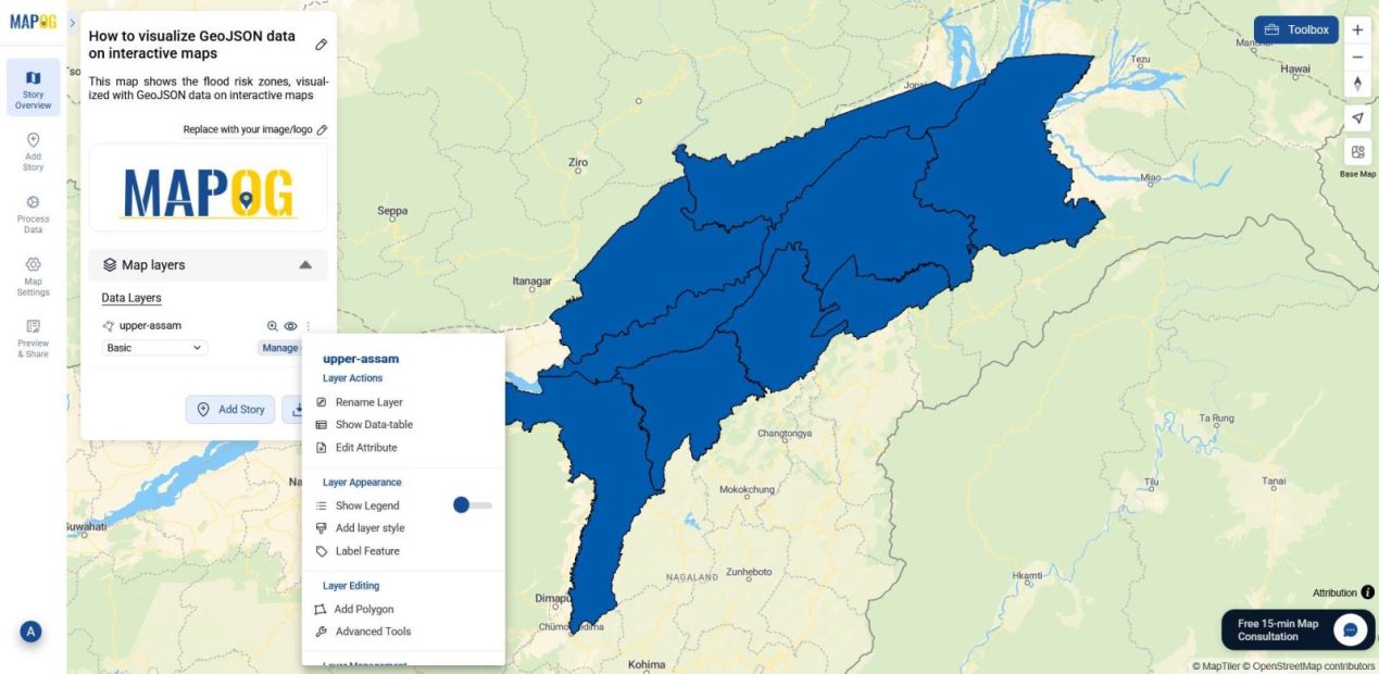
Then, choose Edit Attribute to modify or add new attributes.
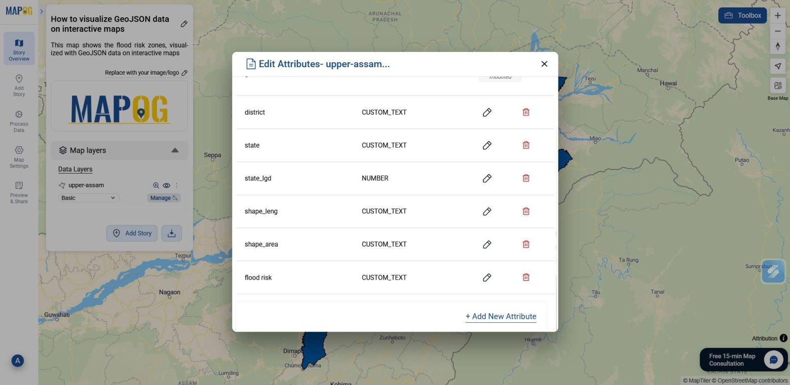
Further, use Add style Layer to select the attribute you want to display on the map.
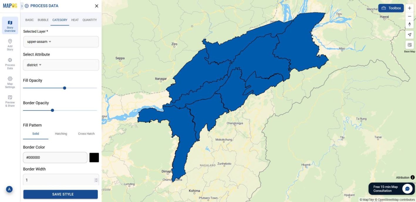
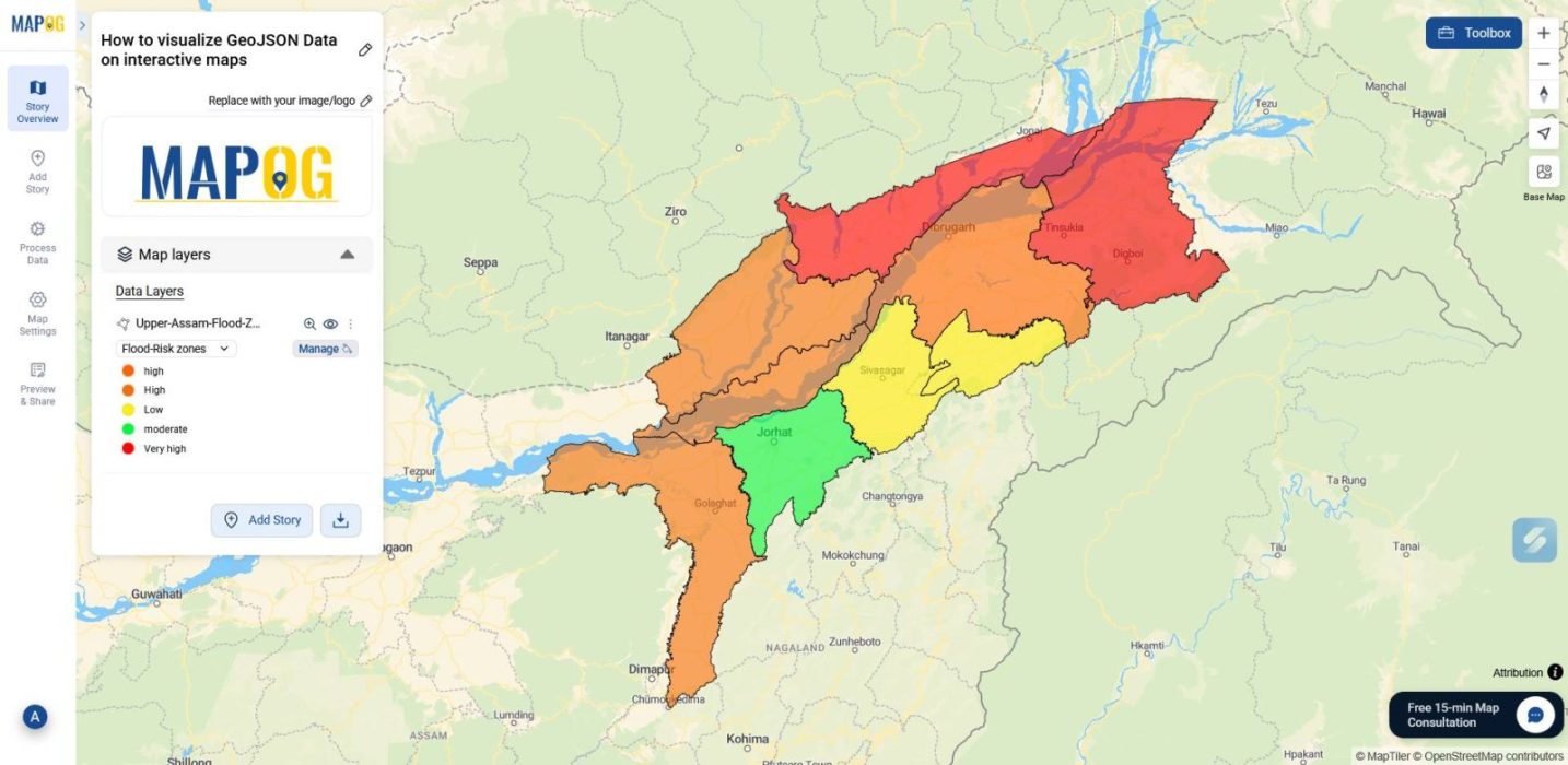
From here, adjust fill opacity and border opacity, color-code the attribute, and click Save Style to apply your changes.
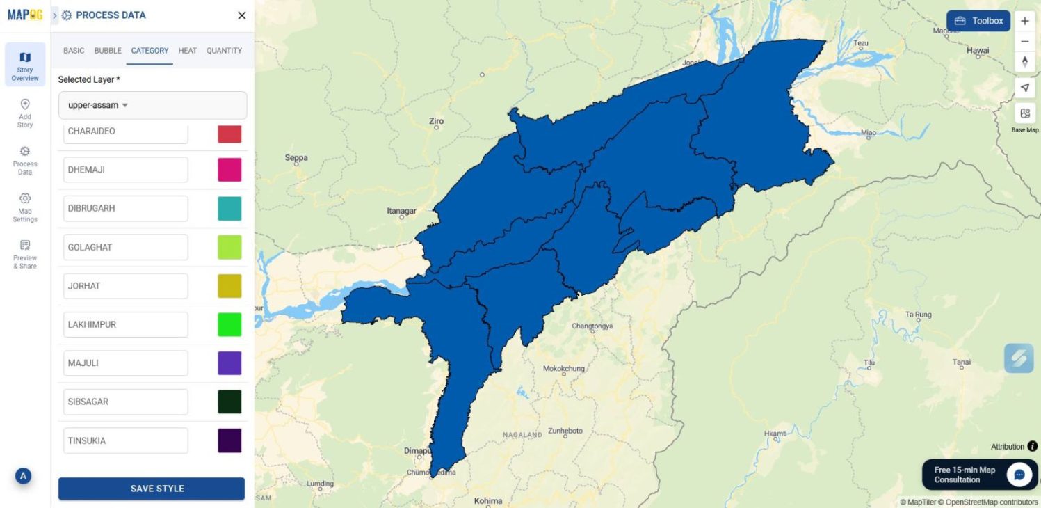
You can also add a legend to explain the color-coded attribute for better readability.
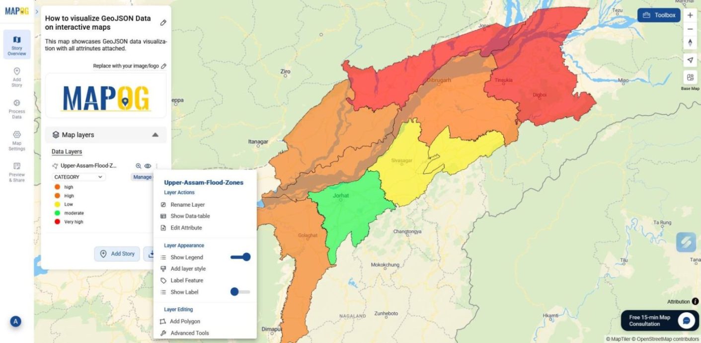
4️. Explore Your Interactive Map
Finally, your map is ready to explore. Open popups to view attribute details, interact with the styled layers, and visualize the data in context.
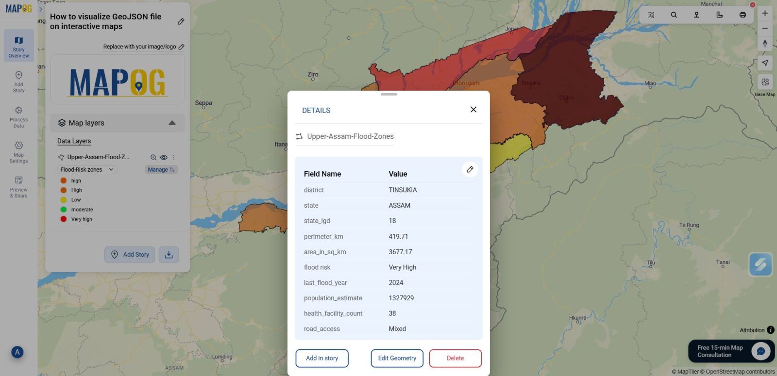
Your GeoJSON data file is now transformed into a dynamic, decision-ready map.
Industry Use and Benefits
Visualizing GeoJSON data on interactive maps helps industries solve location-based challenges with clarity and speed. With MAPOG, teams can style, share, and explore spatial data without writing code. As a result:
- Disaster response improves as teams map flood zones, shelters, and evacuation routes for faster coordination.
- Urban planning becomes more transparent by visualizing zoning boundaries and infrastructure gaps.
- Agriculture benefits through clearer views of field layouts, soil types, and irrigation networks.
- Telecom providers gain efficiency by identifying dead zones and planning tower placement.
- Environmental efforts advance by tracking pollution, forest cover, and protected areas in context.
Conclusion
In conclusion, visualizing GeoJSON data on interactive maps empowers industries to act on spatial insights with clarity and speed. By using MAPOG, teams can skip technical hurdles and focus on styling, sharing, and exploring data that drives real-world decisions. For instance, from flood mapping to infrastructure planning, interactive visuals make location-based information truly usable.