In today’s digital world, knowing how to upload and visualize CSV data on a map is essential for urban planning, environmental monitoring, and compelling visual storytelling. Moreover, with the growing importance of data-driven storytelling and location-based insights, MAPOG provides an intuitive platform to transform your spreadsheet data into interactive maps. As a result, users can create engaging, informative, and visually appealing content with ease.
Why Use CSV Data on Online Maps for visualization?
CSV data is incredibly useful for online map visualizations because it allows you to easily organize and plot large sets of geographic or attribute-based information—like locations, CSV data is incredibly useful for online map visualizations because it allows you to easily organize and plot large sets of geographic or attribute-based information—like locations, categories, or population figures. In particular, when uploaded to tools like MAPOG, this structured data can be transformed into interactive, insightful maps that make patterns and trends easy to see and share.
CSV (Comma-Separated Values) files are one of the most accessible data formats for professionals and researchers. Consequently, visualizing them on a map helps you:
- Convert raw tabular data into spatial insights
- Identify trends, clusters, and patterns across geographies
- Share interactive visualizations with stakeholders or the public
Furthermore, using MAPOG’s map story tool, you can easily upload CSV data and turn it into powerful spatial stories. Whether you’re just starting out or already experienced, adding GIS data to an online map can significantly enhance your projects. Therefore, adopting tools like MAPOG is a smart move for anyone looking to create data-driven visual narratives.
Steps to Upload and Visualise CSV Data
1. Search story.mapog.com
To get started visit MAPOG
Once on the homepage:
- Click “Create New Map”
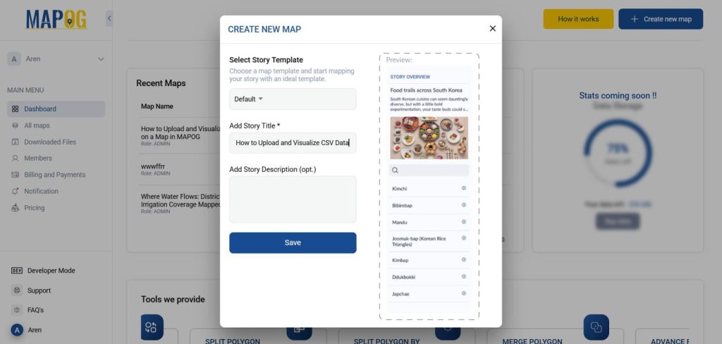
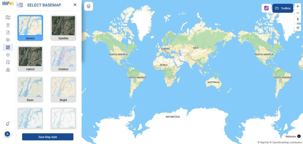
- Next, choose a suitable base map—for example, satellite, terrain, or street view—depending on the type of data you’re presenting and the story you want to tell.
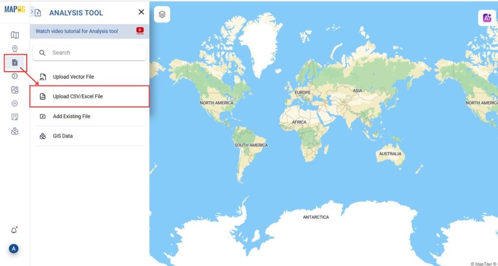
2. Upload Your CSV File and visualise data on a map
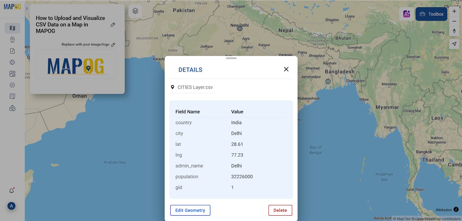
- On the left-side panel, click on “Add/Upload Data”.
- You’ll be presented with multiple data input options. Select “Upload CSV/Excel File”.
- Make sure your CSV includes latitude and longitude columns to enable accurate mapping.
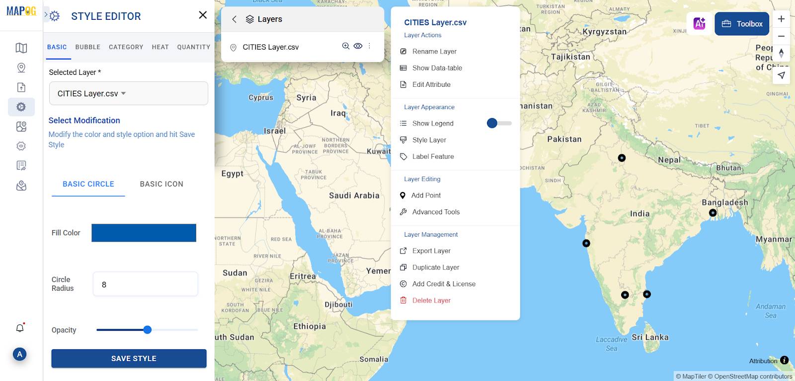
3. Add and Visualize Data on the Map
After uploading:
- Then, click “Publish” to overlay your CSV points onto the map.
- After that, use the Style Editor tools to assign colors, shapes, and sizes based on attribute values.
- Furthermore, customize the legend, tooltips, and pop-ups to enhance clarity and create a more engaging storytelling experience.
4. Enhance with Tools and Export for more visually appealing data
MAPOG offers several tools to refine your map
- Use Filter Tool to narrow down visible data
- Converter Tool for transforming formats (CSV to GeoJSON, etc.)
- Calculate distance and create zones with Isochrone Tool
- Export the map with selected layers for use in reports or presentations
Tips for Better CSV Mapping and visualization
- First, clean your data by ensuring there are no missing or mismatched coordinates.
- Next, avoid clutter by using filters or groupings to highlight the most relevant data.
- Additionally, use legends and tooltips to provide context through simple, informative pop-ups that guide the viewer’s understanding.
- By doing so, you create a clearer, more effective visual experience for your audience.
For example, you can visualize school locations with student enrollment data as proportional circles on a city map. In doing so, you can easily identify overcrowded areas and compare school capacity across different neighbourhoods. As a result, decision-makers can prioritize infrastructure improvements where they’re most needed.
Real-World Applications
- Healthcare Access: Visualize clinic distribution and patient volumes
- Retail Expansion: Identify high-demand zones based on customer addresses
- Emergency Response: Track and respond to real-time CSV incident reports
These use cases demonstrate the versatility of CSV/ Excel data in creating impactful maps.
Conclusion
Uploading and visualizing CSV data on MAPOG is a fast and intuitive process that turns flat tables into dynamic spatial stories. Whether you’re analysing population data, infrastructure projects, or environmental trends, the platform helps you bring your data to life—visually, interactively, and insightfully. Moreover, MAPOG simplifies complex data tasks, making them accessible even to beginners. In addition, whether you’re working in education, research, or planning, knowing how to upload and visualize CSV data on a map gives your project a visual edge. As a result, you can communicate insights more clearly and make data-driven decisions more effectively. Ultimately, MAPOG empowers users to transform raw data into compelling spatial narratives.
Other related articles
How to Use GIS Grid Tools for Mapping Healthcare Services and Improving Access
Spatial Retail Store Analysis: Boost Business Growth with Convex Hull Mapping
Fast Emergency Response: Using GIS and Isochrone Maps for 10-Minute Ambulance Arrival