When businesses work with sales data spread across multiple locations, spreadsheets alone often fail to reveal meaningful insights. Simply listing numbers does not clearly show where performance is strong or weak. That is why MAPOG plays a crucial role in sales visuals . By visualizing sales data geographically, you can instantly high and low sales areas using interactive maps spot , compare regions, and make smarter decisions. Moreover, modern GIS-based mapping tools now allow you to filter, group, and analyze sales data without complex coding.
Why High and Low Sales Mapping Matters
Before diving into the process, it is important to understand why sales mapping is so effective. For example, two stores may generate similar revenue, yet their surrounding buildings might perform very differently. While one area may show frequent purchases, another might spot high and low sales areas. Therefore, mapping sales data helps you identify such patterns quickly. Additionally, it allows sales teams to focus on underperforming zones, optimize marketing strategies, and allocate resources more efficiently. As a result, decision-making becomes more data-driven and location-aware.
Types of Sales
To analyze sales areas properly, your dataset should include meaningful attributes. Furthermore, combining different attribute types enhances your map’s analytical power:
- Category Attributes – High sales, medium sales, or low sales zones
- Numeric Attributes – Purchase frequency, total revenue, order value
- Text Attributes – Customer name, locality, sales region
- Multi-Select Attributes – Product types, services purchased
Because of this mix, interactive maps can highlight not just where sales happen, but also why they vary.
Steps to spot High and Low Sales areas Mapping
Although different platforms may vary slightly, the overall workflow remains largely the same.
1. Prepare and Upload Your Data
Start by logging in to your MAPOG workspace. From the main dashboard, click “Create New Map.” Assign a relevant project name to keep it organized.

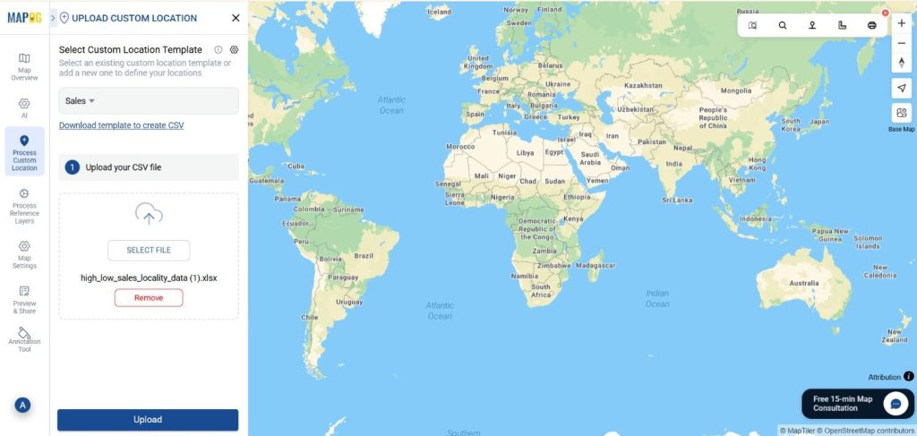
2. Upload Your Excel File
Collect your location data in a clean spreadsheet. Furthermore, include fields such as category, attributes, ratings, capacity, and area names.
Next, click the “Process custom location ” option and Go to Add by Uploading CSV/Excel.

3. Create and Assign Attributes
Now, go to the select custom location template section to add a new custom template called Tourist spot. select the geometry type like point. Inside this custom template, create attributes—such as “Sales Category,” “Purchase Frequency,” and “Revenue Range.”
")
Browse your device to locate the Excel sheet containing your tourist spot details. Once selected, confirm the upload.
After that, match each Excel column to its corresponding attribute. Because many GIS tools auto-detect data types, this step becomes faster and more intuitive. If your dataset includes additional attributes, MAPOG allows you to match all column names during the import process. After aligning attributes like “Tittle ,” category” and “Latitude/Longitude,” finalize the upload to visualize all entries instantly.

4. Style the Map by Sales Performance
Once the data appears on the map, move to the layer styling section.

Choose a category-based style and assign different colors to high and low sales areas. For instance, high-performing localities can be shown in darker shades, while low-sales zones appear lighter. Consequently, patterns become visible at a glance.

5- Showing Legend
Right click on the layer styling section and turn on the show legend option to show the legend on the map.

6. Share the Sales Map
Finally, click on Share & Publish. This allows teams, managers, or stakeholders to explore the data interactively without needing access to raw files. Moreover, shared maps make collaboration far more effective.

Industry and benefits
High and low sales mapping is widely used across industries such as retail, FMCG, real estate, banking, and franchise businesses to understand performance by location. By visualizing sales data on a map, companies can clearly identify high-performing areas and low-sales zones that need attention.
Conclusion
Spotting high and low sales areas using interactive maps transforms raw sales data into actionable insights. Furthermore, by combining filters, styling, and grouping, businesses can quickly identify trends that might otherwise go unnoticed. MAPOG adds clarity and depth to your sales strategy. Ultimately, location-based insights help you move from guessing to informed decision-making.