In fast-growing cities, mapping waste disposal sites with GIS is becoming essential to public health and sustainability. As waste volumes rise, understanding where and how it’s managed is key to building cleaner, more efficient cities.
This project uses MAPOG, a cloud-based spatial mapping platform, to visualize key waste disposal sites—ranging from major landfills to Refuse Transfer Stations (RTS).Turning infrastructure data into interactive maps makes invisible systems visible, helping identify gaps and improve long-term strategies. Similar mapping methods in sustainable waste management show how spatial tools enhance awareness and drive smarter planning.
Why Map Waste Disposal Sites?
Cities rely on a network of facilities to manage waste:
- Landfills – Final dumping grounds for solid waste
- Refuse Transfer Stations (RTS) – Temporary collection and transport points
- Regional Landfills – Serving large-scale metropolitan needs
Mapping waste disposal sites with GIS reveals spatial patterns and operational dynamics that traditional reports cannot capture.
Understanding Waste Infrastructure Spatially
Mapping is not just about location—it reveals how waste systems interact with population zones, transport routes, and the environment. Much like mapping sewage networks using cross-intersection tools, this spatial approach helps:
- Identify infrastructure gaps
- Support equitable planning
Making Waste Visible, Planning for Cleanliness
Clean cities depend on hidden systems—often overlooked. This project brings those systems to the surface through MAPOG, turning backend data into interactive visuals that empower planning, policy-making, and public understanding.
Step-by-Step: Mapping Waste Disposal Sites Using MAPOG
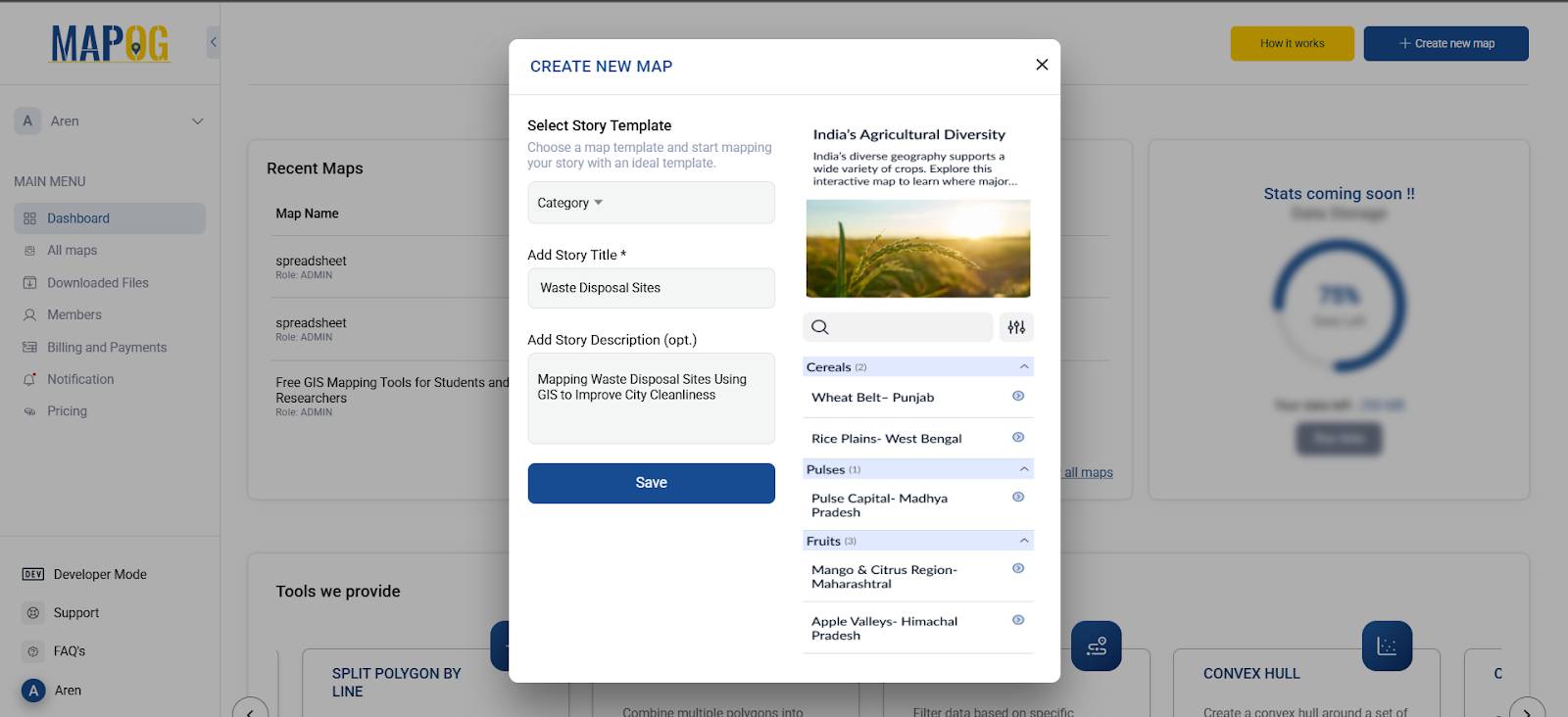
Step 1: Access the MAPOG Platform
- Visit MAPOG and click “Create New Map”
- Choose “Category” as your Story Template
- Add a Story Title and short Description
- Click Save to launch the map editor
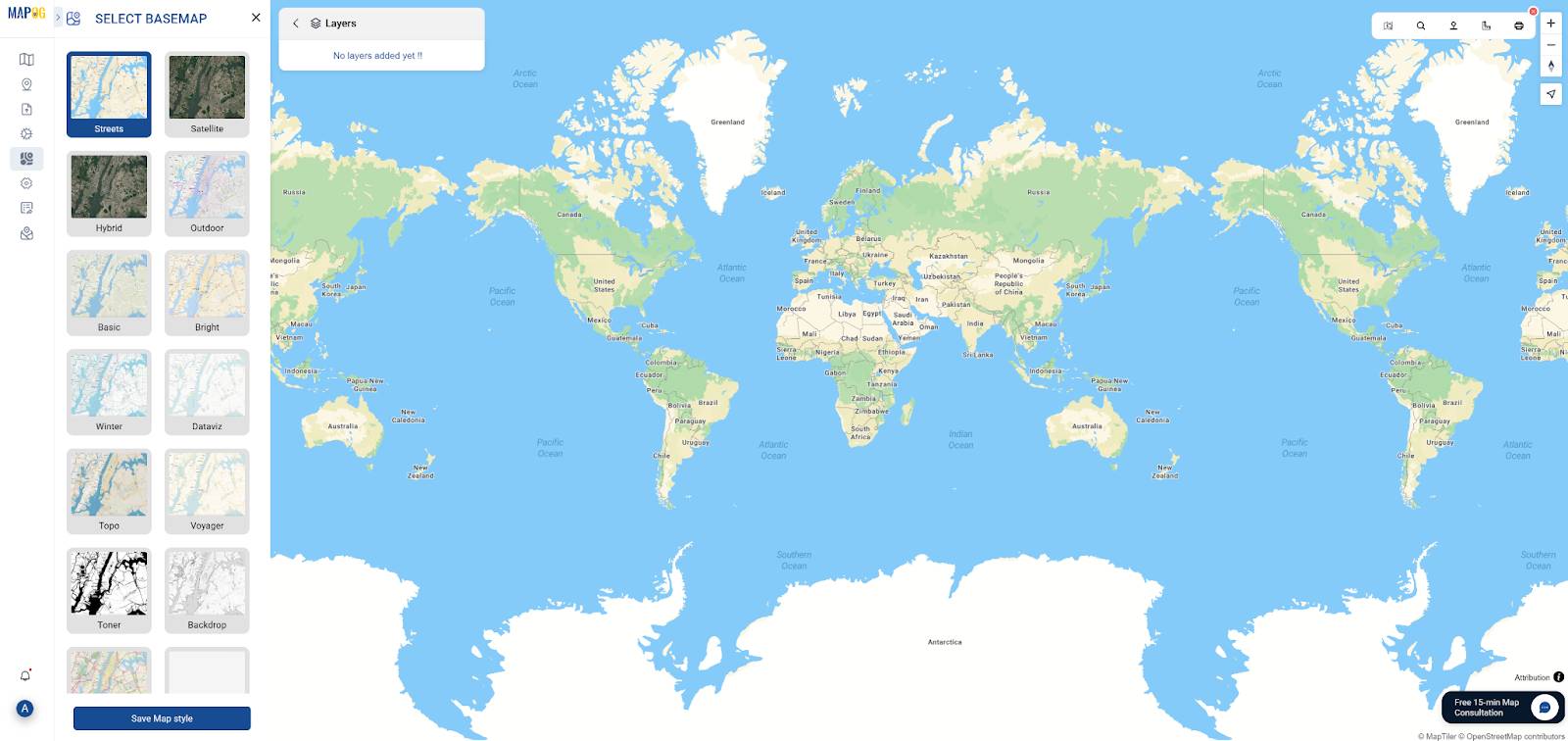
Step 2: Add Layers for Spatial Context
- Go to the “GIS Data” tab and upload relevant layers such as:
- Landfill boundaries
- Municipal transfer stations
- District boundary
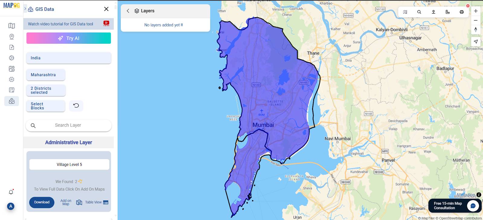
These spatial layers provide important visual context around each mapped facility
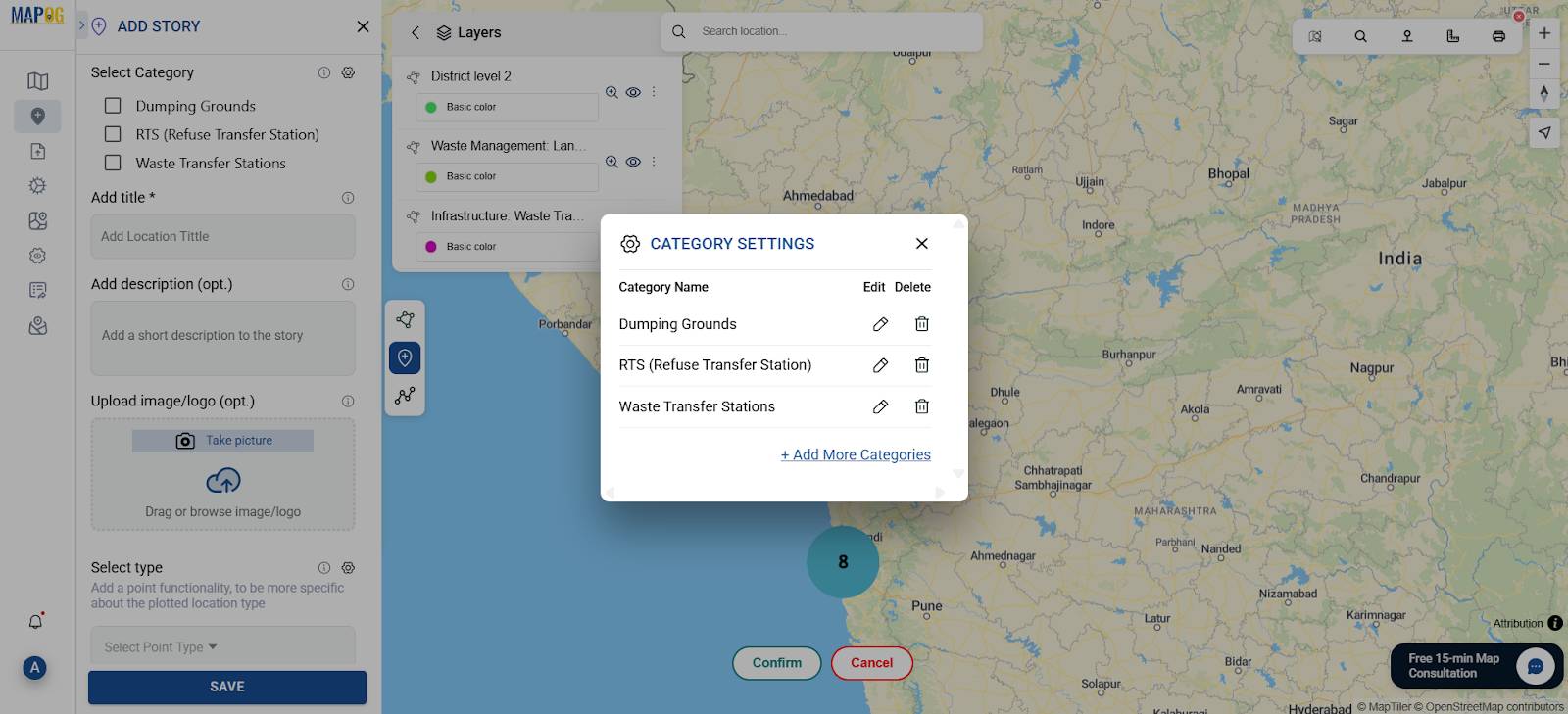
Step 3: Select Categories for Your Story
Before adding any points, go to the ”Add Story” tab. This is where you’ll access the Category Story interface.
Choose or create categories such as:
- Dumping Grounds
- RTS (Refuse Transfer Station)
- Waste Transfer Stations
Setting this up first helps maintain a clean structure and makes your map easier to navigate.
Step 4: Add Points
- Use the search bar or manually input coordinates to add locations
- For each point, fill in the title, add description and upload images.
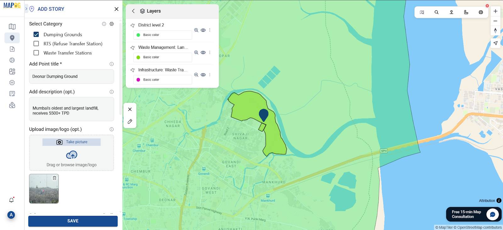
This step helps create an interactive learning experience beyond just map visuals.
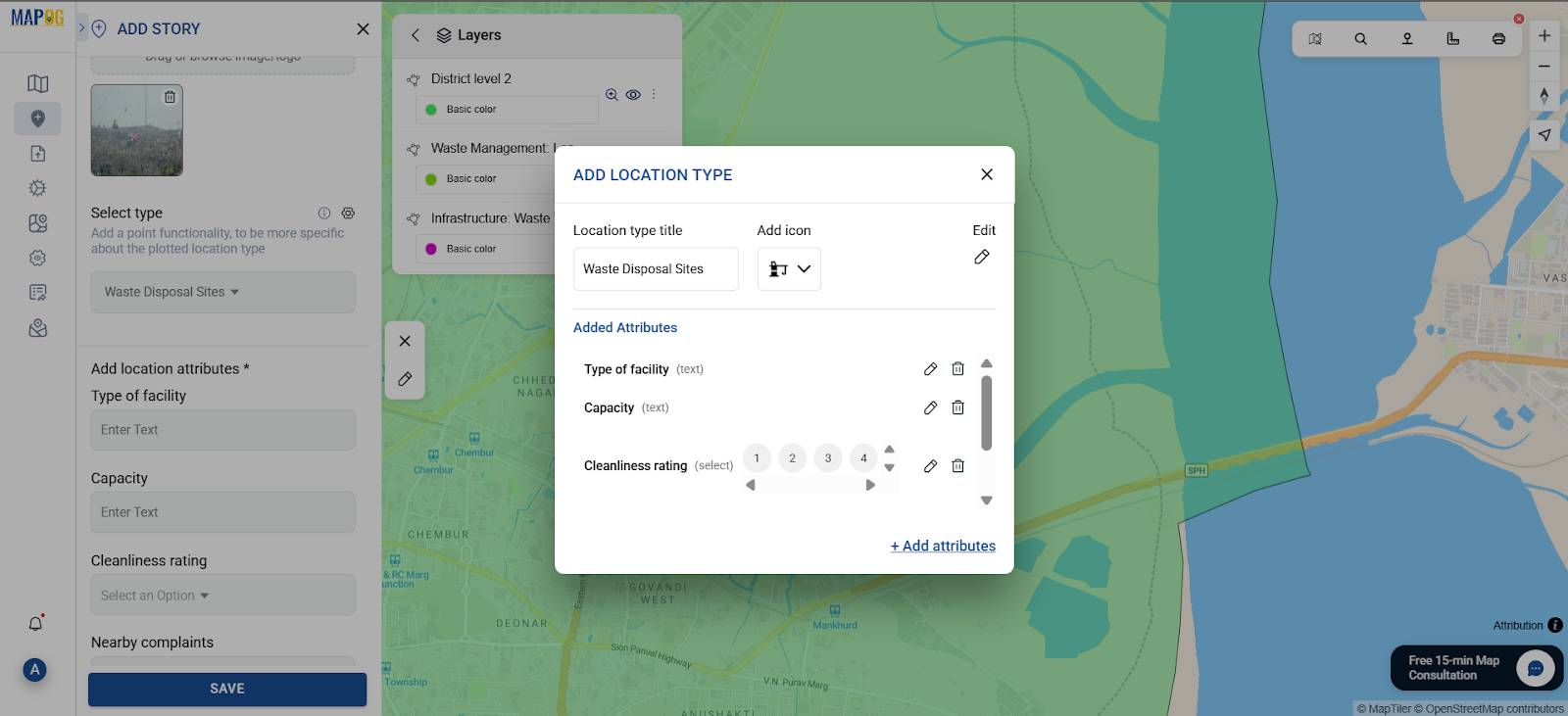
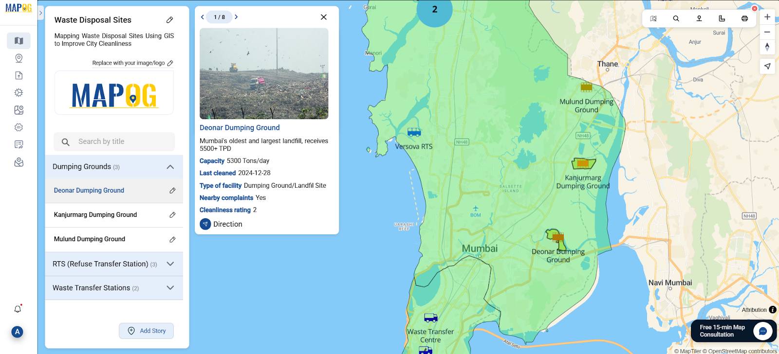
Step 5: Define Point Type & Add Attributes
After adding points, select or create a “Point Type”.
Click the Select point type⚙️ icon to add a new “Location Type” and assign an icon.
Then, click “Add Attributes” to define what information will be stored for each point. Suggested attributes include:
- Type of facility
- Capacity
- Cleanliness rating
- Nearby complaints
- Last cleaned
Then, open the “Point Customization” tab for each location to:
- Assign meaningful icons
- Set label style, color, and placement
- Reflect cleanliness status with colors
- Toggle labels based on zoom level
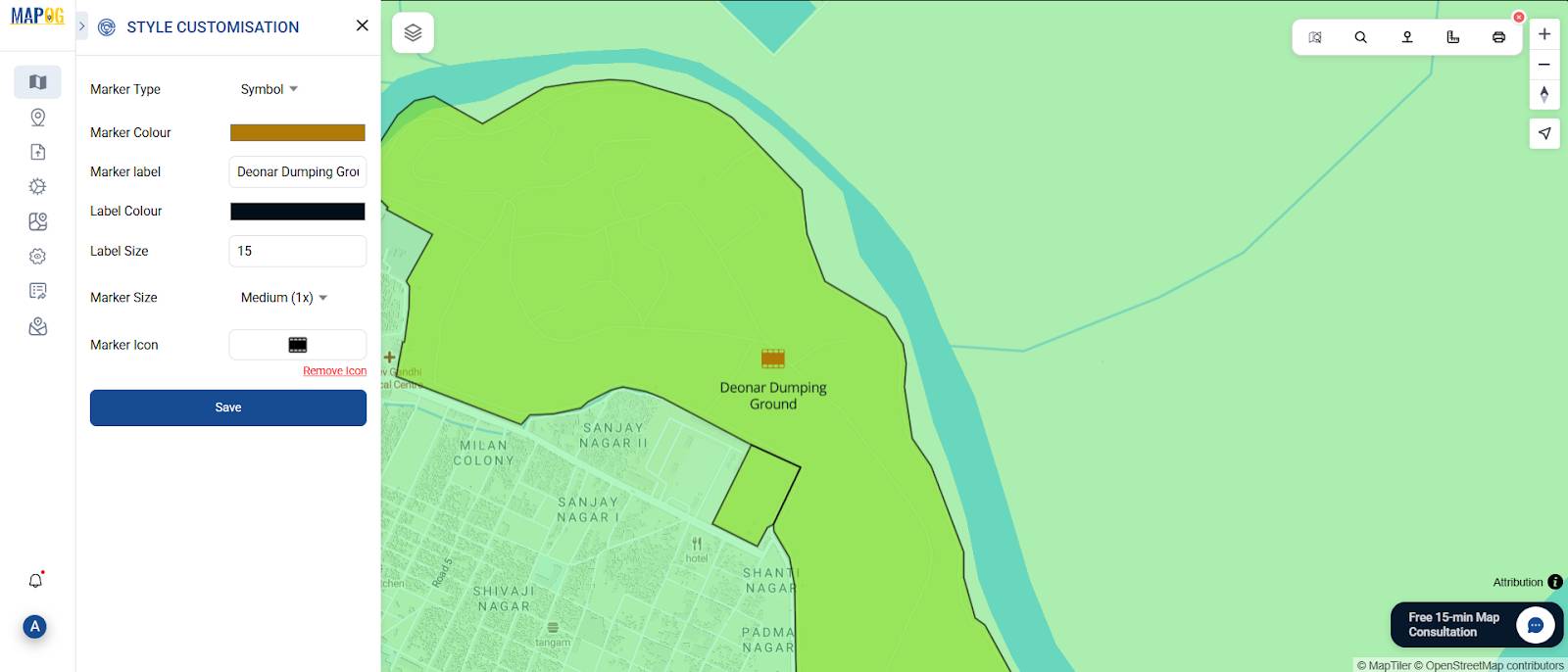
This categorization helps users navigate and interpret your map intuitively, and repeat the same steps for all other points.
Step 6: Save, Publish & Share
- Go to the “Share & Publish” tab
- Set your visibility to Public or Private
- Copy the link and share your interactive map via web or reports
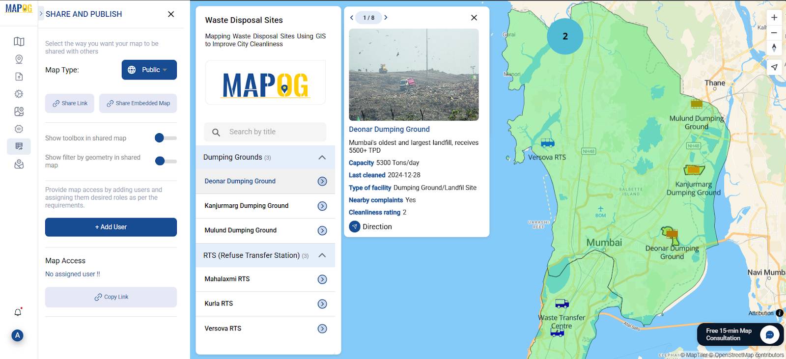
Industry Use & Benefits
Story mapping turns static data into spatial insight—making waste infrastructure understandable and interactive. For cities, this means:
- Planners can identify service gaps and improve waste logistics.
- Environmental bodies can assess proximity to sensitive areas.
- Citizens become more aware of how and where waste is managed.
With MAPOG’s easy-to-use tools—like location tagging, shapefile upload, and media integration—you can build powerful story maps without any GIS experience.
GIS Data Used
To map Mumbai’s waste infrastructure effectively, the following GIS layers were used from the MAPOG GIS Data Library:
These spatial layers allow for better analysis of how waste flows across zones and help identify service gaps, overlaps, or environmental risks.
Conclusion
Mapping Mumbai’s waste sites with MAPOG turns hidden infrastructure into a visible, engaging narrative. It helps make cleanliness systems transparent and encourages smarter decisions.
Turn raw data into a story that drives change.