If you have ever managed an extensive list of locations in an Excel sheet — such as customer addresses, store locations, survey sites, or well coordinates — and wanted to represent them spatially, you are not alone. Visualizing location-based data on a map enables you to clearly understand the spatial distribution, relationships, and patterns that tables often obscure. Moreover, mapping helps you move beyond raw numbers and uncover meaningful insights about how different locations connect and interact.
With MAPOG, you can easily plot multiple locations from your spreadsheet onto an interactive map in just a few steps. As a result, by connecting your Excel sheet to an interactive platform, you transform static data into actionable intelligence — helping you analyze, plan, and communicate with greater precision and impact.
Key Concepts to Plot Multiple Locations from Excel on a Map
To plot multiple locations from an Excel sheet onto a map, it includes understanding geospatial data and coordinate systems, which define how locations are represented on Earth’s surface. Proper data preparation ensures that each entry is correctly formatted for mapping, while geocoding converts addresses into precise coordinates. Visual clarity is achieved through symbology — using colors, sizes, or shapes to convey meaning and the resulting map reveals spatial patterns such as clusters or gaps.
Step by Step Guide on how to plot multiple locations from an excel sheet on a map
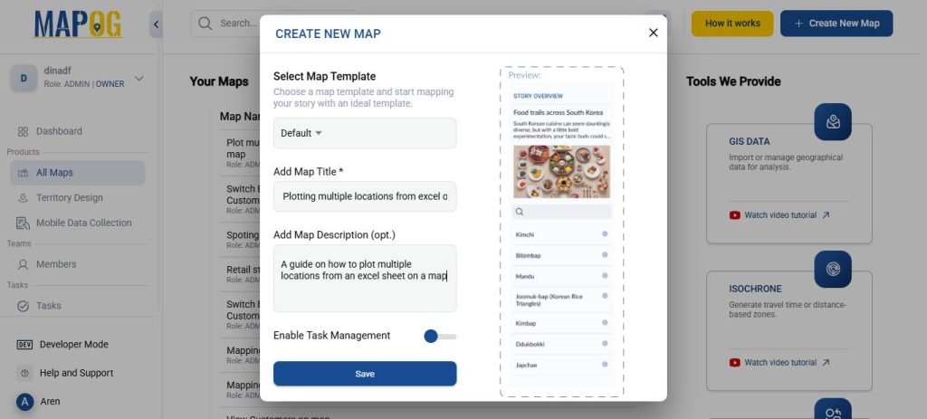
1. Start with a New Map
Open MAPOG and click on “Create New Map.” Give your project a title and a brief description, then hit save.
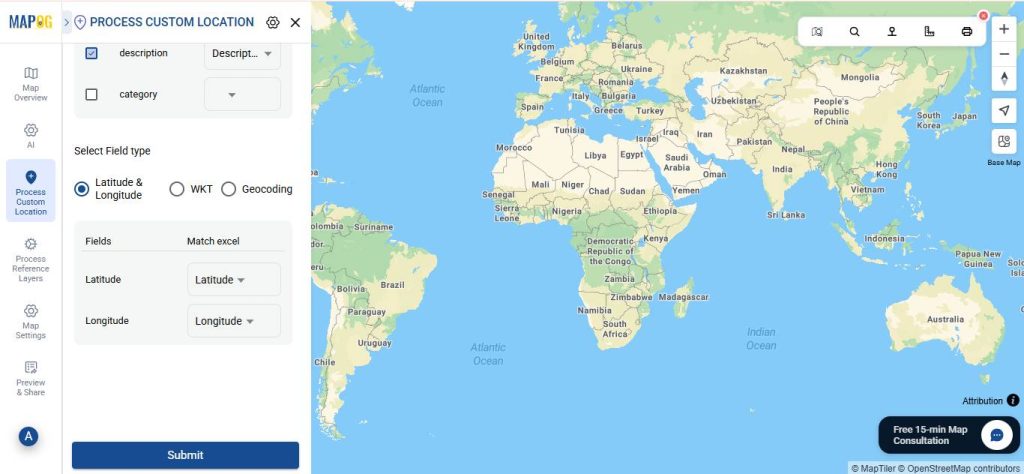
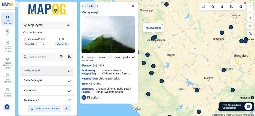
2. Add coordinates using a CSV file
Go to Process Custom Location and then select “Add by uploading CSV/Excel”.
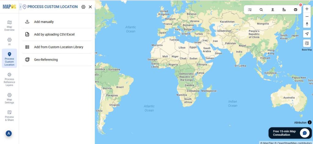
And then upload your desired Excel file.

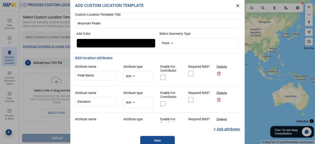
Go to Select Custom Location Template settings option, add custom location template, such as — Mountain Peaks, as here we use a dataset containing mountain peaks. Then input necessary attributes such as the name, elevation, state, etc.
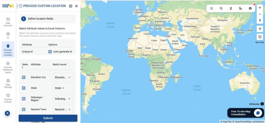
Then, match your Excel columns with the corresponding attributes, selecting the appropriate field type for latitude and longitude (or WKT location, if preferred). In this example, we match the fields with latitude and longitude, respectively. After that, click Submit.
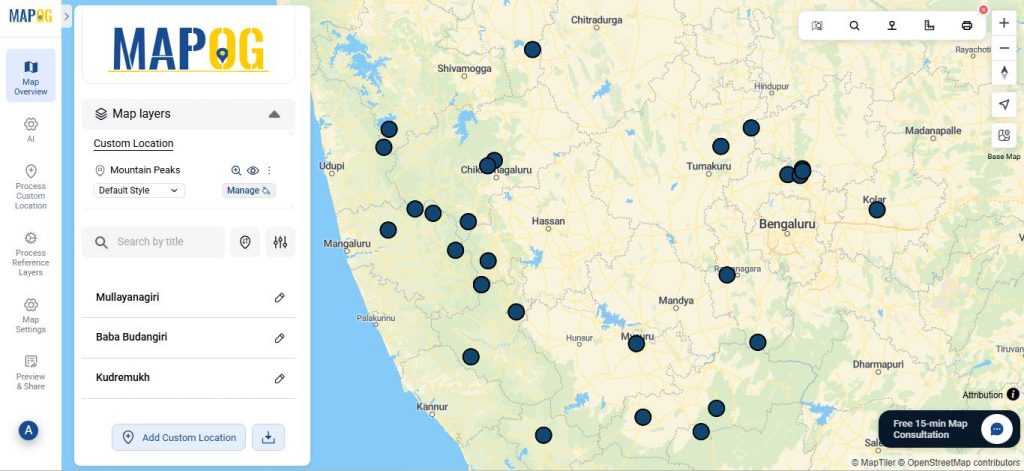
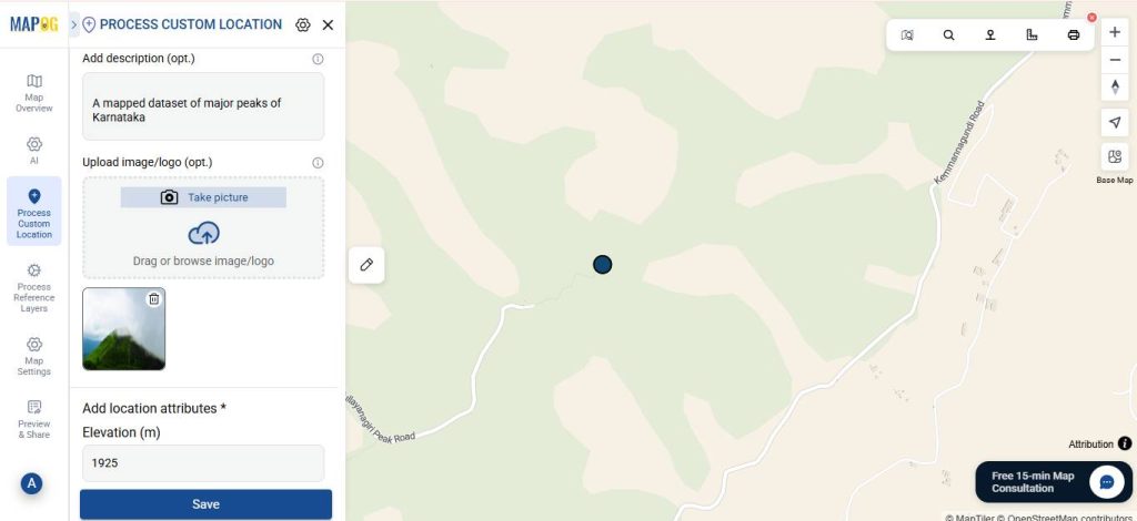
3. Editing the points.
Go to Edit point details. Next, upload a relevant image for your point to complete the necessary attributes, then click Save.
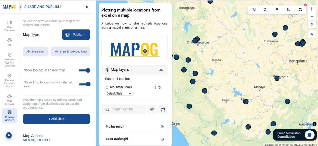
4. Share Your Map
Once your map is ready, click “Preview and Share”. You can also set your map to Public for wider visibility or share it using the Share Link option.
Real World Applications
Plotting multiple locations from an Excel sheet on a map has numerous real-world applications across diverse sectors. For instance, businesses use it to visualize customer distribution, optimize delivery routes, and plan store expansions more efficiently.
Meanwhile, researchers and environmental scientists rely on mapping to study biodiversity, track field sites, and analyze spatial relationships within ecosystems. Similarly, urban planners and government agencies employ these maps to monitor infrastructure, manage public services, and guide sustainable development. Furthermore, in the field of resource management, mapping supports the analysis of well locations, mineral deposits, and groundwater networks.
Conclusion
In summary, mapping data from an Excel sheet transforms ordinary lists of locations into meaningful geographic insights. It not only enhances data interpretation but also supports better planning, analysis, and decision-making across various fields. By using MAPOG, this process becomes accessible to anyone — allowing users to visualize complex datasets, identify spatial patterns, and present their findings with clarity. Ultimately, turning tabular data into interactive maps bridges the gap between information and understanding, making location-based analysis both practical and powerful.