Transform raw data into interactive visuals showing customer locations, spending, and trends. Furthermore, Switch Between Map Styles reveals interactive map insights like top buyers, regional demand, and performance gaps, enabling faster, data-driven decisions without coding.
Key Concept: Switch Between Map Styles
However, by smoothly Switch map styles, you can easily explore one dataset from multiple analytical angles, thereby revealing patterns, hotspots, and trends instantly.
Explore Customer Data Switch Between Map Styles
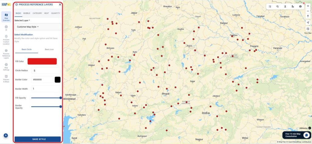
🗺️ Basic Map: The Foundation View
The Basic map gives a clean view of all customer points, helping verify data accuracy and spot overall patterns. Ideal for quick reviews, presentations, or setting a baseline before deeper analysis.
Basic Style : Methodology
- Go to MAPOG and create a new map for example, Customer Distribution Analysis. You can style the customer points to display attributes such as purchase value, category, or density clearly.
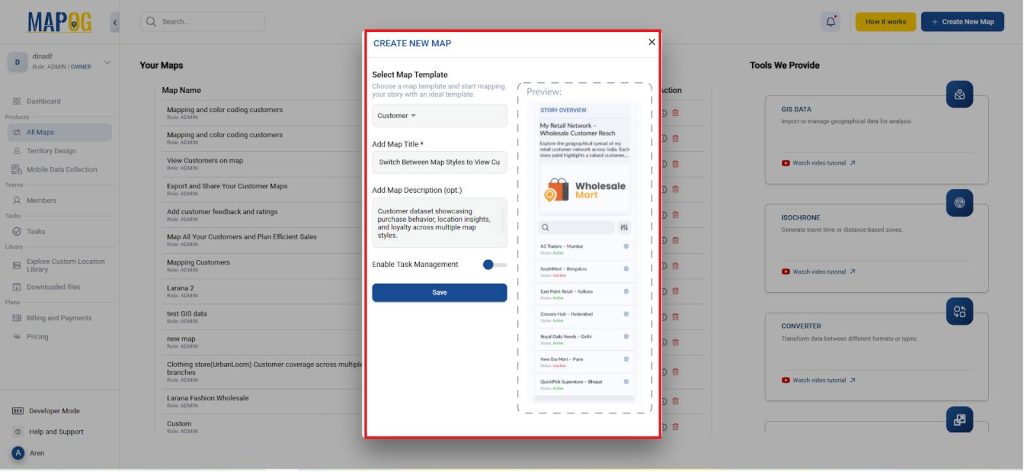
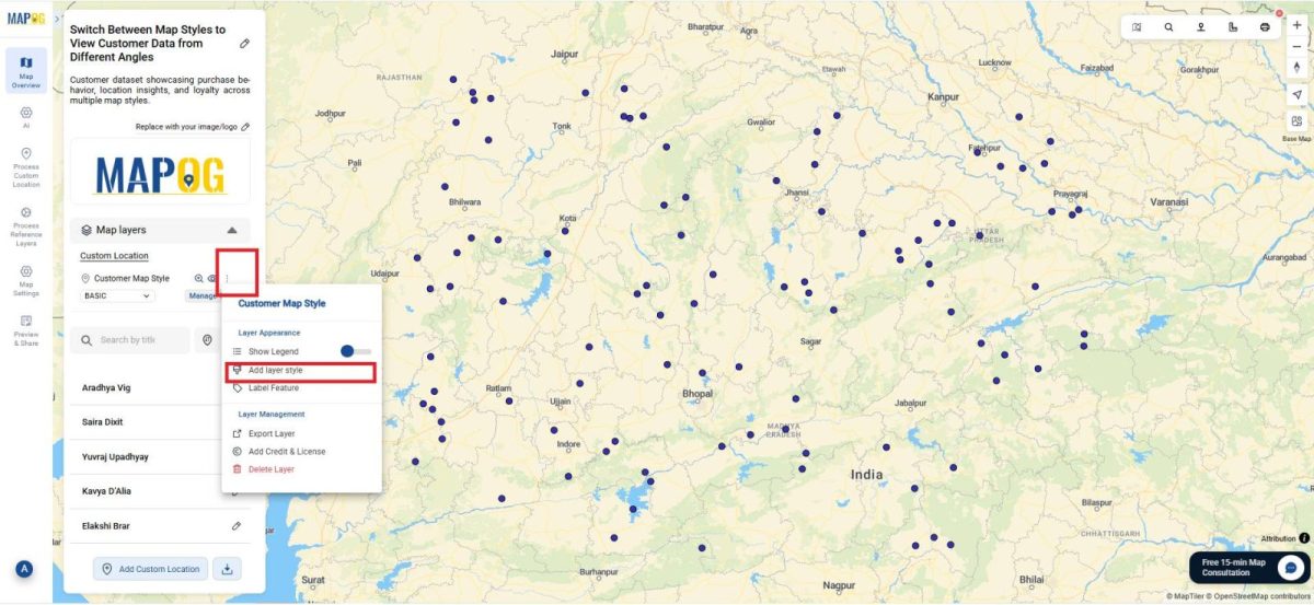
- To begin, open the Layer Settings of your customer data layer and select Add Layer Style to choose how your customer information appears on the map.
- So,go to basic style and customize colors, icon sizes, and opacity to best represent your data.
- Click Save Style instantly transforming your map into an interactive visualization dashboard.
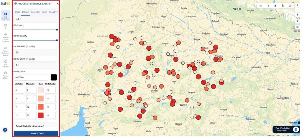
🔵 Bubble Map: Visualizing Purchase Value
In a Bubble map, customer points scale by purchase value or sales volume. Larger bubbles reveal high-value clusters, helping sales teams target key markets and plan promotions effectively.
Bubble style: Methodology
- Open the Style Layer in layer setting and choose Bubble as the visualization type.
- Set Purchase Value as the size field so higher values appear larger and adjust the minimum and maximum bubble sizes for visual balance.
- And give the Number of Parts as 4 and Color Scheme as red to add color variations to represent customer categories or loyalty levels.
- Apply the style to view revenue clusters and identify top-performing areas.
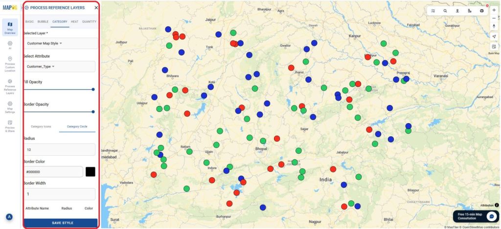
🏷️ Category Map: Grouping by Customer Type
The Category map colors customers by type, thus enabling faster market comparison and improving targeted marketing decisions.
Category style: Methodology
- Open the Style Layer in the layer settings and select Category as the visualization type.
- Set Loyalty status as the key Attribute to group data.
- And give specific colors like Retail 🔴 , Wholesale 🟢, or Online 🔵.
- Finally, apply the style to visualize dominant customer types and compare market distribution across regions.
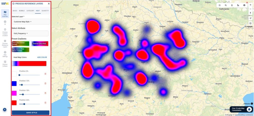
🔥 Heat Map: Detecting Density and Demand
The Heat map visualizes customer intensity hot zones show high activity, while cooler zones reveal low engagement. It helps identify key markets, optimize logistics, and spot untapped opportunities.
Heat Map: Methodology
- Open the Style Layer and select Heat as the visualization type.
- Set Visit Frequency as the intensity field (i.e.., Attribute) to show density variations.
- Adjust the color gradient to highlight high- and low-activity zones, then apply the style.
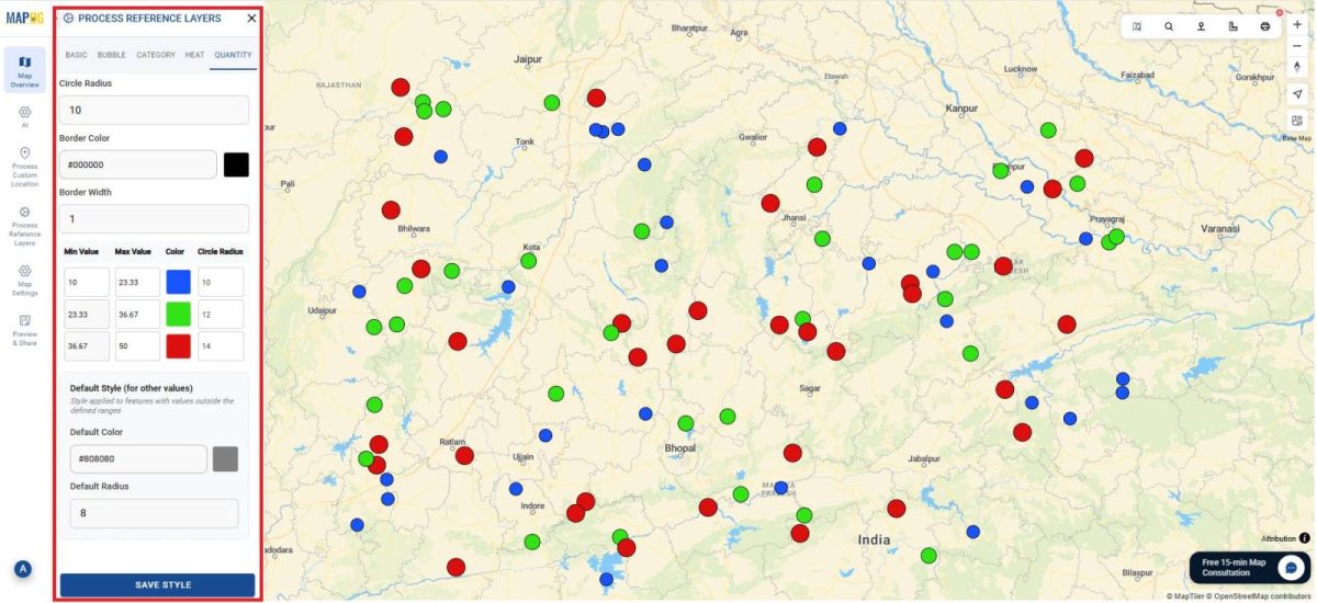
📊 Quantity Map: Comparing Regional Totals
The Quantity map shades regions according to total customers or revenue. Moreover, darker areas indicate stronger performance, helping compare markets and guide growth or resource allocation.
Quality Map: Methodology
- Open the Style Layer and choose Quantity as the visualization type.
- Set Total order Count as the value field for shading intensity.
- Adjust the number of classes to 3 and color scale to green to clearly show regional performance levels, then apply the style.
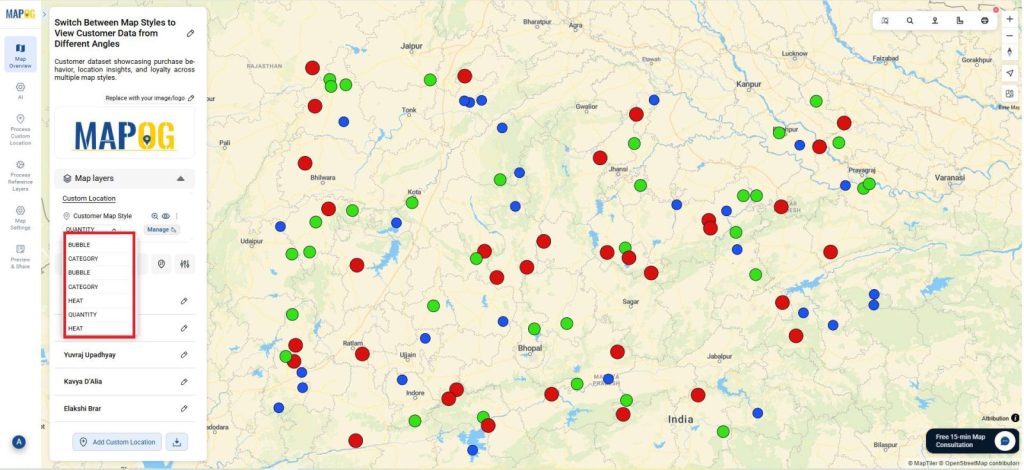
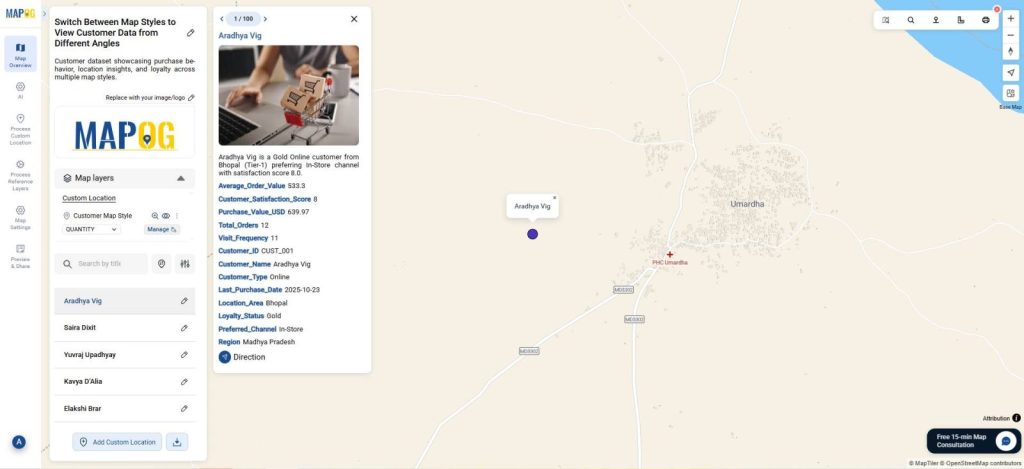
Switch Between Map Styles
- Below the map layer, the customer location table includes a Map Styles column.
- Open the dropdown in the Map Styles column.
- Choose from Basic, Bubble, Category, Heat, or Quantity styles to view customer data from various analytical angles instantly.
Insights, Applications & Users
- Spot Trends: Identify high-value zones or customer clusters instantly.
- Analyze Easily: Compare map views without altering data.
- Empower Teams: Perfect for sales, planners, and analysts using visual insights for better decisions.
Conclusion
Finally, Multi-Style Customer Mapping in MAPOG offers five views of one dataset, revealing spending, segments, and density turning raw data into insights that boost performance, planning, and customer relationships.
So, do you want to see the step-by-step process to create such beautiful interactive map?