Analysing and interpreting population data across various geographic regions can be done visually with Interactive Population Maps with Heat Bubble and Category Styling. It is simple to quickly identify high and low concentration areas on these maps because they use heat bubbles, which vary in size and colour, to represent population density or totals. Furthermore, category styling makes it possible to group and distinguish regions according to predetermined demographic criteria or population ranges, which improves comparison and clarity. This method makes complicated data interactive and easier to understand, which helps with research, public policy, and urban planning. MAPOG enhances the attractiveness and usability of these maps, enabling real-time exploration and deeper insights into population trends and patterns for better decision-making.
Key Concepts in interactive Population Mapping:
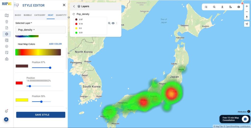
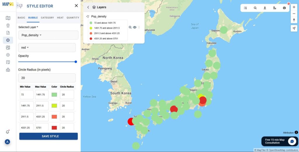
- Heat Bubble Visualization: Heat maps of Bubble maps makes spatial patterns easily identifiable by representing population density or totals with circles of different sizes and colors
- Data Simplification: Translates complex datasets into clear, visual formats for easier interpretation.
- Geographic Insight: Improves knowledge of population distribution across regions, supporting regional planning and analysis.
- User Interactivity: Lets you perform zooming, filtering, and data exploration in real time, offering a dynamic user experience.
Why use Heat Bubble and Category Styling in Interactive Population Maps ?
By transforming unprocessed data into clear, visual insights, Heat Bubble and Category Styling improve population maps. Heat bubbles make it simple to identify high and low density areas by using their size and colour to represent population density. Moreover Category styling facilitates comparison and trend identification by grouping regions according to population ranges. When combined, they make complex data easier to understand, enhance decision-making, and increase user engagement.
Following points can be used to describe the use of Heat Bubble and category styling in Population map:
- Enhanced Visual Clarity: Heat bubbles make it simple to notice patterns and hotspots by using size and colour to rapidly represent population density or totals.
- Simplified Comparison: By classifying regions into distinct population ranges (such as low, medium, and high), category style facilitates rapid cross-region comparison.
- Improved Data Interpretation : Even non-experts can understand complex numerical data thanks to its translation into easily understood visual formats.
Steps to Interactive Population Maps using Heat Bubble and Category Styling:
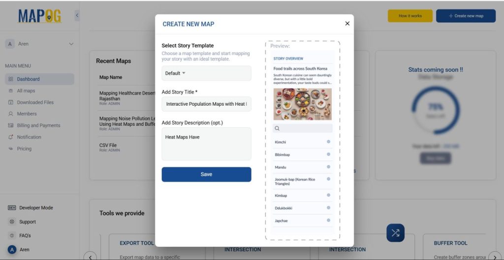
1. Access MAPOG’s Mapping Platform:
Visit MAPOG platform in your browser. Click on “Create New Map” in the top- right corner of the homepage to start creating your own map.
Place the following details on your map:
- Add Title of your map.
- Description telling us what it’s about.
- And a nice Image to symbolize your theme on the map.
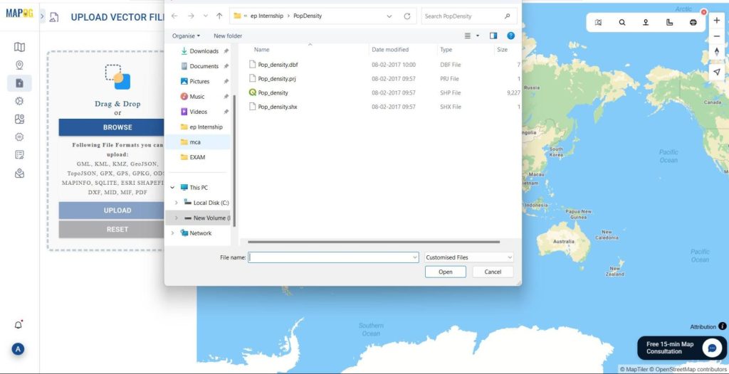
2. Add Data:
Click on the “Add/Upload Data” button to add the necessary data.
- Select your data type depending on the nature of your data, from Point, Line or Polygon.
- You can select from a Vector file, CSV/ Excel file, or also acquire data from the GIS data button.
- Select the data from the desired folder in your computer, and add it into the add data interface either by drag drop or directly selecting the files.
After selecting the data, click Upload.
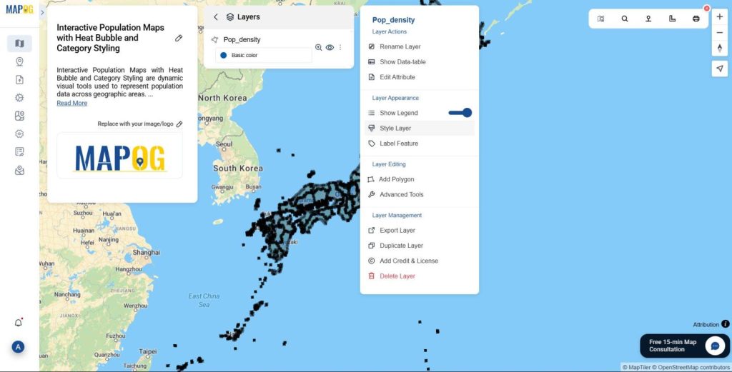
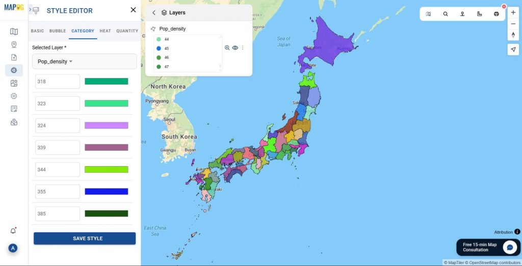
3. Customize the data according to your need:
You can customize the data uploaded in the map according to your requirement into Heat , Bubble and Category
- Click on the 3 dotted button in the layer tab on the top.
- Likewise Click on the “Style Layer” button to change the styles from Heat, Bubble and Category Styling.
- Subsequently Choose proper parameters in styling the Heat, Bubble and Category styled map.
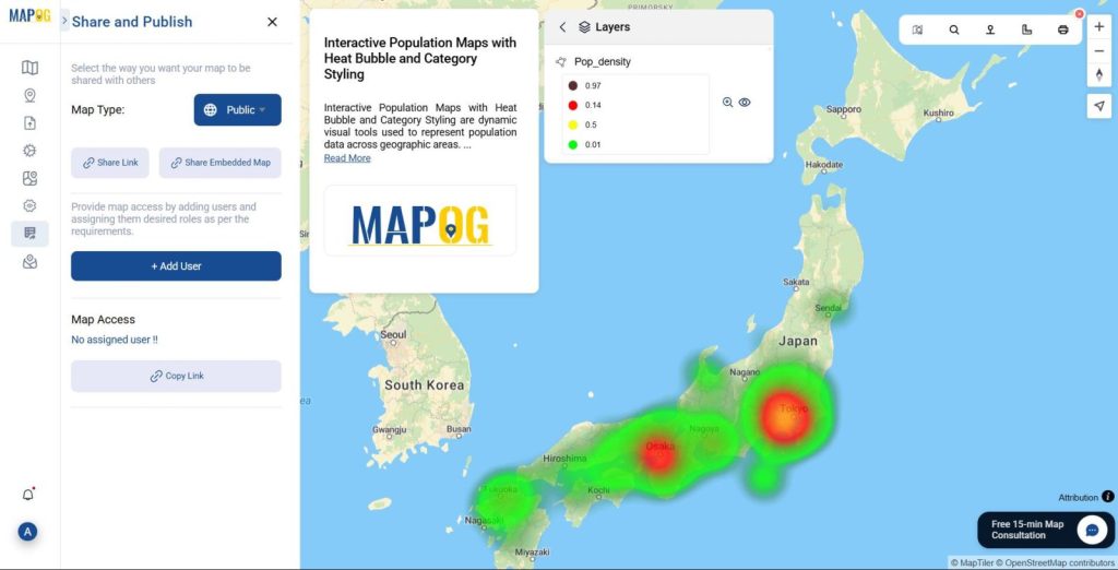
Publish and Share:
Lastly, With the help of the publish and share option, you can share it and distribute it to anybody.
Advantages of using Heat Bubble and Category Styling in Population Map:
1. Quick Identification of Population Density:
- Heat bubbles, which fluctuate in size and colour intensity, visually depict the population’s concentration.
- This Straightaway eliminates the need to read intricate data tables and makes it simple to quickly identify high- and low-density locations.
2. Easy to use and straightforward:
- These graphic components translate complicated data into formats that are easy to comprehend.
- It is appropriate for a broader audience because patterns are simple enough for even non-technical users to understand.
3. Supports Thematic Layering:
- Can be combined with other layers (e.g., literacy, poverty, healthcare access) to build multi-dimensional insights.
- Significantly Facilitates deeper analysis of how the population interacts with other factors.
Conclusion:
Moreover the use of Heat Bubble and Category Styling in population maps greatly improves the visualization and interpretation of demographic data. Data-driven decision-making across sectors is supported by these techniques, which also provide rapid comparisons and simplify complicated datasets. By emphasizing population density and dispersion, they enable academics, planners, and policymakers. For real-time analysis and strategic planning, these visualizations become even more dynamic, accessible, and powerful when combined with tools like MAPOG.
Have you ever used interactive maps with Heat Bubble and Category Styling to investigate population patterns or regional planning? Leave a comment below with your thoughts and experiences!
You can check more Articles from the MAPOG links given by: