In rapidly growing cities, fire safety is critical—particularly in industrial zones, where risk is high and emergency response must be quick. Moreover, fire stations in industrial areas play a key role in reducing disaster response time. This project uses MAPOG, a cloud-based spatial mapping platform, to visualize and analyze coverage gaps in fire response infrastructure.
Drawing from approaches like Fire Station Reachability Analysis, this project further highlights the importance of mapping fire stations to industrial areas to ensure faster response and strategic infrastructure placement. By making emergency infrastructure visible and measurable, it supports safer, data-driven urban planning.
Key Concept: Why Map Fire Station Proximity to Industrial Areas?
A mapped emergency network is more than just points on a map—it’s about preparedness, risk, and resilience. While a list of fire stations offers basic information, spatial mapping shows how well industrial zones are actually protected. Therefore, each fire station marker reflects response potential, coverage gaps, and infrastructure equity.
With MAPOG, planners can build context-rich visualizations Just like Analysis of Forest Fire and Map Risk Areas with Buffer Tool uses buffers to identify fire-prone regions. This project applies spatial thinking to analyze fire station reach. Thus, it allows decision-makers to see which industrial zones are underserved—empowering smarter safety planning and infrastructure investment.
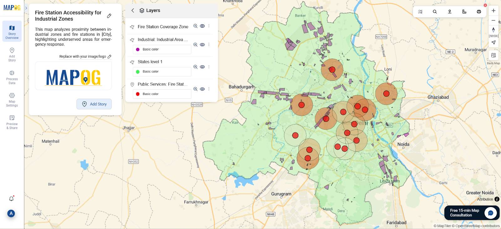
Step-by-Step Workflow: Fire Station Reachability Analysis Using MAPOG
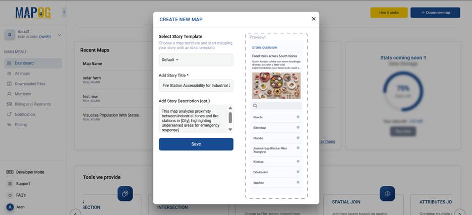
Step 1. Create a New Map
- Go to MAPOG and log in.
- Click “Create New Map.”
- Then, give title like “Fire Station Reachability in Industrial Zones” and a brief description.
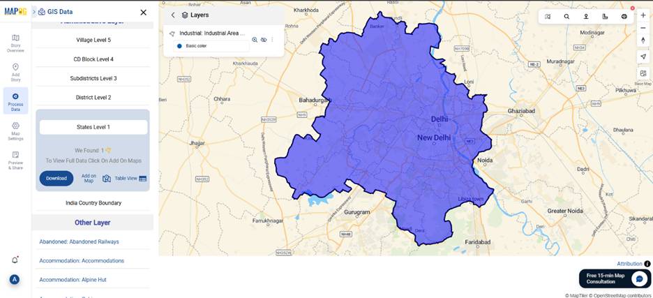
Step 2. Add GIS Data Layers
Use the “GIS Data” from “Process Data” to add:
- State Boundary (Polygon) – for regional context
- Industrial Areas (Polygon) – to identify risk zones
- Fire Station Locations (Point) – main layer for proximity analysis
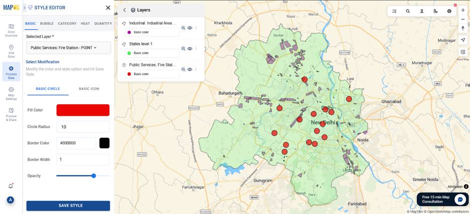
Step 3. Style the Layers
- Open the Style Editor for clarity:
- Fire stations: red points
- Industrial zones: light fill
- State boundary: subtle outline
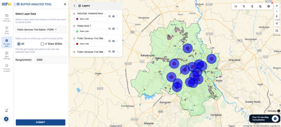
Step 4. Create Buffer Zones Around Fire Stations
- Go to Process Data → Buffer Tool
- Then Input Layer: Fire Station Points
- Buffer Radius: 3–5 km (optimal response range)
- Output Layer: “Fire Station Coverage Zone”
Thus, this generates buffer zones representing each station’s approximate service area.
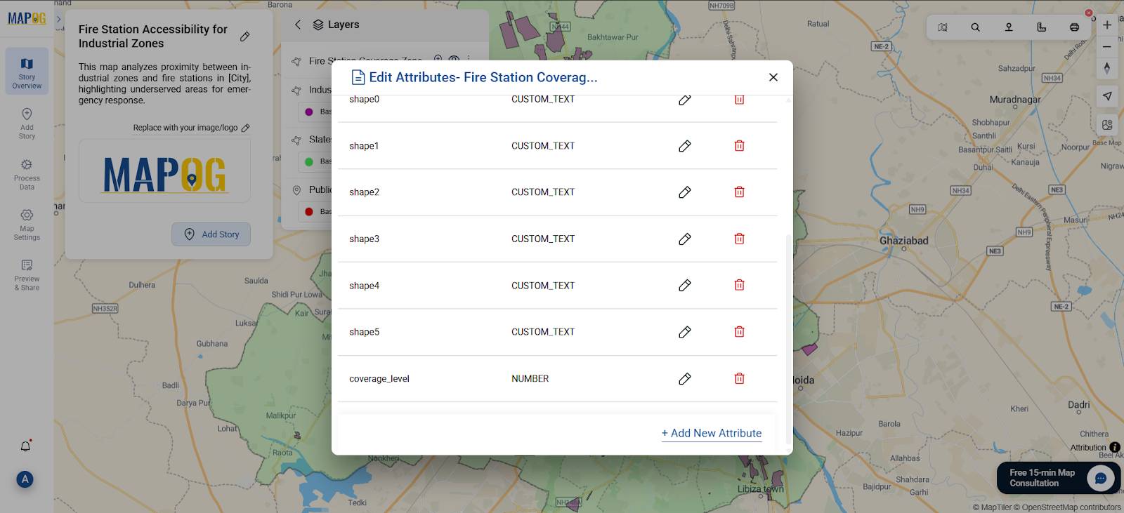
Step 5. Add a Coverage Attribute
To show service strength visually:
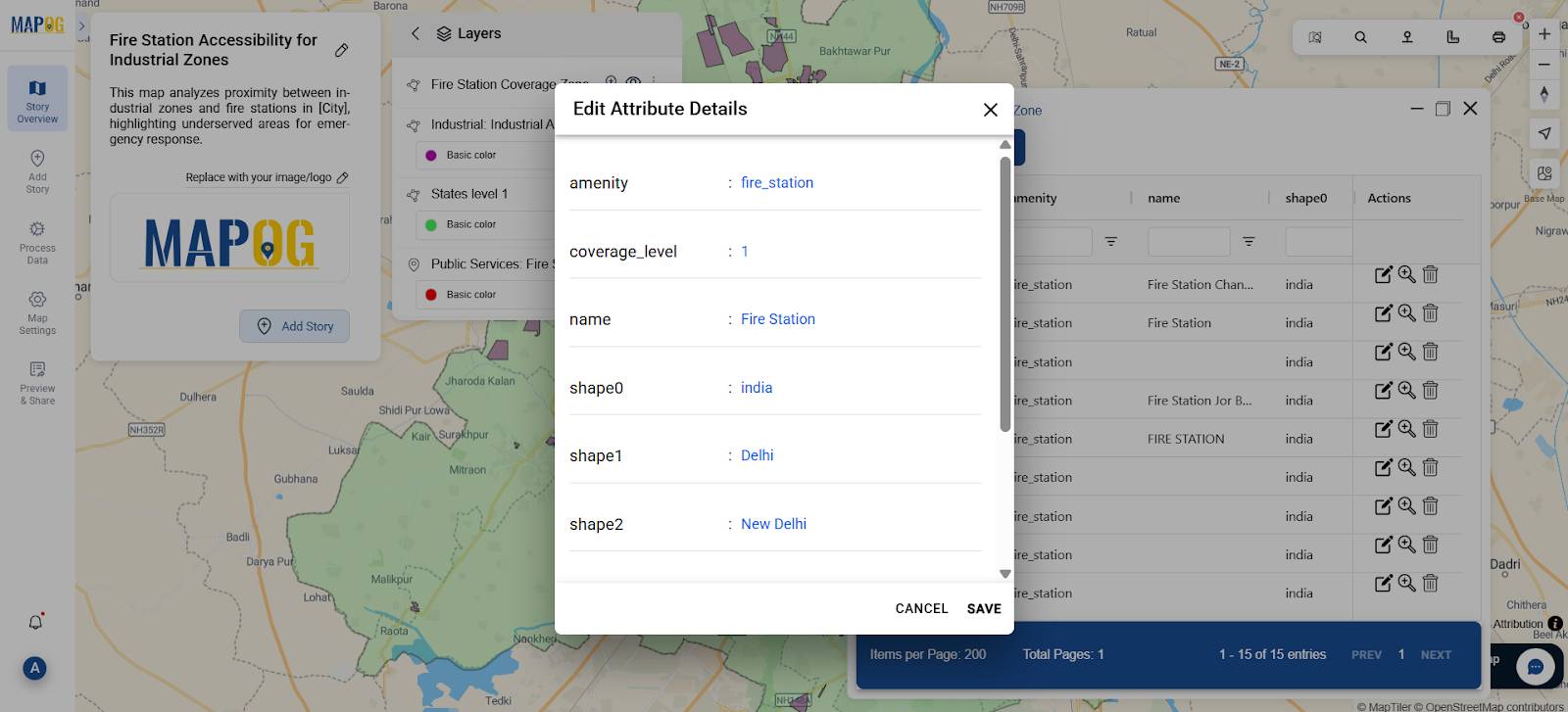
- Go to the buffer layer, click “Edit Attribute Table”
- Then, add a new column: coverage_level.
- Open “Show Data Table.” & manually assign numeric values:
- 3 → High coverage
- 2 → Moderate coverage
- 1 → Low/underserved
Thus, this numerical field helps with bubble-style visualization.
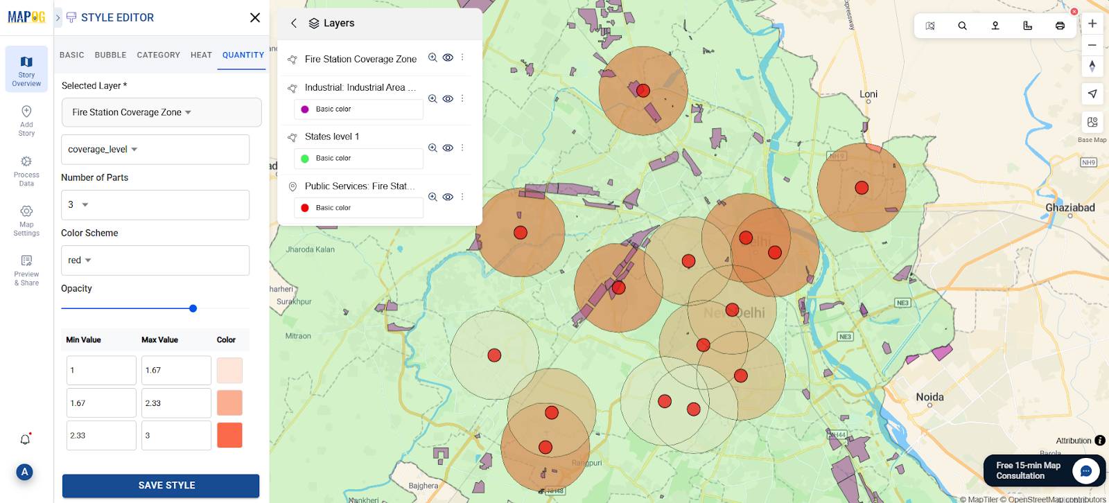
Step 5. Style Using Quantity Bubble
- Open the Style Editor for the buffer layer.
- Then, switch to the Quantity tab.
- Under Select Attribute, choose coverage_level.
- Then, set Number of Parts to 3 (low, medium, high).
- Choose a Color Scheme like Red to indicate intensity:
- Light orange → Low coverage
- Medium red → Moderate coverage
- Dark red → High coverage
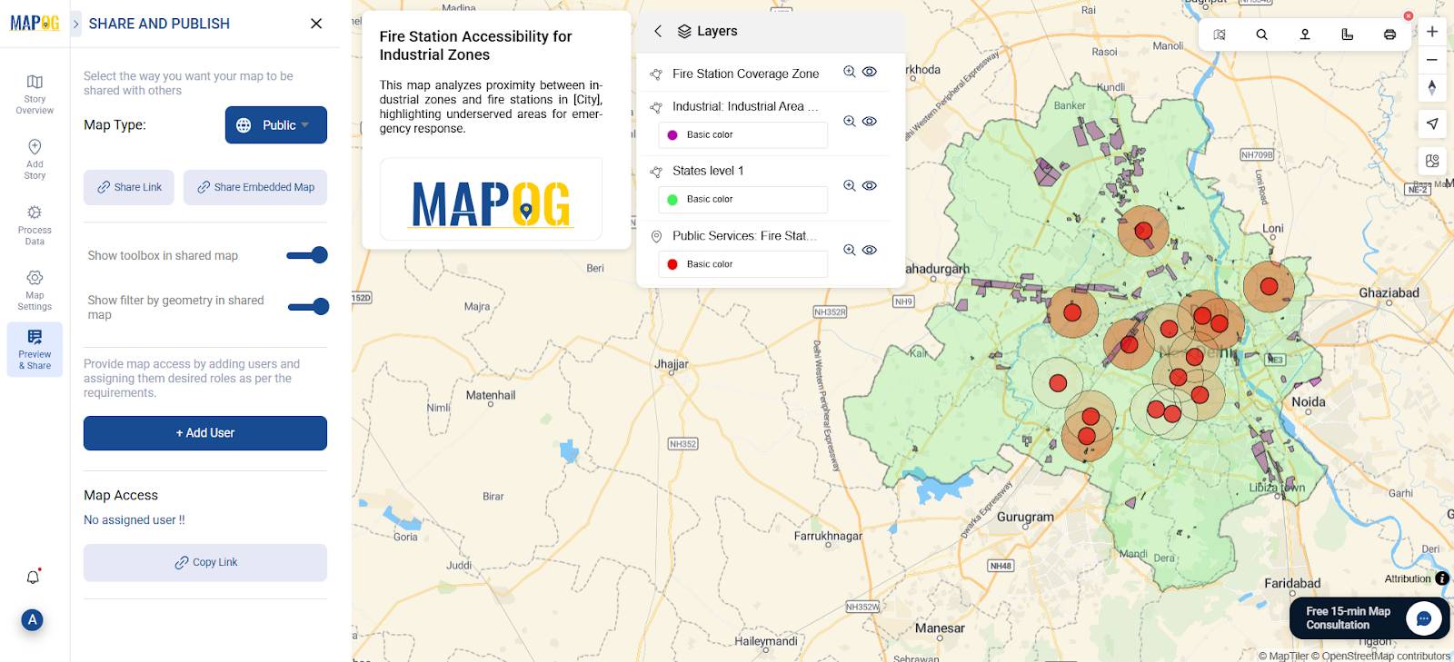
Step 6. Share or Export the Final Map
- Click “Preview & Share”
- Then, choose to make the map public or private
- Export as image or embed in reports or presentations
Industry Use & Benefits of Mapping Fire Station Coverage
Interactive fire coverage maps are transforming emergency planning. Specifically, MAPOG helps in:
- Urban Planners: Spot safety gaps and suggest new station sites
- Disaster Management Authorities: Optimize response times
- Municipal Engineers: Prevent service overlap
- Policy Makers: Back fire safety investments with data
Moreover, just like climate change impact mapping, this method turns static datasets into dynamic, action-oriented insights. Buffer zones here expose safety blind spots—crucial for protecting lives..
GIS Data Used
The following layers were sourced from the MAPOG GIS Data Library:
- State Boundary Polygon – for regional context
- Industrial Areas Polygon – to assess high-risk zones
- Fire Station Point Data – to map emergency infrastructure locations
Conclusion
With MAPOG’s intuitive tools—like Buffer, Style Editor, and GIS overlays—planners can shift from reactive to strategic emergency planning. Fire station buffers become more than circles—they reveal safety gaps, guide smarter investments, and support resilient urban development.