In our fast-evolving cities and growing rural communities, access to healthcare is a basic need which still remains unevenly distributed. The healthcare revolution arises from Geographic information Systems (GIS) which enables complex data to be converted into life-saving decisions such as hospital site selection and healthcare
Through integration of several layers, GIS produces an accurate picture to identify areas that face heavy healthcare demands along with locations requiring foundational healthcare infrastructure. The implementation of GIS creates better decision-making transparency because it improves what was previously based on guesses or outdated data.
Key Concept
By utilizing spatial tools such as Buffer Zones & Layer styling planners can assess potential hospital sites with remarkable precision. Features like MAPOG’s buffer tool and Add Story function turn this otherwise complex analysis into a streamlined, user-friendly process.
Step-by-Step Process for Hospital Site Selection and Accessibility Analysis Using GIS
Let’s see a step-by-step process on how GIS helps in hospital site selection and accessibility analysis using a real-life example using MAPOG .
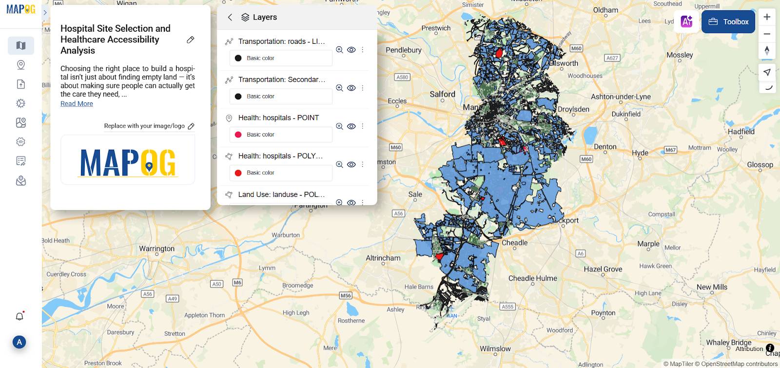
1. Importing Key GIS Layers
Once inside the MAPOG interface, you can access a variety of built-in GIS data using the GIS Data option. These ready-to-use layers can be added directly to your map, allowing you to start your analysis right away.
Import critical dataset’s such as –
- Transportation Roads
- Secondary roads
- Hospital points
- Hospital polygons
- Land use/Landcover
- Residential area
These layers add up to create a clear picture about the analysis
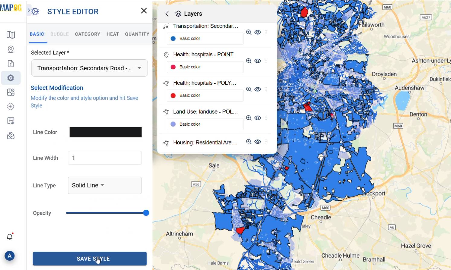
2.Styling layers for clarity
Using the Style Editor from the action button, I can easily tweak each layer to make the map more readable. For example, when working with GIS in hospital site selection, I might shade transportation roads in black, highlight residential areas in blue, and mark hospitals in red. It really helps separate different zones visually and makes everything much easier to understand at a glance.
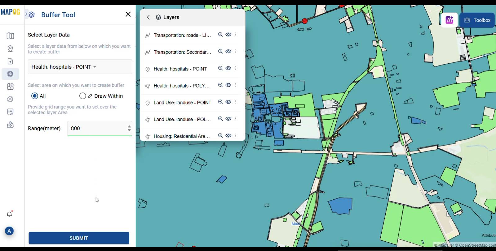
3.Drawing Buffer zones Around Important Features
This is where MAPOG’s buffer tool really comes in handy. Using the process data panel on the left, one can quickly open the Buffer Tool and start marking out zones. For Instance, creating an 800-meter buffer around all the existing hospitals in the city. These buffers help define areas which have quick access to hospitals and also helps planners to build new medical Centre’s for better accessibility.
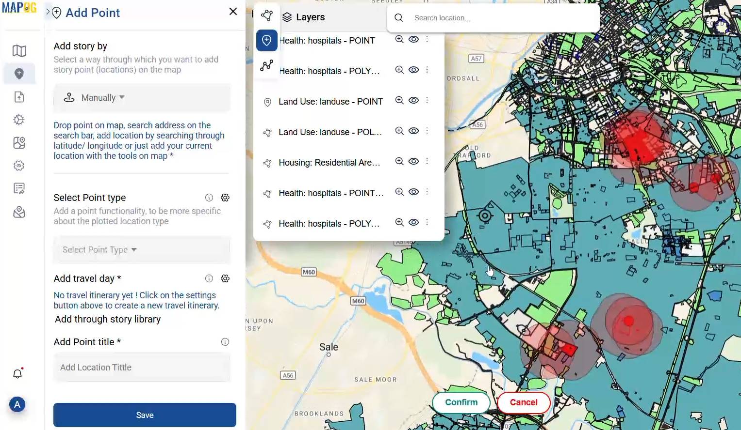
4.Suggesting the best locations with GIS
After setting up the buffer zones, I use the “Add Point” feature in the Add Story section to mark possible spots for new hospitals. These points are carefully placed within the most suitable areas highlighted by the spatial analysis using GIS in hospital site selection. I can manually choose each location, add a title, write a short description, and even attach images basically giving each proposed site proper context and meaning. It’s a simple but powerful way to present and communicate the best options.
5.Industry Applications and Key Benefits
GIS provides valuable insights across multiple sectors such as healthcare industry, urban planner, NGO’s and emergency services. Overall, GIS ensures smarter, data driven actions that improve community efficiency.
Key Industrial norms are
- Accuracy: Ensure high precision in spatial data collection and analysis.
- Cost efficiency: Being close to existing infrastructure reduces initial setup expenses
By combining storytelling with spatial data tools like MAPOG enables professionals to visualize, share and rework on hospital plans more collaboratively
GIS data used:
Ever wonder how to know about the area’s which are disease affected? CREATE MAP— How to use GIS for Mapping Disease Affected Area.
Conclusion: Let GIS Guide Your Hospital Planning
From mapping transportation road layers to making proposed locations using buffer zones, GIS transforms hospital site selection and accessibility into a clear, scalable process. With platforms like MAPOG featuring the Add story and Buffer Tool even non-specialists can craft meaningful, data driven spatial narratives for healthcare planning.
So, the next time you’re planning a new hospital location let the maps lead the way.
Here are some other blogs you might be interested in
1 thought on “How GIS Helps in Hospital Site Selection and Healthcare Accessibility Analysis”